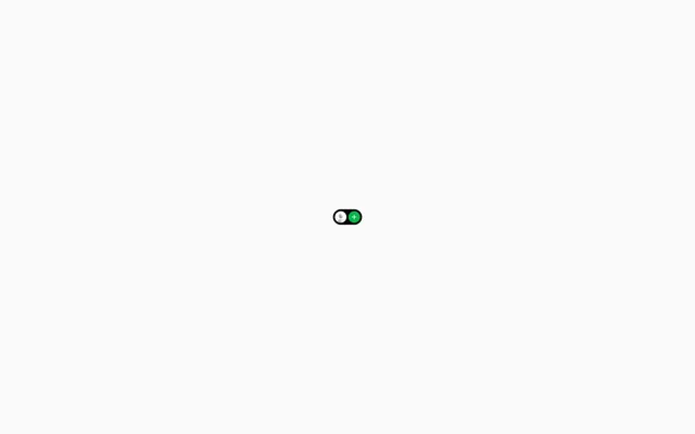
Preview image. Unlock full-res
White paper blueprint – precise, high-contrast, functional.
Color palette
Background for interactive buttons, indicating success or progression. Its vividness is a deliberate contrast against the neutral palette.
Background for interactive buttons, used sparingly for specific calls to action where its warmth draws attention.
Background for interactive buttons, providing a cool, stable option for calls to action.
Page backgrounds, card surfaces, primary text color for buttons and links.
Body text and secondary information, providing clear readability against Canvas White without competing with primary accents.
Typography
- Weights
- 400
- Sizes
- 12px, 14px, 16px
- Line height
- 1.33, 1.43, 1.5
- Letter spacing
- -0.020em (12px), -0.010em (14px)
- Fallback
- Inter
Primary typeface for all UI elements, including headings, body text, links, and buttons. Its clean, sans-serif structure maintains legibility even at small sizes and with minimal letter-spacing adjustments, reinforcing the functional aesthetic.
- Weights
- 400
- Sizes
- 16px
- Line height
- 1.5
- Letter spacing
- normal
- Fallback
- Karla
Used for specific secondary text areas (e.g., footers or descriptive labels). Its slightly wider character set provides a subtle visual distinction from Inter, while maintaining high readability.
Spacing & shape
Components
Transparent background, 'Canvas White' text (#ffffff), 1px 'Canvas White' border (#ffffff), and a 9999px border-radius, giving it a distinctive pill shape. Padding is minimal or absent, relying on text size for visual weight.
Solid 'Accent Green' background (#00b849), 'Canvas White' text (#ffffff), 1px 'Canvas White' border (#ffffff) and a 9999px border-radius. Padding is minimal or absent, leveraging color for prominence.
Solid 'Accent Orange' background (#f57200), 'Canvas White' text (#ffffff), 1px 'Canvas White' border (#ffffff) and a 9999px border-radius. Padding is minimal or absent.
No discernable background, 'Canvas White' text (#ffffff) only when within navigation components or when it contrasts with background color like Black, or '#757575' for general text. Has a 4px border-radius applied (likely to its hover/active state or an underlying container) with no explicit border.
Guidelines
- Prioritize 'Canvas White' (#ffffff) for all main backgrounds to maintain visual brevity.
- Use 'Text Gray' (#757575) exclusively for body copy and descriptive text.
- Apply 9999px border-radius to all interactive buttons for a consistent pill-shaped aesthetic.
- Reserve 'Accent Green' (#00b849), 'Accent Orange' (#f57200), and 'Action Blue' (#008bf5) for button backgrounds only, to highlight interactive elements.
- Maintain minimal padding (4-8px) around interactive elements to keep dense information layout.
- Use Inter at weight 400 for all primary text elements, and restrict letter-spacing adjustments to `-0.02em` or `-0.01em` at smaller sizes.
- Do not use color for decorative purposes; every color must serve a functional role.
- Avoid shadows or complex gradients; the design relies on flat colors and clean lines for depth.
- Do not introduce additional font families beyond Inter and Karla.
- Do not use a border-radius other than 9999px for primary buttons or 4px for links, unless explicitly defined for a specific component.
- Avoid excessive spacing between elements; maintain a compact information density.
- Do not use highly saturated colors for text or non-interactive elements.
About this system
ShowHide
Kons presents a minimalist interface, characterized by a stark white background and primarily achromatic text. The design is a study in restraint, relying on subtle gray tones for body copy and reserving vibrant, highly saturated colors exclusively for interactive button states, creating a focused, high-contrast interaction model. This approach elevates functionality, where color guides the user rather than decorating the interface, resulting in a direct, utilitarian aesthetic.
The layout is characterized by a central, information-dense block against a full-bleed 'Canvas White' background. There is no discernible `pageMaxWidth` value, suggesting a potentially fluid or center-aligned content area that adapts to viewport width. The hero section, if present, is a simple, typography-focused statement. Section rhythm is implied by vertical spacing, not by alternating background colors or distinct dividers. Content appears to be stacked vertically, with elements like buttons and links grouping together. Navigation, as seen in the isolated button variant, consists of distinct, pill-shaped elements.
This design system primarily relies on UI elements and typography to convey information. There is no visible use of photography, complex illustrations, or 3D renders. Icons, if present (as suggested by the button content), are minimal and monochromatic, acting as functional indicators rather than decorative elements. The visual language is purely UI-driven, focusing on text and interactive components.
Reminiscent of Linear, Vercel, Supabase, Framer.
# Kons — Style Reference
> White paper blueprint – precise, high-contrast, functional.

**Theme:** light

**Site:** https://kons.fyi

Kons presents a minimalist interface, characterized by a stark white background and primarily achromatic text. The design is a study in restraint, relying on subtle gray tones for body copy and reserving vibrant, highly saturated colors exclusively for interactive button states, creating a focused, high-contrast interaction model. This approach elevates functionality, where color guides the user rather than decorating the interface, resulting in a direct, utilitarian aesthetic.

## Tokens — Colors

| Name | Value | Token | Role |
|------|------|------|------|
| Accent Green | `#00b849` | `--color-accent-green` | Background for interactive buttons, indicating success or progression. Its vividness is a deliberate contrast against the neutral palette. |
| Accent Orange | `#f57200` | `--color-accent-orange` | Background for interactive buttons, used sparingly for specific calls to action where its warmth draws attention. |
| Action Blue | `#008bf5` | `--color-action-blue` | Background for interactive buttons, providing a cool, stable option for calls to action. |
| Canvas White | `#ffffff` | `--color-canvas-white` | Page backgrounds, card surfaces, primary text color for buttons and links. |
| Text Gray | `#757575` | `--color-text-gray` | Body text and secondary information, providing clear readability against Canvas White without competing with primary accents. |

## Tokens — Typography

### Inter
- **Substitute:** Inter
- **Weights:** 400
- **Sizes:** 12px, 14px, 16px
- **Line height:** 1.33, 1.43, 1.5
- **Letter spacing:** -0.020em (12px), -0.010em (14px)
- **Role:** Primary typeface for all UI elements, including headings, body text, links, and buttons. Its clean, sans-serif structure maintains legibility even at small sizes and with minimal letter-spacing adjustments, reinforcing the functional aesthetic.

### Karla
- **Substitute:** Karla
- **Weights:** 400
- **Sizes:** 16px
- **Line height:** 1.5
- **Letter spacing:** normal
- **Role:** Used for specific secondary text areas (e.g., footers or descriptive labels). Its slightly wider character set provides a subtle visual distinction from Inter, while maintaining high readability.

## Tokens — Spacing

- **Section gap:** 64px
- **Card padding:** 8px
- **Element gap:** 4px

## Tokens — Radius

- **Buttons:** 9999px
- **links:** 4px
- **tags:** 32px

## Layout

The layout is characterized by a central, information-dense block against a full-bleed 'Canvas White' background. There is no discernible `pageMaxWidth` value, suggesting a potentially fluid or center-aligned content area that adapts to viewport width. The hero section, if present, is a simple, typography-focused statement. Section rhythm is implied by vertical spacing, not by alternating background colors or distinct dividers. Content appears to be stacked vertically, with elements like buttons and links grouping together. Navigation, as seen in the isolated button variant, consists of distinct, pill-shaped elements.

## Imagery

This design system primarily relies on UI elements and typography to convey information. There is no visible use of photography, complex illustrations, or 3D renders. Icons, if present (as suggested by the button content), are minimal and monochromatic, acting as functional indicators rather than decorative elements. The visual language is purely UI-driven, focusing on text and interactive components.

## Components

### Button Group — Pill Variants

### Toggle / Add Action Control

### Stat / Metric Card Block

### Ghost Button (Pill)
*Primary interactive element for navigation and secondary actions.*

Transparent background, 'Canvas White' text (#ffffff), 1px 'Canvas White' border (#ffffff), and a 9999px border-radius, giving it a distinctive pill shape. Padding is minimal or absent, relying on text size for visual weight.

### Accent Green Button
*Call-to-action button, indicating successful or primary actions.*

Solid 'Accent Green' background (#00b849), 'Canvas White' text (#ffffff), 1px 'Canvas White' border (#ffffff) and a 9999px border-radius. Padding is minimal or absent, leveraging color for prominence.

### Accent Orange Button
*Secondary call-to-action button, for important but not primary actions.*

Solid 'Accent Orange' background (#f57200), 'Canvas White' text (#ffffff), 1px 'Canvas White' border (#ffffff) and a 9999px border-radius. Padding is minimal or absent.

### Link
*Inline text navigation.*

No discernable background, 'Canvas White' text (#ffffff) only when within navigation components or when it contrasts with background color like Black, or '#757575' for general text. Has a 4px border-radius applied (likely to its hover/active state or an underlying container) with no explicit border.

## Guidelines

### Do

- Prioritize 'Canvas White' (#ffffff) for all main backgrounds to maintain visual brevity.
- Use 'Text Gray' (#757575) exclusively for body copy and descriptive text.
- Apply 9999px border-radius to all interactive buttons for a consistent pill-shaped aesthetic.
- Reserve 'Accent Green' (#00b849), 'Accent Orange' (#f57200), and 'Action Blue' (#008bf5) for button backgrounds only, to highlight interactive elements.
- Maintain minimal padding (4-8px) around interactive elements to keep dense information layout.
- Use Inter at weight 400 for all primary text elements, and restrict letter-spacing adjustments to `-0.02em` or `-0.01em` at smaller sizes.

### Don't

- Do not use color for decorative purposes; every color must serve a functional role.
- Avoid shadows or complex gradients; the design relies on flat colors and clean lines for depth.
- Do not introduce additional font families beyond Inter and Karla.
- Do not use a border-radius other than 9999px for primary buttons or 4px for links, unless explicitly defined for a specific component.
- Avoid excessive spacing between elements; maintain a compact information density.
- Do not use highly saturated colors for text or non-interactive elements.

## Agent Prompt Guide

### Quick Color Reference
- Text (Body): #757575
- Background (Page): #ffffff
- Button (Accent Green): #00b849
- Button (Accent Orange): #f57200
- Button (Action Blue): #008bf5
- Button Text color: #ffffff

### 3-5 Example Component Prompts
1. Create a `Ghost Button (Pill)` with the text 'Back'. Use Inter font, weight 400, size 16px, color #ffffff, border-color #ffffff, border-width 1px, border-radius 9999px. Padding 8px horizontal, 4px vertical.
2. Render a `Body Text` paragraph: 'It's been 14 years'. Use Inter font, weight 400, size 16px, line-height 1.5, color #757575, normal letter-spacing.
3. Create an `Accent Green Button` with the text 'Queelp'. Use Inter font, weight 400, size 16px, color #ffffff, background-color #00b849, border-radius 9999px.
More like this






Keep what you find
A free account saves references to boards and can send you a weekly email of picks based on what you save.
To see every result, go Pro.