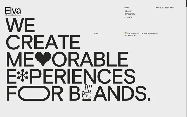
Preview image. Unlock full-res
Typographic Brutalism in a Monochrome Gallery. The design feels like a curated exhibition where letterforms are the central art pieces.
Color palette
Primary text, headings, interactive elements (links, navigation items) — this near-black anchors all visual content.
Page backgrounds, large content blocks — provides a stark, clean canvas for the dominant typography.
Used rarely for specific icon fills or subtle accents, creating a deeper contrast point.
Subtle background shifts, potentially for secondary content areas or dividers, creating minimal visual separation.
Typography
- Weights
- 400, 500, 700
- Sizes
- 10px, 12px, 15px, 16px, 32px, 40px, 120px, 160px, 640px
- Line height
- 0.8, 0.82, 0.9, 1, 1.2, 1.3, 2
- Letter spacing
- -0.06
- Fallback
- system-ui
Primary typeface for all general content, links, navigation, and most headlines. Its robustness at various weights supports the overall bold typographic hierarchy. Negative letter spacing at larger sizes tightens the forms for maximum visual impact.
- Weights
- 500
- Sizes
- 240px
- Line height
- 1
- Letter spacing
- -0.08, -0.06
- Fallback
- Helvetica Neue
Exclusive typeface for the largest hero headlines and main branding elements. Its extreme scale and tight kerning, combined with custom character integrations, define the brand's distinctive, artistic, and almost sculptural typographic presence.
Spacing & shape
Components
Text link with Anchor Black (#262523) color, Basis font, weight 400, size 16px. No border or background, relying on context for interactive distinction.
Uses Messina Sans, weight 500, size 640px for the largest display, and 240px for slightly smaller. Color Anchor Black (#262523), line-height 0.8, letter-spacing -0.08em (for 240px) and -0.06em (for 640px). Integrates custom graphic elements within letterforms.
Basis font, weight 400, size 15px, color Anchor Black (#262523). Minimal line-height (1.2) for dense informational delivery.
Basis font, weight 400, size 16px, color Anchor Black (#262523). Explicitly includes the default browser blue link color for `SEE WHATS NEXT`.
Elva logo uses Anchor Black (#262523) and Basis font for the tagline 'A Third And Grove Company'.
Guidelines
- Prioritize Messina Sans for all visual-hero level typography, at sizes above 240px with a line-height of 0.80 and letter-spacing of -0.0600em.
- Maintain a strict monochrome palette using Anchor Black (#262523) for text and Gallery White (#ececec) for backgrounds as primary colors.
- Use Basis font with negative letter spacing (e.g., -0.0600em for 120px) to enhance the condensed, impactful look of large headlines.
- Leverage the 160px sectionGap to create significant breathing room between major content blocks, emphasizing spaciousness.
- Integrate playful iconography or graphic elements directly into large text headlines rather than as standalone images, as seen with the heart and asterisk.
- Apply Anchor Black (#262523) for all interactive text elements to ensure a consistent focal point for action.
- Avoid introducing any saturated chromatic colors; the system relies purely on a grayscale palette with minor shifts.
- Do not use box-shadows or complex elevation effects; depth is created through scale and typographic hierarchy.
- Do not use default system font styles for any textual content; all type must conform to Basis or Messina Sans rules.
- Avoid generic imagery like stock photos; if visuals are needed, they should be integrated graphically with typography.
- Do not use small, secondary buttons or badges that break the overall bold, oversized aesthetic.
- Do not introduce border-radius values other than 0px, except for intentional graphic elements like the 70px rounded shape in the headline.
About this system
ShowHide
This design system is a study in stark monochrome contrast, evoking a gallery space for typographic art. Large-scale, custom typography dominates, creating a bold, almost brutalist visual identity. The absence of color and subtle shifts in near-achromatic tones (#262523 on #ECECEC) place absolute focus on form, text, and playful graphic interventions within the letterforms themselves. Subtle hints of illustration are integrated directly into oversized headlines, turning text into hero content.
The page model is full-bleed, but content appears visually contained by generous margins from the edge. The hero section is characterized by a full-viewport, centered, and dramatically oversized headline, serving as the primary visual and content focus. There's no immediately apparent section rhythm beyond large vertical spacing created by the `sectionGap`. Content arrangement is primarily centered or implicitly balanced around large typographic blocks. There is no visible grid for cards or features, suggesting a more free-form, editorial approach. The layout is extremely spacious with ample `sectionGap` (160px) and `elementGap` (16px), creating significant whitespace. Navigation is minimal, consisting of a top-right header with text links and contact info, likely a fixed or sticky element due to its separation from the main content. The main navigation is a simple list of text links 'WORK', 'COMPANY', 'CAPABILITIES', 'CONTACT'.
The visual language is dominantly typographic, with imagery integrated directly into or replacing parts of large headlines. For example, the heart and asterisk symbols act as visual substitutions within key phrases. There are no traditional photographs, illustrations, or product shots. The treatment is sharp and graphic, with no rounded corners or masking on any visual elements observed. The role of these integrated graphics is purely decorative and atmospheric, enhancing the 'memorable experiences' concept without literal representation. The density is image-light, text-dominant, with visual weight coming from typography itself.
Reminiscent of Huge Inc., Pentagram, Work & Co.
# Elva — Style Reference
> Typographic Brutalism in a Monochrome Gallery. The design feels like a curated exhibition where letterforms are the central art pieces.

**Theme:** light

**Site:** https://helloelva.com

This design system is a study in stark monochrome contrast, evoking a gallery space for typographic art. Large-scale, custom typography dominates, creating a bold, almost brutalist visual identity. The absence of color and subtle shifts in near-achromatic tones (#262523 on #ECECEC) place absolute focus on form, text, and playful graphic interventions within the letterforms themselves. Subtle hints of illustration are integrated directly into oversized headlines, turning text into hero content.

## Tokens — Colors

| Name | Value | Token | Role |
|------|------|------|------|
| Anchor Black | `#262523` | `--color-anchor-black` | Primary text, headings, interactive elements (links, navigation items) — this near-black anchors all visual content. |
| Gallery White | `#ececec` | `--color-gallery-white` | Page backgrounds, large content blocks — provides a stark, clean canvas for the dominant typography. |
| Pure Black | `#000000` | `--color-pure-black` | Used rarely for specific icon fills or subtle accents, creating a deeper contrast point. |
| Fog Gray | `#cfcdcd` | `--color-fog-gray` | Subtle background shifts, potentially for secondary content areas or dividers, creating minimal visual separation. |

## Tokens — Typography

### Basis
- **Substitute:** system-ui
- **Weights:** 400, 500, 700
- **Sizes:** 10px, 12px, 15px, 16px, 32px, 40px, 120px, 160px, 640px
- **Line height:** 0.8, 0.82, 0.9, 1, 1.2, 1.3, 2
- **Letter spacing:** -0.06
- **Role:** Primary typeface for all general content, links, navigation, and most headlines. Its robustness at various weights supports the overall bold typographic hierarchy. Negative letter spacing at larger sizes tightens the forms for maximum visual impact.

### Messina Sans
- **Substitute:** Helvetica Neue
- **Weights:** 500
- **Sizes:** 240px
- **Line height:** 1
- **Letter spacing:** -0.08, -0.06
- **Role:** Exclusive typeface for the largest hero headlines and main branding elements. Its extreme scale and tight kerning, combined with custom character integrations, define the brand's distinctive, artistic, and almost sculptural typographic presence.

## Tokens — Type Scale

| Role | Size | Line height | Letter spacing |
|------|------|------|------|
| caption | 10px | 1.2 | — |
| body | 15px | 1.2 | — |
| subheading | 32px | 1 | — |
| heading-sm | 40px | 0.9 | — |
| heading | 120px | 0.82 | -0.72px |
| display | 240px | 1 | -19.2px |
| heading-lg | 640px | 0.8 | -38.4px |

## Tokens — Spacing

- **Section gap:** 160px
- **Card padding:** 40px
- **Element gap:** 16px

## Tokens — Radius

- **Default:** 0px
- **accent:** 70px

## Layout

The page model is full-bleed, but content appears visually contained by generous margins from the edge. The hero section is characterized by a full-viewport, centered, and dramatically oversized headline, serving as the primary visual and content focus. There's no immediately apparent section rhythm beyond large vertical spacing created by the `sectionGap`. Content arrangement is primarily centered or implicitly balanced around large typographic blocks. There is no visible grid for cards or features, suggesting a more free-form, editorial approach. The layout is extremely spacious with ample `sectionGap` (160px) and `elementGap` (16px), creating significant whitespace. Navigation is minimal, consisting of a top-right header with text links and contact info, likely a fixed or sticky element due to its separation from the main content. The main navigation is a simple list of text links 'WORK', 'COMPANY', 'CAPABILITIES', 'CONTACT'.

## Imagery

The visual language is dominantly typographic, with imagery integrated directly into or replacing parts of large headlines. For example, the heart and asterisk symbols act as visual substitutions within key phrases. There are no traditional photographs, illustrations, or product shots. The treatment is sharp and graphic, with no rounded corners or masking on any visual elements observed. The role of these integrated graphics is purely decorative and atmospheric, enhancing the 'memorable experiences' concept without literal representation. The density is image-light, text-dominant, with visual weight coming from typography itself.

## Components

### Navigation Links

### Announcement Banner

### Hero Headline Display

### Header Navigation Link
*Interactive element*

Text link with Anchor Black (#262523) color, Basis font, weight 400, size 16px. No border or background, relying on context for interactive distinction.

### Hero Headline
*Prominent heading*

Uses Messina Sans, weight 500, size 640px for the largest display, and 240px for slightly smaller. Color Anchor Black (#262523), line-height 0.8, letter-spacing -0.08em (for 240px) and -0.06em (for 640px). Integrates custom graphic elements within letterforms.

### Body Text
*Standard content*

Basis font, weight 400, size 15px, color Anchor Black (#262523). Minimal line-height (1.2) for dense informational delivery.

### Information Link
*Secondary interactive element*

Basis font, weight 400, size 16px, color Anchor Black (#262523). Explicitly includes the default browser blue link color for `SEE WHATS NEXT`.

### Logo
*Brand identity*

Elva logo uses Anchor Black (#262523) and Basis font for the tagline 'A Third And Grove Company'.

## Guidelines

### Do

- Prioritize Messina Sans for all visual-hero level typography, at sizes above 240px with a line-height of 0.80 and letter-spacing of -0.0600em.
- Maintain a strict monochrome palette using Anchor Black (#262523) for text and Gallery White (#ececec) for backgrounds as primary colors.
- Use Basis font with negative letter spacing (e.g., -0.0600em for 120px) to enhance the condensed, impactful look of large headlines.
- Leverage the 160px sectionGap to create significant breathing room between major content blocks, emphasizing spaciousness.
- Integrate playful iconography or graphic elements directly into large text headlines rather than as standalone images, as seen with the heart and asterisk.
- Apply Anchor Black (#262523) for all interactive text elements to ensure a consistent focal point for action.

### Don't

- Avoid introducing any saturated chromatic colors; the system relies purely on a grayscale palette with minor shifts.
- Do not use box-shadows or complex elevation effects; depth is created through scale and typographic hierarchy.
- Do not use default system font styles for any textual content; all type must conform to Basis or Messina Sans rules.
- Avoid generic imagery like stock photos; if visuals are needed, they should be integrated graphically with typography.
- Do not use small, secondary buttons or badges that break the overall bold, oversized aesthetic.
- Do not introduce border-radius values other than 0px, except for intentional graphic elements like the 70px rounded shape in the headline.

## Agent Prompt Guide

### Quick Color Reference
- Text: #262523 (Anchor Black)
- Background: #ececec (Gallery White)
- Navigation Links: #262523 (Anchor Black)
- Secondary Background: #cfcdcd (Fog Gray)

### 3-5 Example Component Prompts
1. Create a hero section: background #ececec. Headline 'WE CREATE' using Messina Sans, weight 500, size 640px, line-height 0.8, color #262523. Below, 'MEMORABLE EXPERIENCES' with an SVG heart instead of 'O' and an SVG asterisk substituting 'X', Messina Sans, weight 500, size 640px, line-height 0.8, color #262523. Ensure a 160px margin-bottom for the section.
2. Create a navigation bar: top-right corner. Links 'WORK', 'COMPANY', 'CAPABILITIES', 'CONTACT' using Basis font, weight 400, size 16px, color #262523. 'INFO@HELLOELVA.COM' link uses same styles. All links are spaced with a 40px padding-right.
3. Create a body text block: A simple paragraph of 'Elva is now part of Third and Grove! SEE WHATS NEXT' with 'SEE WHATS NEXT' as a link. Paragraph text (excluding link) uses Basis font, weight 400, size 15px, line-height 1.2, color #262523. The link 'SEE WHATS NEXT' uses Basis font, weight 400, size 16px, color #262523.
4. Design a 'HELLO' badge: Text 'HELLO' using Basis font, weight 400, size 16px, color #262523, no background or padding to maintain an ephemeral feel.
More like this







Keep what you find
A free account saves references to boards and can send you a weekly email of picks based on what you save.
To see every result, go Pro.