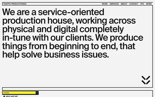
Preview image. Unlock full-res
Industrial Print Workshop: stark black, off-white, and sharp yellow accents on bold, condensed type.
Color palette
Interactive elements, highlight bars, active states — acts as a critical visual cue and brand accent.
Primary text, borders, button backgrounds — the dominant dark color creating strong contrast.
Page backgrounds, large content blocks — provides a muted contrast to text without being blinding white.
Fine lines, icons, secondary text — used sparingly for maximum impact or to provide slight variation from Midnight Ink.
Subtle borders, dividers, disabled states — an understated neutral for visual separation.
Typography
- Weights
- 400, 700
- Sizes
- 12px, 18px, 30px, 54px, 84px, 108px
- Line height
- 0.89, 0.93, 0.96, 1, 1.17
- Letter spacing
- -0.0440em at 108px, -0.0400em at 84px, -0.0300em at 54px, -0.0200em at 30px, -0.0100em at 18px
- Fallback
- Open Sans Condensed / Source Sans 3 (condensed weights)
The sole typeface, Suisse, is a custom condensed sans-serif, giving the entire site a direct, impactful, and almost industrial voice. The tight letter-spacing and low line-height create dense blocks of text, resembling a printed layout rather than a fluid digital interface.
Spacing & shape
Components
Text in Midnight Ink (#151515), no background, no border, 0px border radius, 0px padding. Uses Suisse font size 18px, weight 400.
Background: Midnight Ink (#151515); Text: Canvas White (#f3f3f3); 9999px border radius. Uses Suisse font size 18px, weight 400. Not padded.
Background: Canvas White (#f3f3f3); Text: Midnight Ink (#151515); 0px border radius; 9px padding. Uses Suisse font size 18px, weight 400. Border color #151515.
Text: Midnight Ink (#151515), Suisse font size 18px, weight 400. Active state indicated by a bottom highlight bar in Highlight Yellow (#fff824).
Background: Highlight Yellow (#fff824); Text: Midnight Ink (#151515); padding: 9px. Contains an 'X' button to close.
Solid line of Midnight Ink (#151515) with an optional Highlight Yellow (#fff824) accent line above or below.
Guidelines
- Use Suisse (or a substitute with similar condensed, impactful qualities) for all typography.
- Maintain a stark, high-contrast palette with Midnight Ink (#151515) for text and Canvas White (#f3f3f3) for backgrounds.
- Reserve Highlight Yellow (#fff824) exclusively for active states, small accents, or critical interactive elements.
- Apply 0px border radius to all elements except explicitly pill-shaped buttons (9999px).
- Utilize fine lines (1px) in Midnight Ink (#151515) for borders and dividers to emphasize structure.
- Employ the aggressive letter-spacing and low line-height values defined in the typography section to create dense, impactful text blocks.
- Do not introduce additional color accents or gradients, as they dilute the system's impact.
- Avoid soft shadows or subtle gradients; the design relies on flat colors and sharp distinctions.
- Do not use rounded corners unless it's a specific pill button; maintain a rectilinear aesthetic.
- Never use generic body text; all text should adhere to the Suisse font family and its specified weights/sizes.
- Do not use varied padding or margin values for similar components; adhere to the defined spacing tokens (e.g., 9px for component padding, 20px for larger element margins).
- Avoid complex layouts or overlapping elements; maintain a clean, grid-like structure with clear visual separation.
About this system
ShowHide
This design system projects a raw, industrial efficiency, like a minimalist print workshop. Bold, condensed typography in Suisse (or a similar sans-serif) dominates the visual field, creating an assertive, no-nonsense tone. The stark black and white palette is punctured by a single, aggressive yellow accent, reminiscent of hazard tape or highlighting, which directs attention and provides visual adrenaline. Understated component styling, characterized by sharp angles and strong lines, reinforces the functional and direct approach.
The site employs a full-width layout, pushing content to the edges of the viewport, but features a strong underlying grid for content organization. The hero section is characterized by a large, centered, bold heading over a Canvas White background, occupying significant vertical space. Sections flow with consistent vertical spacing (approx. 48px `sectionGap`), often using thin rule lines and Highlight Yellow accents as visual dividers or separators. Content is typically arranged in clear, contained blocks, favoring a text-left/text-right or stacked approach, with visual tension created by the bold typography and strategic use of negative space. Navigation is a sticky top bar with minimal styling, emphasizing functionality. The layout is information-dense but meticulously structured, akin to a printed magazine.
The visual language is characterized by an absence of stock photography or complex illustrations. Instead, it relies on minimalist icons (black on white), carefully framed product/project samples, and abstract graphical elements like lines and arrows. When photography is present, it's typically within a contained frame, often monochrome (as seen in the 'House of Schwarzkopf' example), treated as an object within the design grid rather than a background element. The overall density of imagery is low, with text and graphical lines playing a more dominant role in conveying information and mood. Imagery serves an explanatory or showcase role for work, rather than decorative atmosphere.
Reminiscent of Huge Inc., Pentagram, Stripe, Future Fonts.
# Traffic Productions — Style Reference
> Industrial Print Workshop: stark black, off-white, and sharp yellow accents on bold, condensed type.

**Theme:** light

**Site:** https://traffic.productions

This design system projects a raw, industrial efficiency, like a minimalist print workshop. Bold, condensed typography in Suisse (or a similar sans-serif) dominates the visual field, creating an assertive, no-nonsense tone. The stark black and white palette is punctured by a single, aggressive yellow accent, reminiscent of hazard tape or highlighting, which directs attention and provides visual adrenaline. Understated component styling, characterized by sharp angles and strong lines, reinforces the functional and direct approach.

## Tokens — Colors

| Name | Value | Token | Role |
|------|------|------|------|
| Highlight Yellow | `#fff824` | `--color-highlight-yellow` | Interactive elements, highlight bars, active states — acts as a critical visual cue and brand accent. |
| Midnight Ink | `#151515` | `--color-midnight-ink` | Primary text, borders, button backgrounds — the dominant dark color creating strong contrast. |
| Canvas White | `#f3f3f3` | `--color-canvas-white` | Page backgrounds, large content blocks — provides a muted contrast to text without being blinding white. |
| Pure Black | `#000000` | `--color-pure-black` | Fine lines, icons, secondary text — used sparingly for maximum impact or to provide slight variation from Midnight Ink. |
| Faded Gray | `#e5e5e5` | `--color-faded-gray` | Subtle borders, dividers, disabled states — an understated neutral for visual separation. |

## Tokens — Typography

### Suisse
- **Substitute:** Open Sans Condensed / Source Sans 3 (condensed weights)
- **Weights:** 400, 700
- **Sizes:** 12px, 18px, 30px, 54px, 84px, 108px
- **Line height:** 0.89, 0.93, 0.96, 1, 1.17
- **Letter spacing:** -0.0440em at 108px, -0.0400em at 84px, -0.0300em at 54px, -0.0200em at 30px, -0.0100em at 18px
- **Role:** The sole typeface, Suisse, is a custom condensed sans-serif, giving the entire site a direct, impactful, and almost industrial voice. The tight letter-spacing and low line-height create dense blocks of text, resembling a printed layout rather than a fluid digital interface.

## Tokens — Type Scale

| Role | Size | Line height | Letter spacing |
|------|------|------|------|
| caption | 12px | 14.04px | — |
| body | 18px | 20.88px | -0.18px |
| subheading | 30px | 30px | -0.6px |
| heading | 54px | 50.76px | -1.62px |
| heading-lg | 84px | 74.04px | -3.36px |
| display | 108px | 95.04px | -4.75px |

## Tokens — Spacing

- **Section gap:** 48px
- **Card padding:** 9px
- **Element gap:** 4px

## Tokens — Radius

- **Default:** 0px
- **Buttons:** 9999px

## Layout

The site employs a full-width layout, pushing content to the edges of the viewport, but features a strong underlying grid for content organization. The hero section is characterized by a large, centered, bold heading over a Canvas White background, occupying significant vertical space. Sections flow with consistent vertical spacing (approx. 48px `sectionGap`), often using thin rule lines and Highlight Yellow accents as visual dividers or separators. Content is typically arranged in clear, contained blocks, favoring a text-left/text-right or stacked approach, with visual tension created by the bold typography and strategic use of negative space. Navigation is a sticky top bar with minimal styling, emphasizing functionality. The layout is information-dense but meticulously structured, akin to a printed magazine.

## Imagery

The visual language is characterized by an absence of stock photography or complex illustrations. Instead, it relies on minimalist icons (black on white), carefully framed product/project samples, and abstract graphical elements like lines and arrows. When photography is present, it's typically within a contained frame, often monochrome (as seen in the 'House of Schwarzkopf' example), treated as an object within the design grid rather than a background element. The overall density of imagery is low, with text and graphical lines playing a more dominant role in conveying information and mood. Imagery serves an explanatory or showcase role for work, rather than decorative atmosphere.

## Components

### Cookie Bar

### About Section — Non-Agency Offer

### Work Card — Project Listing

### Text Link Button
*Basic navigation and call to action.*

Text in Midnight Ink (#151515), no background, no border, 0px border radius, 0px padding. Uses Suisse font size 18px, weight 400.

### Pill Button
*Primary action button, standing out with its distinctive shape.*

Background: Midnight Ink (#151515); Text: Canvas White (#f3f3f3); 9999px border radius. Uses Suisse font size 18px, weight 400. Not padded.

### Framed Box Button
*Interactive elements with a strong visual presence, like the 'Cookies' banner or content cards.*

Background: Canvas White (#f3f3f3); Text: Midnight Ink (#151515); 0px border radius; 9px padding. Uses Suisse font size 18px, weight 400. Border color #151515.

### Navigation Link
*Main navigation items.*

Text: Midnight Ink (#151515), Suisse font size 18px, weight 400. Active state indicated by a bottom highlight bar in Highlight Yellow (#fff824).

### Cookie Bar
*Legal compliance notification.*

Background: Highlight Yellow (#fff824); Text: Midnight Ink (#151515); padding: 9px. Contains an 'X' button to close.

### Section Divider
*Visual separation between content blocks.*

Solid line of Midnight Ink (#151515) with an optional Highlight Yellow (#fff824) accent line above or below.

## Guidelines

### Do

- Use Suisse (or a substitute with similar condensed, impactful qualities) for all typography.
- Maintain a stark, high-contrast palette with Midnight Ink (#151515) for text and Canvas White (#f3f3f3) for backgrounds.
- Reserve Highlight Yellow (#fff824) exclusively for active states, small accents, or critical interactive elements.
- Apply 0px border radius to all elements except explicitly pill-shaped buttons (9999px).
- Utilize fine lines (1px) in Midnight Ink (#151515) for borders and dividers to emphasize structure.
- Employ the aggressive letter-spacing and low line-height values defined in the typography section to create dense, impactful text blocks.

### Don't

- Do not introduce additional color accents or gradients, as they dilute the system's impact.
- Avoid soft shadows or subtle gradients; the design relies on flat colors and sharp distinctions.
- Do not use rounded corners unless it's a specific pill button; maintain a rectilinear aesthetic.
- Never use generic body text; all text should adhere to the Suisse font family and its specified weights/sizes.
- Do not use varied padding or margin values for similar components; adhere to the defined spacing tokens (e.g., 9px for component padding, 20px for larger element margins).
- Avoid complex layouts or overlapping elements; maintain a clean, grid-like structure with clear visual separation.

## Agent Prompt Guide

**Quick Color Reference:**
- Text: #151515
- Background: #f3f3f3
- CTA: #151515 (bg) / #f3f3f3 (text)
- Accent: #fff824
- Border: #151515

**3-5 Example Component Prompts:**
1. Create a hero section: background #f3f3f3. Headline 'We are TRAFFIC' in Suisse 108px, weight 700, #151515, letter-spacing -4.75px, line-height 95.04px. Subtitle 'PRODUCTIONS' in Suisse 54px, weight 400, #151515, letter-spacing -1.62px, line-height 50.76px. Ensure the section ends with a thin #151515 border line and a thin #fff824 line above it.
2. Design a 'Read More' link: text 'more about us' in Suisse 18px, weight 400, #151515, letter-spacing -0.18px, line-height 20.88px. Underline is 1px #151515. On hover, the text color should remain #151515, and the underline should change to #fff824.
3. Implement a primary action button: text 'Submit' in Suisse 18px, weight 400, #f3f3f3, letter-spacing -0.18px, line-height 20.88px. Background #151515, border-radius 9999px. Padding 9px all around. No borders.
4. Create a framed content card: title 'PROJECT NAME' in Suisse 30px, weight 700, #151515, letter-spacing -0.6px, line-height 30px. Body text 'A brief description of the project' in Suisse 18px, weight 400, #151515, letter-spacing -0.18px, line-height 20.88px. Card has a 1px #151515 border and 9px padding. Background #f3f3f3.
More like this






Keep what you find
A free account saves references to boards and can send you a weekly email of picks based on what you save.
To see every result, go Pro.