Preview image. Unlock full-res
midnight command center, bright button
Color palette
Primary action buttons, interactive elements, accent highlights — a vivid spark against dark and light themes
Subtle background for UI elements like cards or secondary highlights
Page background (dark sections), primary dark text, button text on accent backgrounds, footer background
Background for light sections, card surfaces, button text on dark backgrounds
Subtle light background texture, secondary light text, ghost button borders in dark sections
Primary dark background for hero sections and prominent blocks
Dark card backgrounds within dark sections
Subtle borders, tertiary text for helper messages and captions
Typography
- Weights
- 400
- Sizes
- 11px, 13px, 16px, 18px, 20px, 21px, 26px
- Line height
- 1.2, 1.27, 1.33, 1.38, 1.48, 1.5
- Letter spacing
- -0.0300em (at 26px), -0.0280em (at 21px), -0.0190em (at 18px), -0.0150em (at 16px)
- Fallback
- Inter
Primary body text, links, navigation items, and some smaller headings. Its extended width gives a distinctive, confident character to text.
- Weights
- 400, 500
- Sizes
- 11px, 12px, 13px, 16px
- Line height
- 1.5, 1.54, 1.82
- Letter spacing
- -0.0230em (at 16px), -0.0190em (at 13px), 0.0940em (at 12px), 0.1000em (at 11px)
- Fallback
- Inter
Used for specific button labels and navigation, the expanded width adds emphasis without increasing weight.
- Weights
- 400, 900
- Sizes
- 16px, 24px, 40px, 48px, 96px, 205px
- Line height
- 1, 1.5
- Letter spacing
- -0.0210em (at 205px), -0.0100em (at 96px), -0.0060em (at 48px)
- Fallback
- Poppins
Primary display font for hero headlines and impactful statements. Its bold presence and extremely tight letter-spacing create an assertive, almost digital feel.
- Weights
- 400, 600
- Sizes
- 16px, 40px, 96px, 205px
- Line height
- 1, 1.5
- Letter spacing
- -0.0060em (at 205px), -0.0050em (at 96px)
- Fallback
- Playfair Display
Secondary display font for large expressive headings, contrasting Gravity with its serif structure but maintaining a strong, direct presence.
- Weights
- 500
- Sizes
- 36px
- Line height
- 1.11
- Letter spacing
- -0.0070em
- Fallback
- Inter
Used for prominent subheadings, offering a slightly bolder alternative to GTAmericaExtended for increased hierarchy without resorting to heavier display fonts.
Spacing & shape
Components
Filled button with Button Yellow (#e4e24e) background, Night Sky (#100f0f) text (GTAmericaExpanded, weight 400), and a large border-radius (effectively pill-shaped). Padding is 8px vertical, 16px horizontal.
Transparent background, Cloud Whisper (#fffdf6) text (GTAmericaExtended, weight 400), thin Cloud Whisper (#fffdf6) border, large border-radius (effectively pill-shaped). Padding is 8px vertical, 16px horizontal.
Transparent background, Night Sky (#100f0f) text (GTAmericaExtended, weight 400), thin Night Sky (#100f0f) border, large border-radius (effectively pill-shaped). Padding is 20px all around.
Charcoal Card (#262525) background, 24px border-radius, no shadow. Padding 8px horizontal, 40px bottom relative to content framing imagery at top.
Cloud Whisper (#fffdf6) background, 16px border-radius, no shadow. Padding 32px top, 24px horizontal, 24px bottom.
Muted Yellow (#faf9b6) background, 24px border-radius, no shadow. Padding 32px all around.
Guidelines
- Use Night Sky (#100f0f) as the primary dark background for main page sections.
- Apply Button Yellow (#e4e24e) exclusively for primary interactive elements, ensuring its vibrancy draws attention.
- For headlines, select Gravity (weight 900) or EmpowerSerif (weight 600) with their specific tight letter-spacing for maximum impact.
- Maintain a large, effectively pill-shaped border-radius for all primary buttons, visually communicating interaction.
- Structure information using a strong contrast between Night Sky (#100f0f) and Canvas White (#ffffff) sections for clear visual separation.
- Employ GTAmericaExtended for body text and navigation, capitalizing on its extended character for a distinctive textual rhythm.
- Use a minimum of 24px border-radius for cards and modules, lending a friendly but structured appearance.
- Do not introduce new saturated accent colors; limit accents to shades of yellow.
- Avoid applying heavy drop shadows; cards and elements should primarily rely on background color and border-radius for definition.
- Do not use generic system fonts for any headline or prominent text; stick to the custom font stack for brand consistency.
- Never use Button Yellow (#e4e24e) for text; it is reserved for backgrounds of interactive elements.
- Avoid breaking button styles by using square corners for primary calls to action; always use the large border-radius.
- Do not vary paragraph or body text letter-spacing from the tokenized GTAmericaExtended values, especially for smaller sizes.
- Refrain from using thin light lines on dark backgrounds unless specified as Ghost Button borders or subtle dividers.
About this system
ShowHide
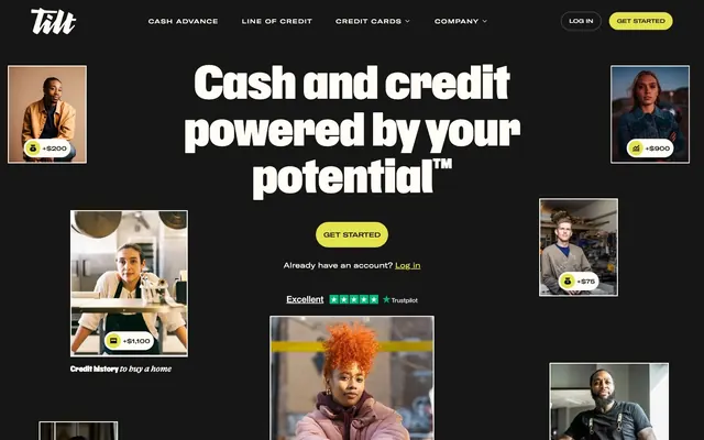
Tilt communicates a direct, no-nonsense financial brand with a strong visual identity built on bold, condensed typography and a high-contrast dark theme punctuated by a vibrant, optimistic yellow. Components are lightweight and purposeful, relying on shape and color to convey hierarchy rather than heavy shadows. The overall aesthetic is one of confident utility, where key actions are highlighted by bright accents against a dominant dark canvas, switching to a clean light background for content-heavy sections.
The page exhibits a mixed layout, starting with a full-bleed dark hero section featuring a centered headline. Following sections often alternate between dark and light backgrounds, creating a distinct vertical rhythm. Content is typically arranged in centered stacks or two-column text-left/image-right patterns. A prominent feature is the use of image grids with rounded-corner photo cards. The navigation is a fixed top bar on dark background for clarity, with a maximum content width that appears to be contained within around 1200px after the initial full-bleed hero.
The site heavily features photography of diverse individuals, often presented within circular or rounded containers. Imagery is typically lifestyle-oriented, focusing on people in everyday situations, implying relatability and broad accessibility. Product screenshots occasionally appear, mainly for mobile UI, showcasing a clean and focused interface with brand colors. Icons are outlined, simple, and monochrome, primarily acting as functional indicators rather than decorative elements. Image density is moderate, carefully balanced with bold typography, and serves to humanize the financial services offered.
Reminiscent of Stripe, Ramp, Mercury Bank, Wise (formerly TransferWise).
# Empower — Style Reference
> midnight command center, bright button

**Theme:** mixed

**Site:** https://empower.me

Tilt communicates a direct, no-nonsense financial brand with a strong visual identity built on bold, condensed typography and a high-contrast dark theme punctuated by a vibrant, optimistic yellow. Components are lightweight and purposeful, relying on shape and color to convey hierarchy rather than heavy shadows. The overall aesthetic is one of confident utility, where key actions are highlighted by bright accents against a dominant dark canvas, switching to a clean light background for content-heavy sections.

## Tokens — Colors

| Name | Value | Token | Role |
|------|------|------|------|
| Button Yellow | `#e4e24e` | `--color-button-yellow` | Primary action buttons, interactive elements, accent highlights — a vivid spark against dark and light themes |
| Muted Yellow | `#faf9b6` | `--color-muted-yellow` | Subtle background for UI elements like cards or secondary highlights |
| Night Sky | `#100f0f` | `--color-night-sky` | Page background (dark sections), primary dark text, button text on accent backgrounds, footer background |
| Canvas White | `#ffffff` | `--color-canvas-white` | Background for light sections, card surfaces, button text on dark backgrounds |
| Cloud Whisper | `#fffdf6` | `--color-cloud-whisper` | Subtle light background texture, secondary light text, ghost button borders in dark sections |
| Deep Space | `#171616` | `--color-deep-space` | Primary dark background for hero sections and prominent blocks |
| Charcoal Card | `#262525` | `--color-charcoal-card` | Dark card backgrounds within dark sections |
| Metal Gray | `#64635c` | `--color-metal-gray` | Subtle borders, tertiary text for helper messages and captions |

## Tokens — Typography

### GTAmericaExtended
- **Substitute:** Inter
- **Weights:** 400
- **Sizes:** 11px, 13px, 16px, 18px, 20px, 21px, 26px
- **Line height:** 1.2, 1.27, 1.33, 1.38, 1.48, 1.5
- **Letter spacing:** -0.0300em (at 26px), -0.0280em (at 21px), -0.0190em (at 18px), -0.0150em (at 16px)
- **Role:** Primary body text, links, navigation items, and some smaller headings. Its extended width gives a distinctive, confident character to text.

### GTAmericaExpanded
- **Substitute:** Inter
- **Weights:** 400, 500
- **Sizes:** 11px, 12px, 13px, 16px
- **Line height:** 1.5, 1.54, 1.82
- **Letter spacing:** -0.0230em (at 16px), -0.0190em (at 13px), 0.0940em (at 12px), 0.1000em (at 11px)
- **Role:** Used for specific button labels and navigation, the expanded width adds emphasis without increasing weight.

### Gravity
- **Substitute:** Poppins
- **Weights:** 400, 900
- **Sizes:** 16px, 24px, 40px, 48px, 96px, 205px
- **Line height:** 1, 1.5
- **Letter spacing:** -0.0210em (at 205px), -0.0100em (at 96px), -0.0060em (at 48px)
- **Role:** Primary display font for hero headlines and impactful statements. Its bold presence and extremely tight letter-spacing create an assertive, almost digital feel.

### EmpowerSerif
- **Substitute:** Playfair Display
- **Weights:** 400, 600
- **Sizes:** 16px, 40px, 96px, 205px
- **Line height:** 1, 1.5
- **Letter spacing:** -0.0060em (at 205px), -0.0050em (at 96px)
- **Role:** Secondary display font for large expressive headings, contrasting Gravity with its serif structure but maintaining a strong, direct presence.

### GTAmericaExtendedMedium
- **Substitute:** Inter
- **Weights:** 500
- **Sizes:** 36px
- **Line height:** 1.11
- **Letter spacing:** -0.0070em
- **Role:** Used for prominent subheadings, offering a slightly bolder alternative to GTAmericaExtended for increased hierarchy without resorting to heavier display fonts.

## Tokens — Type Scale

Augmented Fourth (1.414) from 16px base.

| Role | Size | Line height | Letter spacing |
|------|------|------|------|
| caption | 11px | 1.5 | 1.1px |
| body | 16px | 1.33 | -0.24px |
| subheading | 26px | 1.2 | -0.78px |
| heading-sm | 36px | 1.11 | -0.252px |
| heading | 40px | 1 | -0.24px |
| heading-lg | 48px | 1.5 | -0.288px |
| display | 96px | 1 | -0.96px |

## Tokens — Spacing

- **Section gap:** 32px
- **Card padding:** 24px
- **Element gap:** 8px

## Tokens — Radius

- **Buttons:** 16777216px
- **Cards:** 24px
- **modules:** 16px

## Layout

The page exhibits a mixed layout, starting with a full-bleed dark hero section featuring a centered headline. Following sections often alternate between dark and light backgrounds, creating a distinct vertical rhythm. Content is typically arranged in centered stacks or two-column text-left/image-right patterns. A prominent feature is the use of image grids with rounded-corner photo cards. The navigation is a fixed top bar on dark background for clarity, with a maximum content width that appears to be contained within around 1200px after the initial full-bleed hero.

## Imagery

The site heavily features photography of diverse individuals, often presented within circular or rounded containers. Imagery is typically lifestyle-oriented, focusing on people in everyday situations, implying relatability and broad accessibility. Product screenshots occasionally appear, mainly for mobile UI, showcasing a clean and focused interface with brand colors. Icons are outlined, simple, and monochrome, primarily acting as functional indicators rather than decorative elements. Image density is moderate, carefully balanced with bold typography, and serves to humanize the financial services offered.

## Components

### Primary Action Button
*Main call to action across the site.*

Filled button with Button Yellow (#e4e24e) background, Night Sky (#100f0f) text (GTAmericaExpanded, weight 400), and a large border-radius (effectively pill-shaped). Padding is 8px vertical, 16px horizontal.

### Ghost Navigation Button
*Secondary action or navigation in dark sections.*

Transparent background, Cloud Whisper (#fffdf6) text (GTAmericaExtended, weight 400), thin Cloud Whisper (#fffdf6) border, large border-radius (effectively pill-shaped). Padding is 8px vertical, 16px horizontal.

### Ghost Secondary Button
*Clickable elements requiring less emphasis, often in light sections.*

Transparent background, Night Sky (#100f0f) text (GTAmericaExtended, weight 400), thin Night Sky (#100f0f) border, large border-radius (effectively pill-shaped). Padding is 20px all around.

### Dark Photo Card
*Displaying imagery with associated monetary values against a dark background.*

Charcoal Card (#262525) background, 24px border-radius, no shadow. Padding 8px horizontal, 40px bottom relative to content framing imagery at top.

### Light Content Card
*General content display in light sections.*

Cloud Whisper (#fffdf6) background, 16px border-radius, no shadow. Padding 32px top, 24px horizontal, 24px bottom.

### Muted Yellow Content Card
*Highlighting specific content blocks with a soft accent hue.*

Muted Yellow (#faf9b6) background, 24px border-radius, no shadow. Padding 32px all around.

## Guidelines

### Do

- Use Night Sky (#100f0f) as the primary dark background for main page sections.
- Apply Button Yellow (#e4e24e) exclusively for primary interactive elements, ensuring its vibrancy draws attention.
- For headlines, select Gravity (weight 900) or EmpowerSerif (weight 600) with their specific tight letter-spacing for maximum impact.
- Maintain a large, effectively pill-shaped border-radius for all primary buttons, visually communicating interaction.
- Structure information using a strong contrast between Night Sky (#100f0f) and Canvas White (#ffffff) sections for clear visual separation.
- Employ GTAmericaExtended for body text and navigation, capitalizing on its extended character for a distinctive textual rhythm.
- Use a minimum of 24px border-radius for cards and modules, lending a friendly but structured appearance.

### Don't

- Do not introduce new saturated accent colors; limit accents to shades of yellow.
- Avoid applying heavy drop shadows; cards and elements should primarily rely on background color and border-radius for definition.
- Do not use generic system fonts for any headline or prominent text; stick to the custom font stack for brand consistency.
- Never use Button Yellow (#e4e24e) for text; it is reserved for backgrounds of interactive elements.
- Avoid breaking button styles by using square corners for primary calls to action; always use the large border-radius.
- Do not vary paragraph or body text letter-spacing from the tokenized GTAmericaExtended values, especially for smaller sizes.
- Refrain from using thin light lines on dark backgrounds unless specified as Ghost Button borders or subtle dividers.

## Agent Prompt Guide

Quick Color Reference:
text: #100f0f
background: #100f0f (dark sections), #ffffff (light sections)
border: #64635c
accent: #e4e24e
primary action: #e4e24e (filled action)

Example Component Prompts:
1. Create a Primary Action Button: #e4e24e background, #000000 text, 9999px radius, compact pill padding. Use this filled treatment for the main CTA.
2. Design a feature card for a light section: Cloud Whisper (#fffdf6) background, 16px radius, with a GTAmericaExtended weight 400 headline at 26px and regular GTAmericaExtended body text, both in Night Sky (#100f0f). Add 32px padding all around.
3. Build a navigation bar item: Night Sky (#100f0f) background, GTAmericaExtended weight 400 text at 16px in Cloud Whisper (#fffdf6), and on hover, use a ghost button style with a Cloud Whisper (#fffdf6) border.
More like this




Keep what you find
A free account saves references to boards and can send you a weekly email of picks based on what you save.
To see every result, go Pro.