Preview image. Unlock full-res
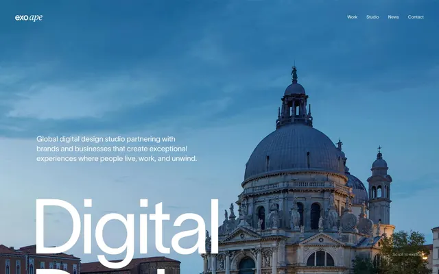
Architectural grandiosity on textured paper.
Color palette
Primary text, dark backgrounds for contrast, borders, subtle icons
Page backgrounds, navigational elements, reversed text in dark sections, borders
Subtle background surfaces, subdued text, borders for architectural elements
Decorative borders, accents in footers and lists, subtle background fills
Text for body content and links, outlines for interactive elements
Footer background
Muted body text, borders
Subtle background fills for secondary elements
Typography
- Weights
- 400
- Sizes
- 14px
- Line height
- 2.64
Lausanne-400 — detected in extracted data but not described by AI
- Weights
- 400
- Sizes
- 14px, 16px, 24px, 144px, 250px
- Line height
- 0.73, 0.76, 0.9, 1, 1.33, 1.5, 1.88
- Letter spacing
- 0.084, -0.56, -0.84, -6.624, -11.5
- Fallback
- Inter, Montserrat
Dominant branding and large display headlines use Lausanne-400 at massive sizes, characterized by tight negative letter-spacing for impact and a contemporary feel.
- Weights
- 400
- Sizes
- 16px
- Line height
- 1.2, 2
- Letter spacing
- normal
- Fallback
- serif system font
Used sparingly for traditional elements and general body text, providing a classic counterpoint to the modern display font. Often found in detailed content sections and navigation.
Spacing & shape
Guidelines
- Employ Lausanne-400 with negative letter-spacing for all headlines and display text to maintain visual impact and distinction.
- Use Paper White (#ffffff) as the primary background for most page content, creating a bright canvas.
- Incorporate Carbon (#0d0e13) for primary text and dark backgrounds to ensure strong contrast and depth.
- Utilize Sandstone (#e0ccbb) for decorative borders and accents, especially in footers or list items, to add a subtle organic texture.
- Maintain generous vertical spacing between sections, typically 60px, to create an airy, unhurried page rhythm.
- Outline interactive elements like links and navigation items using Parchment (#e6d7ca) as a border color, avoiding filled button styles.
- Ensure all primary content stays within a 1200px max-width, center-aligned, for consistent structure.
- Avoid using highly saturated, chromatic colors for backgrounds or large areas; the palette is predominantly neutral.
- Do not introduce heavy box shadows or strong elevation effects; surfaces remain largely flat and layered through color rather than depth.
- Refrain from using generic sans-serif fonts for headlines; stick to Lausanne for its distinctive character and tight tracking.
- Do not use small, dense text blocks, especially on large headlines; prioritize spaciousness and readability even for large type.
- Avoid decorative gradients or overwhelming imagery that distracts from the large typography and clean surfaces.
- Do not apply large border-radius values to elements; a lack of explicit radius implies sharp, architectural edges.
- Avoid strong visual dividers between sections; rely on background color changes or generous spacing to delineate blocks.
About this system
ShowHide
Exo Ape embraces a grand, architectural aesthetic, layering substantial typography and large-scale imagery against a stark yet subtle neutral palette. Text carries the primary visual weight, with massive display typography and precise letter-spacing establishing a commanding presence. Functional interactions are understated, allowing content blocks and imagery to dominate the visual field without interruption.
The page model is primarily a max-width contained layout at 1200px, though hero sections extend full-bleed. The hero pattern features large, atmospheric imagery with overlaid, monumental white typography and descriptive text. Content sections typically follow a consistent vertical rhythm, using generous section gaps, and often present information in a single-column or alternating text-left/image-right pattern. Navigation is a minimalist top bar, blending into the hero at the start and likely becoming sticky on scroll. The overall density is spacious, allowing content to breathe.
This design system uses large-scale, high-quality photography, often depicting architectural structures or abstract, atmospheric scenes in full-bleed hero sections. The imagery serves as a dramatic backdrop rather than a detailed explanation, evoking a sense of grandeur and professional calm. Photography is typically desaturated or features subtle cool tones, aligning with the neutral color palette. Product shots or illustrative elements are absent, maintaining the focus on an experience-driven and sophisticated aesthetic.
Reminiscent of Awwwards, Locomotive Agency, Anton & Irene.
# Exo Ape — Style Reference
> Architectural grandiosity on textured paper.

**Theme:** light

**Site:** https://www.exoape.com

Exo Ape embraces a grand, architectural aesthetic, layering substantial typography and large-scale imagery against a stark yet subtle neutral palette. Text carries the primary visual weight, with massive display typography and precise letter-spacing establishing a commanding presence. Functional interactions are understated, allowing content blocks and imagery to dominate the visual field without interruption.

## Tokens — Colors

| Name | Value | Token | Role |
|------|------|------|------|
| Carbon | `#0d0e13` | `--color-carbon` | Primary text, dark backgrounds for contrast, borders, subtle icons |
| Paper White | `#ffffff` | `--color-paper-white` | Page backgrounds, navigational elements, reversed text in dark sections, borders |
| Plaster | `#e4e0db` | `--color-plaster` | Subtle background surfaces, subdued text, borders for architectural elements |
| Sandstone | `#e0ccbb` | `--color-sandstone` | Decorative borders, accents in footers and lists, subtle background fills |
| Parchment | `#e6d7ca` | `--color-parchment` | Text for body content and links, outlines for interactive elements |
| Ink Black | `#070707` | `--color-ink-black` | Footer background |
| Slate | `#6e6e71` | `--color-slate` | Muted body text, borders |
| Stone Gray | `#9e9fa1` | `--color-stone-gray` | Subtle background fills for secondary elements |

## Tokens — Typography

### Lausanne-400
- **Weights:** 400
- **Sizes:** 14px
- **Line height:** 2.64
- **Role:** Lausanne-400 — detected in extracted data but not described by AI

### Lausanne
- **Substitute:** Inter, Montserrat
- **Weights:** 400
- **Sizes:** 14px, 16px, 24px, 144px, 250px
- **Line height:** 0.73, 0.76, 0.9, 1, 1.33, 1.5, 1.88
- **Letter spacing:** 0.084, -0.56, -0.84, -6.624, -11.5
- **Role:** Dominant branding and large display headlines use Lausanne-400 at massive sizes, characterized by tight negative letter-spacing for impact and a contemporary feel.

### Times
- **Substitute:** serif system font
- **Weights:** 400
- **Sizes:** 16px
- **Line height:** 1.2, 2
- **Letter spacing:** normal
- **Role:** Used sparingly for traditional elements and general body text, providing a classic counterpoint to the modern display font. Often found in detailed content sections and navigation.

## Tokens — Type Scale

| Role | Size | Line height | Letter spacing |
|------|------|------|------|
| body | 14px | 1.88 | 0.084em |
| body-lg | 16px | 1.5 | -0.56px |
| subheading | 24px | 1.33 | -0.84px |
| display-lg | 144px | 0.9 | -6.624px |
| display | 250px | 0.73 | -11.5px |

## Tokens — Spacing

- **Max width:** 1200px
- **Section gap:** 60px
- **Card padding:** 15px
- **Element gap:** 13px

## Layout

The page model is primarily a max-width contained layout at 1200px, though hero sections extend full-bleed. The hero pattern features large, atmospheric imagery with overlaid, monumental white typography and descriptive text. Content sections typically follow a consistent vertical rhythm, using generous section gaps, and often present information in a single-column or alternating text-left/image-right pattern. Navigation is a minimalist top bar, blending into the hero at the start and likely becoming sticky on scroll. The overall density is spacious, allowing content to breathe.

## Imagery

This design system uses large-scale, high-quality photography, often depicting architectural structures or abstract, atmospheric scenes in full-bleed hero sections. The imagery serves as a dramatic backdrop rather than a detailed explanation, evoking a sense of grandeur and professional calm. Photography is typically desaturated or features subtle cool tones, aligning with the neutral color palette. Product shots or illustrative elements are absent, maintaining the focus on an experience-driven and sophisticated aesthetic.

## Guidelines

### Do

- Employ Lausanne-400 with negative letter-spacing for all headlines and display text to maintain visual impact and distinction.
- Use Paper White (#ffffff) as the primary background for most page content, creating a bright canvas.
- Incorporate Carbon (#0d0e13) for primary text and dark backgrounds to ensure strong contrast and depth.
- Utilize Sandstone (#e0ccbb) for decorative borders and accents, especially in footers or list items, to add a subtle organic texture.
- Maintain generous vertical spacing between sections, typically 60px, to create an airy, unhurried page rhythm.
- Outline interactive elements like links and navigation items using Parchment (#e6d7ca) as a border color, avoiding filled button styles.
- Ensure all primary content stays within a 1200px max-width, center-aligned, for consistent structure.

### Don't

- Avoid using highly saturated, chromatic colors for backgrounds or large areas; the palette is predominantly neutral.
- Do not introduce heavy box shadows or strong elevation effects; surfaces remain largely flat and layered through color rather than depth.
- Refrain from using generic sans-serif fonts for headlines; stick to Lausanne for its distinctive character and tight tracking.
- Do not use small, dense text blocks, especially on large headlines; prioritize spaciousness and readability even for large type.
- Avoid decorative gradients or overwhelming imagery that distracts from the large typography and clean surfaces.
- Do not apply large border-radius values to elements; a lack of explicit radius implies sharp, architectural edges.
- Avoid strong visual dividers between sections; rely on background color changes or generous spacing to delineate blocks.

## Agent Prompt Guide

Quick Color Reference:
text: #0d0e13
background: #ffffff
border: #e0ccbb
accent: #e6d7ca
primary action: no distinct CTA color

Example Component Prompts:
Create a hero section: full-bleed background image with a cool blue cast, overlaid with a 'Digital Design Experience' headline at 250px Lausanne-400 #ffffff, letter-spacing -11.5px. Below, add a body text paragraph 'Global digital design studio partnering with brands and businesses that create exceptional experiences where people live, work, and unwind.' at 16px Lausanne-400 #ffffff, line-height 1.5, letter-spacing -0.56px.

Create a navigation bar: top bar with 'exo ape' logo (text #ffffff) on the left, right-aligned nav links 'Work', 'Studio', 'News', 'Contact' (all 14px Times-400 #ffffff, line-height 2.00, normal letter-spacing). The entire bar should be transparent over the hero image.

Create a 'Featured Projects' section heading: 'Featured Projects' at 144px Lausanne-400 #0d0e13, letter-spacing -6.624px, aligned left. Below it, add a descriptive paragraph at 14px Lausanne-400 #e6d7ca, line-height 1.88, letter-spacing 0.084px.

Create a list item for work overview: 'The story behind Exo Ape is one of exploration, creativity and curiosity.' text at 14px Lausanne-400 #e6d7ca, with a border of 1px #e0ccbb at the bottom, and a subtle icon in #0d0e13.
More like this









Keep what you find
A free account saves references to boards and can send you a weekly email of picks based on what you save.
To see every result, go Pro.