Preview image. Unlock full-res
Secure utility, bright teal highlights
Color palette
Primary action buttons, accented headings, highlighted links, functional card accents. This vibrant teal signifies activation and important calls to action
Accent color for specific navigation items and active states, providing a deeper tonal variation of the brand's primary color
Subtle background accent in navigation, providing a touch of warmth
Subtle background for specific card sections, introducing a soft, pastel accent
Background for specific card sections, a light, cool accent color
Background for subtle accents within navigation, a very light, cool accent
Highlight gradient, used for specific alerts or promotional banners, suggesting warmth and urgency
Background for hero sections or prominent feature blocks, creating depth and a sense of security
Primary text, deep surface backgrounds, navigation elements, input borders, button text for ghost/outlined buttons
Card backgrounds, primary surface background for specific components, essential text on dark backgrounds, selected badge backgrounds
Page background, secondary background for navigation elements, tertiary card backgrounds
Hairline borders, subtle dividers, secondary text, muted icon fills
Muted body text, helper text, and decorative icon fills
Typography
- Weights
- 400, 500, 600, 700
- Sizes
- 10px, 12px, 14px, 16px, 18px, 20px, 24px
- Line height
- 1, 1.2, 1.33, 1.44, 1.5, 1.67, 1.72, 1.75, 1.8, 1.83, 1.9, 2
- Letter spacing
- 0.1em, 0.133em, 0.14em
- Fallback
- system-ui, sans-serif
Body text, navigation items, button labels, and small descriptive text. It maintains clarity and a functional aesthetic across various contexts.
- Weights
- 400, 500, 600, 700
- Sizes
- 10px, 12px, 14px, 16px, 18px, 20px, 24px
- Line height
- 1, 1.2, 1.33, 1.44, 1.5, 1.67, 1.72, 1.75, 1.8, 1.83, 1.9, 2
- Letter spacing
- 0.1em, 0.133em, 0.14em
- Fallback
- system-ui, sans-serif
Medium weight for specific body text, emphasized navigation, and subtitles.
- Weights
- 400, 500, 600, 700
- Sizes
- 10px, 12px, 14px, 16px, 18px, 20px, 24px
- Line height
- 1, 1.2, 1.33, 1.44, 1.5, 1.67, 1.72, 1.75, 1.8, 1.83, 1.9, 2
- Letter spacing
- 0.1em, 0.133em, 0.14em
- Fallback
- system-ui, sans-serif
Semibold for strong emphasis in body text, navigation highlights, and subheadings.
- Weights
- 400, 500, 600, 700
- Sizes
- 10px, 12px, 14px, 16px, 18px, 20px, 24px
- Line height
- 1, 1.2, 1.33, 1.44, 1.5, 1.67, 1.72, 1.75, 1.8, 1.83, 1.9, 2
- Letter spacing
- 0.1em, 0.133em, 0.14em
- Fallback
- system-ui, sans-serif
Bold text for clear headings, active states, and important short phrases.
- Weights
- 400, 700
- Sizes
- 13px, 18px
- Line height
- 1.2, 1.45
- Letter spacing
- normal
- Fallback
- sans-serif
Fallback and utility text, often for legacy components or system-level prompts.
- Weights
- 400, 700
- Sizes
- 13px, 18px
- Line height
- 1.2, 1.45
- Letter spacing
- normal
- Fallback
- sans-serif
Bold fallback text, similar to the regular weight but for stronger emphasis.
- Weights
- 500, 700
- Sizes
- 18px, 32px, 46px, 64px
- Line height
- 1, 1.09, 1.25
- Letter spacing
- -0.016em
- Fallback
- serif
Distinctive headings and display text, particularly for hero sections. Its precise tracking at larger sizes implies modern authority without being overly decorative.
- Weights
- 500, 700
- Sizes
- 18px, 32px, 46px, 64px
- Line height
- 1, 1.09, 1.25
- Letter spacing
- -0.016em
- Fallback
- serif
Bold headings and display text, used for primary headlines where maximum impact is required through size and weight.
Spacing & shape
Elevation
Components
Background: Forest Teal (#0f866c), Text: Cloud White (#ffffff), Border Radius: 34px, Padding: 14px vertical, 24px horizontal. Represents a key interactive element.
Background: transparent (#00000000), Text: Midnight Ink (#001d2f), Border: 1px solid Midnight Ink (#001d2f), Border Radius: 10px, Padding: 21px vertical, 40px horizontal.
Background: Ghost Gray (#f7f8f9), Text: Midnight Ink (#001d2f), Border: none, Border Radius: 10px, Padding: 21px vertical, 40px horizontal. Softened visual weight.
Background: transparent (#00000000), Text: Midnight Ink (#001d2f), Border: none, Padding: 13px vertical, 0px horizontal.
Background: Cloud White (#ffffff), Border Radius: 24px, Box Shadow: rgba(0, 0, 0, 0.12) 0px 0px 32px 0px, Padding: 32px all sides. Used for important content blocks with visual separation.
Background: transparent (#00000000), Border Radius: 0px, Box Shadow: none, Padding: 100px vertical, 0px horizontal. Acts as a divider or section for related content.
Background: Ghost Gray (#f7f8f9), Border Radius: 32px, Box Shadow: none, Padding: 24px all sides. Used for sections that need a slight distinction from the page background.
Background: Forest Teal (#0f866c), Border Radius: 20px, Box Shadow: rgba(0, 0, 0, 0.1) 0px 0px 15px 0px, Padding: 30px all sides. Draws significant attention to its content.
Background: Cloud White (#ffffff), Text: Midnight Ink (#001d2f), Border Radius: 24px, Padding: 24px vertical, 40px horizontal. Often used for status or categorization.
Background: Cloud White (#ffffff), Text: Midnight Ink (#001d2f), Border: 1px solid Cool Stone (#adadad), Border Radius: 24px, Box Shadow: rgba(0, 0, 0, 0.12) 0px 4px 16px 0px, Padding: 24px vertical, 40px horizontal.
Guidelines
- Use FS Kim weight 500 or 700 with -0.016em letter-spacing for all primary headings (h1, h2, h3) to maintain a modern, crisp feel.
- Apply Forest Teal (#0f866c) for primary action buttons and key monetary values in headlines to draw immediate attention.
- Adhere to Cloud White (#ffffff) for elevated card backgrounds and Hero Gray (#f7f8f9) for global page backgrounds to establish clear surface hierarchy.
- Implement a 24px border-radius for all primary content cards and badges to ensure consistent softness and approachability.
- Utilize Midnight Ink (#001d2f) for all body text, navigation labels, and borders of ghost buttons, ensuring strong contrast and readability.
- Maintain 32px padding for elevated content cards, ensuring ample visual breathing room within structured elements.
- Employ a 34px border-radius for primary action buttons to give them a distinct, pill-like appearance.
- Avoid using highly saturated colors for large background areas or extensive text blocks, as the system relies on a neutral canvas with targeted accents.
- Do not deviate from the Inter typeface for body copy and navigational elements; reserve FS Kim exclusively for larger headlines and display text.
- Do not use sharp 0px corners for cards or buttons that convey actions or significant information; maintain rounded edges for a consistent brand feel.
- Refrain from introducing decorative gradients outside of the two specified accent gradients (Crimson Glow and Deep Ocean Gradient).
- Do not apply heavy, opaque shadows to elements that are not feature cards or interactive badges; rely on subtle elevation for most UI elements.
- Avoid arbitrary changes to letter spacing for body text; only apply the specified negative tracking for FS Kim headings and the positive tracking for Inter utility text.
- Do not use #001d2f as a primary text color against backgrounds other than #f7f8f9 or #ffffff; check contrast ratios carefully.
About this system
ShowHide
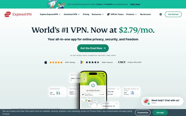
ExpressVPN utilizes a 'Confident Utility' visual language, combining a clean light canvas with distinct brand-colored accents for critical actions and information. The design promotes trust and clarity through a high-contrast monochromatic base, softened by rounded corners and subtle elevation for focal elements. Typography is precise and direct, avoiding flourishes, consistently driving attention to key product offerings and security benefits. The overall impression is professional and secure, with a clear hierarchy established through color and weight.
The page exhibits a max-width contained layout, likely around a 1200px equivalent, with content consistently centered. The hero section features a prominent centered headline over a background that can vary from a deep gradient to a softer fill. Subsequent sections employ distinct visual banding, often alternating between the Ghost Gray (#f7f8f9) page canvas and Cloud White (#ffffff) content blocks. Content arrangement frequently uses a centered stack for textual information, transitioning to a simple 2-column or card grid for features. Navigation is a sticky top bar with clearly segmented links and a distinct 'Get Started' button. Vertical spacing between sections is generous and consistent, creating a comfortable, open density.
The imagery leans towards product-focused presentation, featuring clean, modern product shots (e.g., phone UI) with contextually relevant, minimal UI elements. Iconography is clean and functional, generally outlined or monochrome with a medium stroke weight. There's a minimal use of abstract graphics (like subtle background gradients) for atmospheric depth rather than decorative content. Photography is absent. Imagery primarily serves an explanatory and product showcase role, with a focus on clarity and directness, not heavy. The density is moderate, with images typically contained within the layout rather than full-bleed.
Reminiscent of NordVPN, ProtonVPN, Cloudflare, LastPass.
# ExpressVPN — Style Reference
> Secure utility, bright teal highlights

**Theme:** light

**Site:** https://www.expressvpn.com

ExpressVPN utilizes a 'Confident Utility' visual language, combining a clean light canvas with distinct brand-colored accents for critical actions and information. The design promotes trust and clarity through a high-contrast monochromatic base, softened by rounded corners and subtle elevation for focal elements. Typography is precise and direct, avoiding flourishes, consistently driving attention to key product offerings and security benefits. The overall impression is professional and secure, with a clear hierarchy established through color and weight.

## Tokens — Colors

| Name | Value | Token | Role |
|------|------|------|------|
| Forest Teal | `#0f866c` | `--color-forest-teal` | Primary action buttons, accented headings, highlighted links, functional card accents. This vibrant teal signifies activation and important calls to action |
| Dark Teal | `#00695c` | `--color-dark-teal` | Accent color for specific navigation items and active states, providing a deeper tonal variation of the brand's primary color |
| Warm Beige | `#f0eacf` | `--color-warm-beige` | Subtle background accent in navigation, providing a touch of warmth |
| Soft Peach | `#ffe4d4` | `--color-soft-peach` | Subtle background for specific card sections, introducing a soft, pastel accent |
| Sky Mist | `#b7d1d0` | `--color-sky-mist` | Background for specific card sections, a light, cool accent color |
| Light Mint | `#c3ece8` | `--color-light-mint` | Background for subtle accents within navigation, a very light, cool accent |
| Crimson Glow | `#da3940` | `--color-crimson-glow` | Highlight gradient, used for specific alerts or promotional banners, suggesting warmth and urgency |
| Deep Ocean Gradient | `#0c3956` | `--color-deep-ocean-gradient` | Background for hero sections or prominent feature blocks, creating depth and a sense of security |
| Midnight Ink | `#001d2f` | `--color-midnight-ink` | Primary text, deep surface backgrounds, navigation elements, input borders, button text for ghost/outlined buttons |
| Cloud White | `#ffffff` | `--color-cloud-white` | Card backgrounds, primary surface background for specific components, essential text on dark backgrounds, selected badge backgrounds |
| Ghost Gray | `#f7f8f9` | `--color-ghost-gray` | Page background, secondary background for navigation elements, tertiary card backgrounds |
| Cool Stone | `#ccd2d5` | `--color-cool-stone` | Hairline borders, subtle dividers, secondary text, muted icon fills |
| Slate Blue | `#667782` | `--color-slate-blue` | Muted body text, helper text, and decorative icon fills |

## Tokens — Typography

### Inter
- **Substitute:** system-ui, sans-serif
- **Weights:** 400, 500, 600, 700
- **Sizes:** 10px, 12px, 14px, 16px, 18px, 20px, 24px
- **Line height:** 1, 1.2, 1.33, 1.44, 1.5, 1.67, 1.72, 1.75, 1.8, 1.83, 1.9, 2
- **Letter spacing:** 0.1em, 0.133em, 0.14em
- **Role:** Body text, navigation items, button labels, and small descriptive text. It maintains clarity and a functional aesthetic across various contexts.

### Inter
- **Substitute:** system-ui, sans-serif
- **Weights:** 400, 500, 600, 700
- **Sizes:** 10px, 12px, 14px, 16px, 18px, 20px, 24px
- **Line height:** 1, 1.2, 1.33, 1.44, 1.5, 1.67, 1.72, 1.75, 1.8, 1.83, 1.9, 2
- **Letter spacing:** 0.1em, 0.133em, 0.14em
- **Role:** Medium weight for specific body text, emphasized navigation, and subtitles.

### Inter
- **Substitute:** system-ui, sans-serif
- **Weights:** 400, 500, 600, 700
- **Sizes:** 10px, 12px, 14px, 16px, 18px, 20px, 24px
- **Line height:** 1, 1.2, 1.33, 1.44, 1.5, 1.67, 1.72, 1.75, 1.8, 1.83, 1.9, 2
- **Letter spacing:** 0.1em, 0.133em, 0.14em
- **Role:** Semibold for strong emphasis in body text, navigation highlights, and subheadings.

### Inter
- **Substitute:** system-ui, sans-serif
- **Weights:** 400, 500, 600, 700
- **Sizes:** 10px, 12px, 14px, 16px, 18px, 20px, 24px
- **Line height:** 1, 1.2, 1.33, 1.44, 1.5, 1.67, 1.72, 1.75, 1.8, 1.83, 1.9, 2
- **Letter spacing:** 0.1em, 0.133em, 0.14em
- **Role:** Bold text for clear headings, active states, and important short phrases.

### Arial
- **Substitute:** sans-serif
- **Weights:** 400, 700
- **Sizes:** 13px, 18px
- **Line height:** 1.2, 1.45
- **Letter spacing:** normal
- **Role:** Fallback and utility text, often for legacy components or system-level prompts.

### Arial
- **Substitute:** sans-serif
- **Weights:** 400, 700
- **Sizes:** 13px, 18px
- **Line height:** 1.2, 1.45
- **Letter spacing:** normal
- **Role:** Bold fallback text, similar to the regular weight but for stronger emphasis.

### FS Kim
- **Substitute:** serif
- **Weights:** 500, 700
- **Sizes:** 18px, 32px, 46px, 64px
- **Line height:** 1, 1.09, 1.25
- **Letter spacing:** -0.016em
- **Role:** Distinctive headings and display text, particularly for hero sections. Its precise tracking at larger sizes implies modern authority without being overly decorative.

### FS Kim
- **Substitute:** serif
- **Weights:** 500, 700
- **Sizes:** 18px, 32px, 46px, 64px
- **Line height:** 1, 1.09, 1.25
- **Letter spacing:** -0.016em
- **Role:** Bold headings and display text, used for primary headlines where maximum impact is required through size and weight.

## Tokens — Type Scale

Perfect Fourth (1.333) from 14px base.

| Role | Size | Line height | Letter spacing |
|------|------|------|------|
| caption | 10px | 1.5 | 0.1px |
| body | 14px | 1.72 | — |
| body-lg | 16px | 1.83 | — |
| subheading | 18px | 1.67 | -0.016em |
| heading | 24px | 1.5 | — |
| heading-lg | 32px | 1.25 | -0.016em |
| display | 64px | 1 | -0.016em |

## Tokens — Spacing

- **Section gap:** 24px
- **Card padding:** 32px
- **Element gap:** 24px

## Tokens — Radius

- **Buttons:** 34px
- **Inputs:** 10px
- **Cards:** 24px
- **badges:** 24px
- **extraLarge:** 1132.2px
- **navItems:** 4px
- **tags:** 10px

## Tokens — Elevation

- **Elevated Feature Card:** `rgba(0, 0, 0, 0.12) 0px 0px 32px 0px`
- **Accent Card:** `rgba(0, 0, 0, 0.1) 0px 0px 15px 0px`
- **Chat Widget Badge:** `rgba(0, 0, 0, 0.12) 0px 4px 16px 0px`

## Layout

The page exhibits a max-width contained layout, likely around a 1200px equivalent, with content consistently centered. The hero section features a prominent centered headline over a background that can vary from a deep gradient to a softer fill. Subsequent sections employ distinct visual banding, often alternating between the Ghost Gray (#f7f8f9) page canvas and Cloud White (#ffffff) content blocks. Content arrangement frequently uses a centered stack for textual information, transitioning to a simple 2-column or card grid for features. Navigation is a sticky top bar with clearly segmented links and a distinct 'Get Started' button. Vertical spacing between sections is generous and consistent, creating a comfortable, open density.

## Imagery

The imagery leans towards product-focused presentation, featuring clean, modern product shots (e.g., phone UI) with contextually relevant, minimal UI elements. Iconography is clean and functional, generally outlined or monochrome with a medium stroke weight. There's a minimal use of abstract graphics (like subtle background gradients) for atmospheric depth rather than decorative content. Photography is absent. Imagery primarily serves an explanatory and product showcase role, with a focus on clarity and directness, not heavy. The density is moderate, with images typically contained within the layout rather than full-bleed.

## Components

### Primary Action Button
*Filled button indicating primary calls to action*

Background: Forest Teal (#0f866c), Text: Cloud White (#ffffff), Border Radius: 34px, Padding: 14px vertical, 24px horizontal. Represents a key interactive element.

### Ghost Button
*Outlined button for secondary actions or navigation.*

Background: transparent (#00000000), Text: Midnight Ink (#001d2f), Border: 1px solid Midnight Ink (#001d2f), Border Radius: 10px, Padding: 21px vertical, 40px horizontal.

### Subtle Ghost Button
*Outlined button with lighter background for less prominent actions.*

Background: Ghost Gray (#f7f8f9), Text: Midnight Ink (#001d2f), Border: none, Border Radius: 10px, Padding: 21px vertical, 40px horizontal. Softened visual weight.

### Inline Text Link
*Non-button interactive text within content.*

Background: transparent (#00000000), Text: Midnight Ink (#001d2f), Border: none, Padding: 13px vertical, 0px horizontal.

### Elevated Feature Card
*Prominent information card with emphasis.*

Background: Cloud White (#ffffff), Border Radius: 24px, Box Shadow: rgba(0, 0, 0, 0.12) 0px 0px 32px 0px, Padding: 32px all sides. Used for important content blocks with visual separation.

### Neutral Content Card
*Standard content grouping without strong visual hierarchy.*

Background: transparent (#00000000), Border Radius: 0px, Box Shadow: none, Padding: 100px vertical, 0px horizontal. Acts as a divider or section for related content.

### Subtle Feature Card
*Card with slight background distinction.*

Background: Ghost Gray (#f7f8f9), Border Radius: 32px, Box Shadow: none, Padding: 24px all sides. Used for sections that need a slight distinction from the page background.

### Accent Card
*Card with the primary brand color background for high importance.*

Background: Forest Teal (#0f866c), Border Radius: 20px, Box Shadow: rgba(0, 0, 0, 0.1) 0px 0px 15px 0px, Padding: 30px all sides. Draws significant attention to its content.

### Informative Badge
*Small informational tag or label.*

Background: Cloud White (#ffffff), Text: Midnight Ink (#001d2f), Border Radius: 24px, Padding: 24px vertical, 40px horizontal. Often used for status or categorization.

### Chat Widget Badge
*Interactive chat notification badge.*

Background: Cloud White (#ffffff), Text: Midnight Ink (#001d2f), Border: 1px solid Cool Stone (#adadad), Border Radius: 24px, Box Shadow: rgba(0, 0, 0, 0.12) 0px 4px 16px 0px, Padding: 24px vertical, 40px horizontal.

## Guidelines

### Do

- Use FS Kim weight 500 or 700 with -0.016em letter-spacing for all primary headings (h1, h2, h3) to maintain a modern, crisp feel.
- Apply Forest Teal (#0f866c) for primary action buttons and key monetary values in headlines to draw immediate attention.
- Adhere to Cloud White (#ffffff) for elevated card backgrounds and Hero Gray (#f7f8f9) for global page backgrounds to establish clear surface hierarchy.
- Implement a 24px border-radius for all primary content cards and badges to ensure consistent softness and approachability.
- Utilize Midnight Ink (#001d2f) for all body text, navigation labels, and borders of ghost buttons, ensuring strong contrast and readability.
- Maintain 32px padding for elevated content cards, ensuring ample visual breathing room within structured elements.
- Employ a 34px border-radius for primary action buttons to give them a distinct, pill-like appearance.

### Don't

- Avoid using highly saturated colors for large background areas or extensive text blocks, as the system relies on a neutral canvas with targeted accents.
- Do not deviate from the Inter typeface for body copy and navigational elements; reserve FS Kim exclusively for larger headlines and display text.
- Do not use sharp 0px corners for cards or buttons that convey actions or significant information; maintain rounded edges for a consistent brand feel.
- Refrain from introducing decorative gradients outside of the two specified accent gradients (Crimson Glow and Deep Ocean Gradient).
- Do not apply heavy, opaque shadows to elements that are not feature cards or interactive badges; rely on subtle elevation for most UI elements.
- Avoid arbitrary changes to letter spacing for body text; only apply the specified negative tracking for FS Kim headings and the positive tracking for Inter utility text.
- Do not use #001d2f as a primary text color against backgrounds other than #f7f8f9 or #ffffff; check contrast ratios carefully.

## Agent Prompt Guide

Quick Color Reference:
text: #001d2f
background: #f7f8f9
border: #ccd2d5
accent: #0f866c
primary action: #0f866c (filled action)

Example Component Prompts:
1. Create a Hero Section: Background is Deep Ocean Gradient, headline 'World’s #1 VPN. Now at $2.79/mo.' uses FS Kim weight 700 at 64px, #ffffff, letter-spacing -0.016em. Subheadline 'Your all-in-one app for online privacy, security, and freedom' uses Inter weight 400 at 20px, #ffffff. Centered Primary Action Button 'Get the Deal Now' (#0f866c background, #ffffff text, 34px radius, 14px vertical 24px horizontal padding).
2. Create an Elevated Feature Card: Background Cloud White (#ffffff), 24px radius, box-shadow 'rgba(0, 0, 0, 0.12) 0px 0px 32px 0px', 32px padding all sides. Headline 'Why ExpressVPN?' uses FS Kim weight 500 at 32px, #001d2f. Body text 'Discover the benefits.' uses Inter weight 400 at 16px, #001d2f.
3. Create a Ghost Button: Transparent background, text 'Explore ExpressVPN' in Midnight Ink (#001d2f) using Inter weight 400 at 16px, 1px solid Midnight Ink (#001d2f) border, 10px radius, 21px vertical 40px horizontal padding.
4. Create an Accent Card: Background Forest Teal (#0f866c), 20px radius, box-shadow 'rgba(0, 0, 0, 0.1) 0px 0px 15px 0px', 30px padding all sides. Text in Cloud White (#ffffff), such as '30-DAY MONEY-BACK GUARANTEE FOR FIRST-TIME USERS' using Inter weight 700 at 14px.
More like this









Keep what you find
A free account saves references to boards and can send you a weekly email of picks based on what you save.
To see every result, go Pro.