Preview image. Unlock full-res
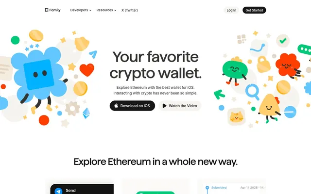
Pixar storyboard on cream paper — playful illustrated characters inhabit a warm off-white world where fintech feels like an adventure game.
Color palette
Primary brand accent — CTA text links, icon highlights, illustration character color — the single most prominent chromatic color site-wide, heat against the cream canvas
Secondary brand accent — success indicators, illustration fills, receive/confirmation states
Tertiary brand accent — links in body, illustration fills, Ethereum-related UI elements
Quaternary brand accent — coin illustrations, star motifs, card highlights
Yellow shadow/stroke in illustrations, icon outlines on yellow elements
Link color in body copy, stroke on blue illustration elements
Illustration fill — lighter blue tones on characters and graphics
Illustration stroke and fill variant for green characters
Illustration accent — pink character fills, occasional badge backgrounds
Illustration accent — purple character/NFT badge backgrounds
Page background, nav background, light button fill
Card inset border color, secondary button background, subtle dividers
Feature card backgrounds (display-p3 0.984 0.980 0.976 approximation)
Body text, nav links, card body copy — the dominant text color across the entire page
Nav text, headings at smaller sizes, links — mapped to --color-primary and --color-text
Primary CTA button background, high-contrast heading text
Dark card background (phone mockup cards), icon fills
Muted body text, secondary nav labels
Footer text, inactive borders, dividers
Disabled states, placeholder text, tertiary labels
Dark nav overlay text, deep secondary labels
Error state background, destructive action indicator
Success/valid input state — mapped to --background-valid
Typography
- Weights
- 500
- Sizes
- 44px, 68px
- Line height
- 1.09
- Letter spacing
- -2.11px at 68px, -0.88px at 44px
- Fallback
- Fraunces or Playfair Display at weight 500
Hero and section display headlines only. The 68px/500 weight with -0.031em tracking is the signature move — a custom typeface that reads as a friendly geometric serif hybrid, warmer than Inter but less precious than a display serif. Used sparingly: 2-3 instances per page maximum.
- Weights
- 400, 500, 600
- Sizes
- 12px, 13px, 14px, 15px, 16px, 17px, 19px, 23px, 44px
- Line height
- 1
- Letter spacing
- -1.14px at 44px, -0.44px at 23px, -0.25px at 19px, -0.22px at 17px, -0.16px at 16px, -0.20px at 15px, -0.18px at 14px, -0.17px at 13px, -0.12px at 12px
- Fallback
- System UI stack or IBM Plex Sans
All UI text: nav (14px/500), body copy (15-17px/400), card labels (13px/500), buttons (14-15px/500-600), captions (12px/400). Letter-spacing tightens with size — large Inter (44px) gets -0.026em to match the display font's density.
Spacing & shape
Elevation
Components
Background #121212, text #ffffff, border-radius 32px, padding 0px 14px. Inter 14px weight 500-600. The near-black pill floats against #fbfaf9 canvas as the site's only dark punch. Hover state likely lightens to #343433 via 0.2s ease transition.
Background #f6f4ef (warm cream), text #121212, border-radius 32px, padding 0px 14px. Inter 14px weight 500. Creates a paired hierarchy with the dark pill without competing — same shape, inverted warmth.
Background transparent, text color #ff3e00 (Ember Orange), border-radius 0px, padding 4px 0px. No border. Inter 14-15px weight 500. The underline-less orange text link is the signature inline action — orange on cream reads as warm urgency without a button shell.
Background transparent, text #474645 (Graphite), border 1px solid #474645, border-radius 12px, padding 12px 32px 12px 12px. Inter 14px weight 500. Used for modal-adjacent actions that need definition without weight.
Background white (display-p3 1 1 1), border via inset box-shadow: color(display-p3 0.949 0.941 0.929) 0px 0px 0px 1px inset (warm stone border, ~#f2f0ed), border-radius 10px, padding 32px all sides. The inset shadow technique keeps borders off-layout-flow — cards look hand-placed on the canvas.
Background #f8f7f4 (display-p3 0.984 0.980 0.976), no box-shadow, border-radius 12px, padding 0px 22.8px 14px 22.8px. Slightly sunken into the page — the warm tint against #fbfaf9 creates a 1-level depth shift without any shadow.
Background #000000, border-radius 24px (top) 0px 0px 24px (bottom), box-shadow rgba(0,0,0,0.15) 0px 0px 24px 0px, padding 4px 0px 4px 4px. The only true drop shadow on the page — reserved for the product hero moment, making the dark phone pop off the cream background.
Background white, border via inset stone shadow (same as Feature Card White), border-radius 10px, padding 32px. Contains avatar (circular, ~40px), handle in Inter 13px #848281, body in Inter 15px #474645, X logo icon in top-right. Horizontally scrolling or grid-arranged.
Flat illustrated characters using brand palette: Ember Orange, Meadow Green, Sky Blue, Sunburst Yellow, Flamingo. Contained in 72px radius rounded containers or free-floating. No shadow, no border. Characters have expressive faces (dot eyes, smile curves) and stick limbs. Sized 60-120px, clustered around headline.
Background #fbfaf9 (canvas), height ~64px, box-shadow rgba(0,0,0,0.04) 0px 0px 0px 1px (barely-there outline). Logo left, nav links center in Inter 14px #343433 weight 500, 'Log In' ghost pill and 'Get Started' dark pill right. Dropdown chevrons on Developers/Resources.
Family typeface 500 at 68px with -2.11px letter-spacing and line-height 1.09 for hero. Inter 600 at 44px with -1.14px letter-spacing for sub-section heads. Color #343433 or #121212. Always left-aligned or centered — no right-aligned headlines.
Circular icon badge: background in brand color (Meadow Green for Receive, Flamingo for Purchase), icon in white, border-radius 40px, ~40px diameter. Acts as the only iconographic navigation within the dark phone card context.
Guidelines
- Use #fbfaf9 as page background — never pure white (#ffffff) at canvas level; the warm cream cast is the foundation of the tactile feel.
- Apply the inset stone border (box-shadow: color(display-p3 0.949 0.941 0.929) 0px 0px 0px 1px inset) on all white cards instead of a CSS border property — keeps cards off-layout-flow.
- Use border-radius 32px for all pill buttons (both #121212 dark and #f6f4ef light variants) — the pill shape is non-negotiable for interactive elements.
- Apply tight negative letter-spacing to all large text: -2.11px at 68px display, -1.14px at 44px heading-lg, scaling to near-zero at body sizes.
- Restrict the Family custom typeface to display and large section headings only (44px and 68px) — Inter handles all UI text regardless of weight.
- Use Ember Orange (#ff3e00) exclusively for text-link CTAs and illustration accents — never as a button background fill; its power is as an inline pop against cream.
- Space illustration characters asymmetrically around hero text — overlap the headline bounding box with characters to create depth through layering, not z-index stacking.
- Don't use drop shadows on content cards — the inset warm-stone border is the only surface definition mechanism; shadows appear only on the dark phone mockup and hover-elevated states.
- Don't use pure #ffffff as a page background — it breaks the warm cream identity; #fbfaf9 is the minimum warmth threshold.
- Don't use the illustration characters as pure decoration at small sizes — below 60px they lose their expressive faces and become abstract blobs.
- Don't mix Inter weight 700+ with the Family display typeface — the site uses Inter max weight 600; heavier weights fight the custom font's personality.
- Don't apply Ember Orange (#ff3e00) to more than one UI element per viewport — its rarity is what creates urgency; overuse collapses the hierarchy.
- Don't use border-radius below 10px on cards — the minimum card radius is 10px; anything sharper breaks the soft-edged system.
- Don't use the Violet Pop (#9f4fff), Flamingo (#ff58ae), or Coral Red (#ff2b3a) colors in UI chrome — these are illustration-only accents and have no role in buttons, nav, or body text.
About this system
ShowHide
Family lands like a children's book dropped into a fintech dashboard — warm off-white canvas (#fbfaf9) littered with expressive flat-illustrated characters in vivid primary colors (electric orange, grass green, sky blue, bright yellow) while the typography stays grounded and authoritative. The custom 'Family' typeface at 68px with tight -0.031em tracking carries the hero weight, while Inter handles everything else with progressively tighter letter-spacing as sizes increase. Cards use an inset warm-stone border (a single 1px shadow at #f2f0ed) instead of drop shadows, keeping surfaces flat and tactile. The only dark surface is the 'Get Started' pill button in near-black #121212 against the warm cream background — a single moment of contrast in an otherwise light, airy layout. The illustration vocabulary — wobbly blob creatures with stick legs and expressive faces — is the real identity system, not the color palette alone.
Max-width ~1200px centered on the warm canvas. Hero is full-viewport with centered headline text (Family typeface), flanked by illustration characters positioned left and right of the text column — not a split layout but a 'headline-surrounded-by-friends' composition. Below hero: alternating sections with generous vertical gaps (120-180px). Feature section uses a 3-column card grid (white cards with inset borders). Phone mockup sections show 2-3 device frames side by side on white or cream bands. Social proof section ('Friends of Family') uses a horizontal scrolling card row. Navigation is a fixed top bar with logo left, links center, actions right. Footer is minimal — link grid on canvas background. No sidebar, no mega-menu. Page is text-dominant with illustrations as punctuation, not wallpaper.
Exclusively custom flat illustration — no photography anywhere on the page. Characters are organic blob-shaped creatures with stick limbs, dot eyes, and emoji-like expressions, rendered in vivid primaries (orange, green, blue, yellow) against the warm cream canvas. Illustration density is highest in the hero: 12-15 characters and objects scattered asymmetrically around the headline, creating a 'spilled toy box' composition. Product screenshots appear inside dark rounded phone mockups (border-radius 24px) — contained and framed, never bleeding to page edge. Icons are filled monochrome at small sizes; action badges use filled circles with white icon glyphs. The illustration style is the primary brand differentiator: deliberately childlike but executed with precision — consistent stroke weights, flat shading with no gradients, expressive character design that makes crypto feel approachable rather than intimidating.
Reminiscent of Lunchbox, Linear, Notionforms, Superhuman, Raycast.
# Family — Style Reference
> Pixar storyboard on cream paper — playful illustrated characters inhabit a warm off-white world where fintech feels like an adventure game.

**Theme:** light

**Site:** https://family.co

Family lands like a children's book dropped into a fintech dashboard — warm off-white canvas (#fbfaf9) littered with expressive flat-illustrated characters in vivid primary colors (electric orange, grass green, sky blue, bright yellow) while the typography stays grounded and authoritative. The custom 'Family' typeface at 68px with tight -0.031em tracking carries the hero weight, while Inter handles everything else with progressively tighter letter-spacing as sizes increase. Cards use an inset warm-stone border (a single 1px shadow at #f2f0ed) instead of drop shadows, keeping surfaces flat and tactile. The only dark surface is the 'Get Started' pill button in near-black #121212 against the warm cream background — a single moment of contrast in an otherwise light, airy layout. The illustration vocabulary — wobbly blob creatures with stick legs and expressive faces — is the real identity system, not the color palette alone.

## Tokens — Colors

| Name | Value | Token | Role |
|------|------|------|------|
| Ember Orange | `#ff3e00` | `--color-ember-orange` | Primary brand accent — CTA text links, icon highlights, illustration character color — the single most prominent chromatic color site-wide, heat against the cream canvas |
| Meadow Green | `#00ca48` | `--color-meadow-green` | Secondary brand accent — success indicators, illustration fills, receive/confirmation states |
| Sky Blue | `#0090ff` | `--color-sky-blue` | Tertiary brand accent — links in body, illustration fills, Ethereum-related UI elements |
| Sunburst Yellow | `#ffbb26` | `--color-sunburst-yellow` | Quaternary brand accent — coin illustrations, star motifs, card highlights |
| Deep Amber | `#d48f00` | `--color-deep-amber` | Yellow shadow/stroke in illustrations, icon outlines on yellow elements |
| Ocean Blue | `#0086fc` | `--color-ocean-blue` | Link color in body copy, stroke on blue illustration elements |
| Ice Blue | `#64c6ff` | `--color-ice-blue` | Illustration fill — lighter blue tones on characters and graphics |
| Spearmint | `#00c978` | `--color-spearmint` | Illustration stroke and fill variant for green characters |
| Flamingo | `#ff58ae` | `--color-flamingo` | Illustration accent — pink character fills, occasional badge backgrounds |
| Violet Pop | `#9f4fff` | `--color-violet-pop` | Illustration accent — purple character/NFT badge backgrounds |
| Warm Canvas | `#fbfaf9` | `--color-warm-canvas` | Page background, nav background, light button fill |
| Stone Surface | `#f2f0ed` | `--color-stone-surface` | Card inset border color, secondary button background, subtle dividers |
| Parchment Card | `#f8f7f4` | `--color-parchment-card` | Feature card backgrounds (display-p3 0.984 0.980 0.976 approximation) |
| Graphite | `#474645` | `--color-graphite` | Body text, nav links, card body copy — the dominant text color across the entire page |
| Charcoal Primary | `#343433` | `--color-charcoal-primary` | Nav text, headings at smaller sizes, links — mapped to --color-primary and --color-text |
| Midnight | `#121212` | `--color-midnight` | Primary CTA button background, high-contrast heading text |
| Obsidian | `#000000` | `--color-obsidian` | Dark card background (phone mockup cards), icon fills |
| Ash | `#848281` | `--color-ash` | Muted body text, secondary nav labels |
| Fog | `#c6c6c6` | `--color-fog` | Footer text, inactive borders, dividers |
| Smoke | `#a7a7a7` | `--color-smoke` | Disabled states, placeholder text, tertiary labels |
| Pepper | `#282624` | `--color-pepper` | Dark nav overlay text, deep secondary labels |
| Coral Red | `#ff2b3a` | `--color-coral-red` | Error state background, destructive action indicator |
| Valid Green | `#00c454` | `--color-valid-green` | Success/valid input state — mapped to --background-valid |

## Tokens — Typography

### Family
- **Substitute:** Fraunces or Playfair Display at weight 500
- **Weights:** 500
- **Sizes:** 44px, 68px
- **Line height:** 1.09
- **Letter spacing:** -2.11px at 68px, -0.88px at 44px
- **Role:** Hero and section display headlines only. The 68px/500 weight with -0.031em tracking is the signature move — a custom typeface that reads as a friendly geometric serif hybrid, warmer than Inter but less precious than a display serif. Used sparingly: 2-3 instances per page maximum.

### Inter
- **Substitute:** System UI stack or IBM Plex Sans
- **Weights:** 400, 500, 600
- **Sizes:** 12px, 13px, 14px, 15px, 16px, 17px, 19px, 23px, 44px
- **Line height:** 1
- **Letter spacing:** -1.14px at 44px, -0.44px at 23px, -0.25px at 19px, -0.22px at 17px, -0.16px at 16px, -0.20px at 15px, -0.18px at 14px, -0.17px at 13px, -0.12px at 12px
- **Role:** All UI text: nav (14px/500), body copy (15-17px/400), card labels (13px/500), buttons (14-15px/500-600), captions (12px/400). Letter-spacing tightens with size — large Inter (44px) gets -0.026em to match the display font's density.

## Tokens — Type Scale

Augmented Fourth (1.414) from 15px base.

| Role | Size | Line height | Letter spacing |
|------|------|------|------|
| caption | 12px | 1.58 | -0.14px |
| body | 15px | 1.47 | -0.2px |
| heading-sm | 19px | 1.38 | -0.25px |
| heading | 23px | 1.2 | -0.44px |
| heading-lg | 44px | 1.09 | -1.14px |
| display | 68px | 1.09 | -2.11px |

## Tokens — Spacing

- **Max width:** 1200px
- **Section gap:** 120-180px
- **Card padding:** 32px
- **Element gap:** 8-12px

## Tokens — Radius

- **Buttons:** 32px
- **Inputs:** 10px
- **Cards:** 10px
- **buttonsPill:** 32px
- **cardsLarge:** 24px
- **icons:** 40px
- **illustrations:** 72px
- **tags:** 6px

## Tokens — Elevation

- **Feature Card (White):** `color(display-p3 0.949 0.941 0.929) 0px 0px 0px 1px inset`
- **Dark Phone Mockup Card:** `rgba(0, 0, 0, 0.15) 0px 0px 24px 0px`
- **Navigation Bar:** `rgba(0, 0, 0, 0.04) 0px 0px 0px 1px`
- **Elevated Card (hover/active):** `rgba(0, 0, 0, 0.04) 0px 1px 6px 0px, rgba(0, 0, 0, 0.05) 0px 0px 24px 0px`

## Layout

Max-width ~1200px centered on the warm canvas. Hero is full-viewport with centered headline text (Family typeface), flanked by illustration characters positioned left and right of the text column — not a split layout but a 'headline-surrounded-by-friends' composition. Below hero: alternating sections with generous vertical gaps (120-180px). Feature section uses a 3-column card grid (white cards with inset borders). Phone mockup sections show 2-3 device frames side by side on white or cream bands. Social proof section ('Friends of Family') uses a horizontal scrolling card row. Navigation is a fixed top bar with logo left, links center, actions right. Footer is minimal — link grid on canvas background. No sidebar, no mega-menu. Page is text-dominant with illustrations as punctuation, not wallpaper.

## Imagery

Exclusively custom flat illustration — no photography anywhere on the page. Characters are organic blob-shaped creatures with stick limbs, dot eyes, and emoji-like expressions, rendered in vivid primaries (orange, green, blue, yellow) against the warm cream canvas. Illustration density is highest in the hero: 12-15 characters and objects scattered asymmetrically around the headline, creating a 'spilled toy box' composition. Product screenshots appear inside dark rounded phone mockups (border-radius 24px) — contained and framed, never bleeding to page edge. Icons are filled monochrome at small sizes; action badges use filled circles with white icon glyphs. The illustration style is the primary brand differentiator: deliberately childlike but executed with precision — consistent stroke weights, flat shading with no gradients, expressive character design that makes crypto feel approachable rather than intimidating.

## Components

### Primary CTA Button (Pill Dark)
*Main conversion action — 'Get Started', 'Download on iOS'*

Background #121212, text #ffffff, border-radius 32px, padding 0px 14px. Inter 14px weight 500-600. The near-black pill floats against #fbfaf9 canvas as the site's only dark punch. Hover state likely lightens to #343433 via 0.2s ease transition.

### Secondary CTA Button (Pill Light)
*Alternative actions — 'Log In', 'Watch the Video'*

Background #f6f4ef (warm cream), text #121212, border-radius 32px, padding 0px 14px. Inter 14px weight 500. Creates a paired hierarchy with the dark pill without competing — same shape, inverted warmth.

### Ghost Text Link Button
*Inline navigation links — 'Watch the demo', section CTAs*

Background transparent, text color #ff3e00 (Ember Orange), border-radius 0px, padding 4px 0px. No border. Inter 14-15px weight 500. The underline-less orange text link is the signature inline action — orange on cream reads as warm urgency without a button shell.

### Outlined Navigation Button
*Tertiary actions in nav or contextual contexts*

Background transparent, text #474645 (Graphite), border 1px solid #474645, border-radius 12px, padding 12px 32px 12px 12px. Inter 14px weight 500. Used for modal-adjacent actions that need definition without weight.

### Feature Card (White)
*Primary content cards — feature descriptions, testimonials*

Background white (display-p3 1 1 1), border via inset box-shadow: color(display-p3 0.949 0.941 0.929) 0px 0px 0px 1px inset (warm stone border, ~#f2f0ed), border-radius 10px, padding 32px all sides. The inset shadow technique keeps borders off-layout-flow — cards look hand-placed on the canvas.

### Feature Card (Warm Cream)
*Secondary content panels — screenshot containers, demo previews*

Background #f8f7f4 (display-p3 0.984 0.980 0.976), no box-shadow, border-radius 12px, padding 0px 22.8px 14px 22.8px. Slightly sunken into the page — the warm tint against #fbfaf9 creates a 1-level depth shift without any shadow.

### Dark Phone Mockup Card
*Product screenshot showcase — wallet UI demonstrations*

Background #000000, border-radius 24px (top) 0px 0px 24px (bottom), box-shadow rgba(0,0,0,0.15) 0px 0px 24px 0px, padding 4px 0px 4px 4px. The only true drop shadow on the page — reserved for the product hero moment, making the dark phone pop off the cream background.

### Testimonial Card
*Social proof — Twitter/X quotes in 'Friends of Family' section*

Background white, border via inset stone shadow (same as Feature Card White), border-radius 10px, padding 32px. Contains avatar (circular, ~40px), handle in Inter 13px #848281, body in Inter 15px #474645, X logo icon in top-right. Horizontally scrolling or grid-arranged.

### Illustration Character
*Decorative brand mascots — blob creatures, emoji animals scattered in hero*

Flat illustrated characters using brand palette: Ember Orange, Meadow Green, Sky Blue, Sunburst Yellow, Flamingo. Contained in 72px radius rounded containers or free-floating. No shadow, no border. Characters have expressive faces (dot eyes, smile curves) and stick limbs. Sized 60-120px, clustered around headline.

### Navigation Bar
*Sticky top navigation*

Background #fbfaf9 (canvas), height ~64px, box-shadow rgba(0,0,0,0.04) 0px 0px 0px 1px (barely-there outline). Logo left, nav links center in Inter 14px #343433 weight 500, 'Log In' ghost pill and 'Get Started' dark pill right. Dropdown chevrons on Developers/Resources.

### Section Heading
*Page section titles*

Family typeface 500 at 68px with -2.11px letter-spacing and line-height 1.09 for hero. Inter 600 at 44px with -1.14px letter-spacing for sub-section heads. Color #343433 or #121212. Always left-aligned or centered — no right-aligned headlines.

### Colored Action Badge
*Transaction type labels inside wallet UI mockups — Send, Receive, Purchase*

Circular icon badge: background in brand color (Meadow Green for Receive, Flamingo for Purchase), icon in white, border-radius 40px, ~40px diameter. Acts as the only iconographic navigation within the dark phone card context.

## Guidelines

### Do

- Use #fbfaf9 as page background — never pure white (#ffffff) at canvas level; the warm cream cast is the foundation of the tactile feel.
- Apply the inset stone border (box-shadow: color(display-p3 0.949 0.941 0.929) 0px 0px 0px 1px inset) on all white cards instead of a CSS border property — keeps cards off-layout-flow.
- Use border-radius 32px for all pill buttons (both #121212 dark and #f6f4ef light variants) — the pill shape is non-negotiable for interactive elements.
- Apply tight negative letter-spacing to all large text: -2.11px at 68px display, -1.14px at 44px heading-lg, scaling to near-zero at body sizes.
- Restrict the Family custom typeface to display and large section headings only (44px and 68px) — Inter handles all UI text regardless of weight.
- Use Ember Orange (#ff3e00) exclusively for text-link CTAs and illustration accents — never as a button background fill; its power is as an inline pop against cream.
- Space illustration characters asymmetrically around hero text — overlap the headline bounding box with characters to create depth through layering, not z-index stacking.

### Don't

- Don't use drop shadows on content cards — the inset warm-stone border is the only surface definition mechanism; shadows appear only on the dark phone mockup and hover-elevated states.
- Don't use pure #ffffff as a page background — it breaks the warm cream identity; #fbfaf9 is the minimum warmth threshold.
- Don't use the illustration characters as pure decoration at small sizes — below 60px they lose their expressive faces and become abstract blobs.
- Don't mix Inter weight 700+ with the Family display typeface — the site uses Inter max weight 600; heavier weights fight the custom font's personality.
- Don't apply Ember Orange (#ff3e00) to more than one UI element per viewport — its rarity is what creates urgency; overuse collapses the hierarchy.
- Don't use border-radius below 10px on cards — the minimum card radius is 10px; anything sharper breaks the soft-edged system.
- Don't use the Violet Pop (#9f4fff), Flamingo (#ff58ae), or Coral Red (#ff2b3a) colors in UI chrome — these are illustration-only accents and have no role in buttons, nav, or body text.

## Agent Prompt Guide

**Quick Color Reference**
- Page background: #fbfaf9 (warm cream, never pure white)
- Primary text: #474645 (Graphite)
- Heading text: #343433 (Charcoal Primary)
- CTA button (dark): #121212 background, #ffffff text
- CTA button (light): #f6f4ef background, #121212 text
- Brand accent / link: #ff3e00 (Ember Orange)
- Card border: box-shadow inset ~#f2f0ed 1px
- Muted text: #848281

**Example Component Prompts**

1. **Hero Section**: Background #fbfaf9. Center-aligned headline in Family typeface 500 at 68px, color #343433, letter-spacing -2.11px, line-height 1.09. Subtext at 16px Inter 400, color #474645, max-width 480px. Two pill buttons below: dark (#121212 background, #ffffff text, 32px radius, 0px 14px padding) and light (#f6f4ef background, #121212 text, 32px radius, 0px 14px padding). Surround headline with flat illustrated characters in orange, green, blue, yellow at sizes 60-120px positioned asymmetrically.

2. **Feature Card Grid (3-column)**: Each card: background #ffffff, box-shadow color(display-p3 0.949 0.941 0.929) 0px 0px 0px 1px inset, border-radius 10px, padding 32px. Heading in Inter 600 19px #343433. Body in Inter 400 15px #474645 line-height 1.47. Product screenshot or illustration inside card on #f8f7f4 panel with border-radius 12px.

3. **Testimonial Card**: Background #ffffff, inset stone border same as Feature Card, border-radius 10px, padding 32px. Top-right: X/Twitter icon in #474645. User row: circular avatar 40px, name in Inter 500 14px #343433, handle in Inter 400 13px #848281. Quote in Inter 400 15px #474645 letter-spacing -0.20px. Arrange in horizontally scrolling row with 12px gap.

4. **Navigation Bar**: Background #fbfaf9, height 64px, box-shadow rgba(0,0,0,0.04) 0px 0px 0px 1px. Logo (square icon + 'Family' wordmark) at left in #343433 Inter 500 15px. Center links: Inter 500 14px #343433 with dropdown chevrons. Right: 'Log In' light pill + 'Get Started' dark pill (#121212, 32px radius).

5. **Section Heading Block**: Inter 600 at 44px, color #121212, letter-spacing -1.14px, line-height 1.09. Optional orange accent word in same size but color #ff3e00. Supporting body text below at Inter 400 17px #474645, letter-spacing -0.22px, max-width 560px. Section gap above: 120-180px.

## Illustration System

The illustration system IS the brand identity — not a decoration layer. Key rules:

**Character vocabulary**: Organic blob shapes (no hard geometric forms) with stick limbs, expressive dot eyes, and simple mouth curves. Each character uses one dominant brand color (Ember Orange, Meadow Green, Sky Blue, Sunburst Yellow) with a darker shade for depth stroke.

**Object vocabulary**: Coins (gold #ffbb26 with amber stroke #d48f00), hearts (red #ff2b3a), stars (yellow), lock icons (gold), magnifying glass (blue), arrows (teal/green). All flat-filled, no gradients.

**Placement rule**: Hero characters bleed INTO the headline bounding box — the blue blob character's arm overlaps the 'Y' of 'Your'. This intentional overlap is the signature composition move.

**Color usage in illustration**: Maximum 4-5 brand colors per scene. Each character claims one color family. Avoid two characters of the same hue adjacent.

**CSS token reference for illustration colors**: --graphic-orange, --graphic-green, --graphic-blue, --graphic-yellow, --graphic-gold, --graphic-purple — all defined as display-p3 for wide-gamut screens.

## Motion Philosophy

Motion personality is 'expressive' with 0.2s ease as the base duration (123 instances). Key patterns:

**Micro-interactions**: 0.1-0.2s ease for hover states on buttons (background color, box-shadow). Buttons likely scale or lighten slightly.

**Illustration animation**: 1s duration with cubic-bezier(0.19, 1, 0.22, 1) — the 'snappy overshoot' easing suggests characters bounce or spring into position on scroll entry.

**Transition properties**: Transform (103×) and opacity (44×) dominate — elements slide or fade in rather than recoloring. Box-shadow transitions (33×) animate card hover elevations.

**Named animation 'hdKGda'**: Custom keyframe animation, likely the floating/bobbing motion on hero illustration characters.

**Rule**: Never use linear easing on visible UI — the brand is expressive, and linear motion reads as mechanical. Default to ease or the cubic-bezier(0.19, 1, 0.22, 1) spring curve.
More like this






Keep what you find
A free account saves references to boards and can send you a weekly email of picks based on what you save.
To see every result, go Pro.