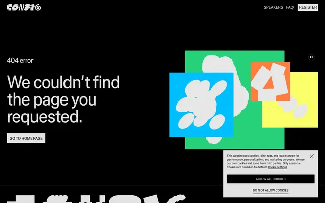
Preview image. Unlock full-res
monochrome command console
Color palette
Page background, primary text on light surfaces, button backgrounds for primary actions
Primary text on dark backgrounds, ghost button borders, navigation links
Subtle button borders, secondary dividers
Background for lighter surfaces, such as cookie consent dialogs, secondary text color on dark backgrounds
Typography
- Weights
- 400
- Sizes
- 16px, 18px, 20px, 32px, 80px
- Line height
- 0.95, 1, 1.1, 1.25, 1.3
- Letter spacing
- -0.0300em at large sizes, -0.0200em at medium sizes
- Fallback
- Inter
Primary brand typeface for all headlines, body text, and interactive elements. Its specific letter-spacing creates a compact, intentional appearance, especially noticeable on larger headings.
- Weights
- 400
- Sizes
- 16px
- Line height
- 1.3
- Letter spacing
- normal
- Fallback
- Menlo
Monospaced typeface for code snippets or technical details, offering a distinct visual break from the primary typeface while maintaining legibility.
Spacing & shape
Components
Solid Midnight Void background, Ghost White text. Padding 12px horizontal and vertical. Square corners (0px radius). Example: 'ALLOW ALL COOKIES'.
Transparent background, Ghost White text and 1px border. No padding specified, acts as a text link with button styling. Example: 'GO TO HOMEPAGE'.
Solid Midnight Void background with Ghost White text and a subtle 1px border of `rgba(255, 255, 255, 0.24)`. Rounded with 50% border radius. No explicit padding data, likely derived from text size.
Ghost White text, with a 1px border of Midnight Void. Compact padding of 4-6px vertical and 6-12px horizontal. Renders as text only with a subtle underline effect on hover (not present in current data).
Polar Mist background with Midnight Void text for primary content. Elements within use Shadow Charcoal borders. Padding is not explicit but appears generous. Square corners (0px radius).
Guidelines
- Use Midnight Void (#000000) as the dominant background color for all main canvas areas.
- Apply FigmaSans for all text elements, setting letter-spacing to -0.0300em for display text (80px, 32px) and -0.0200em for smaller headings and body text.
- Form primary interactive buttons with a Midnight Void (#000000) background and Ghost White (#e2e2e2) text, using 0px border-radius.
- For ghost buttons or secondary actions, use Ghost White (#e2e2e2) for both text and a 1px border, maintaining a transparent background.
- Utilize the 4-6px vertical padding and 6-12px horizontal padding for navigation and compact interactive elements.
- Maintain a primary text color of Ghost White (#e2e2e2) against dark backgrounds and Midnight Void (#000000) against light backgrounds.
- Apply 1px borders using Midnight Void or Shadow Charcoal (#3d3d3d) for subtle division and emphasis.
- Avoid using gradients; the system relies on flat colors for a stark, impactful appearance.
- Do not introduce intermediate grey tones between Midnight Void (#000000) and Ghost White (#e2e2e2) without a clear functional purpose, as the system favors high contrast.
- Do not use highly saturated colors for large surface areas; color is reserved for functional accents or semantic states.
- Do not use generic system fonts; stick to figmaSans or figmaMono for all typographic elements.
- Avoid soft, rounded corners for main interactive elements (buttons, cards); prefer sharp, square edges unless specifically for small pill-shaped accents.
- Do not use drop shadows for elevation; rely on color contrast and borders to define hierarchy and interactive states.
About this system
ShowHide
Figma Config employs a bold, high-contrast dark theme, emphasizing clarity and directness. Monochrome neutrals dominate the canvas, creating space for content to stand out. Typography is dense and strong, utilizing custom fonts that command attention while maintaining high legibility against the dark background. Interaction is signaled through subtle border changes and direct color swaps rather than complex elevation, giving components a lightweight and integrated feel.
The page maintains a full-bleed dark background, with content neatly centered or aligned to the left. The hero section features a prominent headline centered over the dark background. Sections generally use consistent vertical spacing, often indicated by the 40px section gap. Content arrangement appears to be stacked vertically, with some areas allowing for asymmetric or interleaved visual elements like the abstract shapes. The navigation is a minimal, right-aligned header bar that stays fixed at the top, offering essential links.
The visual language uses abstract, organic, blob-like shapes in a limited, vibrant accent palette (blue, green, orange, yellow) against the dark, high-contrast UI. These shapes are mostly opaque, layered, and slightly rotated, creating a playful yet dynamic feel. They function primarily as decorative atmosphere rather than conveying specific content. Icons, such as the `(pause)` and `(X)` are minimal, outlined, and monochromatic, integrated seamlessly into the UI.
Reminiscent of Sanity.io, Supabase, Vercel, Linear.
# Figma Config — Style Reference
> monochrome command console

**Theme:** dark

**Site:** https://config.figma.com/events/figma-config-2022

Figma Config employs a bold, high-contrast dark theme, emphasizing clarity and directness. Monochrome neutrals dominate the canvas, creating space for content to stand out. Typography is dense and strong, utilizing custom fonts that command attention while maintaining high legibility against the dark background. Interaction is signaled through subtle border changes and direct color swaps rather than complex elevation, giving components a lightweight and integrated feel.

## Tokens — Colors

| Name | Value | Token | Role |
|------|------|------|------|
| Midnight Void | `#000000` | `--color-midnight-void` | Page background, primary text on light surfaces, button backgrounds for primary actions |
| Ghost White | `#e2e2e2` | `--color-ghost-white` | Primary text on dark backgrounds, ghost button borders, navigation links |
| Shadow Charcoal | `#3d3d3d` | `--color-shadow-charcoal` | Subtle button borders, secondary dividers |
| Polar Mist | `#ffffff` | `--color-polar-mist` | Background for lighter surfaces, such as cookie consent dialogs, secondary text color on dark backgrounds |

## Tokens — Typography

### figmaSans
- **Substitute:** Inter
- **Weights:** 400
- **Sizes:** 16px, 18px, 20px, 32px, 80px
- **Line height:** 0.95, 1, 1.1, 1.25, 1.3
- **Letter spacing:** -0.0300em at large sizes, -0.0200em at medium sizes
- **Role:** Primary brand typeface for all headlines, body text, and interactive elements. Its specific letter-spacing creates a compact, intentional appearance, especially noticeable on larger headings.

### figmaMono
- **Substitute:** Menlo
- **Weights:** 400
- **Sizes:** 16px
- **Line height:** 1.3
- **Letter spacing:** normal
- **Role:** Monospaced typeface for code snippets or technical details, offering a distinct visual break from the primary typeface while maintaining legibility.

## Tokens — Type Scale

| Role | Size | Line height | Letter spacing |
|------|------|------|------|
| body | 16px | 1.3 | — |
| subheading | 20px | 1.1 | — |
| heading | 32px | 1.1 | -0.64px |
| display | 80px | 0.95 | -2.4px |

## Tokens — Spacing

- **Section gap:** 40px
- **Card padding:** 12px
- **Element gap:** 12px

## Tokens — Radius

- **Buttons:** 0px
- **navPills:** 50%

## Layout

The page maintains a full-bleed dark background, with content neatly centered or aligned to the left. The hero section features a prominent headline centered over the dark background. Sections generally use consistent vertical spacing, often indicated by the 40px section gap. Content arrangement appears to be stacked vertically, with some areas allowing for asymmetric or interleaved visual elements like the abstract shapes. The navigation is a minimal, right-aligned header bar that stays fixed at the top, offering essential links.

## Imagery

The visual language uses abstract, organic, blob-like shapes in a limited, vibrant accent palette (blue, green, orange, yellow) against the dark, high-contrast UI. These shapes are mostly opaque, layered, and slightly rotated, creating a playful yet dynamic feel. They function primarily as decorative atmosphere rather than conveying specific content. Icons, such as the `(pause)` and `(X)` are minimal, outlined, and monochromatic, integrated seamlessly into the UI.

## Components

### Primary Filled Button
*Main call-to-action on dark backgrounds.*

Solid Midnight Void background, Ghost White text. Padding 12px horizontal and vertical. Square corners (0px radius). Example: 'ALLOW ALL COOKIES'.

### Ghost Button
*Secondary action or navigable link that appears as a button.*

Transparent background, Ghost White text and 1px border. No padding specified, acts as a text link with button styling. Example: 'GO TO HOMEPAGE'.

### Cookie Consent Button
*Button within the cookie consent dialog.*

Solid Midnight Void background with Ghost White text and a subtle 1px border of `rgba(255, 255, 255, 0.24)`. Rounded with 50% border radius. No explicit padding data, likely derived from text size.

### Navigation Link
*Top-level navigation items.*

Ghost White text, with a 1px border of Midnight Void. Compact padding of 4-6px vertical and 6-12px horizontal. Renders as text only with a subtle underline effect on hover (not present in current data).

### Cookie Consent Panel
*Floating informational message.*

Polar Mist background with Midnight Void text for primary content. Elements within use Shadow Charcoal borders. Padding is not explicit but appears generous. Square corners (0px radius).

## Guidelines

### Do

- Use Midnight Void (#000000) as the dominant background color for all main canvas areas.
- Apply FigmaSans for all text elements, setting letter-spacing to -0.0300em for display text (80px, 32px) and -0.0200em for smaller headings and body text.
- Form primary interactive buttons with a Midnight Void (#000000) background and Ghost White (#e2e2e2) text, using 0px border-radius.
- For ghost buttons or secondary actions, use Ghost White (#e2e2e2) for both text and a 1px border, maintaining a transparent background.
- Utilize the 4-6px vertical padding and 6-12px horizontal padding for navigation and compact interactive elements.
- Maintain a primary text color of Ghost White (#e2e2e2) against dark backgrounds and Midnight Void (#000000) against light backgrounds.
- Apply 1px borders using Midnight Void or Shadow Charcoal (#3d3d3d) for subtle division and emphasis.

### Don't

- Avoid using gradients; the system relies on flat colors for a stark, impactful appearance.
- Do not introduce intermediate grey tones between Midnight Void (#000000) and Ghost White (#e2e2e2) without a clear functional purpose, as the system favors high contrast.
- Do not use highly saturated colors for large surface areas; color is reserved for functional accents or semantic states.
- Do not use generic system fonts; stick to figmaSans or figmaMono for all typographic elements.
- Avoid soft, rounded corners for main interactive elements (buttons, cards); prefer sharp, square edges unless specifically for small pill-shaped accents.
- Do not use drop shadows for elevation; rely on color contrast and borders to define hierarchy and interactive states.

## Agent Prompt Guide

Quick Color Reference:
text: #e2e2e2
background: #000000
border: #3d3d3d
accent: no distinct accent color
primary action: #000000 (filled action)

Example Component Prompts:
1. Create a primary call-to-action button: background #000000, text #e2e2e2 (FigmaSans, 16px, weight 400, lineHeight 1.3), 0px radius, 12px padding. Label it 'ALLOW ALL COOKIES'.
2. Design a ghost button for navigation: text #e2e2e2 (FigmaSans, 16px, weight 400, lineHeight 1.3), 1px border #e2e2e2, transparent background, 0px radius. Label it 'GO TO HOMEPAGE'.
3. Build a main section header: text #e2e2e2 (FigmaSans, 80px, weight 400, lineHeight 0.95, letterSpacing -2.4px). Label it 'We couldn't find the page you requested.'.
4. Create a navigation link: text #e2e2e2 (FigmaSans, 16px, weight 400, lineHeight 1.3), 1px border #000000, transparent background, 4px vertical and 6px horizontal padding. Label it 'Speakers'.
More like this






Keep what you find
A free account saves references to boards and can send you a weekly email of picks based on what you save.
To see every result, go Pro.