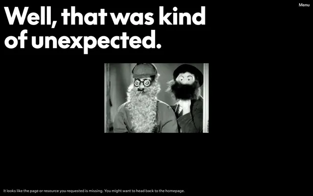
Preview image. Unlock full-res
monochrome cinematic canvas
Color palette
Page backgrounds, prominent text, button borders
Major headings, interactive text (links, buttons), text on black backgrounds
Subtle border elements, secondary text, muted links
Typography
- Weights
- 400
- Sizes
- 17px, 19px
- Line height
- 1.29, 1.37
- Letter spacing
- normal
- Fallback
- Inter
General body text, navigation items, secondary information. Its consistent weight contributes to the system's sense of calm authority.
- Weights
- 400
- Sizes
- 108px
- Line height
- 1
- Letter spacing
- -0.0250em
- Fallback
- Anton
Primary headings and display text. Its large size and tight tracking make a strong, unmissable statement.
- Weights
- 400
- Sizes
- 19px
- Line height
- 1.37
- Letter spacing
- -0.0350em
- Fallback
- Inter
Specific button text, often for interactive elements requiring emphasis without increased weight.
Spacing & shape
Components
Text in Canvas White (#ffffff) on an Obsidian Black (#000000) background, with a 'border' that is essentially the text itself. No padding or border-radius, maintaining a direct, stark appearance. Inherits the base font style for navigation clarity.
A contrasting button with an Obsidian Black (#000000) background and Canvas White (#ffffff) text, featuring a border-radius of 50% to create a distinct circular shape. No explicit padding is defined, relying on text size and shape for visual weight.
Displays text in Ash Gray (#ece8e7) on an Obsidian Black (#000000) background. It uses a base font at sizes like 17px or 19px with default line spacing. This container ensures readability for longer passages while maintaining the monochrome theme.
Guidelines
- Prioritize Obsidian Black (#000000) for backgrounds and main body text to create a high-contrast foundation.
- Use Canvas White (#ffffff) exclusively for primary headings and interactive text on dark backgrounds to ensure maximum prominence.
- Apply the 'black' font at 108px with -0.0250em letter-spacing for all significant hero headlines.
- Utilize Ash Gray (#ece8e7) for all subtle UI text, borders on neutral elements, and secondary content.
- Employ a border-radius of 0px for all non-interactive elements and informational blocks to maintain a sharp, architectural edge.
- Ensure all text (except headings) uses 'untitled' font with 'kern' feature settings for consistent body typography.
- For primary navigation, use link-styled text in Canvas White (#ffffff) on Obsidian Black (#000000) without explicit padding or borders.
- Avoid using highly saturated colors for functional UI elements; color is reserved for content or specific brand applications outside general UI.
- Do not introduce gradients into core UI components; the system relies on flat colors and strong contrast.
- Refrain from using any borders with a radius greater than 0px on cards or section dividers; maintain sharp, defined edges.
- Do not stack multiple shadow layers; the system intentionally avoids depth through elevation for a flat aesthetic.
- Do not deviate from the specified letter-spacing for headlines and button text; precise tracking is key to the typographic identity.
- Avoid mixed alignment or playful spacing; maintain a sense of order and directness through consistent grid-like structures and centered content.
- Do not use font weights other than 400; the system achieves distinctiveness through size and tracking rather than varied weight.
About this system
ShowHide
Marx Design uses a stark, high-contrast visual language with a focus on bold typography and achromatic tones. The design system emphasizes clarity and directness through prominent text elements on a predominantly black background. Visual interest is derived from strong typographic presence and the occasional use of black-and-white imagery, creating an atmosphere that is both authoritative and understated.
The page structure is full-bleed, dominated by a stark Obsidian Black (#000000) background. Content, including the hero section, is centrally aligned. Headings utilize extremely large typography for immediate impact. The design avoids complex grids for content presentation, favoring stacked, centered elements with generous vertical spacing between sections. Navigation is minimal, presented as a 'Menu' link in the top right corner.
This design system primarily utilizes black-and-white photography, often historical or abstract, serving as a decorative and atmospheric element rather than explanatory content. Images are contained within the layout, not full-bleed, and generally appear without rounded corners, maintaining the sharp aesthetic. The imagery density is low, making text the dominant visual element on the page.
Reminiscent of AIGA, Pentagram, Verlet.
# Marx Design — Style Reference
> monochrome cinematic canvas

**Theme:** dark

**Site:** https://marxdesign.co.nz

Marx Design uses a stark, high-contrast visual language with a focus on bold typography and achromatic tones. The design system emphasizes clarity and directness through prominent text elements on a predominantly black background. Visual interest is derived from strong typographic presence and the occasional use of black-and-white imagery, creating an atmosphere that is both authoritative and understated.

## Tokens — Colors

| Name | Value | Token | Role |
|------|------|------|------|
| Obsidian Black | `#000000` | `--color-obsidian-black` | Page backgrounds, prominent text, button borders |
| Canvas White | `#ffffff` | `--color-canvas-white` | Major headings, interactive text (links, buttons), text on black backgrounds |
| Ash Gray | `#ece8e7` | `--color-ash-gray` | Subtle border elements, secondary text, muted links |

## Tokens — Typography

### untitled
- **Substitute:** Inter
- **Weights:** 400
- **Sizes:** 17px, 19px
- **Line height:** 1.29, 1.37
- **Letter spacing:** normal
- **Role:** General body text, navigation items, secondary information. Its consistent weight contributes to the system's sense of calm authority.

### black
- **Substitute:** Anton
- **Weights:** 400
- **Sizes:** 108px
- **Line height:** 1
- **Letter spacing:** -0.0250em
- **Role:** Primary headings and display text. Its large size and tight tracking make a strong, unmissable statement.

### medium
- **Substitute:** Inter
- **Weights:** 400
- **Sizes:** 19px
- **Line height:** 1.37
- **Letter spacing:** -0.0350em
- **Role:** Specific button text, often for interactive elements requiring emphasis without increased weight.

## Tokens — Type Scale

| Role | Size | Line height | Letter spacing |
|------|------|------|------|
| body | 17px | 1.29 | — |
| body-lg | 19px | 1.37 | — |
| display | 108px | 1 | -1.08px |

## Tokens — Spacing

- **Card padding:** 18px
- **Element gap:** 6px

## Tokens — Radius

- **Buttons:** 0px for ghost, 50% for filled
- **Cards:** 0px

## Layout

The page structure is full-bleed, dominated by a stark Obsidian Black (#000000) background. Content, including the hero section, is centrally aligned. Headings utilize extremely large typography for immediate impact. The design avoids complex grids for content presentation, favoring stacked, centered elements with generous vertical spacing between sections. Navigation is minimal, presented as a 'Menu' link in the top right corner.

## Imagery

This design system primarily utilizes black-and-white photography, often historical or abstract, serving as a decorative and atmospheric element rather than explanatory content. Images are contained within the layout, not full-bleed, and generally appear without rounded corners, maintaining the sharp aesthetic. The imagery density is low, making text the dominant visual element on the page.

## Components

### Ghost Navigation Button
*Primary navigation and menu items.*

Text in Canvas White (#ffffff) on an Obsidian Black (#000000) background, with a 'border' that is essentially the text itself. No padding or border-radius, maintaining a direct, stark appearance. Inherits the base font style for navigation clarity.

### Filled Circular Button
*Call to action or prominent interaction.*

A contrasting button with an Obsidian Black (#000000) background and Canvas White (#ffffff) text, featuring a border-radius of 50% to create a distinct circular shape. No explicit padding is defined, relying on text size and shape for visual weight.

### Body Text Container
*Wrapping descriptive content and secondary information.*

Displays text in Ash Gray (#ece8e7) on an Obsidian Black (#000000) background. It uses a base font at sizes like 17px or 19px with default line spacing. This container ensures readability for longer passages while maintaining the monochrome theme.

## Guidelines

### Do

- Prioritize Obsidian Black (#000000) for backgrounds and main body text to create a high-contrast foundation.
- Use Canvas White (#ffffff) exclusively for primary headings and interactive text on dark backgrounds to ensure maximum prominence.
- Apply the 'black' font at 108px with -0.0250em letter-spacing for all significant hero headlines.
- Utilize Ash Gray (#ece8e7) for all subtle UI text, borders on neutral elements, and secondary content.
- Employ a border-radius of 0px for all non-interactive elements and informational blocks to maintain a sharp, architectural edge.
- Ensure all text (except headings) uses 'untitled' font with 'kern' feature settings for consistent body typography.
- For primary navigation, use link-styled text in Canvas White (#ffffff) on Obsidian Black (#000000) without explicit padding or borders.

### Don't

- Avoid using highly saturated colors for functional UI elements; color is reserved for content or specific brand applications outside general UI.
- Do not introduce gradients into core UI components; the system relies on flat colors and strong contrast.
- Refrain from using any borders with a radius greater than 0px on cards or section dividers; maintain sharp, defined edges.
- Do not stack multiple shadow layers; the system intentionally avoids depth through elevation for a flat aesthetic.
- Do not deviate from the specified letter-spacing for headlines and button text; precise tracking is key to the typographic identity.
- Avoid mixed alignment or playful spacing; maintain a sense of order and directness through consistent grid-like structures and centered content.
- Do not use font weights other than 400; the system achieves distinctiveness through size and tracking rather than varied weight.

## Agent Prompt Guide

**Quick Color Reference:**
text: #ffffff
background: #000000
border: #000000
accent: no distinct accent color
primary action: no distinct CTA color

**3-5 Example Component Prompts:**
1. Create a hero section: Obsidian Black (#000000) background. Heading 'black' font, 108px, Canvas White (#ffffff), letter-spacing -0.0250em. Subtext 'untitled' font, 19px, Ash Gray (#ece8e7), normal letter-spacing, line-height 1.37.
2. Create a ghost navigation link: 'untitled' font, 19px, Canvas White (#ffffff), normal letter-spacing, line-height 1.37. No background, no border, no radius. Element should be in the top right of the section.
3. Create a circular interaction button: Obsidian Black (#000000) background. Canvas White (#ffffff) text, 'medium' font, 19px, letter-spacing -0.0350em. Border-radius 50%, no border color initially visible, no padding.
More like this





Keep what you find
A free account saves references to boards and can send you a weekly email of picks based on what you save.
To see every result, go Pro.