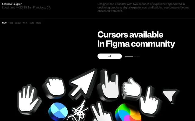
Preview image. Unlock full-res
Midnight Terminal, Razor Sharp
Color palette
Primary background for pages and sections; also serves as input and link text, and borders for ghost buttons. Its pervasive use establishes the site's dark theme
Main text color for headings and body content, providing sharp contrast against the dark backgrounds. Also used sparingly for button backgrounds
Secondary text color for descriptive text and metadata, offering a slightly softer contrast than Canvas White while maintaining readability
Background for interactive elements like input fields and button backgrounds, subtly distinct from the primary page background
Tertiary background color for minor surface variations or less prominent headings, providing a slight elevation from the primary background
Subtle text and critical border outlines, such as dividers and helper text, acting as a visual separator without adding excessive weight
Typography
- Weights
- 1000
- Sizes
- 12px, 14px, 22px, 32px, 64px
- Line height
- 1, 1.06, 1.18, 1.2, 1.6
- Letter spacing
- -0.0400em at 64px, -0.0200em at 32px
- Fallback
- system-ui, sans-serif
Primary display font for prominent headings. Its extra-bold weight (1000) and distinctive variable features create a strong, almost aggressive visual signature for key messages. The tight letter spacing enhances its impact, making the text feel dense and deliberate.
- Weights
- 400
- Sizes
- 22px
- Line height
- 1.18
- Fallback
- Inter, sans-serif
Used for descriptive body text, balancing the intensity of the Raveo Variable headings with a more classic, readable sans-serif. It provides a neutral grounding for longer-form content.
- Weights
- 400
- Sizes
- 14px
- Line height
- 1.2
- Fallback
- system-ui, sans-serif
Utilized for input fields, offering a standard and accessible font choice for user interaction elements.
- Weights
- 400
- Sizes
- 12px
- Line height
- 1.2
- Fallback
- system-ui, sans-serif
Default font for various UI elements like navigation links and small labels. It recedes into the background, allowing the stronger typographic choices to dominate.
Spacing & shape
Components
Text in Canvas White (#ffffff) on Absolute Zero (#000000). Radius of 8px for active states or highlighted items. Uses sans-serif at 12px.
Transparent background with an Absolute Zero (#000000) border. Text color is Absolute Zero (#000000). Full rounded pill shape with a 40px radius. Padding is 40px on left/right for ample touch target.
Filled with Canvas White (#ffffff), text in Absolute Zero (#000000). Half-rounded pill shape with a 28px radius. Padding is 40px on left/right.
Transparent background with barely visible border color of Input Surface (#111111). Placeholder and text color is Input Surface (#111111). No explicit radius, appears square. Uses Arial at 14px.
Implied container on Absolute Zero (#000000) background, with Text Gray (#454545) text. Uses 4px radius as a generic container. Padding of 12px or 16px is common.
Guidelines
- Prioritize Absolute Zero (#000000) as the dominant background color to maintain the dark, high-contrast aesthetic.
- Use Canvas White (#ffffff) for all primary headings and body text to ensure sharp readability against dark backgrounds.
- Apply Raveo Variable with its 1000 weight and specified letter spacing for all major headlines to convey strong visual impact.
- Maintain minimal visual hierarchy for buttons, utilizing ghost or subtly filled variants with large border-radii (28px or 40px).
- Employ Text Gray (#454545) or Hairline Gray (#575757) for secondary information, metadata, or subtle dividers to add nuance without compromising contrast.
- Utilize an 8px radius for interactive link elements and navigation items.
- Ensure generous `elementGap` of 8px and `sectionGap` of 40px to create ample breathing room between content blocks.
- Avoid introducing bright or saturated colors beyond functional accents; the system relies on a monochromatic palette.
- Do not use heavy shadows or multi-layered elevations, as the design philosophy leans towards flat, crisp surfaces.
- Refrain from using lightweight fonts for headings or prominent text; the Raveo Variable 1000 weight is critical for brand recognition.
- Do not deviate from the high-contrast pairing of Canvas White on Absolute Zero for primary content, as it's foundational to the visual identity.
- Avoid complex gradients or patterned backgrounds; keep surfaces clean and solid.
- Do not use generic square buttons or sharply angled corners; button radii should typically be 28px or 40px.
- Do not use Arial outside of input fields; body copy should use Inter Display or a geometric sans-serif substitute.
About this system
ShowHide
Guglieri.com presents itself as a stark, high-contrast digital canvas for showcasing work. Its visual style is predominantly dark, minimal, and typography-driven, with subtle interactive elements. The design prioritizes clear information hierarchy through careful typographic variations and a constrained color palette of intense blacks and whites, accented by strategic use of fine gray lines and text. Components are kept lightweight, focusing on functionality over decoration, creating an immersive, focused browsing experience.
The page operates on a full-bleed model with content centered within implicit vertical divisions, rather than a fixed `pageMaxWidth`. The hero section is full-bleed black with a large, centered Raveo Variable headline and a prominent 3D graphic. Sections are demarcated by consistent vertical spacing, creating distinct information blocks without hard dividers. Content often appears in split layouts with text on one side and a supporting visual element or negative space on the other. A notable pattern is a centered, compact stack for contact information and navigation elements. The overall density is spacious between sections but compact within text blocks. Navigation is a simple, horizontal text menu embedded in the header.
This site uses highly polished 3D rendered graphics of UI elements, specifically computer cursors and app icons, as its primary visual identity. These are tightly cropped, appear against the 'Absolute Zero' background, and utilize subtle reflections and metallic sheens to add depth. Photography is used sparingly, primarily in contextual background shots that are desaturated (grayscale) and serve as atmospheric backdrops rather than focal points. Icons are not emphasized, but when present, they appear as outlined or filled vectors, maintaining UI clarity. The density is text-dominant in informational sections, with hero imagery dominating visual space to showcase core work.
Reminiscent of Bjango, Linear, Figma, Relume Library.
# Guglieri — Style Reference
> Midnight Terminal, Razor Sharp

**Theme:** dark

**Site:** https://guglieri.com

Guglieri.com presents itself as a stark, high-contrast digital canvas for showcasing work. Its visual style is predominantly dark, minimal, and typography-driven, with subtle interactive elements. The design prioritizes clear information hierarchy through careful typographic variations and a constrained color palette of intense blacks and whites, accented by strategic use of fine gray lines and text. Components are kept lightweight, focusing on functionality over decoration, creating an immersive, focused browsing experience.

## Tokens — Colors

| Name | Value | Token | Role |
|------|------|------|------|
| Absolute Zero | `#000000` | `--color-absolute-zero` | Primary background for pages and sections; also serves as input and link text, and borders for ghost buttons. Its pervasive use establishes the site's dark theme |
| Canvas White | `#ffffff` | `--color-canvas-white` | Main text color for headings and body content, providing sharp contrast against the dark backgrounds. Also used sparingly for button backgrounds |
| Text Gray | `#454545` | `--color-text-gray` | Secondary text color for descriptive text and metadata, offering a slightly softer contrast than Canvas White while maintaining readability |
| Input Surface | `#111111` | `--color-input-surface` | Background for interactive elements like input fields and button backgrounds, subtly distinct from the primary page background |
| Subtle Surface | `#1c1c1c` | `--color-subtle-surface` | Tertiary background color for minor surface variations or less prominent headings, providing a slight elevation from the primary background |
| Hairline Gray | `#575757` | `--color-hairline-gray` | Subtle text and critical border outlines, such as dividers and helper text, acting as a visual separator without adding excessive weight |

## Tokens — Typography

### Raveo Variable
- **Substitute:** system-ui, sans-serif
- **Weights:** 1000
- **Sizes:** 12px, 14px, 22px, 32px, 64px
- **Line height:** 1, 1.06, 1.18, 1.2, 1.6
- **Letter spacing:** -0.0400em at 64px, -0.0200em at 32px
- **Role:** Primary display font for prominent headings. Its extra-bold weight (1000) and distinctive variable features create a strong, almost aggressive visual signature for key messages. The tight letter spacing enhances its impact, making the text feel dense and deliberate.

### Inter Display
- **Substitute:** Inter, sans-serif
- **Weights:** 400
- **Sizes:** 22px
- **Line height:** 1.18
- **Role:** Used for descriptive body text, balancing the intensity of the Raveo Variable headings with a more classic, readable sans-serif. It provides a neutral grounding for longer-form content.

### Arial
- **Substitute:** system-ui, sans-serif
- **Weights:** 400
- **Sizes:** 14px
- **Line height:** 1.2
- **Role:** Utilized for input fields, offering a standard and accessible font choice for user interaction elements.

### sans-serif
- **Substitute:** system-ui, sans-serif
- **Weights:** 400
- **Sizes:** 12px
- **Line height:** 1.2
- **Role:** Default font for various UI elements like navigation links and small labels. It recedes into the background, allowing the stronger typographic choices to dominate.

## Tokens — Type Scale

Perfect Fifth (1.5) from 22px base.

| Role | Size | Line height | Letter spacing |
|------|------|------|------|
| caption | 12px | 1.2 | — |
| body-sm | 14px | 1.2 | — |
| body | 22px | 1.18 | — |
| subheading | 32px | 1.2 | -0.64px |
| heading | 64px | 1 | -2.56px |

## Tokens — Spacing

- **Section gap:** 40px
- **Card padding:** 40px
- **Element gap:** 8px

## Tokens — Radius

- **Buttons:** 28px
- **links:** 8px
- **other-ui-elements:** 4px
- **pill-like-elements:** 40px

## Layout

The page operates on a full-bleed model with content centered within implicit vertical divisions, rather than a fixed `pageMaxWidth`. The hero section is full-bleed black with a large, centered Raveo Variable headline and a prominent 3D graphic. Sections are demarcated by consistent vertical spacing, creating distinct information blocks without hard dividers. Content often appears in split layouts with text on one side and a supporting visual element or negative space on the other. A notable pattern is a centered, compact stack for contact information and navigation elements. The overall density is spacious between sections but compact within text blocks. Navigation is a simple, horizontal text menu embedded in the header.

## Imagery

This site uses highly polished 3D rendered graphics of UI elements, specifically computer cursors and app icons, as its primary visual identity. These are tightly cropped, appear against the 'Absolute Zero' background, and utilize subtle reflections and metallic sheens to add depth. Photography is used sparingly, primarily in contextual background shots that are desaturated (grayscale) and serve as atmospheric backdrops rather than focal points. Icons are not emphasized, but when present, they appear as outlined or filled vectors, maintaining UI clarity. The density is text-dominant in informational sections, with hero imagery dominating visual space to showcase core work.

## Components

### Navigation Link
*Simple text link*

Text in Canvas White (#ffffff) on Absolute Zero (#000000). Radius of 8px for active states or highlighted items. Uses sans-serif at 12px.

### Primary Ghost Button
*Actionable button with minimal visual hierarchy*

Transparent background with an Absolute Zero (#000000) border. Text color is Absolute Zero (#000000). Full rounded pill shape with a 40px radius. Padding is 40px on left/right for ample touch target.

### Secondary Filled Button
*Actionable button with subtle fill*

Filled with Canvas White (#ffffff), text in Absolute Zero (#000000). Half-rounded pill shape with a 28px radius. Padding is 40px on left/right.

### Minimal Input Field
*Form input field*

Transparent background with barely visible border color of Input Surface (#111111). Placeholder and text color is Input Surface (#111111). No explicit radius, appears square. Uses Arial at 14px.

### Description Card
*Container for secondary information*

Implied container on Absolute Zero (#000000) background, with Text Gray (#454545) text. Uses 4px radius as a generic container. Padding of 12px or 16px is common.

## Guidelines

### Do

- Prioritize Absolute Zero (#000000) as the dominant background color to maintain the dark, high-contrast aesthetic.
- Use Canvas White (#ffffff) for all primary headings and body text to ensure sharp readability against dark backgrounds.
- Apply Raveo Variable with its 1000 weight and specified letter spacing for all major headlines to convey strong visual impact.
- Maintain minimal visual hierarchy for buttons, utilizing ghost or subtly filled variants with large border-radii (28px or 40px).
- Employ Text Gray (#454545) or Hairline Gray (#575757) for secondary information, metadata, or subtle dividers to add nuance without compromising contrast.
- Utilize an 8px radius for interactive link elements and navigation items.
- Ensure generous `elementGap` of 8px and `sectionGap` of 40px to create ample breathing room between content blocks.

### Don't

- Avoid introducing bright or saturated colors beyond functional accents; the system relies on a monochromatic palette.
- Do not use heavy shadows or multi-layered elevations, as the design philosophy leans towards flat, crisp surfaces.
- Refrain from using lightweight fonts for headings or prominent text; the Raveo Variable 1000 weight is critical for brand recognition.
- Do not deviate from the high-contrast pairing of Canvas White on Absolute Zero for primary content, as it's foundational to the visual identity.
- Avoid complex gradients or patterned backgrounds; keep surfaces clean and solid.
- Do not use generic square buttons or sharply angled corners; button radii should typically be 28px or 40px.
- Do not use Arial outside of input fields; body copy should use Inter Display or a geometric sans-serif substitute.

## Agent Prompt Guide

### Quick Color Reference
- text: #ffffff
- background: #000000
- border: #000000
- accent: no distinct accent color
- primary action: no distinct CTA color

### 3-5 Example Component Prompts
- Create a hero section: Absolute Zero (#000000) background. Headline 'Product Designer' using Raveo Variable, 64px, weight 1000, Canvas White (#ffffff) with letter-spacing -2.56px. Below it, a ghost button 'View Work': transparent background, Absolute Zero (#000000) border, Canvas White (#ffffff) text, 40px radius, 40px horizontal padding, sans-serif 12px.
- Create a navigation bar: Absolute Zero (#000000) background. Links 'About', 'Work', 'Contact' using sans-serif, 12px, Canvas White (#ffffff) text, 8px radius on active states. Element gap 8px between items.
- Create a contact form: Input Surface (#111111) text input fields with a 1px Input Surface (#111111) border, no radius. Placeholder Arial 14px Input Surface (#111111). A "Submit" button, filled with Canvas White (#ffffff), text Absolute Zero (#000000), 28px radius, 40px horizontal padding, Arial 14px.
More like this





Keep what you find
A free account saves references to boards and can send you a weekly email of picks based on what you save.
To see every result, go Pro.