Preview image. Unlock full-res
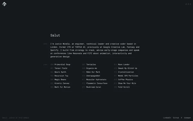
midnight command center behind frosted glass
Color palette
Page background, primary surface
Main body text, headings, general UI text, active links. This cool light gray offers strong contrast against the dark background
Decorative text highlights within code-like listings, often representing active states or key items
Used for subtle borders and visual separation in a dark UI environment
Typography
- Weights
- 300
- Sizes
- 10px, 12px, 13px, 14px, 16px, 24px
- Line height
- 1, 1.7, 2, 2.15
- Letter spacing
- 0.1500em
- Fallback
- monospace
Primary typeface for all UI elements, body text, headings, and lists. Its fixed-width nature reinforces the 'developer console' aesthetic and ensures consistent alignment.
- Weights
- 400
- Sizes
- 16px
- Line height
- 1
Times — detected in extracted data but not described by AI
Spacing & shape
Components
Invisible cards with no background, border, shadow, or padding, effectively acting as logical groupings without visual separation. Used for content blocks like the 'about' section and 'labs' list items.
Inline text link for navigation, uses Primary Text (#e2e6e8) by default and Code Block Highlight (#ffffff) for active or hovered states. No underlines or background fills, relying solely on text color for interaction feedback.
Text link in the footer, rendered in Primary Text (#e2e6e8). Similar to navigation links but within the footer context, implying external resource access.
Each item in the 'Labs' list is a distinct block, potentially interactive. Displays numbers and titles in Primary Text (#e2e6e8).
Guidelines
- Use Console Background (#16191b) as the base for all page backgrounds and primary surfaces.
- Apply Roboto Mono with 0.1500em letter-spacing for all textual content to maintain the code-like aesthetic.
- Ensure all primary text (headings, body, interactive elements) uses Primary Text (#e2e6e8) for high contrast and readability.
- Leverage Code Block Highlight (#ffffff) exclusively for subtle emphasis or active states on textual elements within lists or code contexts.
- Maintain a clear visual hierarchy through variations in Roboto Mono font sizes and the strategic employment of Primary Text (#e2e6e8) vs. the darker background.
- Employ minimal visual adornments, relying on precise typography and spacing to structure content rather than heavy borders or backgrounds.
- Use 166px for section gaps and 8px for inter-element spacing to establish a consistent, compact rhythm.
- Do not introduce any saturated colors; the palette is strictly monochromatic and cool-toned.
- Avoid decorative borders, shadows, or background fills on any cards or content blocks unless explicitly defining an active state with text color.
- Do not use generic system fonts; Roboto Mono is central to the brand's identity.
- Do not deviate from the established letter-spacing of 0.1500em for Roboto Mono; it is a signature characteristic.
- Refrain from using varied timing functions or complex transitions; stick to ease and opacity changes for motion.
- Do not use heavy, display-style headings; maintain a light, technical feel even for titles.
- Do not exceed a page width; the content should be left-aligned within the full-bleed canvas.
About this system
ShowHide
Soulwire adopts a 'digital console' aesthetic, using a dark, monochromatic canvas as a backdrop for highly legible fixed-width typography. Information is presented with a developer-centric precision, featuring sparse layout and a muted, almost clinical color palette. The system emphasizes clear textual hierarchy and functional, unadorned elements, where interactions are highlighted by subtle shifts in text color rather than heavy graphic adornments.
The page employs a full-bleed dark canvas with content largely contained within a left-aligned, unbounded width flow. The hero section introduces the main 'Salut' text, followed by an 'about' section and a 'labs' section, all arranged linearly. Vertical spacing is critical, using a large 166px section gap. Individual content elements are tightly packed, with an 8px element gap. Navigation is minimal, limited to a small header logomark and footer links, all integrated purely as text. There is no grid system for content; everything stacks vertically, creating a continuous, compact flow of information.
This site uses no imagery, illustrations, or graphics beyond its subtly stylized logomark. The visual system is entirely text-dominant, relying on typographic presentation and stark empty space to convey its aesthetic. Icons are minimal, represented by character symbols or single-color SVGs that integrate seamlessly with the text. No photography or graphic elements are present to distract from the code-like interface.
Reminiscent of Vercel, Linear, Stripe (developer docs), GitHub (dark mode UI).
# Soulwire — Style Reference
> midnight command center behind frosted glass

**Theme:** dark

**Site:** https://soulwire.co.uk

Soulwire adopts a 'digital console' aesthetic, using a dark, monochromatic canvas as a backdrop for highly legible fixed-width typography. Information is presented with a developer-centric precision, featuring sparse layout and a muted, almost clinical color palette. The system emphasizes clear textual hierarchy and functional, unadorned elements, where interactions are highlighted by subtle shifts in text color rather than heavy graphic adornments.

## Tokens — Colors

| Name | Value | Token | Role |
|------|------|------|------|
| Console Background | `#16191b` | `--color-console-background` | Page background, primary surface |
| Primary Text | `#e2e6e8` | `--color-primary-text` | Main body text, headings, general UI text, active links. This cool light gray offers strong contrast against the dark background |
| Code Block Highlight | `#ffffff` | `--color-code-block-highlight` | Decorative text highlights within code-like listings, often representing active states or key items |
| Divider & Boundary | `#000000` | `--color-divider-boundary` | Used for subtle borders and visual separation in a dark UI environment |

## Tokens — Typography

### Roboto Mono
- **Substitute:** monospace
- **Weights:** 300
- **Sizes:** 10px, 12px, 13px, 14px, 16px, 24px
- **Line height:** 1, 1.7, 2, 2.15
- **Letter spacing:** 0.1500em
- **Role:** Primary typeface for all UI elements, body text, headings, and lists. Its fixed-width nature reinforces the 'developer console' aesthetic and ensures consistent alignment.

### Times
- **Weights:** 400
- **Sizes:** 16px
- **Line height:** 1
- **Role:** Times — detected in extracted data but not described by AI

## Tokens — Type Scale

Minor Third (1.2) from 13px base.

| Role | Size | Line height | Letter spacing |
|------|------|------|------|
| caption | 10px | 2 | — |
| body-sm | 12px | 2 | — |
| body | 13px | 2 | — |
| body-lg | 14px | 2 | — |
| heading-sm | 16px | 2 | — |
| heading | 24px | 1.3 | — |

## Tokens — Spacing

- **Section gap:** 166px
- **Card padding:** 0px
- **Element gap:** 8px

## Tokens — Radius

- **none:** 0px

## Layout

The page employs a full-bleed dark canvas with content largely contained within a left-aligned, unbounded width flow. The hero section introduces the main 'Salut' text, followed by an 'about' section and a 'labs' section, all arranged linearly. Vertical spacing is critical, using a large 166px section gap. Individual content elements are tightly packed, with an 8px element gap. Navigation is minimal, limited to a small header logomark and footer links, all integrated purely as text. There is no grid system for content; everything stacks vertically, creating a continuous, compact flow of information.

## Imagery

This site uses no imagery, illustrations, or graphics beyond its subtly stylized logomark. The visual system is entirely text-dominant, relying on typographic presentation and stark empty space to convey its aesthetic. Icons are minimal, represented by character symbols or single-color SVGs that integrate seamlessly with the text. No photography or graphic elements are present to distract from the code-like interface.

## Components

### Minimal Card
*Container*

Invisible cards with no background, border, shadow, or padding, effectively acting as logical groupings without visual separation. Used for content blocks like the 'about' section and 'labs' list items.

### Navigation Link
*Interactive Element*

Inline text link for navigation, uses Primary Text (#e2e6e8) by default and Code Block Highlight (#ffffff) for active or hovered states. No underlines or background fills, relying solely on text color for interaction feedback.

### Footer Social Link
*Interactive Element*

Text link in the footer, rendered in Primary Text (#e2e6e8). Similar to navigation links but within the footer context, implying external resource access.

### Listing Item
*Content Display*

Each item in the 'Labs' list is a distinct block, potentially interactive. Displays numbers and titles in Primary Text (#e2e6e8).

## Guidelines

### Do

- Use Console Background (#16191b) as the base for all page backgrounds and primary surfaces.
- Apply Roboto Mono with 0.1500em letter-spacing for all textual content to maintain the code-like aesthetic.
- Ensure all primary text (headings, body, interactive elements) uses Primary Text (#e2e6e8) for high contrast and readability.
- Leverage Code Block Highlight (#ffffff) exclusively for subtle emphasis or active states on textual elements within lists or code contexts.
- Maintain a clear visual hierarchy through variations in Roboto Mono font sizes and the strategic employment of Primary Text (#e2e6e8) vs. the darker background.
- Employ minimal visual adornments, relying on precise typography and spacing to structure content rather than heavy borders or backgrounds.
- Use 166px for section gaps and 8px for inter-element spacing to establish a consistent, compact rhythm.

### Don't

- Do not introduce any saturated colors; the palette is strictly monochromatic and cool-toned.
- Avoid decorative borders, shadows, or background fills on any cards or content blocks unless explicitly defining an active state with text color.
- Do not use generic system fonts; Roboto Mono is central to the brand's identity.
- Do not deviate from the established letter-spacing of 0.1500em for Roboto Mono; it is a signature characteristic.
- Refrain from using varied timing functions or complex transitions; stick to ease and opacity changes for motion.
- Do not use heavy, display-style headings; maintain a light, technical feel even for titles.
- Do not exceed a page width; the content should be left-aligned within the full-bleed canvas.

## Agent Prompt Guide

Quick Color Reference:
text: #e2e6e8
background: #16191b
border: #000000
accent: #e2e6e8 (for active text)
primary action: no distinct CTA color

Example Component Prompts:
Create a header bar: Console Background (#16191b) background, with a brand logomark and navigation links using Primary Text (#e2e6e8) at Roboto Mono 16px, 0.1500em letter-spacing.
Create an 'About' section: Starts with 'Info' heading in Primary Text (#e2e6e8), Roboto Mono 16px, 0.1500em letter-spacing. Follow with body text in Primary Text (#e2e6e8), Roboto Mono 13px, 0.1500em letter-spacing, line-height 2.0, arranged in a simple block.
Create a 'Labs' list item: Start with a numerically prefixed title, using Primary Text (#e2e6e8), Roboto Mono 13px, 0.1500em letter-spacing, line-height 2.0. On hover, change text color to Code Block Highlight (#ffffff).
Create a footer with social links: Console Background (#16191b) background. Links use Primary Text (#e2e6e8), Roboto Mono 12px, 0.1500em letter-spacing, line-height 1.7, spaced with 16px horizontal margins.
More like this





Keep what you find
A free account saves references to boards and can send you a weekly email of picks based on what you save.
To see every result, go Pro.