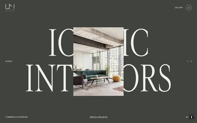
Preview image. Unlock full-res
Gallery backdrop with monumental typography
Color palette
Page background, primary content surface. This dark, desaturated gray provides a deep, sophisticated stage for the content
Background for secondary content blocks and occasional text elements, providing a subtle contrast against the primary canvas
Primary text color for headlines and body copy, borders for ghost buttons, navigation items when active, and icon fills
Used for specific text elements, icon borders, and occasionally as a very dark background to create maximum contrast. Offers a grounding visual weight
Exclusive background for certain interactive elements, suggesting a distinct, albeit minimal, state differentiation
Typography
- Weights
- 400
- Sizes
- 12px, 13px, 14px, 20px, 23px, 30px, 75px, 93px, 185px
- Line height
- 0.8, 1
- Letter spacing
- normal
- Fallback
- Inter
Extensive use across all text roles from body to secondary headings. Its versatility and minimalist structure provide a contemporary counterpoint to the display serif.
- Weights
- 400
- Sizes
- 260px
- Line height
- 1
- Letter spacing
- normal
- Fallback
- Playfair Display
Primary display font for colossal, impactful headlines. Its serif elegance is central to the brand's sophisticated aesthetic.
- Weights
- 500
- Sizes
- 14px
- Line height
- 1.14
- Letter spacing
- -0.004
- Fallback
- Open Sans
Used sparingly for subtle text accents and helper text, its slightly wider tracking lends a distinct modern touch.
- Weights
- 400
- Sizes
- 13px
- Line height
- 1.2
Arial — detected in extracted data but not described by AI
- Weights
- 400
- Sizes
- 16px
- Line height
- 1.2
Times — detected in extracted data but not described by AI
Spacing & shape
Components
Transparent background button with a 50% border radius creating a circular shape. Border and text color are #eeeeee. Padding is minimal (0px padding), creating a compact, unobtrusive control.
Solid background button with a 50% border radius creating a circular shape. Background is #050505, text color is #000000. Padding is minimal (0px padding), used for high-contrast, functionally distinct controls.
Transparent background button with 0px border radius, forming a sharp rectangular shape. Border and text color are #eeeeee. Minimal (0px) padding, used for 'View all projects' links.
Text link using Lausanne-300 font at 14px, #eeeeee. These links are part of the header navigation, with generous right padding (130px) for spatial separation.
Guidelines
- Use Greyscale Canvas (#41443e) as the dominant background color for most page sections.
- Typography should prioritize cardinalfruit-regular for large, impactful headlines, leveraging its unique serif character.
- Implement Ghost Circular Buttons (#eeeeee border/text) for subtle, interactive controls like menu toggles.
- Maintain a spacious density, with section gaps of 89px to ensure breathing room between content blocks.
- Ensure all text, borders, and icons on Greyscale Canvas backgrounds use Text and Accent Light (#eeeeee) for visibility.
- For oversized display text, use Lausanne-300 at 185px with a line height of 0.8.
- Apply 39px horizontal padding for contained content elements, complementing the spacious layout.
- Avoid using highly saturated colors; maintain a largely achromatic palette apart from imagery.
- Do not introduce sharp, angular strokes or imagery against the soft, serif typography without a clear design rationale.
- Do not clutter the layout with dense information blocks; prioritize spaciousness and dramatic visual pauses.
- Avoid generic sans-serif fonts for primary headlines; the distinct serif is key to brand identity.
- Do not deviate from circular or sharp rectangular shapes for buttons; avoid rounded corner treatments.
- Do not use box shadows for elevation; rely on color contrast and spatial separation to differentiate elements.
- Do not use dark text (Midnight Ink) on Greyscale Canvas (#41443e); it lacks sufficient contrast.
About this system
ShowHide
Liron Moran Interiors employs a bold, architectural visual style, characterized by a dominant dark canvas that creates a sophisticated, gallery-like setting for minimalist UI elements. Overlaid huge serif typography with transparent image cutouts defines an immersive and dramatic presentation. The sparse use of neutral colors and ample whitespace around oversized elements contributes to a feeling of premium, considered design where content is paramount and UI recedes until interaction.
Reminiscent of Norm Architects, B&B Italia, Artemide, Dezeen.
# Liron Moran Interiors — Style Reference
> Gallery backdrop with monumental typography

**Theme:** dark

**Site:** https://www.lironmoran-interiors.com

Liron Moran Interiors employs a bold, architectural visual style, characterized by a dominant dark canvas that creates a sophisticated, gallery-like setting for minimalist UI elements. Overlaid huge serif typography with transparent image cutouts defines an immersive and dramatic presentation. The sparse use of neutral colors and ample whitespace around oversized elements contributes to a feeling of premium, considered design where content is paramount and UI recedes until interaction.

## Tokens — Colors

| Name | Value | Token | Role |
|------|------|------|------|
| Greyscale Canvas | `#41443e` | `--color-greyscale-canvas` | Page background, primary content surface. This dark, desaturated gray provides a deep, sophisticated stage for the content |
| Overlaid Paper | `#f2f0ed` | `--color-overlaid-paper` | Background for secondary content blocks and occasional text elements, providing a subtle contrast against the primary canvas |
| Text and Accent Light | `#eeeeee` | `--color-text-and-accent-light` | Primary text color for headlines and body copy, borders for ghost buttons, navigation items when active, and icon fills |
| Midnight Ink | `#000000` | `--color-midnight-ink` | Used for specific text elements, icon borders, and occasionally as a very dark background to create maximum contrast. Offers a grounding visual weight |
| Deepest Black | `#050505` | `--color-deepest-black` | Exclusive background for certain interactive elements, suggesting a distinct, albeit minimal, state differentiation |

## Tokens — Typography

### Lausanne-300
- **Substitute:** Inter
- **Weights:** 400
- **Sizes:** 12px, 13px, 14px, 20px, 23px, 30px, 75px, 93px, 185px
- **Line height:** 0.8, 1
- **Letter spacing:** normal
- **Role:** Extensive use across all text roles from body to secondary headings. Its versatility and minimalist structure provide a contemporary counterpoint to the display serif.

### cardinalfruit-regular
- **Substitute:** Playfair Display
- **Weights:** 400
- **Sizes:** 260px
- **Line height:** 1
- **Letter spacing:** normal
- **Role:** Primary display font for colossal, impactful headlines. Its serif elegance is central to the brand's sophisticated aesthetic.

### Metropolis
- **Substitute:** Open Sans
- **Weights:** 500
- **Sizes:** 14px
- **Line height:** 1.14
- **Letter spacing:** -0.004
- **Role:** Used sparingly for subtle text accents and helper text, its slightly wider tracking lends a distinct modern touch.

### Arial
- **Weights:** 400
- **Sizes:** 13px
- **Line height:** 1.2
- **Role:** Arial — detected in extracted data but not described by AI

### Times
- **Weights:** 400
- **Sizes:** 16px
- **Line height:** 1.2
- **Role:** Times — detected in extracted data but not described by AI

## Tokens — Type Scale

Perfect Fifth (1.5) from 14px base.

| Role | Size | Line height | Letter spacing |
|------|------|------|------|
| caption | 12px | 0.8 | — |
| body | 14px | 0.8 | -0.004em |
| subheading | 20px | 0.8 | — |
| heading-sm | 23px | 0.8 | — |
| heading | 30px | 0.8 | — |
| heading-lg | 75px | 0.8 | — |
| display-xl | 93px | 0.8 | — |
| display-xxl | 185px | 0.8 | — |
| display-max | 260px | 1 | — |

## Tokens — Spacing

- **Section gap:** 89px
- **Element gap:** 5px

## Tokens — Radius

- **Buttons:** 50%
- **navigation:** 0px

## Components

### Ghost Circular Button
*Interactive element (e.g., menu toggle, accessibility toggle)*

Transparent background button with a 50% border radius creating a circular shape. Border and text color are #eeeeee. Padding is minimal (0px padding), creating a compact, unobtrusive control.

### Dark Circular Button
*Interactive element (e.g., close button on overlay)*

Solid background button with a 50% border radius creating a circular shape. Background is #050505, text color is #000000. Padding is minimal (0px padding), used for high-contrast, functionally distinct controls.

### Ghost Rectangular Button
*Text link or secondary action*

Transparent background button with 0px border radius, forming a sharp rectangular shape. Border and text color are #eeeeee. Minimal (0px) padding, used for 'View all projects' links.

### Main Navigation Link
*Top-level navigation items*

Text link using Lausanne-300 font at 14px, #eeeeee. These links are part of the header navigation, with generous right padding (130px) for spatial separation.

## Guidelines

### Do

- Use Greyscale Canvas (#41443e) as the dominant background color for most page sections.
- Typography should prioritize cardinalfruit-regular for large, impactful headlines, leveraging its unique serif character.
- Implement Ghost Circular Buttons (#eeeeee border/text) for subtle, interactive controls like menu toggles.
- Maintain a spacious density, with section gaps of 89px to ensure breathing room between content blocks.
- Ensure all text, borders, and icons on Greyscale Canvas backgrounds use Text and Accent Light (#eeeeee) for visibility.
- For oversized display text, use Lausanne-300 at 185px with a line height of 0.8.
- Apply 39px horizontal padding for contained content elements, complementing the spacious layout.

### Don't

- Avoid using highly saturated colors; maintain a largely achromatic palette apart from imagery.
- Do not introduce sharp, angular strokes or imagery against the soft, serif typography without a clear design rationale.
- Do not clutter the layout with dense information blocks; prioritize spaciousness and dramatic visual pauses.
- Avoid generic sans-serif fonts for primary headlines; the distinct serif is key to brand identity.
- Do not deviate from circular or sharp rectangular shapes for buttons; avoid rounded corner treatments.
- Do not use box shadows for elevation; rely on color contrast and spatial separation to differentiate elements.
- Do not use dark text (Midnight Ink) on Greyscale Canvas (#41443e); it lacks sufficient contrast.

## Agent Prompt Guide

Quick Color Reference:
text: #eeeeee
background: #41443e
border: #eeeeee
accent: no distinct accent color
primary action: no distinct CTA color

Example Component Prompts:
Create a hero section with a Greyscale Canvas background (#41443e). Headline 'ICONIC' in cardinalfruit-regular, 260px, #eeeeee, line height 1.0. The word 'INTERIORS' is a separate headline, same style. Center a product image as a cutout behind the headlines. Add a 'SCROLL' label using Lausanne-300, 14px, #eeeeee, aligned to the left of the main content area.

Create a ghost circular button: background transparent, border 1px solid #eeeeee, border-radius 50%, text 'MENU' in Lausanne-300, 14px, #eeeeee, 0px padding. Place it top right.

Create a 'View All Projects' link: background transparent, border 1px solid #eeeeee, border-radius 0px, text 'VIEW ALL PROJECTS' in Lausanne-300, 14px, #eeeeee, 0px padding. Align it bottom center.

Create a basic body text paragraph: Use Lausanne-300, 14px, #eeeeee, line height 0.8. Ensure left and right padding of 39px.
More like this





Keep what you find
A free account saves references to boards and can send you a weekly email of picks based on what you save.
To see every result, go Pro.