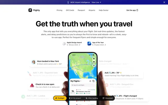
Preview image. Unlock full-res
Inky depths over clear white
Color palette
Primary Call-to-action buttons, interactive elements
Yellow action color for filled buttons, selected navigation states, and focused conversion moments
Background for feature sections, creating a dynamic visual anchor
Dramatic background for feature sections, evoking a celestial feel
Text color in specific headings and decorative borders, hinting at a purple brand identity
Green outline accent for tags, dividers, and focused UI edges
Red outline accent for tags, dividers, and focused UI edges. Use as a supporting accent, not as a status color
Primary page background, elevated card surfaces, primary text on dark backgrounds
Primary text, borders, icons. Used for text on light backgrounds and as a background for certain UI elements
Dark primary background for specific sections and cards
Dark card and section backgrounds, creating a clear contrast with light content
Secondary body text and subtle borders on light backgrounds
Tertiary text, less prominent details, borders
Typography
- Weights
- 400
- Sizes
- 12px
- Line height
- 1.2
- Letter spacing
- normal
- Fallback
- Arial
System fallback or small utility text, ensuring basic readability for peripheral information.
- Weights
- 400, 500, 600, 700
- Sizes
- 13px, 15px, 16px, 17px, 22px, 32px, 56px
- Line height
- 1, 1.1, 1.2, 1.38, 1.5, 2
- Letter spacing
- -1.4px at 56px, -0.66px at 32px, -0.32px at 22px, -0.16px at 17px, -0.06px at 15px
- Fallback
- Inter
Primary UI font for headings, body text, and navigation. Its compact tracking at larger sizes gives a precise, technical feel, avoiding an overly spacious or decorative aesthetic. Prioritizes readability and information density.
- Weights
- 700
- Sizes
- 24px
- Line height
- 0.9
- Letter spacing
- -0.48px
- Fallback
- Playfair Display
Decorative heading font, used sparingly for quotes or special callouts. Its serif style and tight spacing against the primary sans-serif creates a sophisticated, editorial contrast.
- Weights
- 400
- Sizes
- 13px, 15px
- Line height
- 1.2, 1.5
- Letter spacing
- normal
- Fallback
- Inter
Specialized body text, likely for app-specific contexts or where native iOS typography is intended to be replicated. Its weight variation (Regular and Semibold) suggests a functional hierarchy within compact text blocks.
- Weights
- 400
- Sizes
- 16px
- Line height
- 1.2
- Letter spacing
- normal
- Fallback
- Inter
General body text. A robust choice for readable paragraph content.
- Weights
- 400
- Sizes
- 16px
- Line height
- 1.2
Indie Flower — detected in extracted data but not described by AI
Spacing & shape
Elevation
Components
Background: #007bff (Ocean Blue), Text: #ffffff (Canvas White), Radius: 50px, Padding: 12px vertical, 20px horizontal.
Background: transparent, Text: #000000 (Midnight Ink), Border: 1px solid #000000 (Midnight Ink), Radius: 40px, Padding: 12px vertical, 18px horizontal. Hover/active states are implied to change background to a subtle fill for visibility.
Background: #ffffff (Canvas White), Border Radius: 12px, Shadow: rgba(0, 0, 0, 0.04) 0px 0px 0px 1px, rgba(0, 0, 0, 0.02) 0px 1px 1px 0.5px, ..., rgba(0, 0, 0, 0.02) 0px 24px 24px -12px. Internal padding is not consistently applied, implying content governs spacing.
Background: #faf8f7 (Canvas White), Border Radius: 20px, No explicit shadow (elevation is minimal for this variant). Designed for a cleaner, slightly softer appearance.
Background: rgba(255, 255, 255, 0.05), Border Radius: 8px, No explicit shadow. Text content inside this card would be Canvas White. Padding: 20px.
Background: rgba(0, 0, 0, 0.02), Border Radius: 20px, No explicit shadow. Padding: 32px vertical, 40px horizontal.
Background: #f7be00 (Goldenrod) for active state or #000000 (Midnight Ink) for inactive, Text: #ffffff (Canvas White) or #000000 (Midnight Ink), Radius: 999px (full pill shape), Padding is variable but generally compact.
Background: linear-gradient(171deg, rgb(97, 97, 112) -45%, rgb(18, 18, 140) 69%), Text: #ffffff (Canvas White). Used for notifications like 'NEW! Airport Intelligence'.
Guidelines
- Use `Canvas White` #ffffff as the default page and card background, reserving `Deep Space` #05010d or `Abyssal Black` #010a1a for intentional dark sections or contrast.
- Apply `Midnight Ink` #000000 for all primary text and clear borders on light backgrounds, ensuring high contrast and precise visual definition.
- Utilize `system-ui` for all body and heading typography, carefully applying the detected letter-spacing values like `-1.4px` at `56px` to maintain a compact, precise appearance.
- Employ `Ocean Blue` #007bff for primary action button backgrounds, ensuring it stands out as the main interactive element.
- Implement soft, layered shadows on `Standard Cards` using `rgba(0,0,0,0.04) 0px 0px 0px 1px, ...` to create subtle depth without heavy visual weight.
- Round corners with `40px` for buttons and `12px` for cards, and `999px` for pill-shaped elements to maintain a consistent friendly yet precise aesthetic.
- Use `Goldenrod` #f7be00 sparingly as an accent for active navigation states or important links, contrasting with the dominant neutrals.
- Avoid using harsh, opaque drop shadows; instead, prefer the subtle, layered shadow style for `:hover` or active states to maintain visual lightness.
- Do not deviate from the specified tight letter-spacing for `system-ui` headings; generic 'normal' spacing will compromise the intended precise aesthetic.
- Do not use `Ocean Blue` #007bff for anything other than primary actions; its impact is diminished if overused for decorative purposes.
- Avoid large, uncontained images; all imagery should either be contained within cards with `12px` or `20px` radii or serve as full-bleed background elements for distinct sections.
- Do not introduce new color gradients; adhere to `Twilight Gradient` and `Nebula Gradient` for specific feature sections only.
- Refrain from using bulky or heavily outlined components; the system favors lightweight surfaces and subtle borders.
- Do not stretch content beyond the inherent `compact` density; allow for appropriate `10px` element gaps and `20px` card padding, but avoid overly spacious layouts.
About this system
ShowHide
Flighty's design system evokes a sense of technical precision and clarity, balancing a stark white canvas with deep, almost inky, dark surfaces. Typography is compact and precise, utilizing system fonts to create a direct and functional aesthetic. Accents of vivid blue and yellow serve as functional highlights for interactions and status, contrasting against the monochromatic background to guide user attention. Components are lightweight with subtle, layered shadows, prioritizing content over heavy UI chrome.
The page model is generally contained with maximal width not explicitly defined but favoring a central content column over full-bleed sections, except for hero or featured gradient blocks. The hero section prominently features a centered, large headline over a white background, with supporting text in a classic marketing layout, often above a central product screenshot (a phone). Section rhythm alternates between clean white backgrounds and deep gradient blocks or dark surface treatments to delineate content. Content is structured with centered stacks for headlines and subheadings, often followed by text-left/image-right or inverted alternating sections. There's a visible use of simple card grids, particularly for social proof or award recognitions. The overall density is compact, prioritizing information while maintaining visual clarity. Navigation is via a sticky top bar with clearly delineated logo, menu items, and a call-to-action button.
Imagery primarily features product screenshots of the Flighty app on a mobile device, often centrally positioned. These are typically clear, high-fidelity app interfaces with real data, showcasing functionality. The treatment emphasizes the device as the hero, sometimes with a soft, ethereal glow or deep dark backgrounds (like the Nebula Gradient) to make the screen pop. Iconography is minimal and functional, generally outlined or solid #000000, adhering to the clean UI aesthetic. No overt lifestyle photography or abstract illustrations are present, focusing instead on clearly demonstrating the product itself. Imagery serves primarily as product showcase and explanatory content.
Reminiscent of Superhuman, Linear, Raycast, Apple (services pages).
# Flighty — Style Reference
> Inky depths over clear white

**Theme:** light

**Site:** https://flighty.com

Flighty's design system evokes a sense of technical precision and clarity, balancing a stark white canvas with deep, almost inky, dark surfaces. Typography is compact and precise, utilizing system fonts to create a direct and functional aesthetic. Accents of vivid blue and yellow serve as functional highlights for interactions and status, contrasting against the monochromatic background to guide user attention. Components are lightweight with subtle, layered shadows, prioritizing content over heavy UI chrome.

## Tokens — Colors

| Name | Value | Token | Role |
|------|------|------|------|
| Ocean Blue | `#007bff` | `--color-ocean-blue` | Primary Call-to-action buttons, interactive elements |
| Goldenrod | `#f7be00` | `--color-goldenrod` | Yellow action color for filled buttons, selected navigation states, and focused conversion moments |
| Twilight Gradient | `#12128c` | `--color-twilight-gradient` | Background for feature sections, creating a dynamic visual anchor |
| Nebula Gradient | `#120036` | `--color-nebula-gradient` | Dramatic background for feature sections, evoking a celestial feel |
| Deep Violet | `#0d0021` | `--color-deep-violet` | Text color in specific headings and decorative borders, hinting at a purple brand identity |
| Forest Green | `#002111` | `--color-forest-green` | Green outline accent for tags, dividers, and focused UI edges |
| Alert Red | `#d92d20` | `--color-alert-red` | Red outline accent for tags, dividers, and focused UI edges. Use as a supporting accent, not as a status color |
| Canvas White | `#ffffff` | `--color-canvas-white` | Primary page background, elevated card surfaces, primary text on dark backgrounds |
| Midnight Ink | `#000000` | `--color-midnight-ink` | Primary text, borders, icons. Used for text on light backgrounds and as a background for certain UI elements |
| Deep Space | `#05010d` | `--color-deep-space` | Dark primary background for specific sections and cards |
| Abyssal Black | `#010a1a` | `--color-abyssal-black` | Dark card and section backgrounds, creating a clear contrast with light content |
| Shadow Gray | `#333333` | `--color-shadow-gray` | Secondary body text and subtle borders on light backgrounds |
| Muted Ash | `#595959` | `--color-muted-ash` | Tertiary text, less prominent details, borders |

## Tokens — Typography

### sans-serif
- **Substitute:** Arial
- **Weights:** 400
- **Sizes:** 12px
- **Line height:** 1.2
- **Letter spacing:** normal
- **Role:** System fallback or small utility text, ensuring basic readability for peripheral information.

### system-ui
- **Substitute:** Inter
- **Weights:** 400, 500, 600, 700
- **Sizes:** 13px, 15px, 16px, 17px, 22px, 32px, 56px
- **Line height:** 1, 1.1, 1.2, 1.38, 1.5, 2
- **Letter spacing:** -1.4px at 56px, -0.66px at 32px, -0.32px at 22px, -0.16px at 17px, -0.06px at 15px
- **Role:** Primary UI font for headings, body text, and navigation. Its compact tracking at larger sizes gives a precise, technical feel, avoiding an overly spacious or decorative aesthetic. Prioritizes readability and information density.

### EB Garamond
- **Substitute:** Playfair Display
- **Weights:** 700
- **Sizes:** 24px
- **Line height:** 0.9
- **Letter spacing:** -0.48px
- **Role:** Decorative heading font, used sparingly for quotes or special callouts. Its serif style and tight spacing against the primary sans-serif creates a sophisticated, editorial contrast.

### SF Pro Text
- **Substitute:** Inter
- **Weights:** 400
- **Sizes:** 13px, 15px
- **Line height:** 1.2, 1.5
- **Letter spacing:** normal
- **Role:** Specialized body text, likely for app-specific contexts or where native iOS typography is intended to be replicated. Its weight variation (Regular and Semibold) suggests a functional hierarchy within compact text blocks.

### Inter
- **Substitute:** Inter
- **Weights:** 400
- **Sizes:** 16px
- **Line height:** 1.2
- **Letter spacing:** normal
- **Role:** General body text. A robust choice for readable paragraph content.

### Indie Flower
- **Weights:** 400
- **Sizes:** 16px
- **Line height:** 1.2
- **Role:** Indie Flower — detected in extracted data but not described by AI

## Tokens — Type Scale

Perfect Fifth (1.5) from 12px base.

| Role | Size | Line height | Letter spacing |
|------|------|------|------|
| caption | 12px | 1.2 | — |
| heading-sm | 22px | 1.1 | -0.32px |
| heading | 24px | 0.9 | -0.48px |
| heading-lg | 32px | 1.38 | -0.66px |
| display | 56px | 1.2 | -1.4px |

## Tokens — Spacing

- **Section gap:** 64px
- **Card padding:** 20px
- **Element gap:** 10px

## Tokens — Radius

- **Buttons:** 40px
- **Cards:** 12px
- **Images:** 12px
- **accentedCards:** 20px
- **tags:** 999px

## Tokens — Elevation

- **Standard Card:** `rgba(0, 0, 0, 0.04) 0px 0px 0px 1px, rgba(0, 0, 0, 0.02) 0px 1px 1px 0.5px, rgba(0, 0, 0, 0.02) 0px 3px 3px 1.5px, rgba(0, 0, 0, 0.02) 0px 6px 6px -3px, rgba(0, 0, 0, 0.02) 0px 12px 12px -6px, rgba(0, 0, 0, 0.02) 0px 24px 24px -12px`
- **Accent Elements:** `rgba(0, 0, 0, 0.19) 0px 1px 2px 0px`
- **Phone Mockup Shadow:** `rgba(0, 0, 0, 0.03) 0px 159px 3px 10px, rgba(0, 0, 0, 0.1) 0px 89px 54px 5px, rgba(0, 0, 0, 0.17) 0px 40px 40px 0px, rgba(0, 0, 0, 0.19) 0px 10px 22px 0px`

## Layout

The page model is generally contained with maximal width not explicitly defined but favoring a central content column over full-bleed sections, except for hero or featured gradient blocks. The hero section prominently features a centered, large headline over a white background, with supporting text in a classic marketing layout, often above a central product screenshot (a phone). Section rhythm alternates between clean white backgrounds and deep gradient blocks or dark surface treatments to delineate content. Content is structured with centered stacks for headlines and subheadings, often followed by text-left/image-right or inverted alternating sections. There's a visible use of simple card grids, particularly for social proof or award recognitions. The overall density is compact, prioritizing information while maintaining visual clarity. Navigation is via a sticky top bar with clearly delineated logo, menu items, and a call-to-action button.

## Imagery

Imagery primarily features product screenshots of the Flighty app on a mobile device, often centrally positioned. These are typically clear, high-fidelity app interfaces with real data, showcasing functionality. The treatment emphasizes the device as the hero, sometimes with a soft, ethereal glow or deep dark backgrounds (like the Nebula Gradient) to make the screen pop. Iconography is minimal and functional, generally outlined or solid #000000, adhering to the clean UI aesthetic. No overt lifestyle photography or abstract illustrations are present, focusing instead on clearly demonstrating the product itself. Imagery serves primarily as product showcase and explanatory content.

## Components

### Primary Action Button
*Filled button for main calls to action.*

Background: #007bff (Ocean Blue), Text: #ffffff (Canvas White), Radius: 50px, Padding: 12px vertical, 20px horizontal.

### Ghost Button
*Outlined button for secondary actions.*

Background: transparent, Text: #000000 (Midnight Ink), Border: 1px solid #000000 (Midnight Ink), Radius: 40px, Padding: 12px vertical, 18px horizontal. Hover/active states are implied to change background to a subtle fill for visibility.

### Standard Card
*Content container with subtle elevation.*

Background: #ffffff (Canvas White), Border Radius: 12px, Shadow: rgba(0, 0, 0, 0.04) 0px 0px 0px 1px, rgba(0, 0, 0, 0.02) 0px 1px 1px 0.5px, ..., rgba(0, 0, 0, 0.02) 0px 24px 24px -12px. Internal padding is not consistently applied, implying content governs spacing.

### Raised Card
*More prominent content container with stronger elevation.*

Background: #faf8f7 (Canvas White), Border Radius: 20px, No explicit shadow (elevation is minimal for this variant). Designed for a cleaner, slightly softer appearance.

### Dark Overlay Card
*Card used on dark backgrounds, often in hero sections or feature blocks.*

Background: rgba(255, 255, 255, 0.05), Border Radius: 8px, No explicit shadow. Text content inside this card would be Canvas White. Padding: 20px.

### Dark Feature Card
*Larger content block for key features on dark backgrounds.*

Background: rgba(0, 0, 0, 0.02), Border Radius: 20px, No explicit shadow. Padding: 32px vertical, 40px horizontal.

### Tag / Pill Nav Item
*Small, interactive navigation or categorization elements.*

Background: #f7be00 (Goldenrod) for active state or #000000 (Midnight Ink) for inactive, Text: #ffffff (Canvas White) or #000000 (Midnight Ink), Radius: 999px (full pill shape), Padding is variable but generally compact.

### Alert Banner
*Top-level informational banner.*

Background: linear-gradient(171deg, rgb(97, 97, 112) -45%, rgb(18, 18, 140) 69%), Text: #ffffff (Canvas White). Used for notifications like 'NEW! Airport Intelligence'.

## Guidelines

### Do

- Use `Canvas White` #ffffff as the default page and card background, reserving `Deep Space` #05010d or `Abyssal Black` #010a1a for intentional dark sections or contrast.
- Apply `Midnight Ink` #000000 for all primary text and clear borders on light backgrounds, ensuring high contrast and precise visual definition.
- Utilize `system-ui` for all body and heading typography, carefully applying the detected letter-spacing values like `-1.4px` at `56px` to maintain a compact, precise appearance.
- Employ `Ocean Blue` #007bff for primary action button backgrounds, ensuring it stands out as the main interactive element.
- Implement soft, layered shadows on `Standard Cards` using `rgba(0,0,0,0.04) 0px 0px 0px 1px, ...` to create subtle depth without heavy visual weight.
- Round corners with `40px` for buttons and `12px` for cards, and `999px` for pill-shaped elements to maintain a consistent friendly yet precise aesthetic.
- Use `Goldenrod` #f7be00 sparingly as an accent for active navigation states or important links, contrasting with the dominant neutrals.

### Don't

- Avoid using harsh, opaque drop shadows; instead, prefer the subtle, layered shadow style for `:hover` or active states to maintain visual lightness.
- Do not deviate from the specified tight letter-spacing for `system-ui` headings; generic 'normal' spacing will compromise the intended precise aesthetic.
- Do not use `Ocean Blue` #007bff for anything other than primary actions; its impact is diminished if overused for decorative purposes.
- Avoid large, uncontained images; all imagery should either be contained within cards with `12px` or `20px` radii or serve as full-bleed background elements for distinct sections.
- Do not introduce new color gradients; adhere to `Twilight Gradient` and `Nebula Gradient` for specific feature sections only.
- Refrain from using bulky or heavily outlined components; the system favors lightweight surfaces and subtle borders.
- Do not stretch content beyond the inherent `compact` density; allow for appropriate `10px` element gaps and `20px` card padding, but avoid overly spacious layouts.

## Agent Prompt Guide

Quick Color Reference:
text: #000000
background: #ffffff
border: #000000
accent: #0d0021
primary action: #007bff (filled action)

Example Component Prompts:
1. Create a primary action button: Background #007bff, Text #ffffff, Radius 50px, Padding 12px vertical, 20px horizontal.
2. Create a standard content card: Background #ffffff, Border Radius 12px, Shadow rgba(0,0,0,0.04) 0px 0px 0px 1px, rgba(0,0,0,0.02) 0px 1px 1px 0.5px, rgba(0,0,0,0.02) 0px 3px 3px 1.5px, rgba(0,0,0,0.02) 0px 6px 6px -3px, rgba(0,0,0,0.02) 0px 12px 12px -6px, rgba(0,0,0,0.02) 0px 24px 24px -12px.
3. Design a prominent display heading: 'Get the truth when you travel' using `system-ui` font family, 56px size, weight 700, color #000000, line-height 1.2, letter-spacing -1.4px.
4. Produce an active navigation tag: Background #f7be00, Text #000000, Radius 999px, Padding 8px vertical, 15px horizontal.
5. Generate a dark feature section: Background use `Nebula Gradient` (linear-gradient(rgb(18, 0, 54) 0%, rgb(37, 1, 96) 51.0241%, rgb(18, 0, 54) 100%)), place a `Dark Overlay Card` centered within it (transparent background, 8px radius, 20px padding) containing a `Canvas White` #ffffff heading and body text.
More like this







Keep what you find
A free account saves references to boards and can send you a weekly email of picks based on what you save.
To see every result, go Pro.