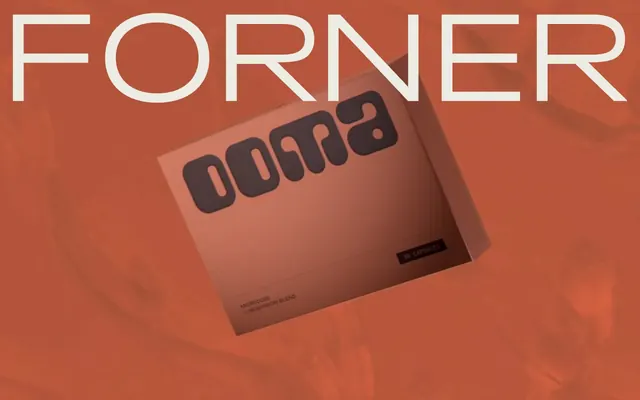
Preview image. Unlock full-res
Earthy, typographic canvas
Color palette
Primary text, darkened background surface, prominent borders
Page backgrounds, large content surfaces, primary UI fill
Subtle borders, inactive text elements, decorative accents
Muted link text and subtle interactive borders
Subtle background washes, light decorative borders
Secondary text, less prominent borders
High-contrast text elements, critical informational accents
Specific heading text for emphasis, dark borders
Typography
- Weights
- 400
- Sizes
- 17px, 30px, 52px, 56px
- Line height
- 0.97, 0.98, 1.1, 1.13
- Letter spacing
- -0.0100em, 0.0200em
- Fallback
- General Sans
Primary headings and emphatic titles for clarity and modern presence.
- Weights
- 400
- Sizes
- 22px, 29px, 45px, 56px, 112px
- Line height
- 0.98, 1, 1.03, 1.1, 1.35, 1.5
- Letter spacing
- -0.0400em, 0.0110em
- Fallback
- Archivo Expanded
Prominent display text, primary navigation, and large headline elements. Its extended proportions give it a distinct, confident voice.
- Weights
- 400
- Sizes
- 17px, 37px, 45px
- Line height
- 0.98, 1, 1.03
- Letter spacing
- -0.0500em, 0.0110em, 0.0200em
- Fallback
- Playfair Display Italic
Decorative accents, subheadings, and stylistic quotes. The light italic treatment adds a touch of unconventional elegance.
Spacing & shape
Components
Minimalist navigation toggle with transparent background, 'Carbon Ink' text, and a hairline 'Stone Gray' border that appears on hover/focus. Text has 'Surt' font at 22px, with 0 tracking.
Guidelines
- Prioritize 'Canvas White' (#ecece4) for primary backgrounds to maintain expansiveness, contrasting with 'Carbon Ink' (#484036) for text.
- Use 'Surt' for large, impactful headlines at sizes like 56px and 112px, setting `letter-spacing` to -0.0400em for a tight, elegant feel.
- Apply the `letter-spacing` values specified in the typography section precisely, especially the negative values for display type, to convey the signature typographic character.
- Employ 'BigDailyShort' at 37px or 45px with an italic style for decorative subheadings or impactful quotes, ensuring -0.0500em letter-spacing for distinction.
- Implement a minimal border radius of 4px for elements requiring subtle definition, such as cards or outlined interactive components.
- Maintain generous vertical spacing using 86px for section gaps, creating visual pauses between content blocks.
- Use 'Stone Gray' (#cacab0) for subtle borders on interactive elements, avoiding strong outlines to keep the aesthetic lightweight.
- Avoid using highly saturated or vibrant chromatic colors; the system relies on a restrained neutral palette with subtle shifts in tone.
- Do not use heavy box shadows or strong elevation effects; the design language favors flat surfaces and minimal depth.
- Refrain from dense, information-packed layouts; instead, embrace ample whitespace and a generous `elementGap` of 14px to promote readability.
- Do not deviate from the specified `letter-spacing` values; they are crucial for the distinct typographic voice of the brand.
- Avoid large, filled primary action buttons; interactive elements lean towards ghost buttons or subtle text links with implicit affordance.
- Do not introduce decorative gradients or complex overlays; the system prefers clean, solid color applications.
- Omit using generic system fonts; `Surt`, `ClashDisplay`, and `BigDailyShort` define the brand's unique typographic identity.
About this system
ShowHide
Forner presents a refined, almost austere aesthetic, balancing a limited palette of warm, earthy neutrals with expansive whitespace. Typography takes center stage, featuring distinct display and accent typefaces that exude a quiet confidence. The overall impression is one of intentionality and understated luxury, where visual silence amplifies the impact of carefully chosen elements.
Reminiscent of Huge Inc., Pentagram, Studiometa.
# Forner — Style Reference
> Earthy, typographic canvas

**Theme:** light

**Site:** https://forner.studio

Forner presents a refined, almost austere aesthetic, balancing a limited palette of warm, earthy neutrals with expansive whitespace. Typography takes center stage, featuring distinct display and accent typefaces that exude a quiet confidence. The overall impression is one of intentionality and understated luxury, where visual silence amplifies the impact of carefully chosen elements.

## Tokens — Colors

| Name | Value | Token | Role |
|------|------|------|------|
| Carbon Ink | `#484036` | `--color-carbon-ink` | Primary text, darkened background surface, prominent borders |
| Canvas White | `#ecece4` | `--color-canvas-white` | Page backgrounds, large content surfaces, primary UI fill |
| Stone Gray | `#cacab0` | `--color-stone-gray` | Subtle borders, inactive text elements, decorative accents |
| Warm Mist | `#d5d5c4` | `--color-warm-mist` | Muted link text and subtle interactive borders |
| Pale Linen | `#f2e9cf` | `--color-pale-linen` | Subtle background washes, light decorative borders |
| Ash Gray | `#666e72` | `--color-ash-gray` | Secondary text, less prominent borders |
| Deep Charcoal | `#212529` | `--color-deep-charcoal` | High-contrast text elements, critical informational accents |
| Rich Wood | `#33302c` | `--color-rich-wood` | Specific heading text for emphasis, dark borders |

## Tokens — Typography

### ClashDisplay
- **Substitute:** General Sans
- **Weights:** 400
- **Sizes:** 17px, 30px, 52px, 56px
- **Line height:** 0.97, 0.98, 1.1, 1.13
- **Letter spacing:** -0.0100em, 0.0200em
- **Role:** Primary headings and emphatic titles for clarity and modern presence.

### Surt
- **Substitute:** Archivo Expanded
- **Weights:** 400
- **Sizes:** 22px, 29px, 45px, 56px, 112px
- **Line height:** 0.98, 1, 1.03, 1.1, 1.35, 1.5
- **Letter spacing:** -0.0400em, 0.0110em
- **Role:** Prominent display text, primary navigation, and large headline elements. Its extended proportions give it a distinct, confident voice.

### BigDailyShort
- **Substitute:** Playfair Display Italic
- **Weights:** 400
- **Sizes:** 17px, 37px, 45px
- **Line height:** 0.98, 1, 1.03
- **Letter spacing:** -0.0500em, 0.0110em, 0.0200em
- **Role:** Decorative accents, subheadings, and stylistic quotes. The light italic treatment adds a touch of unconventional elegance.

## Tokens — Type Scale

| Role | Size | Line height | Letter spacing |
|------|------|------|------|
| body-sm | 17px | 1.5 | 0.34px |
| body | 22px | 1.35 | -0.88px |
| subheading | 29px | 1.1 | 0.32px |
| heading | 45px | 1.03 | -2.25px |
| heading-lg | 56px | 1 | -2.24px |
| display | 112px | 0.98 | -4.48px |

## Tokens — Spacing

- **Section gap:** 86px
- **Card padding:** 29px
- **Element gap:** 14px

## Tokens — Radius

- **Default:** 4px

## Components

### Ghost Navigation Button
*Menu navigation icon/button*

Minimalist navigation toggle with transparent background, 'Carbon Ink' text, and a hairline 'Stone Gray' border that appears on hover/focus. Text has 'Surt' font at 22px, with 0 tracking.

## Guidelines

### Do

- Prioritize 'Canvas White' (#ecece4) for primary backgrounds to maintain expansiveness, contrasting with 'Carbon Ink' (#484036) for text.
- Use 'Surt' for large, impactful headlines at sizes like 56px and 112px, setting `letter-spacing` to -0.0400em for a tight, elegant feel.
- Apply the `letter-spacing` values specified in the typography section precisely, especially the negative values for display type, to convey the signature typographic character.
- Employ 'BigDailyShort' at 37px or 45px with an italic style for decorative subheadings or impactful quotes, ensuring -0.0500em letter-spacing for distinction.
- Implement a minimal border radius of 4px for elements requiring subtle definition, such as cards or outlined interactive components.
- Maintain generous vertical spacing using 86px for section gaps, creating visual pauses between content blocks.
- Use 'Stone Gray' (#cacab0) for subtle borders on interactive elements, avoiding strong outlines to keep the aesthetic lightweight.

### Don't

- Avoid using highly saturated or vibrant chromatic colors; the system relies on a restrained neutral palette with subtle shifts in tone.
- Do not use heavy box shadows or strong elevation effects; the design language favors flat surfaces and minimal depth.
- Refrain from dense, information-packed layouts; instead, embrace ample whitespace and a generous `elementGap` of 14px to promote readability.
- Do not deviate from the specified `letter-spacing` values; they are crucial for the distinct typographic voice of the brand.
- Avoid large, filled primary action buttons; interactive elements lean towards ghost buttons or subtle text links with implicit affordance.
- Do not introduce decorative gradients or complex overlays; the system prefers clean, solid color applications.
- Omit using generic system fonts; `Surt`, `ClashDisplay`, and `BigDailyShort` define the brand's unique typographic identity.

## Agent Prompt Guide

Quick Color Reference:
text: #484036
background: #ecece4
border: #cacab0
accent: no distinct accent color
primary action: no distinct CTA color

Example Component Prompts:
1. Create a hero section: 'Canvas White' (#ecece4) background. Headline 'Surt' at 112px, #484036, letter-spacing -4.48px. Beneath it, a subtext in 'BigDailyShort' at 45px, '#484036', letter-spacing -2.25px.
2. Design a 'Menu' button: ghost style with 'Carbon Ink' (#484036) text and a hairline 'Stone Gray' (#cacab0) 1px border. Text should be 'Surt' 22px, with `letter-spacing` 0.0110em. Padding should respect general element spacing.
3. Implement a project card: 'Pale Linen' (#f2e9cf) background, 4px border radius. Title in 'ClashDisplay' 52px, #484036, letter-spacing -0.52px. Description text using 'Surt' 22px, #484036, with letter-spacing 0.32px. Use 29px padding for content.
More like this









Keep what you find
A free account saves references to boards and can send you a weekly email of picks based on what you save.
To see every result, go Pro.