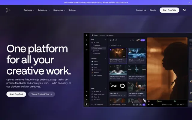
Preview image. Unlock full-res
Midnight control panel, glowing with purpose.
Color palette
Subtle background gradient for atmospheric depth, hinting at distant light sources.
Localized background glow, adding subtle color variation and depth.
Primary accent for interactive elements, links, and icons, drawing immediate attention.
Distinctive accent for key call-to-actions, signaling prime interactivity.
Deepest dark for backgrounds and text when used against lightest accents, like a black hole absorbing light.
Primary surface background, creating the foundational darkness for the UI.
Secondary surface background, subtly lighter than Void Black for nested elements, suggesting layered depth.
Subtle text and icon color, providing contrast against dark backgrounds without being stark white.
High-contrast text color against dark backgrounds, for primary headlines and interactive elements.
Subtle supporting text and soft borders, offering a muted contrast.
Very light text and borders, almost white, used for highlights and delicate details.
Typography
- Weights
- 400, 500, 600
- Sizes
- 10px, 11px, 12px, 13px, 14px, 15px, 16px, 18px, 24px, 30px, 38px, 48px, 80px
- Line height
- 0.96, 1, 1.02, 1.04, 1.16, 1.2, 1.25, 1.3, 1.45, 1.5
- Letter spacing
- -0.045em at 80px, -0.04em at 48px, -0.035em at 38px, -0.03em at 30px, 0.01em for body text
- Fallback
- Inter
Primary brand typeface for all headings, body text, and UI elements. Its sharp, modern sans-serif structure underpins the tech-forward identity. Condensed letter spacing at large sizes creates a focused, intense feel unlike typical web fonts.
- Weights
- 400
- Sizes
- 12px
- Line height
- 0.9
- Letter spacing
- 0.06em
- Fallback
- IBM Plex Mono
Monospace-style font used for small, technical labels or secondary information where a 'data' look is desired. Its very tight line height and wide letter spacing contribute to its distinct, machine-like character.
- Weights
- 400
- Sizes
- 10px
- Line height
- 1
- Fallback
- Lora
Incidental system font for browser-default elements or extremely small print, indicating minimal brand intervention in these areas.
- Weights
- 400
- Sizes
- 13px
- Line height
- 1.2
- Fallback
- Helvetica Neue
Fallback font for general button text and other UI elements, ensuring readability across diverse environments.
Spacing & shape
Elevation
Components
backgroundColor: rgba(0, 0, 0, 0), color: #fcfcfc, borderTopColor: #fcfcfc, borderRadius: 100px (fully rounded ends), paddingTop: 0px, paddingRight: 24px, paddingBottom: 0px, paddingLeft: 24px. Text uses FrameGothic 400. This is the main button style for calls to action against dark backgrounds.
backgroundColor: rgba(0, 0, 0, 0), color: #000000, borderTopColor: #000000, borderRadius: 100px, paddingTop: 0px, paddingRight: 24px, paddingBottom: 0px, paddingLeft: 24px. Text uses FrameGothic 400. Used sparingly.
backgroundColor: rgba(0, 0, 0, 0), color: #fcfcfc, borderTopColor: #fcfcfc, borderRadius: 0px, paddingTop: 0px, paddingRight: 0px, paddingBottom: 0px, paddingLeft: 0px. Text uses FrameGothic 400 at small sizes. This is a text-only link that gains button characteristics dynamically.
backgroundColor: #090a18, borderRadius: 24px, boxShadow: none, paddingTop: varies (e.g., 0px), paddingRight: 0px, paddingBottom: varies (e.g., 0px), paddingLeft: 0px. This card is visually distinct with its rounded corners and subtle background.
backgroundColor: rgba(16, 16, 23, 0.5), borderRadius: 10px, boxShadow: inset 12px 12px 50px 0px #181826, with softer outer shadows. paddingTop: 24px, paddingRight: 24px, paddingBottom: 24px, paddingLeft: 24px. This card creates a strong sense of depth and separation from the background.
Guidelines
- Use Cosmic Violet (#5b53ff) for primary call-to-action buttons, such as 'Start Free Trial'.
- Apply FrameGothic at 80px, weight 400, with -0.045em letter-spacing and 0.96 line-height for main display headlines.
- Utilize the Space Blue Gradient for the hero section background to establish the immersive dark aesthetic.
- Ensure all interactive elements like buttons and navigation links use a borderRadius of 100px for a fully rounded capsule shape.
- Maintain a primary text color of Cloud Whisper (#fcfcfc) on dark backgrounds for readability.
- For nested UI elements, apply the Nested UI Card styling with its distinct inset and outer shadows.
- Employ Pale Ash (#a3a3b3) for secondary informational text and muted borders against darker backgrounds.
- Avoid using bright, high-saturation colors beyond Electric Indigo or Cosmic Violet; maintain the muted, dark palette.
- Do not use hard-edged rectangles for buttons or interactive cards; consistently apply the rounded corner radii.
- Refrain from shadows on basic static cards (like Feature Card) unless they are specifically designed for 'nested UI' components.
- Do not vary line-height significantly for body text; stick to 1.5 for FrameGothic at body sizes to preserve readability.
- Avoid generic system fonts for any primary content; always use our custom FrameGothic or NeueMachinaInktrap when appropriate.
- Do not use small letter-spacing on small body text; maintain a 0.01em or normal letter-spacing for readability.
About this system
ShowHide
Frame.io's design evokes a sophisticated, high-tech command center with a dark, immersive background that immediately draws focus to content. Dark, deeply saturated purples and blues provide an atmospheric stage, accented by electric blue interactive elements that pulse like system indicators. Sharp typography with generous letter-spacing on display elements contrasts with soft-cornered cards, creating a tension between precision and approachability, suitable for creative professionals who value both. The overall impression is one of quiet power and focused efficiency.
The page primarily follows a max-width contained layout, likely around 1200px, but with full-bleed hero sections that leverage atmospheric gradients. The hero section is characterized by a large, centered headline over a dark, gradient background, paired with a prominent product screenshot or video. Section rhythms alternate between full-bleed dark gradient backgrounds and more structured dark panels with content. Content arrangements often feature large headlines with supportive body text, followed by multi-column grids (e.g., 4-column feature grids, 2-column text+image layouts). There's a spacious feel between sections, with subtle visual dividers achieved through background shifts. The navigation is a sticky top bar, providing persistent access.
This design primarily uses dark product screenshots and UI mockups, often presented within 'virtual screens' or cards that appear to float in the dark space. The treatment is contained within defined shapes, usually with slightly rounded corners (10px). When photography is present, it is dark, moody, and often features human subjects in a somewhat stylized, perhaps technical, context. Icons are typically monoline, filled with Electric Indigo or Cloud Whisper, and serve an explanatory or navigational role. The overall density of imagery is balanced with text, allowing for product features to be visually demonstrated without overwhelming the UI.
Reminiscent of Figma, GitHub, Linear, Spline.
# Frame.io — Style Reference
> Midnight control panel, glowing with purpose.

**Theme:** dark

**Site:** https://frame.io

Frame.io's design evokes a sophisticated, high-tech command center with a dark, immersive background that immediately draws focus to content. Dark, deeply saturated purples and blues provide an atmospheric stage, accented by electric blue interactive elements that pulse like system indicators. Sharp typography with generous letter-spacing on display elements contrasts with soft-cornered cards, creating a tension between precision and approachability, suitable for creative professionals who value both. The overall impression is one of quiet power and focused efficiency.

## Tokens — Colors

| Name | Value | Token | Role |
|------|------|------|------|
| Peripheral Haze Gradient | `#000b35` | `--color-peripheral-haze-gradient` | Subtle background gradient for atmospheric depth, hinting at distant light sources. |
| Violet Hue Radial | `#4e55a8` | `--color-violet-hue-radial` | Localized background glow, adding subtle color variation and depth. |
| Electric Indigo | `#6199f6` | `--color-electric-indigo` | Primary accent for interactive elements, links, and icons, drawing immediate attention. |
| Cosmic Violet | `#5b53ff` | `--color-cosmic-violet` | Distinctive accent for key call-to-actions, signaling prime interactivity. |
| Absolute Zero | `#000000` | `--color-absolute-zero` | Deepest dark for backgrounds and text when used against lightest accents, like a black hole absorbing light. |
| Void Black | `#0a0a13` | `--color-void-black` | Primary surface background, creating the foundational darkness for the UI. |
| Dark Nebula | `#08080c` | `--color-dark-nebula` | Secondary surface background, subtly lighter than Void Black for nested elements, suggesting layered depth. |
| Twilight Graphite | `#757580` | `--color-twilight-graphite` | Subtle text and icon color, providing contrast against dark backgrounds without being stark white. |
| Cloud Whisper | `#fcfcfc` | `--color-cloud-whisper` | High-contrast text color against dark backgrounds, for primary headlines and interactive elements. |
| Pale Ash | `#a3a3b3` | `--color-pale-ash` | Subtle supporting text and soft borders, offering a muted contrast. |
| Frost Gleam | `#dedfee` | `--color-frost-gleam` | Very light text and borders, almost white, used for highlights and delicate details. |

## Tokens — Typography

### FrameGothic
- **Substitute:** Inter
- **Weights:** 400, 500, 600
- **Sizes:** 10px, 11px, 12px, 13px, 14px, 15px, 16px, 18px, 24px, 30px, 38px, 48px, 80px
- **Line height:** 0.96, 1, 1.02, 1.04, 1.16, 1.2, 1.25, 1.3, 1.45, 1.5
- **Letter spacing:** -0.045em at 80px, -0.04em at 48px, -0.035em at 38px, -0.03em at 30px, 0.01em for body text
- **Role:** Primary brand typeface for all headings, body text, and UI elements. Its sharp, modern sans-serif structure underpins the tech-forward identity. Condensed letter spacing at large sizes creates a focused, intense feel unlike typical web fonts.

### NeueMachinaInktrap
- **Substitute:** IBM Plex Mono
- **Weights:** 400
- **Sizes:** 12px
- **Line height:** 0.9
- **Letter spacing:** 0.06em
- **Role:** Monospace-style font used for small, technical labels or secondary information where a 'data' look is desired. Its very tight line height and wide letter spacing contribute to its distinct, machine-like character.

### Times
- **Substitute:** Lora
- **Weights:** 400
- **Sizes:** 10px
- **Line height:** 1
- **Role:** Incidental system font for browser-default elements or extremely small print, indicating minimal brand intervention in these areas.

### Arial
- **Substitute:** Helvetica Neue
- **Weights:** 400
- **Sizes:** 13px
- **Line height:** 1.2
- **Role:** Fallback font for general button text and other UI elements, ensuring readability across diverse environments.

## Tokens — Type Scale

Perfect Fifth (1.5) from 14px base.

| Role | Size | Line height | Letter spacing |
|------|------|------|------|
| caption | 10px | 1.5 | 0.01em |
| body | 14px | 1.5 | 0.01em |
| subheading | 18px | 1.45 | — |
| heading | 24px | 1.3 | — |
| heading-lg | 30px | 1.25 | -0.48px |
| display | 80px | 0.96 | -3.6px |

## Tokens — Spacing

- **Max width:** 1200px
- **Card padding:** 24px
- **Element gap:** 16px

## Tokens — Radius

- **Buttons:** 100px
- **Cards:** 24px
- **small-elements:** 10px

## Tokens — Elevation

- **Nested UI Card:** `inset 12px 12px 50px 0px #181826, 84.68px 149.711px 80px 0px rgba(0, 0, 0, 0.31), 54.885px 97.035px 46.852px 0px rgba(0, 0, 0, 0.26), 32.618px 57.666px 25.481px 0px rgba(0, 0, 0, 0.23), 16.936px 29.942px 13px 0px rgba(0, 0, 0, 0.2), 6.9px 12.199px 6.519px 0px rgba(0, 0, 0, 0.18), 1.568px 2.772px 3.148px 0px rgba(0, 0, 0, 0.2)`

## Layout

The page primarily follows a max-width contained layout, likely around 1200px, but with full-bleed hero sections that leverage atmospheric gradients. The hero section is characterized by a large, centered headline over a dark, gradient background, paired with a prominent product screenshot or video. Section rhythms alternate between full-bleed dark gradient backgrounds and more structured dark panels with content. Content arrangements often feature large headlines with supportive body text, followed by multi-column grids (e.g., 4-column feature grids, 2-column text+image layouts). There's a spacious feel between sections, with subtle visual dividers achieved through background shifts. The navigation is a sticky top bar, providing persistent access.

## Imagery

This design primarily uses dark product screenshots and UI mockups, often presented within 'virtual screens' or cards that appear to float in the dark space. The treatment is contained within defined shapes, usually with slightly rounded corners (10px). When photography is present, it is dark, moody, and often features human subjects in a somewhat stylized, perhaps technical, context. Icons are typically monoline, filled with Electric Indigo or Cloud Whisper, and serve an explanatory or navigational role. The overall density of imagery is balanced with text, allowing for product features to be visually demonstrated without overwhelming the UI.

## Components

### CTA Button Group

### Feature Cards Grid

### Announcement Banner + Section Label

### Primary Ghost Button
*Default interactive element for secondary actions.*

backgroundColor: rgba(0, 0, 0, 0), color: #fcfcfc, borderTopColor: #fcfcfc, borderRadius: 100px (fully rounded ends), paddingTop: 0px, paddingRight: 24px, paddingBottom: 0px, paddingLeft: 24px. Text uses FrameGothic 400. This is the main button style for calls to action against dark backgrounds.

### Tertiary Ghost Button (Dark Text)
*Subtle interactive elements on lighter backgrounds or when contrast to white text needs adjustment.*

backgroundColor: rgba(0, 0, 0, 0), color: #000000, borderTopColor: #000000, borderRadius: 100px, paddingTop: 0px, paddingRight: 24px, paddingBottom: 0px, paddingLeft: 24px. Text uses FrameGothic 400. Used sparingly.

### Navigation Link Button
*Styling for interactive text navigation elements.*

backgroundColor: rgba(0, 0, 0, 0), color: #fcfcfc, borderTopColor: #fcfcfc, borderRadius: 0px, paddingTop: 0px, paddingRight: 0px, paddingBottom: 0px, paddingLeft: 0px. Text uses FrameGothic 400 at small sizes. This is a text-only link that gains button characteristics dynamically.

### Feature Card
*Used to group related content, often with an icon or small visual.*

backgroundColor: #090a18, borderRadius: 24px, boxShadow: none, paddingTop: varies (e.g., 0px), paddingRight: 0px, paddingBottom: varies (e.g., 0px), paddingLeft: 0px. This card is visually distinct with its rounded corners and subtle background.

### Nested UI Card
*Interior application-like cards for displaying specific content blocks.*

backgroundColor: rgba(16, 16, 23, 0.5), borderRadius: 10px, boxShadow: inset 12px 12px 50px 0px #181826, with softer outer shadows. paddingTop: 24px, paddingRight: 24px, paddingBottom: 24px, paddingLeft: 24px. This card creates a strong sense of depth and separation from the background.

## Guidelines

### Do

- Use Cosmic Violet (#5b53ff) for primary call-to-action buttons, such as 'Start Free Trial'.
- Apply FrameGothic at 80px, weight 400, with -0.045em letter-spacing and 0.96 line-height for main display headlines.
- Utilize the Space Blue Gradient for the hero section background to establish the immersive dark aesthetic.
- Ensure all interactive elements like buttons and navigation links use a borderRadius of 100px for a fully rounded capsule shape.
- Maintain a primary text color of Cloud Whisper (#fcfcfc) on dark backgrounds for readability.
- For nested UI elements, apply the Nested UI Card styling with its distinct inset and outer shadows.
- Employ Pale Ash (#a3a3b3) for secondary informational text and muted borders against darker backgrounds.

### Don't

- Avoid using bright, high-saturation colors beyond Electric Indigo or Cosmic Violet; maintain the muted, dark palette.
- Do not use hard-edged rectangles for buttons or interactive cards; consistently apply the rounded corner radii.
- Refrain from shadows on basic static cards (like Feature Card) unless they are specifically designed for 'nested UI' components.
- Do not vary line-height significantly for body text; stick to 1.5 for FrameGothic at body sizes to preserve readability.
- Avoid generic system fonts for any primary content; always use our custom FrameGothic or NeueMachinaInktrap when appropriate.
- Do not use small letter-spacing on small body text; maintain a 0.01em or normal letter-spacing for readability.

## Agent Prompt Guide

### Quick Color Reference
- Text: #fcfcfc (Cloud Whisper)
- Background: #0a0a13 (Void Black)
- CTA: #5b53ff (Cosmic Violet)
- Border: #a3a3b3 (Pale Ash)
- Accent: #6199f6 (Electric Indigo)

### 3-5 Example Component Prompts
1. Create a Hero Section: Use 'Space Blue Gradient' as the background. Place a 'display' headline (FrameGothic 80px, 400, -0.045em, #fcfcfc) centered, followed by a 'body' text (FrameGothic 14px, 400, 0.01em, #a3a3b3). Below, add two 'Primary Ghost Buttons' (backgroundColor: rgba(0,0,0,0), color: #fcfcfc, borderTopColor: #fcfcfc, borderRadius: 100px, paddingRight: 24px).
2. Design a Feature Card: Set backgroundColor to 'Dark Nebula' (#08080c), borderRadius to 24px. Inside, use a 'heading' (FrameGothic 24px, 400, 1.3, #fcfcfc) for the title and 'body-sm' (FrameGothic 12px, 400, 1.5, #a3a3b3) for the description.
3. Implement a Nested UI Card: Use backgroundColor: rgba(16, 16, 23, 0.5), borderRadius: 10px, and the provided boxShadow. Ensure internal padding of 24px. Use 'subheading' (FrameGothic 18px, 400, 1.45, #fcfcfc) for a title and 'body' (FrameGothic 14px, 400, 1.5, #a3a3b3) for content.
4. Generate a Navigation Bar: Set background to 'Void Black' (#0a0a13). Include 'Navigation Link Buttons' with text color #fcfcfc and 'Tertiary Ghost Button (Dark Text)' for a sign-in or special action, both on the navigation bar.
More like this







Keep what you find
A free account saves references to boards and can send you a weekly email of picks based on what you save.
To see every result, go Pro.