Preview image. Unlock full-res
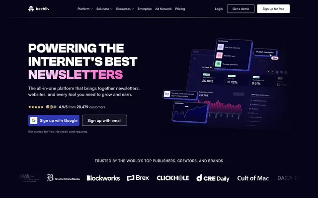
Galactic Command Center. Deep space blues and purples punctuated by bright digital flares against a crisp, dark UI.
Color palette
Primary brand accent, main call-to-action buttons, active states, and interactive elements.
Secondary brand accent, highlights within specific sections, and subtle decorative elements.
Prominent display gradients, hero sections, and important visually dynamic elements.
Page background, primary dark surface.
Card backgrounds, secondary dark surface for contained content, subtle borders.
Disabled states, subtle text, and secondary icon fills.
Tertiary body text, inactive links, and subtle icon details.
Secondary body text, content in specific UI elements.
Primary text on dark backgrounds, icon fills, button text.
Typography
- Weights
- 400, 500, 600, 700
- Sizes
- 12px, 14px, 16px, 18px, 20px, 24px, 48px
- Line height
- 1.2, 1.25, 1.33, 1.4, 1.43, 1.5, 1.56
- Letter spacing
- 0.045em
- Fallback
- Inter
Body copy, links, navigation, buttons, and most informational text. The consistent positive letter-spacing adds a subtle, open feel contrasting with the UI's precision.
- Weights
- 400, 700
- Sizes
- 16px, 20px, 48px, 60px, 72px
- Line height
- 1, 1.2, 1.4, 1.5
- Fallback
- Archivo
Headlines and display text. Its geometric structure provides a strong, modern presence at larger sizes, reinforcing the tech-oriented brand.
Spacing & shape
Components
Background: transparent with a subtle border from #ffffff0f. Text: Starfield White (#ffffff). Radius: 9999px (pill shape). Padding: 12px vertical, 24px horizontal. This button style is primary despite being 'ghost' due to its light text on dark background and prominent position.
Background: Shadow Violet (#141230). Text: Ghost White (#edeff2). Radius: 9999px (pill shape). Padding: 12px vertical, 24px horizontal. Used for actions like 'Sign up with email'.
Background: linear-gradient(90deg, #2f39ba 0%, #ff5ec4 100%). Text: Starfield White (#ffffff). Radius: 7px. Padding: 24px all sides. This button style is visually dense and signals high importance, as seen with the 'Get a demo' button.
Text: Starfield White (#ffffff) for active, Cloud Whisper (#c4c2d6) for inactive. Font: Satoshi, 16px, weight 500. No background or border. Interactivity often involves dropdowns.
Background: Shadow Violet (#0d0b28). Radius: 6px. No visible box shadow. Padding: 24px. Features a 6px radius for general container elements.
Background: Shadow Violet (#0d0b28). Radius: 6px. Box shadow: rgba(0, 0, 0, 0.1) 0px 10px 15px -3px, rgba(0, 0, 0, 0.1) 0px 4px 6px -4px. Padding: 24px. Specifically used for testimonials, utilizing the default box shadow detected for enhanced visual separation.
Guidelines
- Use Midnight Ink (#060419) as the primary page background to establish the dark theme.
- Apply Electric Blue (#2f39ba) for all primary interactive elements and crucial call-to-actions, ensuring high contrast.
- Employ the 9999px radius (pill shape) for all buttons and tags to maintain a consistent interactive element style.
- Reserve Clash Grotesk for headings (sizes 48px, 60px, 72px) and Satoshi for all body text, links, and navigation items.
- Group related content within cards using Shadow Violet (#0d0b28) as the background with a 6px border-radius.
- Utilize the Indigo Fusion gradient (linear-gradient(90deg, rgb(47, 57, 186) 0%, rgb(255, 94, 196) 100%)) as a prominent eye-catcher for hero elements or major announcements.
- Do not use white backgrounds directly on dark content sections; instead, use Shadow Violet (#0d0b28) or similar dark neutral tones for surface differentiation.
- Avoid using radii other than 6px for non-interactive containers and 9999px for buttons/tags to maintain shape consistency.
- Do not introduce strong drop shadows on internal components unless it's a specific testimonial card, to maintain a largely flat aesthetic.
- Refrain from mixing non-Clash Grotesk fonts for headlines or non-Satoshi fonts for body text.
- Do not use highly saturated colors for large text blocks; primarily use Starfield White (#ffffff) or Ghost White (#f7f5ff) for readability on dark backgrounds.
- Avoid excessive use of the Cosmic Magenta (#ff5ec4) accent; reserve it for specific highlights to maintain its impact.
About this system
ShowHide
This design system presents a digital command center aesthetic, utilizing a deep navy background contrasted with vibrant magenta and electric blue accents. The visual tension comes from the interplay of sharp 6px radii for general elements and soft 9999px pill shapes for interactive components. Subtle gradients are layered on dark surfaces, creating depth and a sophisticated, tech-forward atmosphere, ensuring the platform feels powerful yet accessible for creators.
The layout is primarily full-bleed with content centered within an implied maximum width. The hero section is a full-viewport dark background with a large, left-aligned headline and subtext, complemented by floating 3D product mockups on the right. Subsequent sections often feature a 3-column grid for key features or testimonials, maintaining consistent vertical spacing. There's an alternating rhythm of hero-like wide sections and more structured content blocks. Navigation is a sticky top bar, fully contained within the dark theme. The overall density is comfortable, with generous breathing room between sections and content blocks, avoiding a cluttered feel.
The site uses a combination of realistic 3D product mockups and stylized abstract graphics. Product screenshots are typically dark-themed UI elements (cards, dashboards) artfully composed to float in space, often with subtle glow effects or abstract background shapes in brand colors like Electric Blue and Cosmic Magenta. These visuals serve an explanatory role, showcasing product features within a highly polished, aspirational digital environment. Icons are minimal, either Starfield White or Cloud Whisper, often in outlined style, used for feature illustration rather than purely decorative purposes. There's no photography or realistic illustration, maintaining a focus on the digital product itself.
Reminiscent of Vercel, Linear, Supabase, Notion, Framer.
# beehiiv — Style Reference
> Galactic Command Center. Deep space blues and purples punctuated by bright digital flares against a crisp, dark UI.

**Theme:** dark

**Site:** https://beehiiv.com

This design system presents a digital command center aesthetic, utilizing a deep navy background contrasted with vibrant magenta and electric blue accents. The visual tension comes from the interplay of sharp 6px radii for general elements and soft 9999px pill shapes for interactive components. Subtle gradients are layered on dark surfaces, creating depth and a sophisticated, tech-forward atmosphere, ensuring the platform feels powerful yet accessible for creators.

## Tokens — Colors

| Name | Value | Token | Role |
|------|------|------|------|
| Electric Blue | `#2f39ba` | `--color-electric-blue` | Primary brand accent, main call-to-action buttons, active states, and interactive elements. |
| Cosmic Magenta | `#ff5ec4` | `--color-cosmic-magenta` | Secondary brand accent, highlights within specific sections, and subtle decorative elements. |
| Indigo Fusion | `#2f39ba` | `--color-indigo-fusion` | Prominent display gradients, hero sections, and important visually dynamic elements. |
| Midnight Ink | `#060419` | `--color-midnight-ink` | Page background, primary dark surface. |
| Shadow Violet | `#0d0b28` | `--color-shadow-violet` | Card backgrounds, secondary dark surface for contained content, subtle borders. |
| Storm Gray | `#4e4e6c` | `--color-storm-gray` | Disabled states, subtle text, and secondary icon fills. |
| Cloud Whisper | `#c4c2d6` | `--color-cloud-whisper` | Tertiary body text, inactive links, and subtle icon details. |
| Ghost White | `#f7f5ff` | `--color-ghost-white` | Secondary body text, content in specific UI elements. |
| Starfield White | `#ffffff` | `--color-starfield-white` | Primary text on dark backgrounds, icon fills, button text. |

## Tokens — Typography

### Satoshi
- **Substitute:** Inter
- **Weights:** 400, 500, 600, 700
- **Sizes:** 12px, 14px, 16px, 18px, 20px, 24px, 48px
- **Line height:** 1.2, 1.25, 1.33, 1.4, 1.43, 1.5, 1.56
- **Letter spacing:** 0.045em
- **Role:** Body copy, links, navigation, buttons, and most informational text. The consistent positive letter-spacing adds a subtle, open feel contrasting with the UI's precision.

### Clash Grotesk
- **Substitute:** Archivo
- **Weights:** 400, 700
- **Sizes:** 16px, 20px, 48px, 60px, 72px
- **Line height:** 1, 1.2, 1.4, 1.5
- **Role:** Headlines and display text. Its geometric structure provides a strong, modern presence at larger sizes, reinforcing the tech-oriented brand.

## Tokens — Type Scale

Augmented Fourth (1.414) from 16px base.

| Role | Size | Line height | Letter spacing |
|------|------|------|------|
| caption | 12px | 1.56 | 0.54px |
| body | 16px | 1.5 | 0.72px |
| subheading | 20px | 1.4 | 0.9px |
| heading | 24px | 1.33 | 1.08px |
| heading-lg | 48px | 1.2 | 2.16px |
| display | 72px | 1 | — |

## Tokens — Spacing

- **Section gap:** 48px
- **Card padding:** 24px
- **Element gap:** 16px

## Tokens — Radius

- **Default:** 6px
- **Buttons:** 9999px
- **Inputs:** 6px
- **tags:** 9999px

## Layout

The layout is primarily full-bleed with content centered within an implied maximum width. The hero section is a full-viewport dark background with a large, left-aligned headline and subtext, complemented by floating 3D product mockups on the right. Subsequent sections often feature a 3-column grid for key features or testimonials, maintaining consistent vertical spacing. There's an alternating rhythm of hero-like wide sections and more structured content blocks. Navigation is a sticky top bar, fully contained within the dark theme. The overall density is comfortable, with generous breathing room between sections and content blocks, avoiding a cluttered feel.

## Imagery

The site uses a combination of realistic 3D product mockups and stylized abstract graphics. Product screenshots are typically dark-themed UI elements (cards, dashboards) artfully composed to float in space, often with subtle glow effects or abstract background shapes in brand colors like Electric Blue and Cosmic Magenta. These visuals serve an explanatory role, showcasing product features within a highly polished, aspirational digital environment. Icons are minimal, either Starfield White or Cloud Whisper, often in outlined style, used for feature illustration rather than purely decorative purposes. There's no photography or realistic illustration, maintaining a focus on the digital product itself.

## Components

### Sign-Up Button Group

### Feature Cards

### Testimonial Cards

### Primary CTA Button
*Call-to-action button for critical user flows*

Background: transparent with a subtle border from #ffffff0f. Text: Starfield White (#ffffff). Radius: 9999px (pill shape). Padding: 12px vertical, 24px horizontal. This button style is primary despite being 'ghost' due to its light text on dark background and prominent position.

### Secondary CTA Button (Solid)
*Solid background button for secondary actions or filled states*

Background: Shadow Violet (#141230). Text: Ghost White (#edeff2). Radius: 9999px (pill shape). Padding: 12px vertical, 24px horizontal. Used for actions like 'Sign up with email'.

### Accent Gradient Button
*High-impact button for key conversions or emphasized actions*

Background: linear-gradient(90deg, #2f39ba 0%, #ff5ec4 100%). Text: Starfield White (#ffffff). Radius: 7px. Padding: 24px all sides. This button style is visually dense and signals high importance, as seen with the 'Get a demo' button.

### Nav Item
*Standard top navigation link*

Text: Starfield White (#ffffff) for active, Cloud Whisper (#c4c2d6) for inactive. Font: Satoshi, 16px, weight 500. No background or border. Interactivity often involves dropdowns.

### Feature Card
*Card for showcasing various product features*

Background: Shadow Violet (#0d0b28). Radius: 6px. No visible box shadow. Padding: 24px. Features a 6px radius for general container elements.

### Testimonial Card
*Container for partner logos and customer quotes*

Background: Shadow Violet (#0d0b28). Radius: 6px. Box shadow: rgba(0, 0, 0, 0.1) 0px 10px 15px -3px, rgba(0, 0, 0, 0.1) 0px 4px 6px -4px. Padding: 24px. Specifically used for testimonials, utilizing the default box shadow detected for enhanced visual separation.

## Guidelines

### Do

- Use Midnight Ink (#060419) as the primary page background to establish the dark theme.
- Apply Electric Blue (#2f39ba) for all primary interactive elements and crucial call-to-actions, ensuring high contrast.
- Employ the 9999px radius (pill shape) for all buttons and tags to maintain a consistent interactive element style.
- Reserve Clash Grotesk for headings (sizes 48px, 60px, 72px) and Satoshi for all body text, links, and navigation items.
- Group related content within cards using Shadow Violet (#0d0b28) as the background with a 6px border-radius.
- Utilize the Indigo Fusion gradient (linear-gradient(90deg, rgb(47, 57, 186) 0%, rgb(255, 94, 196) 100%)) as a prominent eye-catcher for hero elements or major announcements.

### Don't

- Do not use white backgrounds directly on dark content sections; instead, use Shadow Violet (#0d0b28) or similar dark neutral tones for surface differentiation.
- Avoid using radii other than 6px for non-interactive containers and 9999px for buttons/tags to maintain shape consistency.
- Do not introduce strong drop shadows on internal components unless it's a specific testimonial card, to maintain a largely flat aesthetic.
- Refrain from mixing non-Clash Grotesk fonts for headlines or non-Satoshi fonts for body text.
- Do not use highly saturated colors for large text blocks; primarily use Starfield White (#ffffff) or Ghost White (#f7f5ff) for readability on dark backgrounds.
- Avoid excessive use of the Cosmic Magenta (#ff5ec4) accent; reserve it for specific highlights to maintain its impact.

## Agent Prompt Guide

### Quick Color Reference
- Text (Primary): #ffffff (Starfield White)
- Background (Page): #060419 (Midnight Ink)
- Background (Card): #0d0b28 (Shadow Violet)
- CTA Button (Ghost): #ffffff (Starfield White text) on transparent with #ffffff0f border
- Accent (Primary): #2f39ba (Electric Blue)

### 3-5 Example Component Prompts
1.  **Create a Hero Section**: Background Midnight Ink (#060419) full-bleed. Left-aligned headline 'POWERING THE INTERNET\'S BEST NEWSLETTERS' in Clash Grotesk, 72px, weight 700, Starfield White (#ffffff). Subtext 'The all-in-one platform...' in Satoshi, 24px, weight 400, Ghost White (#f7f5ff), with letter-spacing 1.08px. Below subtext, add a 'Sign up with Google' button (Background: transparent, border: #ffffff0f, text: #ffffff, radius: 9999px, padding: 12px 24px) next to a 'Sign up with email' button (Background: #141230, text: #edeff2, radius: 9999px, padding: 12px 24px).
2.  **Generate a Feature Card**: Background Shadow Violet (#0d0b28), 6px radius, 24px padding. Headline 'Build your brand' in Satoshi, 20px, weight 500, Starfield White (#ffffff), letter-spacing 0.9px. Body text 'Custom build your newsletter...' in Satoshi, 16px, weight 400, Ghost White (#f7f5ff), letter-spacing 0.72px. Include a 'Learn more' link in Satoshi, 16px, weight 500, Electric Blue (#2f39ba).
3.  **Design a Testimonial Card**: Background Shadow Violet (#0d0b28), 6px radius, 24px padding. Apply a box-shadow: rgba(0, 0, 0, 0.1) 0px 10px 15px -3px, rgba(0, 0, 0, 0.1) 0px 4px 6px -4px. Quote text in Satoshi, 18px, weight 400, Starfield White (#ffffff), letter-spacing 0.81px. Include a small circular image and associated name/title at the bottom, name in Satoshi, 16px, weight 600, Starfield White (#ffffff).
More like this





Keep what you find
A free account saves references to boards and can send you a weekly email of picks based on what you save.
To see every result, go Pro.