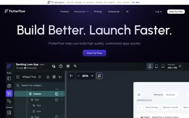
Preview image. Unlock full-res
Deep Space Command Center. Expansive dark surfaces punctuated by vivid violet glows, like stars in a night sky.
Color palette
Interactive elements, primary links, active states, key visual accents. Its vividness signifies importance.
Illustrative elements, background gradients. A cooler, more muted violet that adds depth.
Illustrative elements, subtle highlights, background gradients. A brighter, more ethereal violet.
Minor illustrative accents. Used sparingly for visual pop.
Background for certain interactive states or containers.
Large background sections, hero banners. Creates a subtle radial emanation, drawing focus without overwhelming.
Large background sections, hero banners. Creates a subtle radial emanation, focusing on specific points.
Primary background, deep cards, text on light elements. This foundational dark sets the mood.
Secondary background, UI panels and subtle card elevations. A slightly lighter dark for hierarchy.
Primary text, critical UI elements, button text on dark backgrounds. High contrast against dark surfaces.
Secondary text, subtle descriptions, disabled states. Provides gentle contrast and visual relief.
Tertiary text, less prominent links and subtle accents.
Used for smooth transitions between dark sections, providing a subtle texture.
Typography
- Weights
- 400, 500, 600
- Sizes
- 14px, 16px, 18px, 20px, 24px, 32px, 72px, 100px, 120px
- Line height
- 1, 1.2, 1.3, 1.5, 1.6
- Letter spacing
- -0.045em at 120px, -0.038em at 100px, -0.03em at 72px, normal at body sizes
- Fallback
- system-ui
This sans-serif is the primary display and body font. Its geometric structure provides a clean, modern feel, while varied letter-spacing at display sizes adds a touch of precision and sophistication, making large headlines feel carefully crafted rather than shouting.
- Weights
- 300, 400, 700
- Sizes
- 13px, 14px, 16px, 18px, 20px, 24px
- Line height
- 1.5, 1.6
- Letter spacing
- 0.09em at 24px, 0.057em at 20px, 0.05em at 18px, normal at body sizes
- Fallback
- system-ui
Used for smaller text, navigation, and detailed information. Its higher letter-spacing values ensure readability at smaller sizes, especially crucial in functional UI elements where clarity is paramount.
Spacing & shape
Elevation
Components
backgroundColor=transparent, color=#ffffff, border=none, borderRadius=0px, paddingY=40px, paddingX=16px. Used for subtle, non-intrusive interactive elements.
backgroundColor=transparent, borderRadius=0px, boxShadow=none, padding=0px. A structural container without presentational styling.
backgroundColor=#060311, borderRadius=24px, boxShadow=none, padding=0px. Emphasizes content through distinct, rounded dark surfaces.
backgroundColor=transparent, borderRadius=20%, boxShadow=rgba(0, 0, 0, 0.2) 0px 4px 24px 20px, padding=0px. The circular radius with a large, soft shadow makes this card appear to float prominently.
Guidelines
- Use Midnight Ink (#060311) for primary dark backgrounds and Slate Deep (#161320) for secondary elevated dark surfaces to create depth.
- Apply White Star (#ffffff) consistently for primary text and critical UI elements against dark backgrounds.
- Reserve Deep Violet (#5800fd) for interactive elements, links, and active states to highlight interaction points.
- Ensure large headlines (display-xl and display-lg) use Urbanist with the specified negative letter-spacing values to maintain a refined visual impact.
- Use a `max-width` on content areas to prevent stretching, maintaining readability and aesthetic balance.
- Round all interactive button elements with a 1440px border-radius to achieve a consistent pill shape and friendly interaction target.
- Do not use generic gray tones for interactive elements; all actionable items should leverage Deep Violet (#5800fd) or White Star (#ffffff) for strong visual cues.
- Avoid using box-shadows on cards unless explicitly for the 'Shadowed Card' variant; rely on background color changes for surface distinction.
- Do not deviate from the specified type scale and letter-spacing for headlines; these choices define the distinctive typographic voice.
- Do not introduce highly saturated colors outside the brand's violet palette, as they will clash with the established atmosphere.
- Avoid small, square button shapes; instead, use either the Text Only Button or the Pill Button variants for consistency.
About this system
ShowHide
This design system evokes a 'deep space command center' atmosphere, achieved through a predominantly dark mode with complex, subtle gradients creating depth and energy. The primary visual tension arises from the interplay of smooth, expansive dark surfaces and bursts of vivid, luminous violet. Type is restrained, leveraging specific letter-spacing for refined legibility, while rounded corners on interactive elements provide a friendly counterpoint to the overall high-tech mood.
The page primarily uses a full-bleed layout, particularly in hero sections, with content centered within an implied max-width when present. The hero features a large, centered headline over a dark, gradient background. Sections alternate between deep dark backgrounds and areas with more subtle gradients. Content is frequently arranged in multi-column grids or stacked, centered blocks. Feature sections often employ a 2-column text-left/image-right alternating pattern. The navigation is a sticky top bar, providing persistent access without encroaching on content.
The visual language is a blend of abstract graphics, product screenshots, and minimal, geometric icons. Product screenshots are contained within device mockups or card elements, often overlapping with the dark UI, making them feel integrated. Illustrations lean towards gradients of brand violets, abstract shapes, and subtle glow effects, contributing to the 'deep space' feel. Icons are typically monocolor, filled, and use the brand's violet or white for interaction. The overall density is balanced, with imagery serving both decorative atmosphere and explanatory content roles, often nestled within the dark, gradient-rich backgrounds.
Reminiscent of Vercel, Linear, Github, Raycast.
# FlutterFlow — Style Reference
> Deep Space Command Center. Expansive dark surfaces punctuated by vivid violet glows, like stars in a night sky.

**Theme:** dark

**Site:** https://flutterflow.io

This design system evokes a 'deep space command center' atmosphere, achieved through a predominantly dark mode with complex, subtle gradients creating depth and energy. The primary visual tension arises from the interplay of smooth, expansive dark surfaces and bursts of vivid, luminous violet. Type is restrained, leveraging specific letter-spacing for refined legibility, while rounded corners on interactive elements provide a friendly counterpoint to the overall high-tech mood.

## Tokens — Colors

| Name | Value | Token | Role |
|------|------|------|------|
| Deep Violet | `#5800fd` | `--color-deep-violet` | Interactive elements, primary links, active states, key visual accents. Its vividness signifies importance. |
| Cosmic Indigo | `#2415c6` | `--color-cosmic-indigo` | Illustrative elements, background gradients. A cooler, more muted violet that adds depth. |
| Dawn Violet | `#7066ed` | `--color-dawn-violet` | Illustrative elements, subtle highlights, background gradients. A brighter, more ethereal violet. |
| Flare Violet | `#882fe8` | `--color-flare-violet` | Minor illustrative accents. Used sparingly for visual pop. |
| Action Violet | `#6d5ef9` | `--color-action-violet` | Background for certain interactive states or containers. |
| Hero Gradient Outer | `#4b39ef` | `--color-hero-gradient-outer` | Large background sections, hero banners. Creates a subtle radial emanation, drawing focus without overwhelming. |
| Hero Gradient Inner | `#4b39ef` | `--color-hero-gradient-inner` | Large background sections, hero banners. Creates a subtle radial emanation, focusing on specific points. |
| Midnight Ink | `#060311` | `--color-midnight-ink` | Primary background, deep cards, text on light elements. This foundational dark sets the mood. |
| Slate Deep | `#161320` | `--color-slate-deep` | Secondary background, UI panels and subtle card elevations. A slightly lighter dark for hierarchy. |
| White Star | `#ffffff` | `--color-white-star` | Primary text, critical UI elements, button text on dark backgrounds. High contrast against dark surfaces. |
| Mist Gray | `#9ba1ae` | `--color-mist-gray` | Secondary text, subtle descriptions, disabled states. Provides gentle contrast and visual relief. |
| Dark Star | `#333333` | `--color-dark-star` | Tertiary text, less prominent links and subtle accents. |
| Dividing Gradient | `#161320` | `--color-dividing-gradient` | Used for smooth transitions between dark sections, providing a subtle texture. |

## Tokens — Typography

### Urbanist
- **Substitute:** system-ui
- **Weights:** 400, 500, 600
- **Sizes:** 14px, 16px, 18px, 20px, 24px, 32px, 72px, 100px, 120px
- **Line height:** 1, 1.2, 1.3, 1.5, 1.6
- **Letter spacing:** -0.045em at 120px, -0.038em at 100px, -0.03em at 72px, normal at body sizes
- **Role:** This sans-serif is the primary display and body font. Its geometric structure provides a clean, modern feel, while varied letter-spacing at display sizes adds a touch of precision and sophistication, making large headlines feel carefully crafted rather than shouting.

### Inter
- **Substitute:** system-ui
- **Weights:** 300, 400, 700
- **Sizes:** 13px, 14px, 16px, 18px, 20px, 24px
- **Line height:** 1.5, 1.6
- **Letter spacing:** 0.09em at 24px, 0.057em at 20px, 0.05em at 18px, normal at body sizes
- **Role:** Used for smaller text, navigation, and detailed information. Its higher letter-spacing values ensure readability at smaller sizes, especially crucial in functional UI elements where clarity is paramount.

## Tokens — Type Scale

Perfect Fourth (1.333) from 16px base.

| Role | Size | Line height | Letter spacing |
|------|------|------|------|
| caption | 13px | 1.5 | 0.5px |
| body | 16px | 1.6 | — |
| subheading | 18px | 1.5 | 0.57px |
| heading-sm | 20px | 1.5 | 0.9px |
| heading | 24px | 1.3 | — |
| heading-lg | 32px | 1.2 | — |
| display | 72px | 1 | -0.03em |
| display-lg | 100px | 1 | -0.038em |
| display-xl | 120px | 1 | -0.045em |

## Tokens — Spacing

- **Section gap:** 48px
- **Card padding:** 40px
- **Element gap:** 24px

## Tokens — Radius

- **Buttons:** 1440px
- **Cards:** 24px
- **links:** 16px
- **minorElements:** 12px

## Tokens — Elevation

- **Shadowed Card:** `rgba(0, 0, 0, 0.2) 0px 4px 24px 20px`

## Layout

The page primarily uses a full-bleed layout, particularly in hero sections, with content centered within an implied max-width when present. The hero features a large, centered headline over a dark, gradient background. Sections alternate between deep dark backgrounds and areas with more subtle gradients. Content is frequently arranged in multi-column grids or stacked, centered blocks. Feature sections often employ a 2-column text-left/image-right alternating pattern. The navigation is a sticky top bar, providing persistent access without encroaching on content.

## Imagery

The visual language is a blend of abstract graphics, product screenshots, and minimal, geometric icons. Product screenshots are contained within device mockups or card elements, often overlapping with the dark UI, making them feel integrated. Illustrations lean towards gradients of brand violets, abstract shapes, and subtle glow effects, contributing to the 'deep space' feel. Icons are typically monocolor, filled, and use the brand's violet or white for interaction. The overall density is balanced, with imagery serving both decorative atmosphere and explanatory content roles, often nestled within the dark, gradient-rich backgrounds.

## Components

### CTA Button Group

### Testimonial Card

### Trusted By Banner

### Text Only Button (Nav)
*Navigation and secondary actions*

backgroundColor=transparent, color=#ffffff, border=none, borderRadius=0px, paddingY=40px, paddingX=16px. Used for subtle, non-intrusive interactive elements.

### Basic Card
*Information grouping without visual distinction*

backgroundColor=transparent, borderRadius=0px, boxShadow=none, padding=0px. A structural container without presentational styling.

### Deep Card
*Content sections needing clear boundaries and subtle elevation*

backgroundColor=#060311, borderRadius=24px, boxShadow=none, padding=0px. Emphasizes content through distinct, rounded dark surfaces.

### Shadowed Card
*Interactive or highlighted cards requiring significant visual lift*

backgroundColor=transparent, borderRadius=20%, boxShadow=rgba(0, 0, 0, 0.2) 0px 4px 24px 20px, padding=0px. The circular radius with a large, soft shadow makes this card appear to float prominently.

## Guidelines

### Do

- Use Midnight Ink (#060311) for primary dark backgrounds and Slate Deep (#161320) for secondary elevated dark surfaces to create depth.
- Apply White Star (#ffffff) consistently for primary text and critical UI elements against dark backgrounds.
- Reserve Deep Violet (#5800fd) for interactive elements, links, and active states to highlight interaction points.
- Ensure large headlines (display-xl and display-lg) use Urbanist with the specified negative letter-spacing values to maintain a refined visual impact.
- Use a `max-width` on content areas to prevent stretching, maintaining readability and aesthetic balance.
- Round all interactive button elements with a 1440px border-radius to achieve a consistent pill shape and friendly interaction target.

### Don't

- Do not use generic gray tones for interactive elements; all actionable items should leverage Deep Violet (#5800fd) or White Star (#ffffff) for strong visual cues.
- Avoid using box-shadows on cards unless explicitly for the 'Shadowed Card' variant; rely on background color changes for surface distinction.
- Do not deviate from the specified type scale and letter-spacing for headlines; these choices define the distinctive typographic voice.
- Do not introduce highly saturated colors outside the brand's violet palette, as they will clash with the established atmosphere.
- Avoid small, square button shapes; instead, use either the Text Only Button or the Pill Button variants for consistency.

## Agent Prompt Guide

**Quick Color Reference:**
- Text (primary): #ffffff (White Star)
- Background (base): #060311 (Midnight Ink)
- CTA (primary action): #5800fd (Deep Violet)
- Border (pill button): #ffffff (White Star)
- Accent (interactive): #5800fd (Deep Violet)

**Example Component Prompts:**
1. Create a Hero Section: Background is a full-bleed radial-gradient(circle farthest-side at 0px -30%, rgb(75, 57, 239), rgba(6, 3, 17, 0) 84%). Centered headline 'Build Better. Launch Faster.' using Urbanist, size 120px, weight 400, color #ffffff, letter-spacing -0.045em. Below it, a Pill Button (Navigation) 'Start for Free': transparent background, white text (#ffffff), 1px white border, 1440px border-radius, paddingY 40px, paddingX 25.6px.
2. Design a Feature Card: Background #060311 (Midnight Ink), 24px border-radius. Inside, a heading 'Visual Development' using Urbanist, size 24px, weight 500, color #ffffff. Body text using Inter, size 16px, weight 400, color #9ba1ae. Card padding should be 40px on all sides.
3. Implement a Navigation Bar: Background #060311. Left aligned logo. Right aligned navigation items using Urbanist, size 16px, weight 400, color #ffffff. Include a 'Log in' button as Text Only Button and 'Start for Free' as a Pill Button (Navigation).
More like this





Keep what you find
A free account saves references to boards and can send you a weekly email of picks based on what you save.
To see every result, go Pro.