Preview image. Unlock full-res
Midnight gradient canvas
Color palette
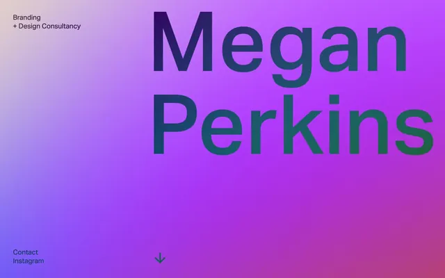
The primary visual identifier, used for the full-bleed hero section background. It transitions from a deep purple to a vibrant magenta, then to a rich green, creating a dynamic atmospheric backdrop
Page backgrounds, button text for ghost buttons, implicit ghost button borders
Medium-contrast borders, control outlines, and structural separators. Do not promote it to the primary CTA color
Dominant headlines, indicating high importance against dark backgrounds
Typography
- Weights
- 400, 700
- Sizes
- 22px
- Line height
- 1.27
- Fallback
- Inter
All textual content across the site, including body, headings, navigation, and links. Its clean, sans-serif nature supports the site's serious and direct communication style.
Spacing & shape
Components
A ghost button with #000000 text and an implicit #959591 border that appears on interaction. No background fill, 0px border-radius, 0px padding. Uses the 'aktiv-grotesk' font at 22px, weight 400.
Guidelines
- Always use 'Canvas Dark' (#000000) for primary page backgrounds to maintain the deep, dark aesthetic.
- Apply 'Text Muted' (#959591) for all body text and navigation elements to ensure soft contrast.
- Utilize 'Heading Accent' (#ffffff) for prominent headlines atop dark surfaces.
- Employ the 'Hero Gradient' for the main hero section to establish the brand's primary visual identity.
- Ensure all interactive elements and text use the 'aktiv-grotesk' font family at the specified weights (400, 700) and sizes (22px, 1.27 line-height).
- Prioritize minimal or ghost component styles; avoid filled buttons or heavy borders.
- Maintain a compact spacing rhythm, with 'elementGap' at 5px for close internal element relationships and 'sectionGap' at 22px for clear content block separation.
- Do not introduce additional saturated colors beyond the defined brand gradient; color should be used sparingly.
- Avoid applying heavy drop shadows or elevation, as the design system explicitly uses flat surfaces and minimal depth.
- Do not use highly decorative fonts or excessive letter-spacing; the typography is designed for clarity and directness.
- Do not use rounded corners; all elements should adhere to the 0px border-radius.
- Avoid large, image-heavy sections; the design is text-dominant with gradients serving as the primary visual interest.
- Do not deviate from the defined compact spacing values; resist adding more padding or margin unless absolutely necessary for readability.
- Do not use system default link colors; ensure all links use 'Text Muted' (#959591).
About this system
ShowHide
Megan Perkins presents a dark, high-contrast, and text-dominant aesthetic. The design relies on a minimal palette of near-black for backgrounds, a single dark gray for most text and borders, and a large, high-impact gradient hero. Typography is compact and precise, maintaining a serious, editorial tone. Components are stripped back, often border-only or ghost elements, with color reserved for the background gradient and the occasional subtle interaction cue.
The page operates on a full-bleed model, with the hero section filling the entire viewport with a dynamic gradient. Content is generally left-aligned within a contained area when text is primary, contrasting with the full-bleed hero. Section rhythm is marked by distinct background changes from the gradient to a solid deep black. Subsequent content appears to be stacked vertically, with consistent vertical spacing between text blocks. Navigation elements are minimal and positioned to the bottom and top left, with subtle interactive ghost components. The layout is text-dominant, with ample breathing room around content blocks despite a compact element spacing.
The site primarily features a vivid, atmospheric gradient as its main visual element, serving a decorative and branding role. There are no photographs, illustrations, product screenshots, or 3D renders. Icons are minimal, consisting only of simple, outlined arrow shapes to guide navigation. The visual density is very low, emphasizing text against the gradient, where imagery's role is purely abstract atmosphere.
Reminiscent of AIGA, Huge Inc., Personal portfolio sites.
# Megan Perkins — Style Reference
> Midnight gradient canvas

**Theme:** dark

**Site:** https://meganperkins.com

Megan Perkins presents a dark, high-contrast, and text-dominant aesthetic. The design relies on a minimal palette of near-black for backgrounds, a single dark gray for most text and borders, and a large, high-impact gradient hero. Typography is compact and precise, maintaining a serious, editorial tone. Components are stripped back, often border-only or ghost elements, with color reserved for the background gradient and the occasional subtle interaction cue.

## Tokens — Colors

| Name | Value | Token | Role |
|------|------|------|------|
| Hero Gradient | `#9a00ff` | `--color-hero-gradient` | The primary visual identifier, used for the full-bleed hero section background. It transitions from a deep purple to a vibrant magenta, then to a rich green, creating a dynamic atmospheric backdrop |
| Canvas Dark | `#000000` | `--color-canvas-dark` | Page backgrounds, button text for ghost buttons, implicit ghost button borders |
| Text Muted | `#959591` | `--color-text-muted` | Medium-contrast borders, control outlines, and structural separators. Do not promote it to the primary CTA color |
| Heading Accent | `#ffffff` | `--color-heading-accent` | Dominant headlines, indicating high importance against dark backgrounds |

## Tokens — Typography

### aktiv-grotesk
- **Substitute:** Inter
- **Weights:** 400, 700
- **Sizes:** 22px
- **Line height:** 1.27
- **Role:** All textual content across the site, including body, headings, navigation, and links. Its clean, sans-serif nature supports the site's serious and direct communication style.

## Tokens — Spacing

- **Section gap:** 22px
- **Card padding:** 22px
- **Element gap:** 5px

## Tokens — Radius

- **none:** 0px

## Layout

The page operates on a full-bleed model, with the hero section filling the entire viewport with a dynamic gradient. Content is generally left-aligned within a contained area when text is primary, contrasting with the full-bleed hero. Section rhythm is marked by distinct background changes from the gradient to a solid deep black. Subsequent content appears to be stacked vertically, with consistent vertical spacing between text blocks. Navigation elements are minimal and positioned to the bottom and top left, with subtle interactive ghost components. The layout is text-dominant, with ample breathing room around content blocks despite a compact element spacing.

## Imagery

The site primarily features a vivid, atmospheric gradient as its main visual element, serving a decorative and branding role. There are no photographs, illustrations, product screenshots, or 3D renders. Icons are minimal, consisting only of simple, outlined arrow shapes to guide navigation. The visual density is very low, emphasizing text against the gradient, where imagery's role is purely abstract atmosphere.

## Components

### Ghost Arrow Button
*Navigation button for scrolling content.*

A ghost button with #000000 text and an implicit #959591 border that appears on interaction. No background fill, 0px border-radius, 0px padding. Uses the 'aktiv-grotesk' font at 22px, weight 400.

## Guidelines

### Do

- Always use 'Canvas Dark' (#000000) for primary page backgrounds to maintain the deep, dark aesthetic.
- Apply 'Text Muted' (#959591) for all body text and navigation elements to ensure soft contrast.
- Utilize 'Heading Accent' (#ffffff) for prominent headlines atop dark surfaces.
- Employ the 'Hero Gradient' for the main hero section to establish the brand's primary visual identity.
- Ensure all interactive elements and text use the 'aktiv-grotesk' font family at the specified weights (400, 700) and sizes (22px, 1.27 line-height).
- Prioritize minimal or ghost component styles; avoid filled buttons or heavy borders.
- Maintain a compact spacing rhythm, with 'elementGap' at 5px for close internal element relationships and 'sectionGap' at 22px for clear content block separation.

### Don't

- Do not introduce additional saturated colors beyond the defined brand gradient; color should be used sparingly.
- Avoid applying heavy drop shadows or elevation, as the design system explicitly uses flat surfaces and minimal depth.
- Do not use highly decorative fonts or excessive letter-spacing; the typography is designed for clarity and directness.
- Do not use rounded corners; all elements should adhere to the 0px border-radius.
- Avoid large, image-heavy sections; the design is text-dominant with gradients serving as the primary visual interest.
- Do not deviate from the defined compact spacing values; resist adding more padding or margin unless absolutely necessary for readability.
- Do not use system default link colors; ensure all links use 'Text Muted' (#959591).

## Agent Prompt Guide

Quick Color Reference:
text: #959591
background: #000000
border: #959591
accent: no distinct accent color
primary action: no distinct CTA color

Example Component Prompts:
1. Create a page hero section using the 'Hero Gradient' background. Overlay 'Heading Accent' (#ffffff) text for a prominent headline, using 'aktiv-grotesk' at the largest available size and weight 700.
2. Create a body text block on a 'Canvas Dark' (#000000) background, using 'Text Muted' (#959591) and the 'aktiv-grotesk' font at 22px, weight 400, line-height 1.27. Ensure an 'elementGap' of 5px for any nested elements.
3. Design a simple navigation link using 'Text Muted' (#959591) on 'Canvas Dark' (#000000). Use 'aktiv-grotesk' at 22px, weight 400. This link should function as a 'Ghost Arrow Button' with 0px padding and a 0px border-radius.
More like this





Keep what you find
A free account saves references to boards and can send you a weekly email of picks based on what you save.
To see every result, go Pro.