Preview image. Unlock full-res
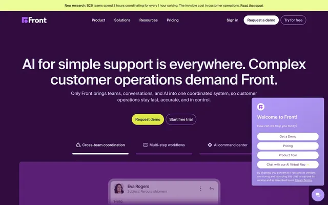
Deep Violet Command Center. An enterprise platform that feels personal and approachable through color and shape.
Color palette
Major surface backgrounds, key branding elements. Its depth provides a canvas for lighter text and vibrant accents.
Background for secondary elements and subtle brand accents. A richer, slightly more saturated version of the primary violet.
Background for secondary buttons, navigation links, and subtle interactive highlights. A vivid, pure violet.
Primary call-to-action button background, active state indicators. Its vividness grabs attention against the deep violet.
Primary text color against dark backgrounds, button foregrounds, and key interactive elements. Provides strong contrast.
Light text on dark backgrounds, secondary button backgrounds, and subtle highlight elements. A near-gray with a cool, violet undertone.
Primary text on light backgrounds, headers. A very dark, desaturated violet that reads as a sophisticated dark gray.
Text for secondary actions, subtle borders, and placeholder text. A muted violet that adds a touch of color to neutral elements.
Dominant body text, subtle borders, and icons on light backgrounds. A highly prominent near-black for content.
Underlying page background for non-hero sections. A very subtle cool white.
Body text on lighter backgrounds, secondary icons. A desaturated mid-tone gray.
Typography
- Weights
- 400, 500
- Sizes
- 10px, 12px, 14px, 15px, 16px, 17px, 20px, 25px, 30px, 36px, 43px, 52px, 62px
- Line height
- 1.1, 1.17, 1.19, 1.2, 1.21, 1.25, 1.27, 1.33, 1.4, 1.41, 1.43, 1.5, 1.53, 2.5
- Letter spacing
- -0.02, -0.019, -0.017, -0.015, -0.01, 0.003, 0.015, 0.017, 0.04, 0.067
- Fallback
- Inter
The primary typeface for all content, from headings to body text and UI elements. Its clean, slightly humanist geometry ensures excellent readability across all sizes, defining the brand's voice as precise and approachable.
- Weights
- 500
- Sizes
- 25px
- Line height
- 1.2
- Letter spacing
- -0.01
- Fallback
- IBM Plex Serif
A secondary, sparingly used display serif font, primarily for specific headings or decorative accents. Its distinct character adds a touch of sophistication and differentiation for key statements.
Spacing & shape
Elevation
Components
Background transparent, text #ffffff, border #ffffff, 40px border-radius, 0px vertical padding, 16px horizontal padding. A subtle interaction point that doesn't compete with the hero.
Background transparent, text #d0c6f0, border #d0c6f0, 64px border-radius, 12px vertical padding, 16px horizontal padding. For less prominent actions, providing a lighter touch.
Background transparent, text #1c1e20, no border, 0px border-radius. Blends seamlessly with body text while indicating interactivity.
White background, #1c1e20 text, 10px border-radius, 16-24px padding. Uses the subtle gray card background to distinguish content sections.
Guidelines
- Use Deep Violet (#300c41) as the primary background for hero sections and brand statements to establish immediate recognition.
- Apply Warm Lemon (#dee948) exclusively for primary call-to-action buttons to ensure maximum visual impact and clear user guidance.
- Prioritize Suisse Intl 500 for all headlines and Suisse Intl 400 for body text to maintain consistency and legibility.
- Implement a generous 64px border-radius for all primary CTA buttons and critical interactive inputs.
- Employ Bright Lavender (#e2dcf6) for accent text and secondary interactive elements when set against Deep Violet.
- Ensure all primary headings utilize letter-spacing of -0.01eM to -0.02em for a refined, modern presentation.
- Use Jet Black (#1c1e20) as the default text color on all lighter backgrounds like Clean White (#f0f4fe).
- Do not use multiple accent colors; Warm Lemon (#dee948) is the singular energetic accent.
- Avoid using hard, sharp corners on interactive elements; prefer 40px or 64px radii for buttons and inputs.
- Do not place body text directly on Deep Violet (#300c41) or Accented Plum (#5b1f76) backgrounds; use Primary White (#ffffff) or Bright Lavender (#e2dcf6) for contrast.
- Do not deviate from the Suisse Intl font family for core UI elements and body copy.
- Avoid applying heavy shadows; use subtle inset shadows like `rgb(208, 198, 240) 0px 0px 0px 1px inset` for a soft, layered effect.
- Do not use black text on Warm Lemon (#dee948) buttons; ensure text is dark, nearly black (#1c1e20) for optimal contrast.
- Avoid using the vivid violet hues for large blocks of content; they are best reserved for accents and backgrounds for distinction.
About this system
ShowHide
Front's visual style is a bold declaration of authority, centered around a deep, immersive purple canvas. It balances the playful energy of vibrant accents with the serious undertones of a mature B2B SaaS. The use of custom typography and deliberate shape choices—sharp corners for content containers vs. generous 40px and 64px radii for interactive elements—creates a dynamic tension, projecting a brand that is both innovative and reliable. The unique deep violet background establishes a distinct brand identity, ensuring instant recognition.
The page primarily uses a full-bleed layout for its hero section, featuring a deep violet background with centered, large headlines. Subsequent sections alternate between full-bleed deep violet and clean white backgrounds, providing clear visual breaks. Content within these sections is largely contained within an implicit max-width, centrally aligned. Body content typically follows a single-column stacked format, with occasional two-column layouts for features (text-left/image-right or vice-versa). Interactive elements like navigation and CTA buttons are part of a sticky header, while the chat widget floats at the bottom-right. Spacing is comfortable, leveraging a base unit of 8px for internal element gaps and larger 32-40px section padding.
The visual language for imagery is primarily product-focused, showcasing UI screenshots and abstract visual metaphors that illustrate specific product features. The UI screenshots are treated as distinct, slightly elevated cards with 10px corner radius, showcasing actual in-app experiences. Photography is minimal, appearing only for user avatars, suggesting a focus on the product's function rather than lifestyle. Icons are simple, outlined, and monochromatic, used descriptively to accompany text. The overall density suggests a balance between communicating complex information visually and providing breathing room for text.
Reminiscent of Slack, Asana, Intercom, Zendesk, Drift.
# Front — Style Reference
> Deep Violet Command Center. An enterprise platform that feels personal and approachable through color and shape.

**Theme:** dark

**Site:** https://front.com

Front's visual style is a bold declaration of authority, centered around a deep, immersive purple canvas. It balances the playful energy of vibrant accents with the serious undertones of a mature B2B SaaS. The use of custom typography and deliberate shape choices—sharp corners for content containers vs. generous 40px and 64px radii for interactive elements—creates a dynamic tension, projecting a brand that is both innovative and reliable. The unique deep violet background establishes a distinct brand identity, ensuring instant recognition.

## Tokens — Colors

| Name | Value | Token | Role |
|------|------|------|------|
| Deep Violet | `#300c41` | `--color-deep-violet` | Major surface backgrounds, key branding elements. Its depth provides a canvas for lighter text and vibrant accents. |
| Accented Plum | `#5b1f76` | `--color-accented-plum` | Background for secondary elements and subtle brand accents. A richer, slightly more saturated version of the primary violet. |
| Vivid Grape | `#8034bf` | `--color-vivid-grape` | Background for secondary buttons, navigation links, and subtle interactive highlights. A vivid, pure violet. |
| Warm Lemon | `#dee948` | `--color-warm-lemon` | Primary call-to-action button background, active state indicators. Its vividness grabs attention against the deep violet. |
| Primary White | `#ffffff` | `--color-primary-white` | Primary text color against dark backgrounds, button foregrounds, and key interactive elements. Provides strong contrast. |
| Bright Lavender | `#e2dcf6` | `--color-bright-lavender` | Light text on dark backgrounds, secondary button backgrounds, and subtle highlight elements. A near-gray with a cool, violet undertone. |
| Rich Plum | `#0d1d39` | `--color-rich-plum` | Primary text on light backgrounds, headers. A very dark, desaturated violet that reads as a sophisticated dark gray. |
| Soft Indigo | `#d0c6f0` | `--color-soft-indigo` | Text for secondary actions, subtle borders, and placeholder text. A muted violet that adds a touch of color to neutral elements. |
| Jet Black | `#1c1e20` | `--color-jet-black` | Dominant body text, subtle borders, and icons on light backgrounds. A highly prominent near-black for content. |
| Clean White | `#f0f4fe` | `--color-clean-white` | Underlying page background for non-hero sections. A very subtle cool white. |
| Mid Grey | `#5b5d63` | `--color-mid-grey` | Body text on lighter backgrounds, secondary icons. A desaturated mid-tone gray. |

## Tokens — Typography

### Suisse Intl
- **Substitute:** Inter
- **Weights:** 400, 500
- **Sizes:** 10px, 12px, 14px, 15px, 16px, 17px, 20px, 25px, 30px, 36px, 43px, 52px, 62px
- **Line height:** 1.1, 1.17, 1.19, 1.2, 1.21, 1.25, 1.27, 1.33, 1.4, 1.41, 1.43, 1.5, 1.53, 2.5
- **Letter spacing:** -0.02, -0.019, -0.017, -0.015, -0.01, 0.003, 0.015, 0.017, 0.04, 0.067
- **Role:** The primary typeface for all content, from headings to body text and UI elements. Its clean, slightly humanist geometry ensures excellent readability across all sizes, defining the brand's voice as precise and approachable.

### Suisse Works
- **Substitute:** IBM Plex Serif
- **Weights:** 500
- **Sizes:** 25px
- **Line height:** 1.2
- **Letter spacing:** -0.01
- **Role:** A secondary, sparingly used display serif font, primarily for specific headings or decorative accents. Its distinct character adds a touch of sophistication and differentiation for key statements.

## Tokens — Type Scale

Augmented Fourth (1.414) from 16px base.

| Role | Size | Line height | Letter spacing |
|------|------|------|------|
| caption | 10px | 1.5 | 0.067em |
| body | 16px | 1.5 | 0.003em |
| subheading | 20px | 1.4 | -0.015em |
| heading | 25px | 1.2 | -0.01em |
| heading-lg | 36px | 1.25 | -0.019em |
| display | 62px | 1.1 | -0.02em |

## Tokens — Spacing

- **Section gap:** 32-40px
- **Card padding:** 16-24px
- **Element gap:** 8-16px

## Tokens — Radius

- **Buttons:** 40px
- **Inputs:** 64px
- **Cards:** 10px
- **primaryCtaButtons:** 64px

## Tokens — Elevation

- **Chat Widget Bubble:** `rgb(208, 198, 240) 0px 0px 0px 1px inset`

## Layout

The page primarily uses a full-bleed layout for its hero section, featuring a deep violet background with centered, large headlines. Subsequent sections alternate between full-bleed deep violet and clean white backgrounds, providing clear visual breaks. Content within these sections is largely contained within an implicit max-width, centrally aligned. Body content typically follows a single-column stacked format, with occasional two-column layouts for features (text-left/image-right or vice-versa). Interactive elements like navigation and CTA buttons are part of a sticky header, while the chat widget floats at the bottom-right. Spacing is comfortable, leveraging a base unit of 8px for internal element gaps and larger 32-40px section padding.

## Imagery

The visual language for imagery is primarily product-focused, showcasing UI screenshots and abstract visual metaphors that illustrate specific product features. The UI screenshots are treated as distinct, slightly elevated cards with 10px corner radius, showcasing actual in-app experiences. Photography is minimal, appearing only for user avatars, suggesting a focus on the product's function rather than lifestyle. Icons are simple, outlined, and monochromatic, used descriptively to accompany text. The overall density suggests a balance between communicating complex information visually and providing breathing room for text.

## Components

### CTA Button Group

### Announcement Banner

### Chat Widget

### Ghost Navigation Button
*Header navigation, secondary actions*

Background transparent, text #ffffff, border #ffffff, 40px border-radius, 0px vertical padding, 16px horizontal padding. A subtle interaction point that doesn't compete with the hero.

### Outline Button (Bright Lavender)
*Tertiary actions, links, ghost buttons*

Background transparent, text #d0c6f0, border #d0c6f0, 64px border-radius, 12px vertical padding, 16px horizontal padding. For less prominent actions, providing a lighter touch.

### Text Link Button
*Inline text links, header links*

Background transparent, text #1c1e20, no border, 0px border-radius. Blends seamlessly with body text while indicating interactivity.

### Product Feature Card
*Displaying product features or benefits*

White background, #1c1e20 text, 10px border-radius, 16-24px padding. Uses the subtle gray card background to distinguish content sections.

## Guidelines

### Do

- Use Deep Violet (#300c41) as the primary background for hero sections and brand statements to establish immediate recognition.
- Apply Warm Lemon (#dee948) exclusively for primary call-to-action buttons to ensure maximum visual impact and clear user guidance.
- Prioritize Suisse Intl 500 for all headlines and Suisse Intl 400 for body text to maintain consistency and legibility.
- Implement a generous 64px border-radius for all primary CTA buttons and critical interactive inputs.
- Employ Bright Lavender (#e2dcf6) for accent text and secondary interactive elements when set against Deep Violet.
- Ensure all primary headings utilize letter-spacing of -0.01eM to -0.02em for a refined, modern presentation.
- Use Jet Black (#1c1e20) as the default text color on all lighter backgrounds like Clean White (#f0f4fe).

### Don't

- Do not use multiple accent colors; Warm Lemon (#dee948) is the singular energetic accent.
- Avoid using hard, sharp corners on interactive elements; prefer 40px or 64px radii for buttons and inputs.
- Do not place body text directly on Deep Violet (#300c41) or Accented Plum (#5b1f76) backgrounds; use Primary White (#ffffff) or Bright Lavender (#e2dcf6) for contrast.
- Do not deviate from the Suisse Intl font family for core UI elements and body copy.
- Avoid applying heavy shadows; use subtle inset shadows like `rgb(208, 198, 240) 0px 0px 0px 1px inset` for a soft, layered effect.
- Do not use black text on Warm Lemon (#dee948) buttons; ensure text is dark, nearly black (#1c1e20) for optimal contrast.
- Avoid using the vivid violet hues for large blocks of content; they are best reserved for accents and backgrounds for distinction.

## Agent Prompt Guide

### Quick Color Reference
- Text (Dark): #1c1e20
- Primary Background (Dark): #300c41
- Accent Background (Light): #f0f4fe
- Primary CTA: #dee948
- Secondary CTA Text: #f0f4fe
- Border (Subtle): #d0c6f0

### Example Component Prompts
1. Create a hero section: Full-bleed background #300c41. Centered headline 'AI for simple support is everywhere. Complex customer operations demand Front.' using Suisse Intl 62px 500, letter-spacing -0.02em, color #e2dcf6. Below it, a line of body text in Suisse Intl 16px 400, color #d0c6f0, line-height 1.5, letter-spacing 0.003em. Two centered buttons: primary 'Request demo' (background #dee948, text #1c1e20, 64px radius, 12px vertical padding, 16px horizontal padding) and secondary 'Start free trial' (background #8034bf, text #f0f4fe, 64px radius, 12px vertical padding, 16px horizontal padding), with 16px element-gap between them.
2. Design a feature card: Background #ffffff, 10px border-radius, 24px padding. Headline 'One view across every team' in Suisse Intl 25px 500, letter-spacing -0.01em, color #1c1e20. Body text below in Suisse Intl 16px 400, color #5b5d63.
3. Implement a ghost navigation button: Text 'Product' in Suisse Intl 16px 400, color #ffffff, background transparent, border #ffffff, 40px border-radius, 0px vertical padding, 16px horizontal padding.
4. Create a chat widget bubble: Background #5b1f76, inset box-shadow `rgb(208, 198, 240) 0px 0px 0px 1px inset`, 10px border-radius. Title 'Welcome to Front!' in Suisse Intl 16px 500, color #e2dcf6. Embedded buttons within have background #8034bf, text #f0f4fe, 64px radius.
More like this






Keep what you find
A free account saves references to boards and can send you a weekly email of picks based on what you save.
To see every result, go Pro.