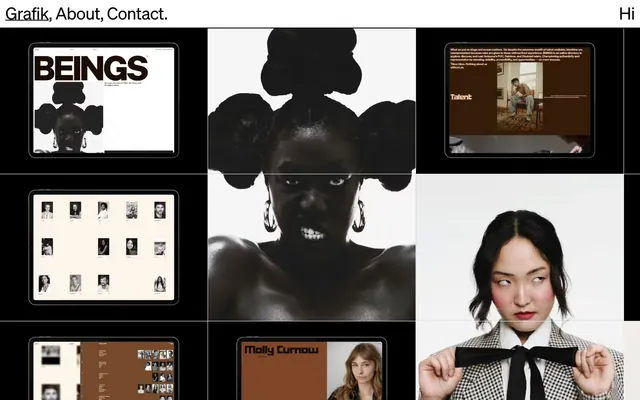
Preview image. Unlock full-res
Gallery Grid, high contrast.
Color palette
Muted hyperlink text — provides a subtle, functional accent in an otherwise monochrome palette
Primary text, borders for content blocks and images, section backgrounds — defining the high-contrast structure
Dominant page background, primary canvas for content
Hairline borders, dividers, input outlines, and card edges on light surfaces. Do not promote it to the primary CTA color
Secondary, muted text, subtle dividers—provides a softer contrast for secondary information
Typography
- Weights
- 400
- Sizes
- 20px, 38px, 40px
- Line height
- 1, 1.11, 1.2
- Letter spacing
- -0.0200em at 20px, -0.0100em at 38px, -0.0050em at 40px
- Fallback
- Space Grotesk or Chivo
All textual content: headlines, body text, links, and footer. The single weight and controlled letter-spacing across all sizes reinforce the authoritative, almost mechanical, visual rhythm.
Spacing & shape
Components
Text uses Grotesk 20px, weight 400, Absolute Black (#000000). Hover state (not explicitly detailed, but implied by 'text-link' token) would likely use Hyperlink Blue (#454ade). No distinct background or border, relying on high contrast with Canvas Parchment or Absolute Black backgrounds. Features `dlig` for distinct ligatures.
These blocks often have a 1px solid Absolute Black (#000000) border, serving as a distinct visual frame for each piece of content. Interior padding varies, with elements inside potentially using 12px or 24px padding. The background is typically Canvas Parchment (#f0eeeb) or Interaction White (#ffffff) for embedded UIs, or Absolute Black (#000000) for hero sections.
Utilizes Grotesk 20px, weight 400, Absolute Black (#000000). Distinctive tight letter-spacing of -0.0200em.
Uses Grotesk 20px, weight 400, Absolute Black (#000000) on Canvas Parchment, or Interaction White (#ffffff) on Absolute Black. Letter-spacing of -0.0200em.
Guidelines
- Prioritize high contrast between text and background, using Absolute Black (#000000) on Canvas Parchment (#f0eeeb) predominantly.
- Frame all content elements with crisp, 1px Absolute Black (#000000) borders to create distinct visual blocks.
- Employ Grotesk font at weight 400 for all textual content, ensuring consistent visual tone and applying tight letter-spacing as specified.
- Maintain a clear visual hierarchy by utilizing the full-width grid for content alignment and section breaks, emphasizing negative space.
- Use Canvas Parchment (#f0eeeb) as the primary page background to provide a neutral, gallery-like setting.
- Apply a generous sectionGap of 225px to separate major content blocks vertically, enhancing the sense of space and visual quiet.
- Incorporate `dlig` font feature settings for all Grotesk text to maintain brand typographic distinctiveness.
- Avoid using curved edges or soft shadows; the design relies on sharp angles and flat surfaces.
- Do not introduce gradients or complex color palettes; limit color use strictly to the defined monochrome scale with minimal accent.
- Refrain from using varied font weights or families; Grotesk 400 is the singular typographic voice.
- Do not break away from the content block framing; every significant piece of content should reside within an implied or explicit container with defined borders.
- Avoid decorative imagery or large background visuals; the focus is on content within a structured, minimal interface.
- Do not use generic button styles; interactive elements should be minimal, often text-based or outlined with the core monochrome palette.
- Do not vary line-height based on individual preference; adhere to the specified line-heights of 1.0, 1.11, and 1.2 for the respective font sizes.
About this system
ShowHide
Grafik employs a stark, high-contrast visual language reminiscent of a curated exhibition space. The design centers on a minimal, off-white canvas punctuated by absolute black typography, creating a powerful, almost brutalist aesthetic. Content is presented in framed, distinct blocks, often showcasing embedded digital interfaces within a larger grid. There's a deliberate lack of decorative elements, focusing instead on sharp edges, precise layout, and the interplay of negative space.
The page follows a full-bleed, almost grid-like structure without a fixed max-width container, allowing content to stretch across the viewport. The hero section often features large, impactful imagery or an inverted color scheme with Absolute Black background and white text. Sections are clearly delineated by substantial vertical spacing (sectionGap of 225px) and a strong implied grid system. Content is arranged in a dynamic, sometimes asymmetric pattern of text and visual blocks, often appearing as framed modules. The navigation is minimal, with a fixed header containing brief text links, and a rich, interactive footer.
The site uses a mix of high-fidelity product screenshots of digital interfaces and impactful, often edgy, black and white artistic photography. Product screenshots are typically rendered within device frames, demonstrating the work in context. Photography is raw, portrait-oriented, and high-contrast, contributing to a strong, independent aesthetic. All imagery is contained within explicit content blocks, often framed by borders, and serves to showcase portfolio work rather than purely decorative purposes. The density is medium, with images being key content, occupying significant visual space in a grid layout.
Reminiscent of AIGA Journal, Offscreen Magazine, Actual Source, Universal Standard.
# Grafik — Style Reference
> Gallery Grid, high contrast.

**Theme:** light

**Site:** https://grafik.co.nz

Grafik employs a stark, high-contrast visual language reminiscent of a curated exhibition space. The design centers on a minimal, off-white canvas punctuated by absolute black typography, creating a powerful, almost brutalist aesthetic. Content is presented in framed, distinct blocks, often showcasing embedded digital interfaces within a larger grid. There's a deliberate lack of decorative elements, focusing instead on sharp edges, precise layout, and the interplay of negative space.

## Tokens — Colors

| Name | Value | Token | Role |
|------|------|------|------|
| Hyperlink Blue | `#454ade` | `--color-hyperlink-blue` | Muted hyperlink text — provides a subtle, functional accent in an otherwise monochrome palette |
| Absolute Black | `#000000` | `--color-absolute-black` | Primary text, borders for content blocks and images, section backgrounds — defining the high-contrast structure |
| Canvas Parchment | `#f0eeeb` | `--color-canvas-parchment` | Dominant page background, primary canvas for content |
| Interaction White | `#ffffff` | `--color-interaction-white` | Hairline borders, dividers, input outlines, and card edges on light surfaces. Do not promote it to the primary CTA color |
| Dark Granite | `#959697` | `--color-dark-granite` | Secondary, muted text, subtle dividers—provides a softer contrast for secondary information |

## Tokens — Typography

### Grotesk
- **Substitute:** Space Grotesk or Chivo
- **Weights:** 400
- **Sizes:** 20px, 38px, 40px
- **Line height:** 1, 1.11, 1.2
- **Letter spacing:** -0.0200em at 20px, -0.0100em at 38px, -0.0050em at 40px
- **Role:** All textual content: headlines, body text, links, and footer. The single weight and controlled letter-spacing across all sizes reinforce the authoritative, almost mechanical, visual rhythm.

## Tokens — Type Scale

Augmented Fourth (1.414) from 20px base.

| Role | Size | Line height | Letter spacing |
|------|------|------|------|
| body | 20px | 1.2 | -0.4px |
| heading | 38px | 1.11 | -0.38px |
| display | 40px | 1 | -0.2px |

## Tokens — Spacing

- **Card padding:** 24px
- **Element gap:** 12px

## Tokens — Radius

- **none:** 0px

## Layout

The page follows a full-bleed, almost grid-like structure without a fixed max-width container, allowing content to stretch across the viewport. The hero section often features large, impactful imagery or an inverted color scheme with Absolute Black background and white text. Sections are clearly delineated by substantial vertical spacing (sectionGap of 225px) and a strong implied grid system. Content is arranged in a dynamic, sometimes asymmetric pattern of text and visual blocks, often appearing as framed modules. The navigation is minimal, with a fixed header containing brief text links, and a rich, interactive footer.

## Imagery

The site uses a mix of high-fidelity product screenshots of digital interfaces and impactful, often edgy, black and white artistic photography. Product screenshots are typically rendered within device frames, demonstrating the work in context. Photography is raw, portrait-oriented, and high-contrast, contributing to a strong, independent aesthetic. All imagery is contained within explicit content blocks, often framed by borders, and serves to showcase portfolio work rather than purely decorative purposes. The density is medium, with images being key content, occupying significant visual space in a grid layout.

## Components

### Navigation Link
*Primary navigation elements in the header and footer.*

Text uses Grotesk 20px, weight 400, Absolute Black (#000000). Hover state (not explicitly detailed, but implied by 'text-link' token) would likely use Hyperlink Blue (#454ade). No distinct background or border, relying on high contrast with Canvas Parchment or Absolute Black backgrounds. Features `dlig` for distinct ligatures.

### Content Block Frame
*Container for all visual and text content sections.*

These blocks often have a 1px solid Absolute Black (#000000) border, serving as a distinct visual frame for each piece of content. Interior padding varies, with elements inside potentially using 12px or 24px padding. The background is typically Canvas Parchment (#f0eeeb) or Interaction White (#ffffff) for embedded UIs, or Absolute Black (#000000) for hero sections.

### Project Metadata Text
*Descriptive text accompanying project visuals, often small and positioned within content blocks.*

Utilizes Grotesk 20px, weight 400, Absolute Black (#000000). Distinctive tight letter-spacing of -0.0200em.

### Time & Location Text
*Small, informational text like current time and location in the header.*

Uses Grotesk 20px, weight 400, Absolute Black (#000000) on Canvas Parchment, or Interaction White (#ffffff) on Absolute Black. Letter-spacing of -0.0200em.

## Guidelines

### Do

- Prioritize high contrast between text and background, using Absolute Black (#000000) on Canvas Parchment (#f0eeeb) predominantly.
- Frame all content elements with crisp, 1px Absolute Black (#000000) borders to create distinct visual blocks.
- Employ Grotesk font at weight 400 for all textual content, ensuring consistent visual tone and applying tight letter-spacing as specified.
- Maintain a clear visual hierarchy by utilizing the full-width grid for content alignment and section breaks, emphasizing negative space.
- Use Canvas Parchment (#f0eeeb) as the primary page background to provide a neutral, gallery-like setting.
- Apply a generous sectionGap of 225px to separate major content blocks vertically, enhancing the sense of space and visual quiet.
- Incorporate `dlig` font feature settings for all Grotesk text to maintain brand typographic distinctiveness.

### Don't

- Avoid using curved edges or soft shadows; the design relies on sharp angles and flat surfaces.
- Do not introduce gradients or complex color palettes; limit color use strictly to the defined monochrome scale with minimal accent.
- Refrain from using varied font weights or families; Grotesk 400 is the singular typographic voice.
- Do not break away from the content block framing; every significant piece of content should reside within an implied or explicit container with defined borders.
- Avoid decorative imagery or large background visuals; the focus is on content within a structured, minimal interface.
- Do not use generic button styles; interactive elements should be minimal, often text-based or outlined with the core monochrome palette.
- Do not vary line-height based on individual preference; adhere to the specified line-heights of 1.0, 1.11, and 1.2 for the respective font sizes.

## Agent Prompt Guide

Quick Color Reference:
text: #000000
background: #f0eeeb
border: #000000
accent: #454ade
primary action: no distinct CTA color

Example Component Prompts:
1. Create a header: Absolute Black (#000000) background, with navigation links 'Grafik', 'About', 'Contact' using Grotesk 20px, weight 400, Interaction White (#ffffff), letter-spacing -0.4px. Left-aligned 'Grafik' and right-aligned 'About, Contact, Hi' with 12px elementGap between Hi (right-aligned) and Contact.
2. Design a portfolio item content block: Canvas Parchment (#f0eeeb) background, 1px solid Absolute Black (#000000) border, 24px padding. Inside, title 'Beings,' using Grotesk 20px, weight 400, Absolute Black (#000000), letter-spacing -0.4px. Below it, a product screenshot (placeholder: 300x200px solid #cccccc) framed by a 1px solid Absolute Black (#000000) border. Follow with 'Digital design, Digital development, Identity design' using Grotesk 20px, weight 400, Absolute Black (#000000), letter-spacing -0.4px.
3. Build a large footer section: Absolute Black (#000000) background, with multiple columns of text links. One column (left) showing 'TOM GOULD DIRECTOR & PHOTOGRAPHER' where DIRECTOR & PHOTOGRAPHER is using Grotesk 20px, weight 400, Interaction White (#ffffff), letter-spacing -0.4px. The other columns (mid/right) show lists of text links using Grotesk 20px, weight 400, Interaction White (#ffffff), letter-spacing -0.4px. All columns are padded with 12px.
More like this








Keep what you find
A free account saves references to boards and can send you a weekly email of picks based on what you save.
To see every result, go Pro.