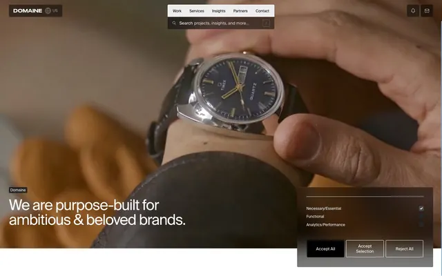
Preview image. Unlock full-res
High-contrast monochrome, violet punctuation
Color palette
Brand accent, highlighting key elements, decorative backgrounds in a very limited, functional capacity
Primary text, darkest backgrounds (hero, footer), borders, button text, icon fills
Page backgrounds, primary card surfaces, light button backgrounds, hover states, accent borders
Input backgrounds, subtle borders, secondary text in dark contexts
Light surface backgrounds, neutral badge backgrounds, button backgrounds for secondary actions
Secondary button backgrounds, muted background elements
Fine borders, subtle dividers, tertiary text in light contexts
Darker input backgrounds, alternate dark card backgrounds
Body text, icon outlines, secondary text
Subtle button borders, tertiary visual accents
Typography
- Weights
- 400
- Sizes
- 12px, 13px, 14px, 16px, 18px, 24px, 32px, 40px, 48px
- Line height
- 1, 1.1, 1.2
- Letter spacing
- -0.0400em at 48px, -0.0200em at 32px, -0.0100em at 24px and below
- Fallback
- Inter
The sole typeface, Suisse Intl, at weight 400 defines all typographic hierarchy. The tight letter-spacing for larger sizes creates a sophisticated, compact feel, avoiding a shouting effect despite large display sizes. Line height of 1.0 reduces visual bulk for display text, with 1.1 and 1.2 used for body text at smaller sizes, maintaining readability while keeping it dense.
Spacing & shape
Components
Background: rgba(0, 0, 0, 0.5), Text: #ffffff, Border: 1px solid #ffffff, Border-radius: 3px, Padding: 10px 15px.
Background: transparent, Text: #ffffff, Border: 1px solid #ffffff, Border-radius: 3px, Padding: 10px.
Background: #ffffff, Text: #000000, Border: 1px solid #000000, Border-radius: 3px, Padding: 10px.
Background: #ededed, Text: #000000, Border: 1px solid #000000, Border-radius: 3px, Padding: 10px 15px.
Background: transparent, Border-radius: 0px, no shadow, no padding.
Background: #ededed, Border-radius: 3px, no shadow, no padding.
Background: rgba(0, 0, 0, 0.5), Border-radius: 3px, no shadow, Padding: 15px 10px.
Background: rgba(0.15, 0.15, 0.15, 1) or #484a4c, Text: #ffffff. Border: none. Border-radius: 3px.
Background: #ededed, Text: #000000, Border-radius: 3px, Padding: 2px 5px.
Background: rgba(0.15, 0.15, 0.15, 1), Text: #ffffff, Border-radius: 3px, Padding: 2px 5px.
Guidelines
- Use Suisse Intl (or Inter as substitute) weight 400 for all text, manipulating size and letter-spacing for hierarchy, not weight.
- Apply #000000 (Ink) as primary text color against light backgrounds, and #ffffff (Canvas) against dark backgrounds.
- Utilize 'Violet Impulse' (#2749ff) strictly for branding accents, functional highlights, or decorative background fills, never for primary text.
- Maintain a default border-radius of 3px for all interactive elements like buttons, badges, and inputs, and for informational cards.
- Employ #ededed (Fog) for secondary background surfaces or passive component states in light themes.
- Structure interactive elements like buttons with explicit background colors or borders, avoiding ambiguous ghost states with no visual definition.
- Favor white (`#ffffff`) as the dominant page canvas, with distinct darker sections for hero and footer areas to create contrast.
- Avoid using multiple font weights or families; adhere exclusively to Suisse Intl (Inter) weight 400.
- Do not introduce new vibrant colors into the palette; stick to the defined achromatic scale and the single violet accent.
- Refrain from heavy drop shadows or elaborate gradients; surfaces should remain flat or use subtle 3px radius.
- Do not use #2749ff (Violet Impulse) for large blocks of text or as a background for primary functional elements outside of specific brand contexts.
- Avoid creating elevation through stacked box shadows; the design relies on clear background/border differences and minimal radius.
- Do not treat every section of the page as full-bleed; content areas should be contained within clear vertical rhythm.
- Do not embed information within images without providing equivalent accessible text, as imagery is highly decorative and often cropped.
About this system
ShowHide
Halfhelix employs a contemporary, slightly austere visual language characterized by high-contrast monochrome UI accented by a singular vivid violet. Text is used as a primary structural element, with generous leadings creating rhythm. Components are lightweight with minimal adornment, favoring subtle outlines and dark overlays for hierarchy in a compact layout. The system balances a dark, high-contrast hero with a predominantly light content theme, creating a dynamic progression from attention-grabbing to informative.
The page primarily employs a max-width contained layout, typically with content centered, though specific sections can lean full-bleed for visual impact. The hero section is full-bleed and dark, featuring a large, centered headline against illustrative or ambient video backgrounds. Sectional rhythm alternates between these full-bleed visual statements and tighter, text-dominant sections on white canvas. Content arrangement frequently uses a multi-column grid for showcasing projects, with implicit visual dividers through background shifts. Overall density is balanced, with generous vertical spacing between major sections but compact text blocks. Navigation includes a sticky header with a minimal logo and primary links, along with an overlay search.
The imagery consists predominantly of tightly cropped, high-quality product photography or selective detail shots that blur into the background. The treatment is often raw-edged, occasionally masked into a full-bleed presentation, but primarily contained within grid-like structures. There's an absence of lifestyle photography, focusing instead on the texture, material, and form of objects. Icons are minimalist, outlined, and monochromatic, taking on the surrounding text color. Images serve a decorative and evocative role, hinting at the brands they represent rather than explicitly showcasing product features, with a high density, often dominating entire sections.
Reminiscent of Stripe, Huge Inc., Shopify Partners.
# Halfhelix — Style Reference
> High-contrast monochrome, violet punctuation

**Theme:** light

**Site:** https://www.halfhelix.com

Halfhelix employs a contemporary, slightly austere visual language characterized by high-contrast monochrome UI accented by a singular vivid violet. Text is used as a primary structural element, with generous leadings creating rhythm. Components are lightweight with minimal adornment, favoring subtle outlines and dark overlays for hierarchy in a compact layout. The system balances a dark, high-contrast hero with a predominantly light content theme, creating a dynamic progression from attention-grabbing to informative.

## Tokens — Colors

| Name | Value | Token | Role |
|------|------|------|------|
| Violet Impulse | `#2749ff` | `--color-violet-impulse` | Brand accent, highlighting key elements, decorative backgrounds in a very limited, functional capacity |
| Ink | `#000000` | `--color-ink` | Primary text, darkest backgrounds (hero, footer), borders, button text, icon fills |
| Canvas | `#ffffff` | `--color-canvas` | Page backgrounds, primary card surfaces, light button backgrounds, hover states, accent borders |
| Lead | `#484a4c` | `--color-lead` | Input backgrounds, subtle borders, secondary text in dark contexts |
| Fog | `#ededed` | `--color-fog` | Light surface backgrounds, neutral badge backgrounds, button backgrounds for secondary actions |
| Stone | `#808080` | `--color-stone` | Secondary button backgrounds, muted background elements |
| Platinum | `#dbdbdb` | `--color-platinum` | Fine borders, subtle dividers, tertiary text in light contexts |
| Charcoal | `#262626` | `--color-charcoal` | Darker input backgrounds, alternate dark card backgrounds |
| Steel | `#686c6d` | `--color-steel` | Body text, icon outlines, secondary text |
| Silver | `#a5a7a8` | `--color-silver` | Subtle button borders, tertiary visual accents |

## Tokens — Typography

### Suisse Intl
- **Substitute:** Inter
- **Weights:** 400
- **Sizes:** 12px, 13px, 14px, 16px, 18px, 24px, 32px, 40px, 48px
- **Line height:** 1, 1.1, 1.2
- **Letter spacing:** -0.0400em at 48px, -0.0200em at 32px, -0.0100em at 24px and below
- **Role:** The sole typeface, Suisse Intl, at weight 400 defines all typographic hierarchy. The tight letter-spacing for larger sizes creates a sophisticated, compact feel, avoiding a shouting effect despite large display sizes. Line height of 1.0 reduces visual bulk for display text, with 1.1 and 1.2 used for body text at smaller sizes, maintaining readability while keeping it dense.

## Tokens — Type Scale

Perfect Fourth (1.333) from 14px base.

| Role | Size | Line height | Letter spacing |
|------|------|------|------|
| caption | 12px | 1.1 | -0.12px |
| body | 14px | 1.1 | -0.14px |
| heading-sm | 18px | 1.2 | -0.18px |
| heading | 24px | 1.2 | -0.24px |
| heading-lg | 32px | 1.1 | -0.64px |
| display | 48px | 1 | -1.92px |

## Tokens — Spacing

- **Section gap:** 60px
- **Card padding:** 15px
- **Element gap:** 5px

## Tokens — Radius

- **Default:** 3px
- **circular:** 1440px

## Layout

The page primarily employs a max-width contained layout, typically with content centered, though specific sections can lean full-bleed for visual impact. The hero section is full-bleed and dark, featuring a large, centered headline against illustrative or ambient video backgrounds. Sectional rhythm alternates between these full-bleed visual statements and tighter, text-dominant sections on white canvas. Content arrangement frequently uses a multi-column grid for showcasing projects, with implicit visual dividers through background shifts. Overall density is balanced, with generous vertical spacing between major sections but compact text blocks. Navigation includes a sticky header with a minimal logo and primary links, along with an overlay search.

## Imagery

The imagery consists predominantly of tightly cropped, high-quality product photography or selective detail shots that blur into the background. The treatment is often raw-edged, occasionally masked into a full-bleed presentation, but primarily contained within grid-like structures. There's an absence of lifestyle photography, focusing instead on the texture, material, and form of objects. Icons are minimalist, outlined, and monochromatic, taking on the surrounding text color. Images serve a decorative and evocative role, hinting at the brands they represent rather than explicitly showcasing product features, with a high density, often dominating entire sections.

## Components

### Primary Dark Button
*Call-to-action button for dark contexts.*

Background: rgba(0, 0, 0, 0.5), Text: #ffffff, Border: 1px solid #ffffff, Border-radius: 3px, Padding: 10px 15px.

### Ghost Dark Button
*Secondary action button for dark contexts.*

Background: transparent, Text: #ffffff, Border: 1px solid #ffffff, Border-radius: 3px, Padding: 10px.

### Neutral Light Button
*Default action button for light contexts.*

Background: #ffffff, Text: #000000, Border: 1px solid #000000, Border-radius: 3px, Padding: 10px.

### Neutral Disabled Button
*Disabled or less prominent action button for light contexts.*

Background: #ededed, Text: #000000, Border: 1px solid #000000, Border-radius: 3px, Padding: 10px 15px.

### Image Card
*Displaying project images or content teasers.*

Background: transparent, Border-radius: 0px, no shadow, no padding.

### Information Card
*Cards containing functional information or contextual content.*

Background: #ededed, Border-radius: 3px, no shadow, no padding.

### Overlay Card
*Elevated cards for interactive elements, like cookie consents.*

Background: rgba(0, 0, 0, 0.5), Border-radius: 3px, no shadow, Padding: 15px 10px.

### Search Input
*Text input areas with a subtle dark background.*

Background: rgba(0.15, 0.15, 0.15, 1) or #484a4c, Text: #ffffff. Border: none. Border-radius: 3px.

### Light Badge
*Categorization or status indicator on light backgrounds.*

Background: #ededed, Text: #000000, Border-radius: 3px, Padding: 2px 5px.

### Dark Badge
*Categorization or status indicator on dark backgrounds.*

Background: rgba(0.15, 0.15, 0.15, 1), Text: #ffffff, Border-radius: 3px, Padding: 2px 5px.

## Guidelines

### Do

- Use Suisse Intl (or Inter as substitute) weight 400 for all text, manipulating size and letter-spacing for hierarchy, not weight.
- Apply #000000 (Ink) as primary text color against light backgrounds, and #ffffff (Canvas) against dark backgrounds.
- Utilize 'Violet Impulse' (#2749ff) strictly for branding accents, functional highlights, or decorative background fills, never for primary text.
- Maintain a default border-radius of 3px for all interactive elements like buttons, badges, and inputs, and for informational cards.
- Employ #ededed (Fog) for secondary background surfaces or passive component states in light themes.
- Structure interactive elements like buttons with explicit background colors or borders, avoiding ambiguous ghost states with no visual definition.
- Favor white (`#ffffff`) as the dominant page canvas, with distinct darker sections for hero and footer areas to create contrast.

### Don't

- Avoid using multiple font weights or families; adhere exclusively to Suisse Intl (Inter) weight 400.
- Do not introduce new vibrant colors into the palette; stick to the defined achromatic scale and the single violet accent.
- Refrain from heavy drop shadows or elaborate gradients; surfaces should remain flat or use subtle 3px radius.
- Do not use #2749ff (Violet Impulse) for large blocks of text or as a background for primary functional elements outside of specific brand contexts.
- Avoid creating elevation through stacked box shadows; the design relies on clear background/border differences and minimal radius.
- Do not treat every section of the page as full-bleed; content areas should be contained within clear vertical rhythm.
- Do not embed information within images without providing equivalent accessible text, as imagery is highly decorative and often cropped.

## Agent Prompt Guide

Quick Color Reference:
text: #000000
background: #ffffff
border: #dbdbdb
accent: #2749ff
primary action: no distinct CTA color

Example Component Prompts:
1. Create a Hero Section: Full-bleed black background (#000000). Headline in Suisse Intl 48px, line-height 1.0, letter-spacing -1.92px, color #ffffff. Subtext in Suisse Intl 16px, line-height 1.2, letter-spacing -0.16px, color #ededed. Place a Ghost Dark Button: background transparent, text #ffffff, border 1px solid #ffffff, radius 3px, padding 10px.
2. Design an Information Card: Background #ededed, radius 3px, no shadow, padding 15px. Title in Suisse Intl 24px, line-height 1.2, letter-spacing -0.24px, color #000000. Body text in Suisse Intl 14px, line-height 1.1, letter-spacing -0.14px, color #686c6d.
3. Create a Navigation Item: Text in Suisse Intl 14px, line-height 1.1, letter-spacing -0.14px, color #000000. Underline on hover: 1px solid #000000. Padding 5px.
More like this








Keep what you find
A free account saves references to boards and can send you a weekly email of picks based on what you save.
To see every result, go Pro.