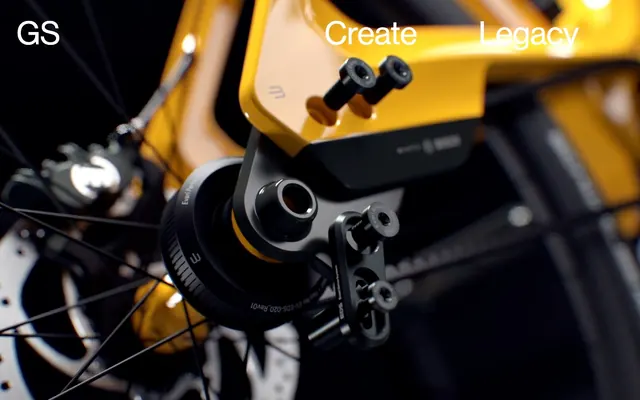
Preview image. Unlock full-res
Monumental monochrome canvas
Color palette
Page backgrounds, significant surface areas, default text
Muted text, inactive links, secondary navigation elements – creates a whispered presence against primary backgrounds
Hairline borders, dividers, input outlines, and card edges on light surfaces. Do not promote it to the primary CTA color
Typography
- Weights
- 400
- Sizes
- 24px, 72px
- Line height
- 1.03, 1.15, 1.17
- Fallback
- Inter
Primary display and content typography. Its direct and unadorned presence underpins the brand's architectural aesthetic.
Spacing & shape
Components
Text in Canvas White (#ffffff) on Greenspace Carbon (#000000) background. Font is haas_grotesk, 72px, weight 400, line height 1.03.
Text in Subtle Ash (#bebebe) on Greenspace Carbon (#000000) background. Font is haas_grotesk, 72px, weight 400, line height 1.03.
Text in Subtle Ash (#bebebe) on a white background. Font is haas_grotesk, 24px, weight 400, line height 1.15. No explicit padding or border.
Implied by 200px vertical spacing, with a strict binary shift between carbon and white background compositions. No explicit line or element.
Guidelines
- Prioritize Greenspace Carbon (#000000) as the dominant background color for most page areas and major content blocks.
- Use Canvas White (#ffffff) sparingly for text on dark backgrounds and for high-contrast link states.
- Employ Subtle Ash (#bebebe) for all secondary and tertiary text, including inactive navigation and project listings, to create a sense of understated authority.
- Maintain a generous 200px vertical section gap to enforce strict separation and emphasize content monumentality.
- Use haas_grotesk (or substitute Inter) at 72px with a line height of 1.03 for all primary calls to action and prominent headings.
- Leverage haas_grotesk (or substitute Inter) at 24px with a line height of 1.15 for all body text, project lists, and secondary content blocks.
- Adhere to a strict 0px border-radius system across all components and elements for a brutalist, architectural feel.
- Avoid introducing any additional chromatic colors; maintain a strictly achromatic palette.
- Do not use subtle gradients or soft shadows; elevation is achieved through color contrast and spatial separation.
- Do not create explicit card borders or outlines; content boundaries are defined by background changes and spacing.
- Do not use smaller font sizes for captions or body text; the minimal display emphasizes impact over detail density.
- Avoid complex or decorative imagery; visuals should be integrated as impactful, high-contrast product shots or abstract elements.
- Do not layer elements or use overlays unless functionally critical; prioritize flat, distinct content blocks.
- Do not vary line heights or letter spacing from the tokenized values; consistency is key to the system's precision.
About this system
ShowHide
Greenspace embodies a brutalist-inspired minimalism, featuring stark monochrome surfaces and expansive negative space. The visual system operates on a high-contrast binary of black and white, punctuated by muted gray typography that hints at legacy and heritage. Typography is bold and architectural, often serving as a primary visual element, while a generous use of spacing emphasizes clarity and the monumental scale of projects.
The page primarily utilizes a full-bleed layout, where content sections often extend across the entire viewport width. The hero section features a prominent visual with large, centered navigation elements. Content is typically arranged in distinct, vertically stacked blocks that leverage large section gaps (200px) to create a spacious rhythm. There's a strong emphasis on full-width content blocks and large-scale typography, suggesting a contained but expansive page model. Navigation is likely a sticky top bar or off-canvas element from the 'GS' emblem, given the minimal on-page navigation elements.
This system primarily uses stark, high-contrast product photography with deep blacks and bright highlights. Imagery is usually full-bleed or cropped tightly, creating immersive backgrounds or focused product showcases. There are no illustrations or complex graphical elements; the focus is on the object or scene itself, often with a moody, almost cinematic treatment. Icons are minimal, likely monochromatic, and serve purely functional roles. The density is image-heavy in hero sections, with images serving as dominant visual anchors rather than decorative accents.
Reminiscent of A24, Brutalism.com, Studio Dumbar, B&W Tek.
# Greenspace — Style Reference
> Monumental monochrome canvas

**Theme:** dark

**Site:** https://thegreenspace.com

Greenspace embodies a brutalist-inspired minimalism, featuring stark monochrome surfaces and expansive negative space. The visual system operates on a high-contrast binary of black and white, punctuated by muted gray typography that hints at legacy and heritage. Typography is bold and architectural, often serving as a primary visual element, while a generous use of spacing emphasizes clarity and the monumental scale of projects.

## Tokens — Colors

| Name | Value | Token | Role |
|------|------|------|------|
| Greenspace Carbon | `#000000` | `--color-greenspace-carbon` | Page backgrounds, significant surface areas, default text |
| Subtle Ash | `#bebebe` | `--color-subtle-ash` | Muted text, inactive links, secondary navigation elements – creates a whispered presence against primary backgrounds |
| Canvas White | `#ffffff` | `--color-canvas-white` | Hairline borders, dividers, input outlines, and card edges on light surfaces. Do not promote it to the primary CTA color |

## Tokens — Typography

### haas_grotesk
- **Substitute:** Inter
- **Weights:** 400
- **Sizes:** 24px, 72px
- **Line height:** 1.03, 1.15, 1.17
- **Role:** Primary display and content typography. Its direct and unadorned presence underpins the brand's architectural aesthetic.

## Tokens — Spacing

- **Section gap:** 200px
- **Card padding:** 37px
- **Element gap:** 37px

## Tokens — Radius

- **none:** 0px

## Layout

The page primarily utilizes a full-bleed layout, where content sections often extend across the entire viewport width. The hero section features a prominent visual with large, centered navigation elements. Content is typically arranged in distinct, vertically stacked blocks that leverage large section gaps (200px) to create a spacious rhythm. There's a strong emphasis on full-width content blocks and large-scale typography, suggesting a contained but expansive page model. Navigation is likely a sticky top bar or off-canvas element from the 'GS' emblem, given the minimal on-page navigation elements.

## Imagery

This system primarily uses stark, high-contrast product photography with deep blacks and bright highlights. Imagery is usually full-bleed or cropped tightly, creating immersive backgrounds or focused product showcases. There are no illustrations or complex graphical elements; the focus is on the object or scene itself, often with a moody, almost cinematic treatment. Icons are minimal, likely monochromatic, and serve purely functional roles. The density is image-heavy in hero sections, with images serving as dominant visual anchors rather than decorative accents.

## Components

### Navigation Link (Active)
*Main navigation and hero links when active or hovered.*

Text in Canvas White (#ffffff) on Greenspace Carbon (#000000) background. Font is haas_grotesk, 72px, weight 400, line height 1.03.

### Navigation Link (Inactive)
*Main navigation and hero links when inactive.*

Text in Subtle Ash (#bebebe) on Greenspace Carbon (#000000) background. Font is haas_grotesk, 72px, weight 400, line height 1.03.

### Project List Item
*Listings for selected projects.*

Text in Subtle Ash (#bebebe) on a white background. Font is haas_grotesk, 24px, weight 400, line height 1.15. No explicit padding or border.

### Section Separator
*Visual divider for content sections.*

Implied by 200px vertical spacing, with a strict binary shift between carbon and white background compositions. No explicit line or element.

## Guidelines

### Do

- Prioritize Greenspace Carbon (#000000) as the dominant background color for most page areas and major content blocks.
- Use Canvas White (#ffffff) sparingly for text on dark backgrounds and for high-contrast link states.
- Employ Subtle Ash (#bebebe) for all secondary and tertiary text, including inactive navigation and project listings, to create a sense of understated authority.
- Maintain a generous 200px vertical section gap to enforce strict separation and emphasize content monumentality.
- Use haas_grotesk (or substitute Inter) at 72px with a line height of 1.03 for all primary calls to action and prominent headings.
- Leverage haas_grotesk (or substitute Inter) at 24px with a line height of 1.15 for all body text, project lists, and secondary content blocks.
- Adhere to a strict 0px border-radius system across all components and elements for a brutalist, architectural feel.

### Don't

- Avoid introducing any additional chromatic colors; maintain a strictly achromatic palette.
- Do not use subtle gradients or soft shadows; elevation is achieved through color contrast and spatial separation.
- Do not create explicit card borders or outlines; content boundaries are defined by background changes and spacing.
- Do not use smaller font sizes for captions or body text; the minimal display emphasizes impact over detail density.
- Avoid complex or decorative imagery; visuals should be integrated as impactful, high-contrast product shots or abstract elements.
- Do not layer elements or use overlays unless functionally critical; prioritize flat, distinct content blocks.
- Do not vary line heights or letter spacing from the tokenized values; consistency is key to the system's precision.

## Agent Prompt Guide

Quick Color Reference:
text: #ffffff
background: #000000
border: no distinct border color
accent: no distinct accent color
primary action: no distinct CTA color

Example Component Prompts:
1. Create a full-width header: Greenspace Carbon (#000000) background. Left-aligned 'GS' text in Canvas White (#ffffff), haas_grotesk (or Inter) at 72px, weight 400, line height 1.03. Right-aligned navigation links 'Create' and 'Legacy' in Subtle Ash (#bebebe), haas_grotesk (or Inter) at 72px, weight 400, line height 1.03.
2. Create a 'Selected Projects' section: Canvas White (#ffffff) background. Heading 'Selected Projects' in Greenspace Carbon (#000000), haas_grotesk (or Inter) at 24px, weight 400, line height 1.15. Project list items 'Battersea Power Station', 'Bicycle Therapeutics' in Subtle Ash (#bebebe), haas_grotesk (or Inter) at 24px, weight 400, line height 1.15. Maintain 200px vertical spacing above this section.
3. Create a hero background: Greenspace Carbon (#000000) full-bleed. Centered text 'Create Legacy' with 'Create' in Subtle Ash (#bebebe) and 'Legacy' in Canvas White (#ffffff), both haas_grotesk (or Inter) at 72px, weight 400, line height 1.03. Text is stacked vertically, with 37px vertical spacing between words.
More like this






Keep what you find
A free account saves references to boards and can send you a weekly email of picks based on what you save.
To see every result, go Pro.