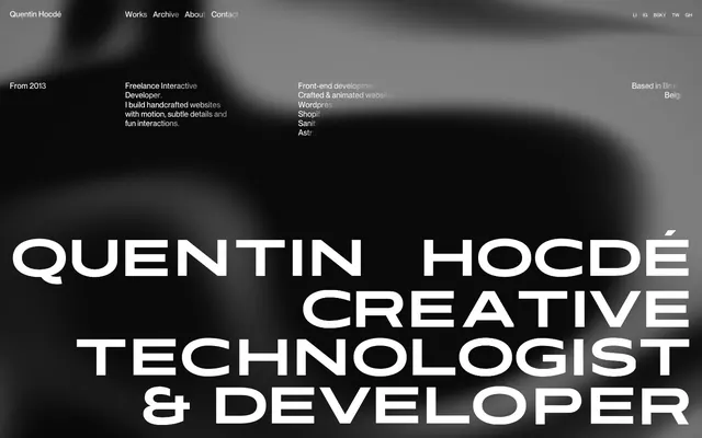
Preview image. Unlock full-res
Color palette
Page backgrounds, card surfaces, primary text for contextual information
Hairline borders, dividers, input outlines, and card edges on light surfaces. Do not promote it to the primary CTA color
Typography
- Weights
- 700
- Sizes
- 97px, 144px
- Line height
- 0.99, 1, 1.04, 1.35
- Letter spacing
- -0.0300em
- Fallback
- Bebas Neue
Dramatic display headlines and impactful brand messaging. The tight line height and negative letter spacing create a dense, powerful presence.
- Weights
- 400
- Sizes
- 10px, 16px
- Line height
- 1, 1.15, 1.2
- Letter spacing
- normal
- Fallback
- Inter
Functional UI text, navigation, and detailed information. Its subtle presence supports the Kinetica headlines without competing.
Spacing & shape
Components
Ghost White text (#ffffff) using PP Neue Montreal at 16px, normal letter spacing, with a minimal 12px right padding from the next item. Underlined on hover or active state.
Ghost White text (#ffffff) using PP Neue Montreal at 10px, with 12px right margin. Visually minimal, intended for social media links in the header.
Ghost White text (#ffffff) using Kinetica 700, sized at 144px, with a line height of 0.99 and letter spacing of -0.0300em. Occupies a significant area of the dark canvas.
Ghost White text (#ffffff) using Kinetica 700, sized at 97px, with a line height of 1.04 and letter spacing of -0.0300em. Provides a hierarchical step down from the main display headline.
Ghost White text (#ffffff) using PP Neue Montreal 400, sized at 16px, with a line height of 1.20 and normal letter spacing. Used for detailed descriptions.
Guidelines
- Prioritize Kinetica for all large, impactful headlines to create a consistent, bold brand statement.
- Use PP Neue Montreal for all body text, navigation, and smaller UI elements, always in Ghost White (#ffffff) against Midnight Ink (#000000).
- Maintain the tight line heights and negative letter spacing of Kinetica to achieve its distinctive dense typographic appearance.
- Ensure generous vertical spacing between content blocks, using at least 40px as a baseline.
- Utilize Ghost White (#ffffff) as the sole accent for interactive elements and subtle borders against the Midnight Ink (#000000) canvas.
- Avoid using multiple colors; the system relies on a strictly achromatic palette of Ghost White (#ffffff) and Midnight Ink (#000000).
- Do not introduce rounded corners; all elements should feature sharp, defined edges.
- Do not use generic system fonts; always specify Kinetica or PP Neue Montreal.
- Avoid decorative elements or heavy ornamentation that could detract from the typographic focus.
- Do not use subtle elevation or shadows; assume a flat, high-contrast visual hierarchy.
About this system
ShowHide
Quentin Hocdé's visual system evokes a dark, cinematic canvas where bold, expanded typography takes center stage. Achromatic colors create a stark contrast, allowing the white text to cut through the deep black background. The design emphasizes deliberate, compact content blocks within a sparse layout, using oversized sans-serifs for dramatic impact, rather than a broad range of type styles.
The page employs a max-width contained layout where elements are flush left, with implicit centering created by the surrounding negative space. The hero section is full-bleed, stretching the entire viewport width, presenting large, stacked expressive typography. Content sections below follow a more conventional block-stacking pattern, maintaining a comfortable density with strong vertical rhythm. Navigation is a fixed top bar on the left, with social links on the right.
The site's visual language is characterized by an absence of conventional photography or illustrations. Instead, it utilizes subtle, blurry, dark-on-dark abstract shapes in the background, serving as a dynamic, atmospheric backdrop rather than content. Iconography is minimized, appearing only as small, white, uppercase letters for social links, keeping the focus entirely on typography and text-based information. Imagery is purely decorative and atmospheric, not explanatory.
Reminiscent of Awwwards Nominees (certain portfolios), Hyper Island, Legwork Studio, Bruno Simon.
# Quentin Hocdé — Style Reference
> Dramatic typographic stage

**Theme:** dark

**Site:** https://quentinhocde.com

Quentin Hocdé's visual system evokes a dark, cinematic canvas where bold, expanded typography takes center stage. Achromatic colors create a stark contrast, allowing the white text to cut through the deep black background. The design emphasizes deliberate, compact content blocks within a sparse layout, using oversized sans-serifs for dramatic impact, rather than a broad range of type styles.

## Tokens — Colors

| Name | Value | Token | Role |
|------|------|------|------|
| Midnight Ink | `#000000` | `--color-midnight-ink` | Page backgrounds, card surfaces, primary text for contextual information |
| Ghost White | `#ffffff` | `--color-ghost-white` | Hairline borders, dividers, input outlines, and card edges on light surfaces. Do not promote it to the primary CTA color |

## Tokens — Typography

### Kinetica
- **Substitute:** Bebas Neue
- **Weights:** 700
- **Sizes:** 97px, 144px
- **Line height:** 0.99, 1, 1.04, 1.35
- **Letter spacing:** -0.0300em
- **Role:** Dramatic display headlines and impactful brand messaging. The tight line height and negative letter spacing create a dense, powerful presence.

### PP Neue Montreal
- **Substitute:** Inter
- **Weights:** 400
- **Sizes:** 10px, 16px
- **Line height:** 1, 1.15, 1.2
- **Letter spacing:** normal
- **Role:** Functional UI text, navigation, and detailed information. Its subtle presence supports the Kinetica headlines without competing.

## Tokens — Spacing

- **Section gap:** 40px
- **Card padding:** 20px
- **Element gap:** 12px

## Tokens — Radius

- **none:** 0px

## Layout

The page employs a max-width contained layout where elements are flush left, with implicit centering created by the surrounding negative space. The hero section is full-bleed, stretching the entire viewport width, presenting large, stacked expressive typography. Content sections below follow a more conventional block-stacking pattern, maintaining a comfortable density with strong vertical rhythm. Navigation is a fixed top bar on the left, with social links on the right.

## Imagery

The site's visual language is characterized by an absence of conventional photography or illustrations. Instead, it utilizes subtle, blurry, dark-on-dark abstract shapes in the background, serving as a dynamic, atmospheric backdrop rather than content. Iconography is minimized, appearing only as small, white, uppercase letters for social links, keeping the focus entirely on typography and text-based information. Imagery is purely decorative and atmospheric, not explanatory.

## Components

### Header Navigation Link
*Primary navigation element*

Ghost White text (#ffffff) using PP Neue Montreal at 16px, normal letter spacing, with a minimal 12px right padding from the next item. Underlined on hover or active state.

### Social Link Icon
*Small, discreet interactive element*

Ghost White text (#ffffff) using PP Neue Montreal at 10px, with 12px right margin. Visually minimal, intended for social media links in the header.

### Main Display Headline
*Prominent, attention-grabbing text*

Ghost White text (#ffffff) using Kinetica 700, sized at 144px, with a line height of 0.99 and letter spacing of -0.0300em. Occupies a significant area of the dark canvas.

### Secondary Content Heading
*Contextual sub-headings*

Ghost White text (#ffffff) using Kinetica 700, sized at 97px, with a line height of 1.04 and letter spacing of -0.0300em. Provides a hierarchical step down from the main display headline.

### Body Text Block
*Descriptive paragraph content*

Ghost White text (#ffffff) using PP Neue Montreal 400, sized at 16px, with a line height of 1.20 and normal letter spacing. Used for detailed descriptions.

## Guidelines

### Do

- Prioritize Kinetica for all large, impactful headlines to create a consistent, bold brand statement.
- Use PP Neue Montreal for all body text, navigation, and smaller UI elements, always in Ghost White (#ffffff) against Midnight Ink (#000000).
- Maintain the tight line heights and negative letter spacing of Kinetica to achieve its distinctive dense typographic appearance.
- Ensure generous vertical spacing between content blocks, using at least 40px as a baseline.
- Utilize Ghost White (#ffffff) as the sole accent for interactive elements and subtle borders against the Midnight Ink (#000000) canvas.

### Don't

- Avoid using multiple colors; the system relies on a strictly achromatic palette of Ghost White (#ffffff) and Midnight Ink (#000000).
- Do not introduce rounded corners; all elements should feature sharp, defined edges.
- Do not use generic system fonts; always specify Kinetica or PP Neue Montreal.
- Avoid decorative elements or heavy ornamentation that could detract from the typographic focus.
- Do not use subtle elevation or shadows; assume a flat, high-contrast visual hierarchy.

## Agent Prompt Guide

Quick Color Reference:
text: #ffffff
background: #000000
border: #ffffff
accent: #ffffff
primary action: no distinct CTA color

Example Component Prompts:
1. Create a header navigation link: 'About' text using PP Neue Montreal 400, 16px, normal letter spacing, color #ffffff.
2. Create a main display headline: 'CREATIVE TECHNOLOGIST' text using Kinetica 700, 144px, 0.99 line height, -0.0300em letter spacing, color #ffffff.
3. Create a descriptive body paragraph: 'I build handcrafted websites with motion, subtle details and fun interactions.' text using PP Neue Montreal 400, 16px, 1.20 line height, normal letter spacing, color #ffffff.
4. Create a social link: 'TW' text using PP Neue Montreal 400, 10px, normal letter spacing, color #ffffff, with a 12px right margin.
More like this





Keep what you find
A free account saves references to boards and can send you a weekly email of picks based on what you save.
To see every result, go Pro.