Preview image. Unlock full-res
High-contrast monochrome blueprint
Color palette
Page backgrounds, primary text, foundational UI borders, critical information, hero section background
Hairline borders, dividers, input outlines, and card edges on light surfaces. Do not promote it to the primary CTA color
Subtle background panels and sections; used for lower-prominence content areas
Typography
- Weights
- 400
- Sizes
- 16px, 26px
- Line height
- 1, 1.25
- Letter spacing
- -0.0200em at all sizes
- Fallback
- Arial
Primary typeface for all content. Its consistent weight and tight letter-spacing across sizes contribute to the direct, industrial feel, serving for both prominent headings and body text.
Spacing & shape
Components
Uses Pure White text (#ffffff) on Absolute Black (#000000) or vice versa, with no underline for a clean, direct appearance. Active states or hover effects are not visibly distinguished through color; interactions rely on inherent link behavior.
Defined by a 1px Pure White border (#ffffff) on a Pure White background, implying an outlined element against a dark canvas. Text color defaults to Absolute Black (#000000). Radii are extreme at 160px, creating a pill-like shape.
Body text in Helvetica Neue, weight 400, 16px, line-height 1.25. Text is Absolute Black (#000000) on Pure White (#ffffff) backgrounds or Pure White on Absolute Black backgrounds, maintaining high contrast. Padding is minimal at 24px.
Large (26px) Helvetica Neue, weight 400, with tight line-height of 1.0 and -0.02em letter-spacing for visual density. Text color is Pure White (#ffffff) on Absolute Black (#000000).
Guidelines
- Maintain a strict monochrome palette, leveraging Absolute Black (#000000) and Pure White (#ffffff) for primary contrast and Ash Gray (#aaaaaa) for subtle variations.
- Apply the extreme 160px border-radius to all interactive components and card-like elements to establish a distinct pill or circular visual cue.
- Use Helvetica Neue (or Arial as substitute) exclusively for all text, maintaining weight 400 and a consistent -0.0200em letter-spacing across all sizes.
- Utilize 200px for vertical section separation to ensure generous breathing room between content blocks.
- Prioritize high contrast pairings of #000000 text on #ffffff backgrounds or vice-versa for all content to maximize readability and visual impact.
- Employ 24px internal padding for card-like elements and similar content containers, with smaller 5px or 10px padding for tighter internal element spacing.
- Avoid introducing any additional chromatic colors; limit the palette to black, white, and a single gray.
- Do not use subtle or moderate border radii, as the system mandates an extreme 160px radius for specific components.
- Do not vary font weights beyond 400 for Helvetica Neue; all typography should maintain its consistent visual weight.
- Do not introduce shadows or elevation effects; the design relies on flat, high-contrast surfaces.
- Avoid intricate layout grids or complex component architectures; maintain a direct, block-based composition.
- Do not use generic system link styles; links should be Pure White or Absolute Black text without explicit underlines unless contextualized.
About this system
ShowHide
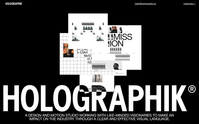
Holographik uses a high-contrast, stark visual language built on an uncompromising black and white palette. Typography is large, bold, and tightly tracked for maximum impact, creating a sense of directness. Components are entirely UI-driven, with no decorative elements, relying on sharp edges and a single, extreme radius for interaction cues. The overall impression is one of confident, unornamented clarity.
The page primarily uses a full-bleed layout on an Absolute Black background, creating a vast, immersive canvas. The hero section features large, layered graphic elements and bold typography, breaking traditional content structures. Content below the hero appears to be organized in stacked, high-contrast blocks, potentially alternating between full-bleed black and contained white sections. Vertical rhythm is established by significant section gaps (200px). The overall layout emphasizes density and visual impact in key areas, suggesting a minimal navigation structure (top-header links only). There's no evident constrained max-width for the main content.
This site features a heavy use of conceptual, abstract graphics composed of tightly cropped, monochromatic or desaturated photography combined with grid patterns and distorted typographic elements. Imagery often appears as overlapping, raw-edged layers without rounded corners, creating a visual collage effect. The role of imagery is primarily decorative atmosphere and brand expression, rather than explanatory content or product showcase. The density is image-heavy in the hero, becoming more text-dominant downwards. Icons are not a prominent feature, with the visual weight carried by the typographic and photographic elements.
Reminiscent of Acme Co., Büro. by Ben Mingo, Future Fonts, AIGA (certain historical designs).
# Holographik — Style Reference
> High-contrast monochrome blueprint

**Theme:** dark

**Site:** https://www.holographik.co

Holographik uses a high-contrast, stark visual language built on an uncompromising black and white palette. Typography is large, bold, and tightly tracked for maximum impact, creating a sense of directness. Components are entirely UI-driven, with no decorative elements, relying on sharp edges and a single, extreme radius for interaction cues. The overall impression is one of confident, unornamented clarity.

## Tokens — Colors

| Name | Value | Token | Role |
|------|------|------|------|
| Absolute Black | `#000000` | `--color-absolute-black` | Page backgrounds, primary text, foundational UI borders, critical information, hero section background |
| Pure White | `#ffffff` | `--color-pure-white` | Hairline borders, dividers, input outlines, and card edges on light surfaces. Do not promote it to the primary CTA color |
| Ash Gray | `#aaaaaa` | `--color-ash-gray` | Subtle background panels and sections; used for lower-prominence content areas |

## Tokens — Typography

### Helvetica Neue
- **Substitute:** Arial
- **Weights:** 400
- **Sizes:** 16px, 26px
- **Line height:** 1, 1.25
- **Letter spacing:** -0.0200em at all sizes
- **Role:** Primary typeface for all content. Its consistent weight and tight letter-spacing across sizes contribute to the direct, industrial feel, serving for both prominent headings and body text.

## Tokens — Type Scale

| Role | Size | Line height | Letter spacing |
|------|------|------|------|
| body | 16px | 1.25 | — |
| heading | 26px | 1 | -0.52px |

## Tokens — Spacing

- **Section gap:** 200px
- **Card padding:** 24px
- **Element gap:** 10px

## Tokens — Radius

- **Buttons:** 160px
- **other:** 160px

## Layout

The page primarily uses a full-bleed layout on an Absolute Black background, creating a vast, immersive canvas. The hero section features large, layered graphic elements and bold typography, breaking traditional content structures. Content below the hero appears to be organized in stacked, high-contrast blocks, potentially alternating between full-bleed black and contained white sections. Vertical rhythm is established by significant section gaps (200px). The overall layout emphasizes density and visual impact in key areas, suggesting a minimal navigation structure (top-header links only). There's no evident constrained max-width for the main content.

## Imagery

This site features a heavy use of conceptual, abstract graphics composed of tightly cropped, monochromatic or desaturated photography combined with grid patterns and distorted typographic elements. Imagery often appears as overlapping, raw-edged layers without rounded corners, creating a visual collage effect. The role of imagery is primarily decorative atmosphere and brand expression, rather than explanatory content or product showcase. The density is image-heavy in the hero, becoming more text-dominant downwards. Icons are not a prominent feature, with the visual weight carried by the typographic and photographic elements.

## Components

### Navigation Link
*Top-bar navigation and footer links*

Uses Pure White text (#ffffff) on Absolute Black (#000000) or vice versa, with no underline for a clean, direct appearance. Active states or hover effects are not visibly distinguished through color; interactions rely on inherent link behavior.

### Accent Bordered Element (Ghost/Outlined)
*Interactive elements, likely buttons/links*

Defined by a 1px Pure White border (#ffffff) on a Pure White background, implying an outlined element against a dark canvas. Text color defaults to Absolute Black (#000000). Radii are extreme at 160px, creating a pill-like shape.

### Text Block
*Descriptive paragraphs and content sections*

Body text in Helvetica Neue, weight 400, 16px, line-height 1.25. Text is Absolute Black (#000000) on Pure White (#ffffff) backgrounds or Pure White on Absolute Black backgrounds, maintaining high contrast. Padding is minimal at 24px.

### Hero Headline
*Main page headline*

Large (26px) Helvetica Neue, weight 400, with tight line-height of 1.0 and -0.02em letter-spacing for visual density. Text color is Pure White (#ffffff) on Absolute Black (#000000).

## Guidelines

### Do

- Maintain a strict monochrome palette, leveraging Absolute Black (#000000) and Pure White (#ffffff) for primary contrast and Ash Gray (#aaaaaa) for subtle variations.
- Apply the extreme 160px border-radius to all interactive components and card-like elements to establish a distinct pill or circular visual cue.
- Use Helvetica Neue (or Arial as substitute) exclusively for all text, maintaining weight 400 and a consistent -0.0200em letter-spacing across all sizes.
- Utilize 200px for vertical section separation to ensure generous breathing room between content blocks.
- Prioritize high contrast pairings of #000000 text on #ffffff backgrounds or vice-versa for all content to maximize readability and visual impact.
- Employ 24px internal padding for card-like elements and similar content containers, with smaller 5px or 10px padding for tighter internal element spacing.

### Don't

- Avoid introducing any additional chromatic colors; limit the palette to black, white, and a single gray.
- Do not use subtle or moderate border radii, as the system mandates an extreme 160px radius for specific components.
- Do not vary font weights beyond 400 for Helvetica Neue; all typography should maintain its consistent visual weight.
- Do not introduce shadows or elevation effects; the design relies on flat, high-contrast surfaces.
- Avoid intricate layout grids or complex component architectures; maintain a direct, block-based composition.
- Do not use generic system link styles; links should be Pure White or Absolute Black text without explicit underlines unless contextualized.

## Agent Prompt Guide

Quick Color Reference:
text: #000000
background: #000000
border: #000000
accent: no distinct accent color
primary action: no distinct CTA color

Example Component Prompts:
1. Create a header bar: Absolute Black background (#000000), with 'HOLOGRAPHIK' in Pure White Helvetica Neue 26px, weight 400, line-height 1.0, and 'hello@holographik.co' and 'Instagram↗' as Pure White Helvetica Neue 16px, weight 400, line-height 1.25, both with -0.0200em letter-spacing.
2. Design a hero section with an Absolute Black background (#000000). Title the section 'HOLOGRAPHIK®' using Pure White #ffffff text, Helvetica Neue 26px, weight 400, line-height 1.0, with -0.0200em letter-spacing. Below it, add a descriptive paragraph: 'A DESIGN AND MOTION STUDIO WORKING WITH LIKE-MINDED VISIONARIES TO MAKE AN IMPACT ON THE INDUSTRY THROUGH A CLEAR AND EFFECTIVE VISUAL LANGUAGE.' in Pure White #ffffff text, Helvetica Neue 16px, weight 400, line-height 1.25, -0.0200em letter-spacing. Ensure ample padding of 24px and a 200px section gap before any subsequent content.
3. Create a conceptual grid element: Pure White background (#ffffff), featuring an internal grid pattern in Absolute Black (#000000), using the default element gap of 10px between grid lines. This element should have a 160px border-radius, giving it a soft, pill-shaped edge. Text content on this element should be Absolute Black (#000000) Helvetica Neue 16px, weight 400, line-height 1.25.
More like this





Keep what you find
A free account saves references to boards and can send you a weekly email of picks based on what you save.
To see every result, go Pro.