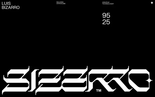
Preview image. Unlock full-res
Color palette
Page background, surface backgrounds, dominant UI color
Hairline borders, dividers, input outlines, and card edges on light surfaces. Do not promote it to the primary CTA color
Typography
- Weights
- 400
- Sizes
- 8px, 14px, 18px, 30px, 32px, 38px, 45px, 60px, 75px
- Line height
- 1, 1.2
- Letter spacing
- -0.0620em for small text, -0.0500em for medium text, tapering to -0.0210em for larger headlines
- Fallback
- Inter, sans-serif
All textual content, from small metadata to large hero headlines. The consistent weight but varied tracking creates hierarchical distinction.
Spacing & shape
Components
Ghost White text set in FK Grotesk Neue at 19px, line height 1.2, with a subtly reduced letter spacing. Employs a 1px Ghost White border on hover.
A block of Void Black background with Ghost White text and details. The entire block is bordered by a 1px Ghost White line, serving as the interactive element boundary. Features 19px internal element spacing and rounded corners at 5px.
Ghost White text in FK Grotesk Neue, typically 8px, with specific letter spacing of -0.0620em. Used for secondary information like 'Building Hypercube' or 'Apple'.
Ghost White numbers (e.g., '95', '25') set in FK Grotesk Neue, size 60px or 75px, with tight line height 1.0. Creates a bold, almost code-like aesthetic.
Multiple lines of Ghost White text, uppercase, usually 38px or 45px FK Grotesk Neue, 1.2 line height, stacked vertically with some letter spacing adjustments (-0.024em or -0.021em). Examples: 'APPLE VISION PRO', 'XBOX MUSEUM'.
Guidelines
- Maintain maximum contrast: use only Ghost White (#ffffff) text and borders on Void Black (#000000) backgrounds.
- Utilize FK Grotesk Neue weight 400 for all typography, varying sizes and letter spacing to establish hierarchy.
- Apply a global border-radius of 5px to all rectangular interactive elements and containers.
- Implement a 1px Ghost White (#ffffff) border for interactive elements to indicate their clickable nature, particularly for project cards and navigation.
- Employ consistent vertical spacing for sections, preferentially using `sectionGap` of 45px and `elementGap` of 19px within containers.
- Use tight line heights (1.0 for large numbers, 1.2 for text blocks) to maintain typographic density and control vertical rhythm.
- Avoid any color other than Ghost White for text, borders, or accents; the system is strictly monochrome.
- Do not introduce unnecessary shadows or complex elevation; surfaces should primarily be flat against the Void Black background.
- Do not vary font weights; FK Grotesk Neue weight 400 is the sole weight for all type.
- Do not use generic padding values; rely instead on `elementGap` for internal spacing and `sectionGap` for block separation.
- Avoid decorative line breaks or excessive horizontal rules; vertical spacing and subtle borders are the primary separators.
- Do not use imagery in a way that breaks the strict monochrome palette or introduces significant color; if imagery is present, it should be abstract or minimal.
About this system
ShowHide
Luis Bizarro's portfolio establishes itself as a minimalist, high-contrast dark canvas, where sparse white typography takes center stage. A grid-based layout with generous vertical spacing emphasizes content partitions. The visual style is stark and intentional, using only black and white to create a focused, almost archival presentation of work, with interactivity implied through subtle hover states rather than overt color cues.
The page follows a full-bleed, dark-themed model with no explicit page max-width, allowing content to stretch across the viewport, though text blocks are inherently contained. The hero section features large, centered typography flanked by smaller, aligned metadata. Subsequent sections predominantly use a high-contrast text-on-black layout, often featuring vertically stacked, large-format project titles. Vertical rhythm is established through consistent `sectionGap` (45px) between content blocks and larger `marginTop` values (up to 220px) for prominent headings. Navigation is minimal, presented as Ghost White text links.
The site largely avoids traditional imagery, focusing instead on stark typography. When visuals are present, they are either abstract, pixelated, or technical renders (like the pixelated face or the Apple Vision Pro render), adhering to a muted, often monochromatic or desaturated color palette that blends with the dark UI. Icons are simple, outlined, and monochromatic (Ghost White). The overall density is image-light, with visuals serving as abstract texture rather than detailed content.
Reminiscent of Bruno Simon, Obys Agency, Garden of Delete.
# Luis Bizarro — Style Reference
> monochrome digital ledger

**Theme:** dark

**Site:** https://bizar.ro

Luis Bizarro's portfolio establishes itself as a minimalist, high-contrast dark canvas, where sparse white typography takes center stage. A grid-based layout with generous vertical spacing emphasizes content partitions. The visual style is stark and intentional, using only black and white to create a focused, almost archival presentation of work, with interactivity implied through subtle hover states rather than overt color cues.

## Tokens — Colors

| Name | Value | Token | Role |
|------|------|------|------|
| Void Black | `#000000` | `--color-void-black` | Page background, surface backgrounds, dominant UI color |
| Ghost White | `#ffffff` | `--color-ghost-white` | Hairline borders, dividers, input outlines, and card edges on light surfaces. Do not promote it to the primary CTA color |

## Tokens — Typography

### FK Grotesk Neue
- **Substitute:** Inter, sans-serif
- **Weights:** 400
- **Sizes:** 8px, 14px, 18px, 30px, 32px, 38px, 45px, 60px, 75px
- **Line height:** 1, 1.2
- **Letter spacing:** -0.0620em for small text, -0.0500em for medium text, tapering to -0.0210em for larger headlines
- **Role:** All textual content, from small metadata to large hero headlines. The consistent weight but varied tracking creates hierarchical distinction.

## Tokens — Type Scale

Major Third (1.25) from 18px base.

| Role | Size | Line height | Letter spacing |
|------|------|------|------|
| body-sm | 14px | 1.2 | -0.7px |
| body | 18px | 1.2 | -0.76px |
| heading-sm | 30px | 1.2 | -0.93px |
| heading | 32px | 1.2 | -0.8px |
| heading-lg | 38px | 1.2 | -0.79px |
| display | 45px | 1.2 | -1.04px |
| display-lg | 60px | 1 | -1.5px |
| display-xl | 75px | 1 | -1.58px |

## Tokens — Spacing

- **Section gap:** 45px
- **Card padding:** 0px
- **Element gap:** 19px

## Tokens — Radius

- **Default:** 5px

## Layout

The page follows a full-bleed, dark-themed model with no explicit page max-width, allowing content to stretch across the viewport, though text blocks are inherently contained. The hero section features large, centered typography flanked by smaller, aligned metadata. Subsequent sections predominantly use a high-contrast text-on-black layout, often featuring vertically stacked, large-format project titles. Vertical rhythm is established through consistent `sectionGap` (45px) between content blocks and larger `marginTop` values (up to 220px) for prominent headings. Navigation is minimal, presented as Ghost White text links.

## Imagery

The site largely avoids traditional imagery, focusing instead on stark typography. When visuals are present, they are either abstract, pixelated, or technical renders (like the pixelated face or the Apple Vision Pro render), adhering to a muted, often monochromatic or desaturated color palette that blends with the dark UI. Icons are simple, outlined, and monochromatic (Ghost White). The overall density is image-light, with visuals serving as abstract texture rather than detailed content.

## Components

### Navigation Link
*Primary navigation and interactive text links*

Ghost White text set in FK Grotesk Neue at 19px, line height 1.2, with a subtly reduced letter spacing. Employs a 1px Ghost White border on hover.

### Project Overview Card (Interactive)
*Container for individual project entries, signaling interactivity*

A block of Void Black background with Ghost White text and details. The entire block is bordered by a 1px Ghost White line, serving as the interactive element boundary. Features 19px internal element spacing and rounded corners at 5px.

### Subtle Metadata Tag
*Small, functional information labels*

Ghost White text in FK Grotesk Neue, typically 8px, with specific letter spacing of -0.0620em. Used for secondary information like 'Building Hypercube' or 'Apple'.

### Large Numeric Display
*Prominent, data-driven typographic element*

Ghost White numbers (e.g., '95', '25') set in FK Grotesk Neue, size 60px or 75px, with tight line height 1.0. Creates a bold, almost code-like aesthetic.

### Section Header (Stacked)
*Divisive title for portfolio projects*

Multiple lines of Ghost White text, uppercase, usually 38px or 45px FK Grotesk Neue, 1.2 line height, stacked vertically with some letter spacing adjustments (-0.024em or -0.021em). Examples: 'APPLE VISION PRO', 'XBOX MUSEUM'.

## Guidelines

### Do

- Maintain maximum contrast: use only Ghost White (#ffffff) text and borders on Void Black (#000000) backgrounds.
- Utilize FK Grotesk Neue weight 400 for all typography, varying sizes and letter spacing to establish hierarchy.
- Apply a global border-radius of 5px to all rectangular interactive elements and containers.
- Implement a 1px Ghost White (#ffffff) border for interactive elements to indicate their clickable nature, particularly for project cards and navigation.
- Employ consistent vertical spacing for sections, preferentially using `sectionGap` of 45px and `elementGap` of 19px within containers.
- Use tight line heights (1.0 for large numbers, 1.2 for text blocks) to maintain typographic density and control vertical rhythm.

### Don't

- Avoid any color other than Ghost White for text, borders, or accents; the system is strictly monochrome.
- Do not introduce unnecessary shadows or complex elevation; surfaces should primarily be flat against the Void Black background.
- Do not vary font weights; FK Grotesk Neue weight 400 is the sole weight for all type.
- Do not use generic padding values; rely instead on `elementGap` for internal spacing and `sectionGap` for block separation.
- Avoid decorative line breaks or excessive horizontal rules; vertical spacing and subtle borders are the primary separators.
- Do not use imagery in a way that breaks the strict monochrome palette or introduces significant color; if imagery is present, it should be abstract or minimal.

## Agent Prompt Guide

Quick Color Reference:
text: #ffffff
background: #000000
border: #ffffff
accent: no distinct accent color
primary action: no distinct CTA color

Example Component Prompts:
Create a navigation link: Ghost White text '#ffffff', FK Grotesk Neue, 18px size, 1.2 line height, -0.76px letter spacing. On hover, add a 1px solid Ghost White border.
Create a project heading: Ghost White text '#ffffff', FK Grotesk Neue, 38px size, 1.2 line height, -0.79px letter spacing, uppercase. Center align.
Create a metadata label: Ghost White text '#ffffff', FK Grotesk Neue, 8px size, 1.0 line height, -0.49px letter spacing.
Create a project overview card: Void Black background '#000000', 5px border-radius, Ghost White 1px border '#ffffff'. Inside, stack project heading, metadata, and an interactive 'SEE' link with 19px vertical elementGap.
More like this





Keep what you find
A free account saves references to boards and can send you a weekly email of picks based on what you save.
To see every result, go Pro.