Preview image. Unlock full-res
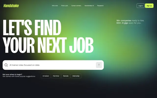
Shifting gradient nebula
Color palette
Primary action background, active navigation indicator, sign-up button, decorative accents — a vibrant beacon against the dark UI; Hero background creating a dynamic, almost ethereal feel, blending blues and greens
Primary text, deep shadow, content background on footer, icon fill
Placeholder text, subtle background for dark ghost buttons, input borders
Footer background
Heading text, body text, canvas for forms, ghost button backgrounds, input background
Secondary body text, helper text
Typography
- Weights
- 400
- Sizes
- 12px, 14px, 16px, 20px, 22px, 28px, 40px
- Line height
- 0.85, 1.1, 1.4, 1.5
- Letter spacing
- -0.0250em at large sizes, -0.0200em, -0.0150em at smaller sizes
- Fallback
- Inter
All body text, navigation links, buttons, and most UI elements. Its slightly condensed feel at various weights maintains compactness.
- Weights
- 500
- Sizes
- 12px, 14px, 16px, 20px, 22px, 28px, 40px
- Line height
- 0.85, 1.1, 1.4, 1.5
- Letter spacing
- -0.0250em at large sizes, -0.0200em, -0.0150em at smaller sizes
- Fallback
- Inter
Used for button labels, and emphasized text segments where a subtle increase in visual weight is needed without feeling heavy.
- Weights
- 600
- Sizes
- 201px
- Line height
- 0.8
- Letter spacing
- -0.0200em
- Fallback
- Anton
Large display headings — the extreme size and tight letter spacing create a commanding, impactful presence that emphasizes the brand's bold statement.
- Weights
- 400
- Sizes
- 16px
- Line height
- 1.5
Arial — detected in extracted data but not described by AI
Spacing & shape
Components
Ghost button with no background, 'Stardust' #ffffff text, and a 'Guidepost Green' #d3fb52 1px border, 8px radius, with 12px vertical and 16px horizontal padding. Prompts interaction without visual weight.
Ghost button with no background, 'Stardust' #ffffff text, and a 'Midnight Core' oklab(1 0 5.96046e-8 / 0.2) 1px border, 8px radius. Padding 16px all sides.
Filled with 'Guidepost Green' #d3fb52, 'Stardust' #ffffff text, 8px radius, and 12px vertical, 16px horizontal padding. Used for the prominent 'Sign up' action.
Background oklab(0.19794 0.0021212 -0.0139539 / 0.1), 'Stardust' #ffffff text, with a 12px radius, and no explicit padding. Used for 'AI trainer', 'Full-time' etc.
Rounded input with 'Stardust' #ffffff background, 'Deep Space' #000000 text and placeholder, 'Midnight Core' #14151c 1px border, 24px radius. Left padding 64px to accommodate the search icon.
Background oklab(1 0 5.96046e-8 / 0.06), no shadow, and 24px border radius. Used for cards that group information.
Guidelines
- Use 'Stardust' #ffffff for all primary text content and 'Deep Space' #000000 for secondary text and sub-headings to maximize contrast against the dynamic backgrounds.
- Apply 'Guidepost Green' #d3fb52 strictly for primary calls-to-action like 'Sign up' and navigational highlights to draw immediate attention. Do not use for generic elements.
- Maintain a clear visual hierarchy using the large SansPlomb 201px heading specifically for page and section titles, with its tight letter-spacing of -0.0200em for impact.
- Round all interactive elements like buttons and primary inputs with 8px uniform radius, and larger content blocks (cards, main inputs) with 24px radius, unless a pill shape (9999px) is used for tags.
- Implement the radial gradient backgrounds for hero sections or prominent content areas to provide a dynamic, branded visual anchor, ensuring the 'Nebula Gradation' blends from 'Guidepost Green' #d3fb52 to blue.
- Use the Base Unit 8px for all spacing decisions, creating consistent element gaps of 16px horizontally and vertically, and section gaps of 24px.
- Employ ghost button styles (no background, white text, defined border) for secondary actions like 'Log In', making the primary 'Sign up' button stand out distinctly.
- Do not introduce new vibrant colors outside of the 'Guidepost Green' #d3fb52 accent, or the blue component of the 'Nebula Gradation', to avoid diluting the brand's energetic yet focused palette.
- Avoid generic box shadows or heavy borders on background elements; components should breathe and appear lightweight against the fluid gradient.
- Do not deviate from the specified typefaces, especially SansPlomb for large headlines, as its distinct letter spacing and weight are critical for brand identity.
- Do not use subtle neutrals for critical calls-to-action; 'Guidepost Green' #d3fb52 is reserved for this purpose.
- Avoid excessive text density or complex multi-column layouts, sticking to a comfortable density with clear vertical rhythm and ample breathing room between elements.
- Do not create completely flat design elements. Even ghost buttons and inputs should retain a subtle border or background transparency as defined.
- Do not use generic system fonts for body or UI text; NoiGrotesk with its feature settings is fundamental to the brand's typographic tone.
About this system
ShowHide
Handshake employs a dark, dynamic canvas lit by a vibrant, shifting gradient backdrop, creating a sense of energy and opportunity. Bold, blocky typography ensures high impact against this fluid background, while UI elements are purposefully minimal, often appearing as ghost outlines or subtle containers. The prominent use of a single vivid green accent ensures calls to action pop with urgency, contrasting sharply with the deep dark base.
The page structure is full-bleed, with content centered but not strictly constrained by a fixed max-width, allowing the background gradients to stretch across the viewport. The hero section is characterized by a central, bold headline over a gradient background, followed by an input field. Sections are distinct but flow seamlessly, often with ample vertical spacing. Content is generally stacked centrally or in simple text-right/image-left type patterns, ensuring focus on typography and the dynamic backdrop. Navigation is a sticky top bar with ghost controls, and a prominent green primary action button.
The site uses minimal imagery, primarily focusing on abstract, atmospheric radial gradients as backgrounds. There are no photographs or complex illustrations. Icons are simple, outlined, and monochromatic, primarily using 'Stardust' #ffffff or 'Deep Space' #000000, serving purely functional roles like search or navigation prompts rather than decorative ones.
Reminiscent of Rive, Pitch, Linear.
# Handshake — Style Reference
> Shifting gradient nebula

**Theme:** light

**Site:** https://joinhandshake.com

Handshake employs a dark, dynamic canvas lit by a vibrant, shifting gradient backdrop, creating a sense of energy and opportunity. Bold, blocky typography ensures high impact against this fluid background, while UI elements are purposefully minimal, often appearing as ghost outlines or subtle containers. The prominent use of a single vivid green accent ensures calls to action pop with urgency, contrasting sharply with the deep dark base.

## Tokens — Colors

| Name | Value | Token | Role |
|------|------|------|------|
| Guidepost Green | `#d3fb52` | `--color-guidepost-green` | Primary action background, active navigation indicator, sign-up button, decorative accents — a vibrant beacon against the dark UI; Hero background creating a dynamic, almost ethereal feel, blending blues and greens |
| Deep Space | `#000000` | `--color-deep-space` | Primary text, deep shadow, content background on footer, icon fill |
| Midnight Core | `#14151c` | `--color-midnight-core` | Placeholder text, subtle background for dark ghost buttons, input borders |
| Cosmic Gray | `#052326` | `--color-cosmic-gray` | Footer background |
| Stardust | `#ffffff` | `--color-stardust` | Heading text, body text, canvas for forms, ghost button backgrounds, input background |
| Muted Text | `#666666` | `--color-muted-text` | Secondary body text, helper text |

## Tokens — Typography

### NoiGrotesk
- **Substitute:** Inter
- **Weights:** 400
- **Sizes:** 12px, 14px, 16px, 20px, 22px, 28px, 40px
- **Line height:** 0.85, 1.1, 1.4, 1.5
- **Letter spacing:** -0.0250em at large sizes, -0.0200em, -0.0150em at smaller sizes
- **Role:** All body text, navigation links, buttons, and most UI elements. Its slightly condensed feel at various weights maintains compactness.

### NoiGrotesk
- **Substitute:** Inter
- **Weights:** 500
- **Sizes:** 12px, 14px, 16px, 20px, 22px, 28px, 40px
- **Line height:** 0.85, 1.1, 1.4, 1.5
- **Letter spacing:** -0.0250em at large sizes, -0.0200em, -0.0150em at smaller sizes
- **Role:** Used for button labels, and emphasized text segments where a subtle increase in visual weight is needed without feeling heavy.

### SansPlomb
- **Substitute:** Anton
- **Weights:** 600
- **Sizes:** 201px
- **Line height:** 0.8
- **Letter spacing:** -0.0200em
- **Role:** Large display headings — the extreme size and tight letter spacing create a commanding, impactful presence that emphasizes the brand's bold statement.

### Arial
- **Weights:** 400
- **Sizes:** 16px
- **Line height:** 1.5
- **Role:** Arial — detected in extracted data but not described by AI

## Tokens — Type Scale

Perfect Fifth (1.5) from 16px base.

| Role | Size | Line height | Letter spacing |
|------|------|------|------|
| caption | 12px | 1.4 | — |
| body-sm | 14px | 1.4 | — |
| body | 16px | 1.4 | — |
| subheading | 20px | 1.1 | — |
| heading-sm | 22px | 1.1 | — |
| heading | 28px | 1.1 | — |
| heading-lg | 40px | 0.85 | — |
| display | 201px | 0.8 | -4.02px |

## Tokens — Spacing

- **Section gap:** 24px
- **Card padding:** 16px
- **Element gap:** 16px

## Tokens — Radius

- **Buttons:** 8px
- **Inputs:** 24px
- **Cards:** 24px
- **buttons-large:** 12px
- **navigationItems:** 8px
- **tags:** 9999px

## Layout

The page structure is full-bleed, with content centered but not strictly constrained by a fixed max-width, allowing the background gradients to stretch across the viewport. The hero section is characterized by a central, bold headline over a gradient background, followed by an input field. Sections are distinct but flow seamlessly, often with ample vertical spacing. Content is generally stacked centrally or in simple text-right/image-left type patterns, ensuring focus on typography and the dynamic backdrop. Navigation is a sticky top bar with ghost controls, and a prominent green primary action button.

## Imagery

The site uses minimal imagery, primarily focusing on abstract, atmospheric radial gradients as backgrounds. There are no photographs or complex illustrations. Icons are simple, outlined, and monochromatic, primarily using 'Stardust' #ffffff or 'Deep Space' #000000, serving purely functional roles like search or navigation prompts rather than decorative ones.

## Components

### Primary Ghost Button
*Call to action variant*

Ghost button with no background, 'Stardust' #ffffff text, and a 'Guidepost Green' #d3fb52 1px border, 8px radius, with 12px vertical and 16px horizontal padding. Prompts interaction without visual weight.

### Navigation Ghost Button
*Navigation and secondary actions*

Ghost button with no background, 'Stardust' #ffffff text, and a 'Midnight Core' oklab(1 0 5.96046e-8 / 0.2) 1px border, 8px radius. Padding 16px all sides.

### Primary Filled Button
*High-priority, primary action.*

Filled with 'Guidepost Green' #d3fb52, 'Stardust' #ffffff text, 8px radius, and 12px vertical, 16px horizontal padding. Used for the prominent 'Sign up' action.

### Filter Tag
*Interactive content categorization*

Background oklab(0.19794 0.0021212 -0.0139539 / 0.1), 'Stardust' #ffffff text, with a 12px radius, and no explicit padding. Used for 'AI trainer', 'Full-time' etc.

### Search Input
*Primary form input for search queries.*

Rounded input with 'Stardust' #ffffff background, 'Deep Space' #000000 text and placeholder, 'Midnight Core' #14151c 1px border, 24px radius. Left padding 64px to accommodate the search icon.

### Feature Card
*Content grouping for features or testimonials.*

Background oklab(1 0 5.96046e-8 / 0.06), no shadow, and 24px border radius. Used for cards that group information.

## Guidelines

### Do

- Use 'Stardust' #ffffff for all primary text content and 'Deep Space' #000000 for secondary text and sub-headings to maximize contrast against the dynamic backgrounds.
- Apply 'Guidepost Green' #d3fb52 strictly for primary calls-to-action like 'Sign up' and navigational highlights to draw immediate attention. Do not use for generic elements.
- Maintain a clear visual hierarchy using the large SansPlomb 201px heading specifically for page and section titles, with its tight letter-spacing of -0.0200em for impact.
- Round all interactive elements like buttons and primary inputs with 8px uniform radius, and larger content blocks (cards, main inputs) with 24px radius, unless a pill shape (9999px) is used for tags.
- Implement the radial gradient backgrounds for hero sections or prominent content areas to provide a dynamic, branded visual anchor, ensuring the 'Nebula Gradation' blends from 'Guidepost Green' #d3fb52 to blue.
- Use the Base Unit 8px for all spacing decisions, creating consistent element gaps of 16px horizontally and vertically, and section gaps of 24px.
- Employ ghost button styles (no background, white text, defined border) for secondary actions like 'Log In', making the primary 'Sign up' button stand out distinctly.

### Don't

- Do not introduce new vibrant colors outside of the 'Guidepost Green' #d3fb52 accent, or the blue component of the 'Nebula Gradation', to avoid diluting the brand's energetic yet focused palette.
- Avoid generic box shadows or heavy borders on background elements; components should breathe and appear lightweight against the fluid gradient.
- Do not deviate from the specified typefaces, especially SansPlomb for large headlines, as its distinct letter spacing and weight are critical for brand identity.
- Do not use subtle neutrals for critical calls-to-action; 'Guidepost Green' #d3fb52 is reserved for this purpose.
- Avoid excessive text density or complex multi-column layouts, sticking to a comfortable density with clear vertical rhythm and ample breathing room between elements.
- Do not create completely flat design elements. Even ghost buttons and inputs should retain a subtle border or background transparency as defined.
- Do not use generic system fonts for body or UI text; NoiGrotesk with its feature settings is fundamental to the brand's typographic tone.

## Agent Prompt Guide

**Quick Color Reference**
text: #ffffff
background: #000000
border: #14151c
accent: #d3fb52
primary action: #d3fb52 (filled action)

**3-5 Example Component Prompts**
1. Create a Hero Section: Background is 'Nebula Gradation' #d3fb52 radial gradient. Primary headline "LET'S FIND YOUR NEXT JOB" using SansPlomb 201px, weight 600, #ffffff, letter-spacing -4.02px, centered. Subtext "1M+ companies ready to hire. 500+ AI gigs open for you." using NoiGrotesk 28px, weight 400, #ffffff. Centered search input component.
2. Create a Search Input Field: With 'Stardust' #ffffff background, 'Midnight Core' #14151c 1px border, 24px radius, left padding 64px. Placeholder text "AI trainer roles focused on data" in 'Deep Space' #000000 with NoiGrotesk 16px, weight 400. Include a simple outlined search icon.
3. Create a Primary Action Button: #d3fb52 background, #000000 text, 9999px radius, compact pill padding. Use this filled treatment for the main CTA.
4. Create a Ghost Navigation Link: "Log in" with no background, 'Stardust' #ffffff text using NoiGrotesk 16px, weight 400, and a 1px border of 'Midnight Core' #14151c, 8px radius, 16px padding on all sides.
5. Create a Filter Tag: "AI trainer" with background oklab(0.19794 0.0021212 -0.0139539 / 0.1), 'Stardust' #ffffff text using NoiGrotesk 14px, weight 400, and a 12px radius, no padding.
More like this







Keep what you find
A free account saves references to boards and can send you a weekly email of picks based on what you save.
To see every result, go Pro.