Preview image. Unlock full-res
Architectural blueprint on white canvas.
Color palette
Specific heading accent color, often paired with bold borders. Functions as a thematic identifier, not a primary interaction color
Dark borders and separators for elevated surfaces and inverted UI. Do not promote it to the primary CTA color
Page backgrounds, primary card surfaces, ghost button backgrounds, default text in interactive elements
Secondary text, link borders, subtle decorative borders, section dividers
Muted text, metadata, subtle card borders
Subtle background for specific card sections, indicating thematic grouping
Subtle background for specific card sections, indicating thematic grouping
Subtle background for specific card sections, indicating thematic grouping
Typography
- Weights
- 400, 700
- Sizes
- 14px, 16px
- Line height
- 1, 1.43
Arial — detected in extracted data but not described by AI
- Weights
- 400
- Sizes
- 10px, 12px, 16px, 20px, 22px, 24px
- Line height
- 1, 1.25, 1.45, 1.5, 1.67, 1.75
- Letter spacing
- 0.033em (10px), 0.040em (12px), normal (16px), normal (over 16px)
- Fallback
- Helvetica Neue, Arial, sans-serif
Body text, small labels, button text, and compact headings. Provides a modern, utilitarian base.
- Weights
- 400
- Sizes
- 16px, 18px, 22px, 30px, 50px, 90px, 100px
- Line height
- 1, 1.08, 1.11, 1.25, 1.33
- Letter spacing
- -0.018em
- Fallback
- Helvetica Neue, Arial, sans-serif
Bold headings, navigation, and large display text. The negative letter-spacing contributes to its compact, impactful appearance.
- Weights
- 400, 700
- Sizes
- 26px, 50px, 60px
- Line height
- 1.15, 1.24, 1.28
- Letter spacing
- normal
- Fallback
- Georgia, serif
Primary marketing headlines. A serif font choice that adds a touch of classic authority and gravitas.
- Weights
- 400
- Sizes
- 18px
- Line height
- 1.44
- Letter spacing
- normal
- Fallback
- Georgia, serif
Long-form body text within cards, offering a contrasting, more traditional readability.
- Weights
- 400
- Sizes
- 16px
- Line height
- 1.75
Helveticaneueltpro roman — detected in extracted data but not described by AI
Spacing & shape
Components
Text: Ink Black (#000000), Helvetica Neue LT Pro (400, 12px, 0.040em). Background: Cloud White (#ffffff). Border: 1px solid Ink Black (#000000). Padding: 9px vertical, 15px horizontal. Radius: 0px.
Background: Sky Tint (#ecf1fb), Rose Tint (#fff3f5), or Mint Tint (#f1fbf6). Border: 1px solid Ink Black (#000000). Padding: 65px top, 40px right, 30px bottom, 30px left. Radius: 0px. Text color: Ink Black (#000000).
Background: Cloud White (#ffffff). Border: 1px solid Ink Black (#000000). Padding: 65px top, 40px right, 30px bottom, 30px left. Radius: 0px. Text color: Ink Black (#000000).
Text: Ink Black (#000000), Helvetica Neue LT Pro (400, 16px). Includes a right-pointing arrow icon often, implied by '→'.
Text: Helvetica Neue LT Pro (400, 16px), Ink Black (#000000). Minimal styling, often 'MENU' in all caps, implying a dynamic dropdown or overlay.
Guidelines
- Always define vertical and horizontal content separation with 1px solid Ink Black (#000000) borders.
- Use Tiempos Headline Web (400, 50px, normal letter-spacing, 1.24 lineHeight) for primary page-level headings to convey authority.
- Apply specific background tints (Sky Tint #ecf1fb, Rose Tint #fff3f5, Mint Tint #f1fbf6) to content cards to delineate thematic sections within the main grid.
- Ensure all interactive elements, including buttons and card links, have a border radius of 0px to maintain the sharp, architectural aesthetic.
- Employ Helvetica Neue LT Pro (400, 12px, 0.040em letter-spacing) for all compact labels and button text for legibility at small sizes.
- Maintain 6px as the default `elementGap` between small, inline elements to preserve density and visual grouping.
- Avoid using rounded corners; the system strongly relies on a 0px border-radius across all components for its structured feel.
- Do not use drop shadows or elevation effects; the design emphasizes flat surfaces and defined borders for depth.
- Do not introduce new vibrant colors outside of the defined thematic accent and very limited brand green; the palette is intentionally restrained.
- Do not use generic system fonts when custom fonts are specified; font choices are critical to establishing the brand's formal yet modern tone.
- Avoid overly spacious layouts; the design prioritizes a comfortable but contained density, particularly with `elementGap` at 6px and `cardPadding` at 30px.
- Do not use filled buttons for primary actions; the system prefers ghost buttons with strong borders to maintain visual lightness and structure.
About this system
ShowHide
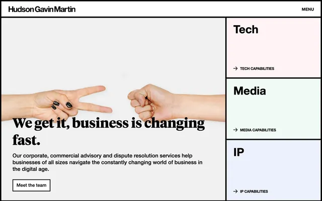
Hudson Gavin Martin uses a structured, grid-based layout with strong black borders defining content areas. A minimal, formal typography set is contrasted by occasional bursts of subtle, tinted surface colors, creating a sense of organized professionalism with approachable accents. The overall feel is that of an architectural blueprint, where clean lines and precise boundaries dictate visual flow and hierarchy.
The page adheres to a strong, box-model layout with both full-bleed and max-width sections typically framed by prominent Ink Black borders. The hero section often features a split layout: conceptual imagery on one side and a prominent headline stack with a ghost button on the other. Subsequent sections are highly grid-based, using 2- or 3-column arrangements for content cards and thematic blocks. Vertical rhythm is established through consistent section gaps and strong horizontal dividers. Navigation is minimal, typically a 'MENU' button in the top right that likely triggers an off-canvas or full-screen overlay.
The site utilizes product-focused photography and graphic elements that emphasize conceptual clarity. Photography primarily features hands in symbolic gestures, often isolated against a clean white background, treated minimally without heavy effects. This imagery serves as conceptual metaphors rather than decorative elements. Icons are typically single-color (Ink Black) outlined, reflecting the overall minimalist and structured aesthetic. The density of imagery is balanced, providing visual breaks but remaining subservient to the strict grid and typographic hierarchy.
Reminiscent of AIGA Design, Dropbox Design, Verge, Pentagram.
# Hudson Gavin Martin — Style Reference
> Architectural blueprint on white canvas.

**Theme:** light

**Site:** https://hgmlegal.com

Hudson Gavin Martin uses a structured, grid-based layout with strong black borders defining content areas. A minimal, formal typography set is contrasted by occasional bursts of subtle, tinted surface colors, creating a sense of organized professionalism with approachable accents. The overall feel is that of an architectural blueprint, where clean lines and precise boundaries dictate visual flow and hierarchy.

## Tokens — Colors

| Name | Value | Token | Role |
|------|------|------|------|
| Forest Green | `#00ac38` | `--color-forest-green` | Specific heading accent color, often paired with bold borders. Functions as a thematic identifier, not a primary interaction color |
| Ink Black | `#000000` | `--color-ink-black` | Dark borders and separators for elevated surfaces and inverted UI. Do not promote it to the primary CTA color |
| Cloud White | `#ffffff` | `--color-cloud-white` | Page backgrounds, primary card surfaces, ghost button backgrounds, default text in interactive elements |
| Carbon Gray | `#333333` | `--color-carbon-gray` | Secondary text, link borders, subtle decorative borders, section dividers |
| Ash Gray | `#797979` | `--color-ash-gray` | Muted text, metadata, subtle card borders |
| Sky Tint | `#ecf1fb` | `--color-sky-tint` | Subtle background for specific card sections, indicating thematic grouping |
| Rose Tint | `#fff3f5` | `--color-rose-tint` | Subtle background for specific card sections, indicating thematic grouping |
| Mint Tint | `#f1fbf6` | `--color-mint-tint` | Subtle background for specific card sections, indicating thematic grouping |

## Tokens — Typography

### Arial
- **Weights:** 400, 700
- **Sizes:** 14px, 16px
- **Line height:** 1, 1.43
- **Role:** Arial — detected in extracted data but not described by AI

### Helvetica Neue LT Pro
- **Substitute:** Helvetica Neue, Arial, sans-serif
- **Weights:** 400
- **Sizes:** 10px, 12px, 16px, 20px, 22px, 24px
- **Line height:** 1, 1.25, 1.45, 1.5, 1.67, 1.75
- **Letter spacing:** 0.033em (10px), 0.040em (12px), normal (16px), normal (over 16px)
- **Role:** Body text, small labels, button text, and compact headings. Provides a modern, utilitarian base.

### Helvetica Neue LT Pro
- **Substitute:** Helvetica Neue, Arial, sans-serif
- **Weights:** 400
- **Sizes:** 16px, 18px, 22px, 30px, 50px, 90px, 100px
- **Line height:** 1, 1.08, 1.11, 1.25, 1.33
- **Letter spacing:** -0.018em
- **Role:** Bold headings, navigation, and large display text. The negative letter-spacing contributes to its compact, impactful appearance.

### Tiempos Headline Web
- **Substitute:** Georgia, serif
- **Weights:** 400, 700
- **Sizes:** 26px, 50px, 60px
- **Line height:** 1.15, 1.24, 1.28
- **Letter spacing:** normal
- **Role:** Primary marketing headlines. A serif font choice that adds a touch of classic authority and gravitas.

### Tiempos Text Web
- **Substitute:** Georgia, serif
- **Weights:** 400
- **Sizes:** 18px
- **Line height:** 1.44
- **Letter spacing:** normal
- **Role:** Long-form body text within cards, offering a contrasting, more traditional readability.

### Helveticaneueltpro roman
- **Weights:** 400
- **Sizes:** 16px
- **Line height:** 1.75
- **Role:** Helveticaneueltpro roman — detected in extracted data but not described by AI

## Tokens — Type Scale

Augmented Fourth (1.414) from 16px base.

| Role | Size | Line height | Letter spacing |
|------|------|------|------|
| caption | 10px | 1 | 0.033em |
| body | 16px | 1.75 | — |
| subheading | 18px | 1.44 | — |
| heading-sm | 22px | 1.11 | -0.018em |
| heading | 30px | 1.25 | -0.018em |
| heading-lg | 50px | 1.24 | — |
| display | 90px | 1.08 | -0.018em |

## Tokens — Spacing

- **Section gap:** 40px
- **Card padding:** 30px
- **Element gap:** 6px

## Tokens — Radius

- **all:** 0px

## Layout

The page adheres to a strong, box-model layout with both full-bleed and max-width sections typically framed by prominent Ink Black borders. The hero section often features a split layout: conceptual imagery on one side and a prominent headline stack with a ghost button on the other. Subsequent sections are highly grid-based, using 2- or 3-column arrangements for content cards and thematic blocks. Vertical rhythm is established through consistent section gaps and strong horizontal dividers. Navigation is minimal, typically a 'MENU' button in the top right that likely triggers an off-canvas or full-screen overlay.

## Imagery

The site utilizes product-focused photography and graphic elements that emphasize conceptual clarity. Photography primarily features hands in symbolic gestures, often isolated against a clean white background, treated minimally without heavy effects. This imagery serves as conceptual metaphors rather than decorative elements. Icons are typically single-color (Ink Black) outlined, reflecting the overall minimalist and structured aesthetic. The density of imagery is balanced, providing visual breaks but remaining subservient to the strict grid and typographic hierarchy.

## Components

### Ghost Button
*Primary action button for key calls to action.*

Text: Ink Black (#000000), Helvetica Neue LT Pro (400, 12px, 0.040em). Background: Cloud White (#ffffff). Border: 1px solid Ink Black (#000000). Padding: 9px vertical, 15px horizontal. Radius: 0px.

### Thematic Content Card
*Categorized content blocks with distinct background tints.*

Background: Sky Tint (#ecf1fb), Rose Tint (#fff3f5), or Mint Tint (#f1fbf6). Border: 1px solid Ink Black (#000000). Padding: 65px top, 40px right, 30px bottom, 30px left. Radius: 0px. Text color: Ink Black (#000000).

### Standard Content Card
*General content blocks that fit into the grid.*

Background: Cloud White (#ffffff). Border: 1px solid Ink Black (#000000). Padding: 65px top, 40px right, 30px bottom, 30px left. Radius: 0px. Text color: Ink Black (#000000).

### Text Link with Arrow
*Navigational links within content, guiding users to deeper information.*

Text: Ink Black (#000000), Helvetica Neue LT Pro (400, 16px). Includes a right-pointing arrow icon often, implied by '→'.

### Header Navigation Link
*Main site navigation.*

Text: Helvetica Neue LT Pro (400, 16px), Ink Black (#000000). Minimal styling, often 'MENU' in all caps, implying a dynamic dropdown or overlay.

## Guidelines

### Do

- Always define vertical and horizontal content separation with 1px solid Ink Black (#000000) borders.
- Use Tiempos Headline Web (400, 50px, normal letter-spacing, 1.24 lineHeight) for primary page-level headings to convey authority.
- Apply specific background tints (Sky Tint #ecf1fb, Rose Tint #fff3f5, Mint Tint #f1fbf6) to content cards to delineate thematic sections within the main grid.
- Ensure all interactive elements, including buttons and card links, have a border radius of 0px to maintain the sharp, architectural aesthetic.
- Employ Helvetica Neue LT Pro (400, 12px, 0.040em letter-spacing) for all compact labels and button text for legibility at small sizes.
- Maintain 6px as the default `elementGap` between small, inline elements to preserve density and visual grouping.

### Don't

- Avoid using rounded corners; the system strongly relies on a 0px border-radius across all components for its structured feel.
- Do not use drop shadows or elevation effects; the design emphasizes flat surfaces and defined borders for depth.
- Do not introduce new vibrant colors outside of the defined thematic accent and very limited brand green; the palette is intentionally restrained.
- Do not use generic system fonts when custom fonts are specified; font choices are critical to establishing the brand's formal yet modern tone.
- Avoid overly spacious layouts; the design prioritizes a comfortable but contained density, particularly with `elementGap` at 6px and `cardPadding` at 30px.
- Do not use filled buttons for primary actions; the system prefers ghost buttons with strong borders to maintain visual lightness and structure.

## Agent Prompt Guide

Quick Color Reference:
text: #000000
background: #ffffff
border: #000000
accent: #00ac38
primary action: no distinct CTA color

Example Component Prompts:
1. Create a hero section with a Ghost Button: Full-width layout. Left side: image of hands gesture. Right side: stacked content. Headline: 'We get it, business is changing fast.' (Tiempos Headline Web, 50px, #000000, normal letter-spacing, 1.24 lineHeight). Body: 'Our corporate, commercial advisory and dispute resolution services help businesses of all sizes navigate...' (Helvetica Neue LT Pro, 16px, #000000, 1.75 lineHeight). Button: 'Meet the team' (Ghost Button: background #ffffff, text #000000, border 1px solid #000000, 0px radius, 9px 15px padding, Helvetica Neue LT Pro 400, 12px, 0.040em letter-spacing).
2. Create a 'Tech' Thematic Content Card: Background #fff3f5, border 1px solid #000000, 65px top, 40px right, 30px bottom, 30px left padding. Heading: 'Tech' (Helvetica Neue LT Pro bold, 50px, #000000, -0.018em letter-spacing, 1.08 lineHeight). Link: '→ TECH CAPABILITIES' (Text #000000, Helvetica Neue LT Pro 400, 16px).
More like this









Keep what you find
A free account saves references to boards and can send you a weekly email of picks based on what you save.
To see every result, go Pro.