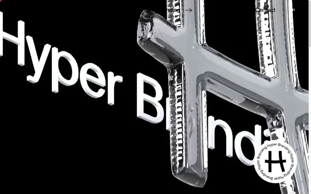
Preview image. Unlock full-res
monochromatic gallery, bold typography
Color palette
Section backgrounds, decorative accents, large brand blocks
Outlined interactive elements, link text, borders for images
Small decorative background elements
Page backgrounds, primary text, borders, navigation text, hero text outlining a vivid accent color
Hairline borders, dividers, input outlines, and card edges on light surfaces. Do not promote it to the primary CTA color
Muted navigation text, secondary borders
Typography
- Weights
- 300, 400, 500
- Sizes
- 13px, 14px, 19px, 20px, 27px, 30px, 35px, 75px, 90px
- Line height
- 0.9, 1, 1.11, 1.16, 1.45, 1.48, 1.7, 2.23
- Letter spacing
- -0.0530em at 90px, -0.0200em at 75px, -0.0100em at 35px, 0.0100em at 14px-20px, 0.0200em at 13px
- Fallback
- system-ui
Primary brand typeface for all headings and body text, providing a premium, contemporary feel with its distinct tracking at larger sizes.
- Weights
- 400
- Sizes
- 14px, 28px, 30px
- Line height
- 1.5, 1.7
- Letter spacing
- normal
Fallback system font for navigation, labels, and smaller text, ensuring broad compatibility while aligning with a clean aesthetic.
Spacing & shape
Components
Displays as 'Hyper Branding': #007bff border with 2px thickness (active/hover) or #000000 border (inactive/default), with #000000 text for current page or #666666 for others. Uses Aeonik weight 400 at 14px with normal letter spacing. Padding on right is 8px for spacing.
Text in Vivid Blue (#007bff) for default state, using Aeonik weight 400 at 14px with normal letter spacing. Appears frequently within body copy and lists.
Black text, using Aeonik weight 300 or 400 at 75px or 90px size, with tight letter spacing (-0.0200em at 75px, -0.0530em at 90px) to create dense, commanding blocks of text. Used for main section titles like 'AN OUT OF THE BOX CONCEPT'.
Black text, using Aeonik weight 400 at 27px or 30px size, with tight letter spacing (-0.0100em) and 23px or 28px bottom margin for clear separation from body text. Example: 'Your Breakfast Box'.
A container with a 1px border in Vivid Blue (#007bff) or Midnight (#000000), encasing images to provide visual structure.
Charcoal text (#666666), Aeonik weight 400 at 14px with normal letter spacing. Used for 'En / Gr' or similar secondary links.
Black text (#000000), -apple-system font at 14px, normal letter spacing, ensuring legibility against the footer's background.
Guidelines
- Use Midnight (#000000) for primary text and Canvas (#ffffff) for backgrounds to maintain high contrast.
- Apply Aeonik for all headings and substantial text blocks, leveraging its distinct letter-spacing for visual impact.
- Use Vivid Blue (#007bff) exclusively for interactive elements like links and button borders, not for backgrounds.
- Ensure generous vertical spacing between sections (44px-100px) and elements (8px-20px) to uphold a spacious aesthetic.
- Maintain sharp, 0px border-radius for all UI elements to align with the minimalist and precise tone.
- Employ the Leaf Green (#0fa64b) for large background sections to create a clear visual break and inject brand identity.
- Prioritize black and white as the dominant color scheme, reserving brand and accent colors for functional highlights only.
- Avoid using multiple chromatic colors for aesthetic purposes; restrict their use to functional UI elements.
- Do not introduce rounded corners; all shapes should remain sharp and angular.
- Refrain from using shadows or gradients, as the system relies on flat surfaces and high contrast.
- Do not deviate from the specified letter-spacing for Aeonik, especially at larger sizes, as it's a key brand identifier.
- Avoid dense, information-heavy blocks of text; break content into manageable, well-spaced segments.
- Do not use Vivid Blue (#007bff) or Leaf Green (#0fa64b) as primary text colors unless the background strongly contrasts in black or white.
- Introduce images without a defined border; images should always be visually contained.
About this system
ShowHide
Hyper Tria presents as a minimalistic, content-driven agency. Its visual system prioritizes stark contrast and ample whitespace, using black and white as primary communicators. Typography is sharp and impactful, often appearing in large, tracked blocks that command attention. Color is used sparingly, primarily as an accent for subtle interactive states or to denote specific sections, creating a focused and uncluttered user experience.
The page employs a full-bleed layout for background elements, but main content is often centered and contained, although no strict `pageMaxWidth` is enforced. The hero section can be full-viewport with large, tracked typography against a dark background, sometimes featuring a prominent 3D graphic. Section rhythm is driven by alternating background colors (e.g., white, black, Leaf Green) and consistent, generous vertical spacing. Content often appears in single-column stacks or a simple two-column arrangement, where a visual (image/graphic) balances off a block of large, impactful text. Navigation is a simple top-bar with text links and a language switcher, suggesting a minimal approach.
This site utilizes a mix of high-quality product photography and sparse, minimalist graphics. Photography often features tight crops of products (like the breakfast box) against clean, light backgrounds, highlighting texture and form without distracting context. In some cases, unique 3D renders or abstract metallic graphic elements (like the 'H' symbol) are used to create a distinctive brand identity, often with a stark, reflective quality against dark backgrounds. Iconography is minimal: often simple, thin-lined arrows or social media icons. Imagery serves to showcase work or add abstract branding, maintaining a generally uncluttered visual field.
Reminiscent of Awwwards, Figma's landing pages, B-Reel, Active Theory.
# Hyper Tria — Style Reference
> monochromatic gallery, bold typography

**Theme:** light

**Site:** https://hypertria.com

Hyper Tria presents as a minimalistic, content-driven agency. Its visual system prioritizes stark contrast and ample whitespace, using black and white as primary communicators. Typography is sharp and impactful, often appearing in large, tracked blocks that command attention. Color is used sparingly, primarily as an accent for subtle interactive states or to denote specific sections, creating a focused and uncluttered user experience.

## Tokens — Colors

| Name | Value | Token | Role |
|------|------|------|------|
| Leaf Green | `#0fa64b` | `--color-leaf-green` | Section backgrounds, decorative accents, large brand blocks |
| Vivid Blue | `#007bff` | `--color-vivid-blue` | Outlined interactive elements, link text, borders for images |
| Accent Red | `#ee3a49` | `--color-accent-red` | Small decorative background elements |
| Midnight | `#000000` | `--color-midnight` | Page backgrounds, primary text, borders, navigation text, hero text outlining a vivid accent color |
| Canvas | `#ffffff` | `--color-canvas` | Hairline borders, dividers, input outlines, and card edges on light surfaces. Do not promote it to the primary CTA color |
| Charcoal | `#666666` | `--color-charcoal` | Muted navigation text, secondary borders |

## Tokens — Typography

### Aeonik
- **Substitute:** system-ui
- **Weights:** 300, 400, 500
- **Sizes:** 13px, 14px, 19px, 20px, 27px, 30px, 35px, 75px, 90px
- **Line height:** 0.9, 1, 1.11, 1.16, 1.45, 1.48, 1.7, 2.23
- **Letter spacing:** -0.0530em at 90px, -0.0200em at 75px, -0.0100em at 35px, 0.0100em at 14px-20px, 0.0200em at 13px
- **Role:** Primary brand typeface for all headings and body text, providing a premium, contemporary feel with its distinct tracking at larger sizes.

### -apple-system
- **Weights:** 400
- **Sizes:** 14px, 28px, 30px
- **Line height:** 1.5, 1.7
- **Letter spacing:** normal
- **Role:** Fallback system font for navigation, labels, and smaller text, ensuring broad compatibility while aligning with a clean aesthetic.

## Tokens — Type Scale

Perfect Fourth (1.333) from 14px base.

| Role | Size | Line height | Letter spacing |
|------|------|------|------|
| body-lg | 14px | 1.7 | 0.01em |
| subheading | 19px | 1.48 | — |
| heading | 27px | 1.16 | — |
| heading-lg | 30px | 1.11 | — |
| display-md | 35px | 1 | -0.01em |
| display | 75px | 0.9 | -0.02em |
| display-lg | 90px | 0.9 | -0.053em |

## Tokens — Radius

- **Default:** 0px

## Layout

The page employs a full-bleed layout for background elements, but main content is often centered and contained, although no strict `pageMaxWidth` is enforced. The hero section can be full-viewport with large, tracked typography against a dark background, sometimes featuring a prominent 3D graphic. Section rhythm is driven by alternating background colors (e.g., white, black, Leaf Green) and consistent, generous vertical spacing. Content often appears in single-column stacks or a simple two-column arrangement, where a visual (image/graphic) balances off a block of large, impactful text. Navigation is a simple top-bar with text links and a language switcher, suggesting a minimal approach.

## Imagery

This site utilizes a mix of high-quality product photography and sparse, minimalist graphics. Photography often features tight crops of products (like the breakfast box) against clean, light backgrounds, highlighting texture and form without distracting context. In some cases, unique 3D renders or abstract metallic graphic elements (like the 'H' symbol) are used to create a distinctive brand identity, often with a stark, reflective quality against dark backgrounds. Iconography is minimal: often simple, thin-lined arrows or social media icons. Imagery serves to showcase work or add abstract branding, maintaining a generally uncluttered visual field.

## Components

### Outlined Navigation Link
*Primary navigation element*

Displays as 'Hyper Branding': #007bff border with 2px thickness (active/hover) or #000000 border (inactive/default), with #000000 text for current page or #666666 for others. Uses Aeonik weight 400 at 14px with normal letter spacing. Padding on right is 8px for spacing.

### Text Link
*Standard interactive text link*

Text in Vivid Blue (#007bff) for default state, using Aeonik weight 400 at 14px with normal letter spacing. Appears frequently within body copy and lists.

### Hero Headline
*Large, impactful display text*

Black text, using Aeonik weight 300 or 400 at 75px or 90px size, with tight letter spacing (-0.0200em at 75px, -0.0530em at 90px) to create dense, commanding blocks of text. Used for main section titles like 'AN OUT OF THE BOX CONCEPT'.

### Section Subheading
*Secondary heading for content blocks*

Black text, using Aeonik weight 400 at 27px or 30px size, with tight letter spacing (-0.0100em) and 23px or 28px bottom margin for clear separation from body text. Example: 'Your Breakfast Box'.

### Image Outline Container
*Visual frame for images*

A container with a 1px border in Vivid Blue (#007bff) or Midnight (#000000), encasing images to provide visual structure.

### Sub-Navigation Text
*Secondary menu or language switcher*

Charcoal text (#666666), Aeonik weight 400 at 14px with normal letter spacing. Used for 'En / Gr' or similar secondary links.

### Footer Copyright
*Legal and branding information in footer*

Black text (#000000), -apple-system font at 14px, normal letter spacing, ensuring legibility against the footer's background.

## Guidelines

### Do

- Use Midnight (#000000) for primary text and Canvas (#ffffff) for backgrounds to maintain high contrast.
- Apply Aeonik for all headings and substantial text blocks, leveraging its distinct letter-spacing for visual impact.
- Use Vivid Blue (#007bff) exclusively for interactive elements like links and button borders, not for backgrounds.
- Ensure generous vertical spacing between sections (44px-100px) and elements (8px-20px) to uphold a spacious aesthetic.
- Maintain sharp, 0px border-radius for all UI elements to align with the minimalist and precise tone.
- Employ the Leaf Green (#0fa64b) for large background sections to create a clear visual break and inject brand identity.
- Prioritize black and white as the dominant color scheme, reserving brand and accent colors for functional highlights only.

### Don't

- Avoid using multiple chromatic colors for aesthetic purposes; restrict their use to functional UI elements.
- Do not introduce rounded corners; all shapes should remain sharp and angular.
- Refrain from using shadows or gradients, as the system relies on flat surfaces and high contrast.
- Do not deviate from the specified letter-spacing for Aeonik, especially at larger sizes, as it's a key brand identifier.
- Avoid dense, information-heavy blocks of text; break content into manageable, well-spaced segments.
- Do not use Vivid Blue (#007bff) or Leaf Green (#0fa64b) as primary text colors unless the background strongly contrasts in black or white.
- Introduce images without a defined border; images should always be visually contained.

## Agent Prompt Guide

Quick Color Reference:
text: #000000
background: #ffffff
border: #000000
accent: #0fa64b
primary action: #007bff (outlined action border)

Example Component Prompts:
Create a hero section with a black background: headline 'HYPER BRANDS' in Canvas (#ffffff), Aeonik weight 300, 90px size, line-height 0.9, letter-spacing -0.053em. Centered vertically and horizontally.
Generate a content section: Leaf Green (#0fa64b) background. Left side: image container with a 1px border in Vivid Blue (#007bff). Right side: heading 'Your Breakfast Box' in Midnight (#000000), Aeonik weight 400, 27px size, line-height 1.16, margin-bottom 23px. Below, body text in Midnight (#000000), Aeonik weight 400, 14px size, line-height 1.7, letter-spacing 0.01em.
Construct a navigation bar: Canvas (#ffffff) background, with 'Hyper Branding' link in Vivid Blue (#007bff) border, 2px thickness, text in Midnight (#000000), Aeonik weight 400, 14px size. 'Agency', 'Works', 'Contact' links with no border, text in Charcoal (#666666), Aeonik weight 400, 14px size.
More like this







Keep what you find
A free account saves references to boards and can send you a weekly email of picks based on what you save.
To see every result, go Pro.