Preview image. Unlock full-res
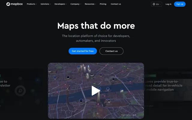
Satellite console at midnight — a dark control room where glowing map tiles are the only light source, surrounded by near-black instrument panels.
Color palette
Primary CTA buttons, active nav indicators, links — single chromatic anchor in an achromatic field, impossible to miss
Info/announcement badges — darker blue variant for label-scale elements
Page background, nav background, footer — the base layer everything sits on
Card surfaces, elevated sections sitting one level above Void Black
Dividers, secondary borders, subtle panel edges
Tertiary surface, hover states on dark cards
Inactive icons, secondary UI strokes, muted borders
Ghost button borders, subtle rule lines
Tertiary text, nav dropdown labels, disabled states
Secondary body text, caption-level descriptions
Footer text, body copy, icon fills — the primary readable text color on dark surfaces
Outlined button borders, slightly elevated muted text
Divider lines in lighter contexts, high-contrast borders
Primary headings, button text, nav labels, high-emphasis body copy
Success and 'Product Update' badge backgrounds — cartographic green signals new features
Typography
- Weights
- 400, 500, 700
- Sizes
- 10px, 14px, 15px, 16px, 18px, 20px, 24px, 32px, 44px, 56px, 68px
- Line height
- 1
- Letter spacing
- -1.36px at 68px (-0.02em), -0.56px at 56px (-0.01em), wide tracking at badge/caption sizes (+0.70em to +1.00em for all-caps labels)
- Fallback
- DM Sans, Plus Jakarta Sans
All text on the site — nav, headings, body, badges, buttons. Weight 700 at 44–68px for hero headlines with -0.02em tracking that compresses letterforms into coordinate-grid density. Weight 500 for subheadings and UI labels. Weight 400 for body copy and captions. The geometric construction of Cera Pro — circular O, monoline strokes — echoes the precision circles of map pin iconography.
Spacing & shape
Elevation
Components
backgroundColor #007afc, color #ffffff, borderRadius 100px, padding 12px 24px. No border visible (border matches background). The only filled blue element on the page — stands alone against the black field.
backgroundColor transparent, color #ffffff, border 1px solid #bbc2ce, borderRadius 100px, padding 12px 24px. On hover, likely shifts border to #ffffff. Maintains pill geometry to match primary CTA.
backgroundColor transparent, color #ffffff or #007afc for links, borderRadius 0px, no padding. Used for narrative-flow links where a button frame would over-formalize the action.
backgroundColor transparent, color #ffffff, border 1px solid #444d5a, borderRadius 6px, padding 8px 10px. Sharp radius breaks from the pill system — signals 'tool', not 'action'.
backgroundColor #228a56, color #ffffff, borderRadius 4px, padding 5.6px 7.7px. All-caps Cera Pro at 10px with +1.00em letter-spacing. Green signals 'new/live', echoing map layer status indicators.
backgroundColor #0062ca, color #ffffff, borderRadius 3px, padding 3px 6px. Slightly tighter radius and padding than Product Update badge — distinguishes tier.
Active state: backgroundColor #007afc, color #ffffff, borderRadius 100px. Inactive: backgroundColor transparent, color #a0aaba, borderRadius 100px with visible border. Cera Pro 500 at 15–16px.
borderRadius 24px, dark surface #15171b, badge at top-left, headline Cera Pro 700, directional arrow link in #007afc. Card edges use inset shadow rgb(14,16,18) to bleed into page background.
Logos rendered in #a0aaba (desaturated) against #0e1012 background. No card frames. Two rows, roughly 6 logos per row. Tight letter-spaced all-caps Cera Pro label above in #566171 at 12px.
backgroundColor #0e1012, height 62px, boxShadow rgb(14,16,18) 0px 0px 100px 50px on scroll. Left: Mapbox wordmark in #ffffff. Center: dropdown nav links in Cera Pro 400/500 at 15px color #ffffff. Right: 'Log in' ghost text + 'Sign up' primary pill (#007afc).
borderRadius 24px, inset shadow rgb(14,16,18) 0px -175px 175px -75px at bottom — the map tile or video appears to dissolve into the page background. Plays on the 'emerging from darkness' surface philosophy.
Guidelines
- Use #007afc exclusively for primary interactive elements (CTA buttons, active tabs, text links needing high emphasis) — never as a decorative fill or background wash.
- Apply 100px borderRadius to all pill buttons and filter tabs; reserve 4–6px radius for badge and utility elements only.
- Set hero and display headlines in Cera Pro weight 700 with -0.02em letter-spacing (-1.36px at 68px, -0.88px at 44px) — no weight below 700 at display sizes.
- Use all-caps Cera Pro at 10–12px with +0.70em to +1.00em letter-spacing for section labels, badge text, and category markers.
- Layer surfaces using the four-step dark scale (#0e1012 → #15171b → #1c1f24 → #23262d); never use drop shadows to imply depth between content layers.
- Apply inset shadow rgb(14,16,18) 0px -175px 175px -75px on bottom edge of map tiles, video embeds, and image blocks to dissolve them into the #0e1012 page background.
- Render partner/brand logos at #a0aaba on #0e1012 — no color, no individual treatment — keeping the partner rail visually subordinate to the product.
- Never use a radius between 6px and 12px on buttons — the system uses either pill (100px), card (24px), chip (12px), or sharp utility (4–6px). Intermediate values break the rhythm.
- Never introduce a second chromatic accent color — orange, purple, teal, or any additional hue violates the single-signal-in-darkness principle of Signal Blue (#007afc).
- Never set body copy or subheadings in white (#ffffff) — use #a0aaba for body and #8b96aa for captions; full white is reserved for headings and interactive labels.
- Never place cards or sections on white or light backgrounds — all content lives within the #0e1012–#15171b dark range; light surfaces appear only inside embedded map tiles.
- Never use Cera Pro weight 400 for headings larger than 24px — weight 500 minimum at subheading scale, 700 at heading-lg and display.
- Never apply colored drop shadows — the only allowed shadows are monochromatic #0e1012 inset vignettes on media blocks.
- Never add decorative borders or dividers between sections — vertical rhythm is created by spacing and surface color change, not ruled lines.
About this system
ShowHide
Mapbox operates in near-total darkness — a #0e1012 void that makes embedded map tiles glow like illuminated instruments. The entire neutral scale runs from #0e1012 through #333943 to #a0aaba, creating depth through layered darkness rather than shadows. A single vivid blue (#007afc) punctuates the black field exclusively on CTAs and active states, like a GPS pin dropped into night sky. Pill-form buttons (100px radius) coexist with sharp 4px badges, creating deliberate tension between cartographic curves and data-table precision. Cera Pro's geometric weight-700 at 68px and tight -0.02em tracking gives headlines a technical density — coordinates on a map, not marketing copy.
Max-width 1344px centered on an always-dark #0e1012 full-bleed background. Hero is full-viewport centered text stack (headline + subtext + dual CTA buttons) with a large rounded map-tile video embed below it, fading at its bottom edge. Second section is a no-frame logo grid (two rows, ~6 logos each) labeled with a tight all-caps eyebrow. Below that, alternating asymmetric 2-column sections: text left + map visual right, then reversed. Customer stories use a 2-column layout: large image card left (~55%), text + logo + body right (~45%). A horizontal filter tab row (pill tabs) controls the visible story. Navigation is a fixed top bar, full-bleed at the background color, with center-aligned dropdown links and right-side auth buttons. Vertical section gaps are approximately 96px. The layout avoids visual dividers entirely — section transitions happen through background color and content spacing only.
The dominant visual is product screenshots of Mapbox map tiles — dark-mode 3D city renders, automotive circular navigation interfaces, satellite-toned street maps. These are always contained within rounded-24px frames and treated with an inset bottom shadow that dissolves the lower edge into the page background, making map content feel embedded in the surface rather than placed on it. Photography appears in customer story cards: tight editorial product shots (BMW instrument cluster, in-vehicle navigation screens) cropped dark and moody, no lifestyle context. Icons are minimal outlined mono-stroke in #a0aaba to #566171. Logo grid partners are desaturated to near-gray. The overall imagery density is medium — one or two large map/product visuals per section, with text-dominant supporting sections. No abstract illustration or decorative graphics; every image is either a real map tile or a real customer device.
Reminiscent of Twilio, Stripe, Vercel, Maptiler, AWS Amplify.
# Mapbox — Style Reference
> Satellite console at midnight — a dark control room where glowing map tiles are the only light source, surrounded by near-black instrument panels.

**Theme:** dark

**Site:** https://mapbox.com

Mapbox operates in near-total darkness — a #0e1012 void that makes embedded map tiles glow like illuminated instruments. The entire neutral scale runs from #0e1012 through #333943 to #a0aaba, creating depth through layered darkness rather than shadows. A single vivid blue (#007afc) punctuates the black field exclusively on CTAs and active states, like a GPS pin dropped into night sky. Pill-form buttons (100px radius) coexist with sharp 4px badges, creating deliberate tension between cartographic curves and data-table precision. Cera Pro's geometric weight-700 at 68px and tight -0.02em tracking gives headlines a technical density — coordinates on a map, not marketing copy.

## Tokens — Colors

| Name | Value | Token | Role |
|------|------|------|------|
| Signal Blue | `#007afc` | `--color-signal-blue` | Primary CTA buttons, active nav indicators, links — single chromatic anchor in an achromatic field, impossible to miss |
| Deep Signal | `#0062ca` | `--color-deep-signal` | Info/announcement badges — darker blue variant for label-scale elements |
| Void Black | `#0e1012` | `--color-void-black` | Page background, nav background, footer — the base layer everything sits on |
| Deep Charcoal | `#15171b` | `--color-deep-charcoal` | Card surfaces, elevated sections sitting one level above Void Black |
| Gunmetal | `#1c1f24` | `--color-gunmetal` | Dividers, secondary borders, subtle panel edges |
| Graphite | `#23262d` | `--color-graphite` | Tertiary surface, hover states on dark cards |
| Steel | `#333943` | `--color-steel` | Inactive icons, secondary UI strokes, muted borders |
| Pewter | `#444d5a` | `--color-pewter` | Ghost button borders, subtle rule lines |
| Slate | `#566171` | `--color-slate` | Tertiary text, nav dropdown labels, disabled states |
| Ash | `#8b96aa` | `--color-ash` | Secondary body text, caption-level descriptions |
| Fog | `#a0aaba` | `--color-fog` | Footer text, body copy, icon fills — the primary readable text color on dark surfaces |
| Silver | `#bbc2ce` | `--color-silver` | Outlined button borders, slightly elevated muted text |
| Cloud | `#d5dae2` | `--color-cloud` | Divider lines in lighter contexts, high-contrast borders |
| White | `#ffffff` | `--color-white` | Primary headings, button text, nav labels, high-emphasis body copy |
| Map Green | `#228a56` | `--color-map-green` | Success and 'Product Update' badge backgrounds — cartographic green signals new features |

## Tokens — Typography

### Cera Pro
- **Substitute:** DM Sans, Plus Jakarta Sans
- **Weights:** 400, 500, 700
- **Sizes:** 10px, 14px, 15px, 16px, 18px, 20px, 24px, 32px, 44px, 56px, 68px
- **Line height:** 1
- **Letter spacing:** -1.36px at 68px (-0.02em), -0.56px at 56px (-0.01em), wide tracking at badge/caption sizes (+0.70em to +1.00em for all-caps labels)
- **Role:** All text on the site — nav, headings, body, badges, buttons. Weight 700 at 44–68px for hero headlines with -0.02em tracking that compresses letterforms into coordinate-grid density. Weight 500 for subheadings and UI labels. Weight 400 for body copy and captions. The geometric construction of Cera Pro — circular O, monoline strokes — echoes the precision circles of map pin iconography.

## Tokens — Type Scale

Perfect Fourth (1.333) from 16px base.

| Role | Size | Line height | Letter spacing |
|------|------|------|------|
| caption | 10px | 1.6 | 1px |
| body-sm | 14px | 1.43 | — |
| body | 16px | 1.5 | — |
| subheading | 18px | 1.4 | — |
| heading-sm | 24px | 1.33 | — |
| heading | 32px | 1.25 | — |
| heading-lg | 44px | 1.14 | -0.88px |
| display | 68px | 1 | -1.36px |

## Tokens — Spacing

- **Max width:** 1344px
- **Section gap:** 96px
- **Card padding:** 24px
- **Element gap:** 12px

## Tokens — Radius

- **Buttons:** 100px
- **Inputs:** 6px
- **Cards:** 24px
- **badges:** 4px
- **chips:** 12px

## Tokens — Elevation

- **Media Card / Video Embed:** `rgb(14, 16, 18) 0px -175px 175px -75px inset`
- **Section Fade Overlay:** `rgb(14, 16, 18) 0px 0px 100px 50px`

## Layout

Max-width 1344px centered on an always-dark #0e1012 full-bleed background. Hero is full-viewport centered text stack (headline + subtext + dual CTA buttons) with a large rounded map-tile video embed below it, fading at its bottom edge. Second section is a no-frame logo grid (two rows, ~6 logos each) labeled with a tight all-caps eyebrow. Below that, alternating asymmetric 2-column sections: text left + map visual right, then reversed. Customer stories use a 2-column layout: large image card left (~55%), text + logo + body right (~45%). A horizontal filter tab row (pill tabs) controls the visible story. Navigation is a fixed top bar, full-bleed at the background color, with center-aligned dropdown links and right-side auth buttons. Vertical section gaps are approximately 96px. The layout avoids visual dividers entirely — section transitions happen through background color and content spacing only.

## Imagery

The dominant visual is product screenshots of Mapbox map tiles — dark-mode 3D city renders, automotive circular navigation interfaces, satellite-toned street maps. These are always contained within rounded-24px frames and treated with an inset bottom shadow that dissolves the lower edge into the page background, making map content feel embedded in the surface rather than placed on it. Photography appears in customer story cards: tight editorial product shots (BMW instrument cluster, in-vehicle navigation screens) cropped dark and moody, no lifestyle context. Icons are minimal outlined mono-stroke in #a0aaba to #566171. Logo grid partners are desaturated to near-gray. The overall imagery density is medium — one or two large map/product visuals per section, with text-dominant supporting sections. No abstract illustration or decorative graphics; every image is either a real map tile or a real customer device.

## Components

### CTA Button Group

### Category Filter Tab Bar

### Customer Story Card

### Primary CTA Button
*Main call-to-action, 'Get started for free', 'Sign up'*

backgroundColor #007afc, color #ffffff, borderRadius 100px, padding 12px 24px. No border visible (border matches background). The only filled blue element on the page — stands alone against the black field.

### Outlined Pill Button
*Secondary actions like 'Contact us', nav secondary links*

backgroundColor transparent, color #ffffff, border 1px solid #bbc2ce, borderRadius 100px, padding 12px 24px. On hover, likely shifts border to #ffffff. Maintains pill geometry to match primary CTA.

### Ghost Text Button
*Inline text links, 'Learn more →', 'Read more →', footer links*

backgroundColor transparent, color #ffffff or #007afc for links, borderRadius 0px, no padding. Used for narrative-flow links where a button frame would over-formalize the action.

### Icon Frame Button
*Utility buttons like language selector 'EN', compact controls*

backgroundColor transparent, color #ffffff, border 1px solid #444d5a, borderRadius 6px, padding 8px 10px. Sharp radius breaks from the pill system — signals 'tool', not 'action'.

### Product Update Badge
*Labels marking new features, product announcements*

backgroundColor #228a56, color #ffffff, borderRadius 4px, padding 5.6px 7.7px. All-caps Cera Pro at 10px with +1.00em letter-spacing. Green signals 'new/live', echoing map layer status indicators.

### Info Badge
*Announcement or info-type labels*

backgroundColor #0062ca, color #ffffff, borderRadius 3px, padding 3px 6px. Slightly tighter radius and padding than Product Update badge — distinguishes tier.

### Category Tab / Filter Pill
*Section filters like 'Automotive', 'Weather', 'Fleets'*

Active state: backgroundColor #007afc, color #ffffff, borderRadius 100px. Inactive: backgroundColor transparent, color #a0aaba, borderRadius 100px with visible border. Cera Pro 500 at 15–16px.

### News / Product Carousel Card
*Homepage feature cards for recent updates and partnerships*

borderRadius 24px, dark surface #15171b, badge at top-left, headline Cera Pro 700, directional arrow link in #007afc. Card edges use inset shadow rgb(14,16,18) to bleed into page background.

### Logo Grid (Social Proof Rail)
*Partner/customer logo display — GM, CNN, BMW, Strava etc.*

Logos rendered in #a0aaba (desaturated) against #0e1012 background. No card frames. Two rows, roughly 6 logos per row. Tight letter-spaced all-caps Cera Pro label above in #566171 at 12px.

### Top Navigation Bar
*Sticky site nav with logo, dropdown menus, CTA*

backgroundColor #0e1012, height 62px, boxShadow rgb(14,16,18) 0px 0px 100px 50px on scroll. Left: Mapbox wordmark in #ffffff. Center: dropdown nav links in Cera Pro 400/500 at 15px color #ffffff. Right: 'Log in' ghost text + 'Sign up' primary pill (#007afc).

### Video / Map Embed Block
*Full-width media with inset shadow fade at bottom edge*

borderRadius 24px, inset shadow rgb(14,16,18) 0px -175px 175px -75px at bottom — the map tile or video appears to dissolve into the page background. Plays on the 'emerging from darkness' surface philosophy.

## Guidelines

### Do

- Use #007afc exclusively for primary interactive elements (CTA buttons, active tabs, text links needing high emphasis) — never as a decorative fill or background wash.
- Apply 100px borderRadius to all pill buttons and filter tabs; reserve 4–6px radius for badge and utility elements only.
- Set hero and display headlines in Cera Pro weight 700 with -0.02em letter-spacing (-1.36px at 68px, -0.88px at 44px) — no weight below 700 at display sizes.
- Use all-caps Cera Pro at 10–12px with +0.70em to +1.00em letter-spacing for section labels, badge text, and category markers.
- Layer surfaces using the four-step dark scale (#0e1012 → #15171b → #1c1f24 → #23262d); never use drop shadows to imply depth between content layers.
- Apply inset shadow rgb(14,16,18) 0px -175px 175px -75px on bottom edge of map tiles, video embeds, and image blocks to dissolve them into the #0e1012 page background.
- Render partner/brand logos at #a0aaba on #0e1012 — no color, no individual treatment — keeping the partner rail visually subordinate to the product.

### Don't

- Never use a radius between 6px and 12px on buttons — the system uses either pill (100px), card (24px), chip (12px), or sharp utility (4–6px). Intermediate values break the rhythm.
- Never introduce a second chromatic accent color — orange, purple, teal, or any additional hue violates the single-signal-in-darkness principle of Signal Blue (#007afc).
- Never set body copy or subheadings in white (#ffffff) — use #a0aaba for body and #8b96aa for captions; full white is reserved for headings and interactive labels.
- Never place cards or sections on white or light backgrounds — all content lives within the #0e1012–#15171b dark range; light surfaces appear only inside embedded map tiles.
- Never use Cera Pro weight 400 for headings larger than 24px — weight 500 minimum at subheading scale, 700 at heading-lg and display.
- Never apply colored drop shadows — the only allowed shadows are monochromatic #0e1012 inset vignettes on media blocks.
- Never add decorative borders or dividers between sections — vertical rhythm is created by spacing and surface color change, not ruled lines.

## Agent Prompt Guide

**Quick Color Reference**
- Text (body): #a0aaba
- Text (headings): #ffffff
- Background (page): #0e1012
- Background (card): #15171b
- CTA / Primary action: #007afc
- Border (subtle): #1c1f24
- Border (pill button): #bbc2ce
- Badge (product update): #228a56

**Example Component Prompts**

1. Hero Section: Background #0e1012. Centered layout max-width 1344px. Headline 'Maps that do more' in Cera Pro weight 700, 68px, #ffffff, letter-spacing -1.36px. Subtext 18px weight 400 #a0aaba, centered, max-width 560px. Two buttons side by side: primary pill (#007afc, #ffffff text, 100px radius, 12px 24px padding) + outlined pill (transparent bg, #ffffff text, 1px solid #bbc2ce, 100px radius, 12px 24px padding). Below: map tile image in a 24px radius container with inset shadow rgb(14,16,18) 0px -175px 175px -75px at bottom edge.

2. Partner Logo Rail: Background #0e1012. All-caps eyebrow label 'TRUSTED BY THE INDUSTRY LEADERS' in Cera Pro 500, 12px, #566171, letter-spacing +0.84px, centered. Below: two rows of partner logos rendered in #a0aaba, evenly spaced, no card frames. Vertical gap 32px between eyebrow and logos.

3. Customer Story Card: Background #15171b, borderRadius 24px, padding 24px. Two columns: left column 55% — image with borderRadius 24px. Right column 45% — brand logo 32px, headline Cera Pro 700 24px #ffffff, body text 16px weight 400 #a0aaba, link text in #007afc 'Discover → ' at 15px weight 500.

4. Product Update Badge + Card: Badge backgroundColor #228a56, #ffffff text, borderRadius 4px, padding 5.6px 7.7px, Cera Pro 700 10px all-caps letter-spacing +1.0em. Card background #15171b, borderRadius 24px. Headline Cera Pro 700 20px #ffffff. Arrow link '#007afc'. Inset vignette shadow on card image area.

5. Navigation Bar: backgroundColor #0e1012, height 62px, horizontal padding 24px. Left: Mapbox logo in #ffffff. Center: nav links 'Products Solutions Developers Company Resources Pricing' in Cera Pro 400 15px #ffffff with dropdown chevrons. Right: 'Log in' ghost text in #ffffff 15px, then 'Sign up' pill button #007afc #ffffff 100px radius 12px 24px padding.
More like this









Keep what you find
A free account saves references to boards and can send you a weekly email of picks based on what you save.
To see every result, go Pro.