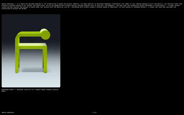
Preview image. Unlock full-res
Minimalist digital gallery
Color palette
Page background, primary text on light surfaces, subtle borders where extreme contrast is needed
Hairline borders, dividers, input outlines, and card edges on light surfaces. Do not promote it to the primary CTA color
Decorative element borders, subtle link borders
Secondary body text, supporting text, subtle border accents
Muted text, copyright information, light border accents
Typography
- Weights
- 500
- Sizes
- 10px
- Line height
- 1.2
- Letter spacing
- normal
- Fallback
- Space Mono
Primary body text, labels, metadata — a monospaced font conveys a technical, precise, and understated tone for core content.
- Weights
- 400
- Sizes
- 13px
- Line height
- 1.2
- Letter spacing
- normal
- Fallback
- Times New Roman
Auxiliary text, specific navigational elements, and sometimes project titles or descriptors. Its serif nature provides a classic counterpoint to the monospace, hinting at editorial sophistication.
Spacing & shape
Components
Transparent background, 0px border radius, no box shadow, 0px padding. Content within the card establishes its own internal spacing and borders. Images inside these cards often use an 8px border radius.
Uses Sometype Mono, weight 500, 10px. Underlined with a 1px border-bottom in Graphite (#191919) for 'link' contexts, and Canvas White (#ffffff) for general 'other' contexts. Padding is 1px on the bottom, 13px right.
Guidelines
- Maintain high contrast by always pairing Canvas White (#ffffff) text on Raven Black (#000000) backgrounds or vice-versa.
- Use Sometype Mono (or Space Mono) at 10px, weight 500, for all body text and general labels to establish a technical, precise voice.
- Apply 1px padding-bottom to all interactive links, combined with a 1px border-bottom in either Graphite (#191919) or Canvas White (#ffffff) to denote interactivity.
- Utilize 8px border radius for all images and internal card elements to introduce a subtle softening to the stark aesthetic.
- Structure pages with a base unit of 6px for internal element spacing, and significant vertical rhythm using 130px gaps between major sections.
- Prioritize minimal, unadorned surfaces with no background, border, or shadow, allowing content to define its own boundaries and presence.
- Employ Times (or Times New Roman) at 13px, weight 400, for specific project titles or contextual text as a deliberate serif accent.
- Avoid using saturated or chromatic colors; the system is strictly achromatic, with no accent colors.
- Do not introduce complex shadows or elevated components; surfaces should remain flat and minimal.
- Refrain from using varied backgrounds or complex textures; stick to solid Raven Black (#000000) as the dominant canvas.
- Do not add additional padding or border styles to the primary Project Card component; it should remain transparent and borderless.
- Avoid decorative imagery; all visuals should be content-driven product shots or conceptual art directly related to the work.
- Do not use generic system fonts without a specific purpose; adhere to Sometype Mono and Times as the defined typographic palette.
- Steer clear of any element that appears glossy, translucent, or employs gradients; the visual language is matte and direct.
About this system
ShowHide
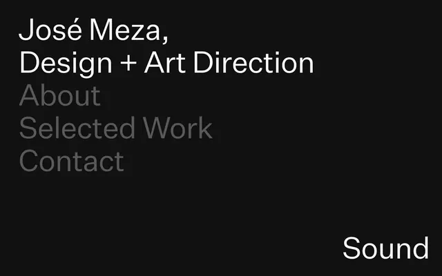
Marcos Rodrigues employs a stark, high-contrast aesthetic, reminiscent of a digital gallery space. The primary interface relies on pure black and white, punctuated by subtle gray typography and hairline borders. Visual hierarchy is established through minimal layout and precise element positioning, with imagery serving as focal points rather than decorative backdrops. Components are unadorned and structural, emphasizing content visibility over elaborate interactive elements. The system feels reserved yet impactful, prioritizing clarity and directness.
The page model is full-bleed with a strong left-aligned bias for content. The hero section often features a minimal, centered element or a primary image against the deep black background. Section rhythm is driven by significant 130px vertical gaps, creating distinct conceptual breaks between content blocks rather than visual dividers. Content arrangement leans heavily into single-column centered stacks or a single, large visual with associated text. There's a notable absence of grid-based layouts or alternating text/image patterns. The overall density is very spacious, emphasizing negative space. Navigation currently appears minimal, likely a simple text-based footer.
This system primarily uses product-focused photography and highly stylized graphic designs / illustrations. Images are presented as contained elements, often with crisp 8px rounded corners, against the stark black background. There's no full-bleed photography or lifestyle shots. The focus is on the object and its form, with lighting often highlighting texture and dimension. Photography appears high-key for specific objects against a solid background or moody for artistic compositions. Icons are not a pervasive element, with the visual system favoring content-rich graphics over symbolic iconography.
Reminiscent of B&O (Bang & Olufsen), Apple (older product pages), AIGA (American Institute of Graphic Arts), Kerning.kr.
# Marcos Rodrigues — Style Reference
> Minimalist digital gallery

**Theme:** dark

**Site:** https://marcosrp.co

Marcos Rodrigues employs a stark, high-contrast aesthetic, reminiscent of a digital gallery space. The primary interface relies on pure black and white, punctuated by subtle gray typography and hairline borders. Visual hierarchy is established through minimal layout and precise element positioning, with imagery serving as focal points rather than decorative backdrops. Components are unadorned and structural, emphasizing content visibility over elaborate interactive elements. The system feels reserved yet impactful, prioritizing clarity and directness.

## Tokens — Colors

| Name | Value | Token | Role |
|------|------|------|------|
| Raven Black | `#000000` | `--color-raven-black` | Page background, primary text on light surfaces, subtle borders where extreme contrast is needed |
| Canvas White | `#ffffff` | `--color-canvas-white` | Hairline borders, dividers, input outlines, and card edges on light surfaces. Do not promote it to the primary CTA color |
| Graphite | `#191919` | `--color-graphite` | Decorative element borders, subtle link borders |
| Charcoal Grey | `#4c4c4c` | `--color-charcoal-grey` | Secondary body text, supporting text, subtle border accents |
| Mist | `#bcbcbc` | `--color-mist` | Muted text, copyright information, light border accents |

## Tokens — Typography

### Sometype Mono
- **Substitute:** Space Mono
- **Weights:** 500
- **Sizes:** 10px
- **Line height:** 1.2
- **Letter spacing:** normal
- **Role:** Primary body text, labels, metadata — a monospaced font conveys a technical, precise, and understated tone for core content.

### Times
- **Substitute:** Times New Roman
- **Weights:** 400
- **Sizes:** 13px
- **Line height:** 1.2
- **Letter spacing:** normal
- **Role:** Auxiliary text, specific navigational elements, and sometimes project titles or descriptors. Its serif nature provides a classic counterpoint to the monospace, hinting at editorial sophistication.

## Tokens — Type Scale

| Role | Size | Line height | Letter spacing |
|------|------|------|------|
| caption | 10px | 1.2 | — |

## Tokens — Spacing

- **Section gap:** 130px
- **Card padding:** 0px
- **Element gap:** 6px

## Tokens — Radius

- **Cards:** 8px
- **Images:** 8px

## Layout

The page model is full-bleed with a strong left-aligned bias for content. The hero section often features a minimal, centered element or a primary image against the deep black background. Section rhythm is driven by significant 130px vertical gaps, creating distinct conceptual breaks between content blocks rather than visual dividers. Content arrangement leans heavily into single-column centered stacks or a single, large visual with associated text. There's a notable absence of grid-based layouts or alternating text/image patterns. The overall density is very spacious, emphasizing negative space. Navigation currently appears minimal, likely a simple text-based footer.

## Imagery

This system primarily uses product-focused photography and highly stylized graphic designs / illustrations. Images are presented as contained elements, often with crisp 8px rounded corners, against the stark black background. There's no full-bleed photography or lifestyle shots. The focus is on the object and its form, with lighting often highlighting texture and dimension. Photography appears high-key for specific objects against a solid background or moody for artistic compositions. Icons are not a pervasive element, with the visual system favoring content-rich graphics over symbolic iconography.

## Components

### Project Card
*Container for individual portfolio items*

Transparent background, 0px border radius, no box shadow, 0px padding. Content within the card establishes its own internal spacing and borders. Images inside these cards often use an 8px border radius.

### Navigational Link
*Interactive text for site navigation and external references*

Uses Sometype Mono, weight 500, 10px. Underlined with a 1px border-bottom in Graphite (#191919) for 'link' contexts, and Canvas White (#ffffff) for general 'other' contexts. Padding is 1px on the bottom, 13px right.

## Guidelines

### Do

- Maintain high contrast by always pairing Canvas White (#ffffff) text on Raven Black (#000000) backgrounds or vice-versa.
- Use Sometype Mono (or Space Mono) at 10px, weight 500, for all body text and general labels to establish a technical, precise voice.
- Apply 1px padding-bottom to all interactive links, combined with a 1px border-bottom in either Graphite (#191919) or Canvas White (#ffffff) to denote interactivity.
- Utilize 8px border radius for all images and internal card elements to introduce a subtle softening to the stark aesthetic.
- Structure pages with a base unit of 6px for internal element spacing, and significant vertical rhythm using 130px gaps between major sections.
- Prioritize minimal, unadorned surfaces with no background, border, or shadow, allowing content to define its own boundaries and presence.
- Employ Times (or Times New Roman) at 13px, weight 400, for specific project titles or contextual text as a deliberate serif accent.

### Don't

- Avoid using saturated or chromatic colors; the system is strictly achromatic, with no accent colors.
- Do not introduce complex shadows or elevated components; surfaces should remain flat and minimal.
- Refrain from using varied backgrounds or complex textures; stick to solid Raven Black (#000000) as the dominant canvas.
- Do not add additional padding or border styles to the primary Project Card component; it should remain transparent and borderless.
- Avoid decorative imagery; all visuals should be content-driven product shots or conceptual art directly related to the work.
- Do not use generic system fonts without a specific purpose; adhere to Sometype Mono and Times as the defined typographic palette.
- Steer clear of any element that appears glossy, translucent, or employs gradients; the visual language is matte and direct.

## Agent Prompt Guide

Quick Color Reference:
text: #ffffff
background: #000000
border: #ffffff
accent: no distinct accent color
primary action: no distinct CTA color

Example Component Prompts:
1. Create a primary project block: background Raven Black (#000000). Place an image with 8px radius. Below the image, add a 13px body text using Times (or Times New Roman), weight 400, Canvas White (#ffffff). Below that, add a navigational link using Sometype Mono (or Space Mono), weight 500, 10px, Canvas White (#ffffff) with a 1px bottom border in Canvas White (#ffffff) and 1px padding-bottom.
2. Design a copyright footer: background Raven Black (#000000). Use Sometype Mono (or Space Mono) at 10px, weight 500, text color Mist (#bcbcbc). Align the text left.
3. Create a descriptive text block: Use Sometype Mono (or Space Mono), weight 500, 10px, Canvas White (#ffffff). Within the block, highlight specific terms using Canvas White (#ffffff) as text color and apply a 1px border-bottom Graphite (#191919) and 1px padding-bottom for link-like elements. Ensure 6px vertical spacing between lines and paragraphs using the base unit.
More like this






Keep what you find
A free account saves references to boards and can send you a weekly email of picks based on what you save.
To see every result, go Pro.