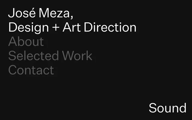
Preview image. Unlock full-res
Color palette
Primary page background, component backdrops — a deep, true black creates high contrast with text
Primary text, active navigation, headings, and outlines for ghost buttons, providing maximum readability against the dark background
Muted text for secondary information, inactive navigation items, and subtle borders. Provides visual separation without harshness
Typography
- Weights
- 400
- Sizes
- 43px, 97px
- Line height
- 1.1, 1.2
- Letter spacing
- -0.021em at 43px, -0.023em at 97px
- Fallback
- Inter
The singular typeface for all textual elements, ranging from large, impactful headlines to functional navigation links. Its clean, sans-serif form reinforces the minimalist aesthetic.
Spacing & shape
Components
Text is Ghost White (#ffffff) using Untitled Sans, weight 400, at 43px with line-height 1.2 and letter-spacing -0.021em. On hover/active, this text remains Ghost White, and its interactive state is implied by context or system-level visual changes.
Text is Slate Echo (#585858) using Untitled Sans, weight 400, at 43px with line-height 1.2 and letter-spacing -0.021em.
Text is Ghost White (#ffffff) using Untitled Sans, weight 400, at 97px with line-height 1.1 and letter-spacing -0.023em. Used for primary page titles or hero sections.
Guidelines
- Prioritize Ghost White (#ffffff) for all primary text and active states against the Midnight Void (#000000) background.
- Use Slate Echo (#585858) exclusively for secondary text, inactive states, and subtle visual dividers.
- Maintain a spacious layout with a consistent 60px vertical and horizontal spacing unit between major content blocks and elements.
- Apply Untitled Sans, weight 400, for all typography, adjusting size and letter-spacing according to the type scale.
- Ensure the page content is contained within a 1320px maximum width, centered on the screen.
- Leverage the high contrast between Midnight Void and Ghost White to establish clear visual hierarchy without needing additional colors.
- Avoid introducing any colors other than Midnight Void, Ghost White, and Slate Echo unless for specific functional or branding elements (not detected here).
- Do not use multiple font families or weights, as the system relies on a singular typeface for consistency.
- Refrain from using shadows or complex gradients; the aesthetic is flat and relies on color contrast and spacing.
- Introduce complex component structures or decorative elements that detract from the minimalist, text-focused presentation.
- Vary the letter-spacing or line-height from the defined typographic scale values for Untitled Sans.
About this system
ShowHide
José Meza presents a stark, high-contrast visual system where typography is the primary aesthetic element. The design uses an almost pure black canvas, allowing crisp white and muted gray text to define hierarchy and interaction. Spacing is generous, creating an atmosphere of spaciousness and deliberate calm. The overall impression is one of directness and essential information rather than rich ornamentation or complex layouts.
The page adheres to a maximalist typographic hero pattern, where the primary content (name and role) is displayed prominently as large, centered text, followed by navigation links. The layout is generally contained within a 1320px maximum width, centered. Vertical rhythm is established by consistent 60px gaps, creating generous breathing room between sections and elements. The navigation is a simple vertical list of text links, suggesting a minimal structure rather than complex menus. The main interaction happens through the text itself, highlighting a content-first, direct approach.
This design system primarily uses a 'no imagery, pure UI' approach. The visual emphasis is entirely on typography and spaciousness. If imagery were to be introduced, it would need to align with a stark, high-contrast, minimalist aesthetic, likely involving full-bleed or tightly cropped visuals that maintain an elegant, understated presence without clashing with the dominant dark canvas and crisp white text. Icons, if present (none detected), should be monochromatic, probably outlined, with medium stroke weight, to blend seamlessly with the typographic style rather than introducing new visual complexity.
Reminiscent of Basic Apple website UI (pre-product imagery), Certain graphic design portfolio sites, Are.na, Editorial design layouts.
# José Meza — Style Reference
> Minimalist Dark Canvas

**Theme:** dark

**Site:** https://josemeza.info

José Meza presents a stark, high-contrast visual system where typography is the primary aesthetic element. The design uses an almost pure black canvas, allowing crisp white and muted gray text to define hierarchy and interaction. Spacing is generous, creating an atmosphere of spaciousness and deliberate calm. The overall impression is one of directness and essential information rather than rich ornamentation or complex layouts.

## Tokens — Colors

| Name | Value | Token | Role |
|------|------|------|------|
| Midnight Void | `#000000` | `--color-midnight-void` | Primary page background, component backdrops — a deep, true black creates high contrast with text |
| Ghost White | `#ffffff` | `--color-ghost-white` | Primary text, active navigation, headings, and outlines for ghost buttons, providing maximum readability against the dark background |
| Slate Echo | `#585858` | `--color-slate-echo` | Muted text for secondary information, inactive navigation items, and subtle borders. Provides visual separation without harshness |

## Tokens — Typography

### Untitled Sans
- **Substitute:** Inter
- **Weights:** 400
- **Sizes:** 43px, 97px
- **Line height:** 1.1, 1.2
- **Letter spacing:** -0.021em at 43px, -0.023em at 97px
- **Role:** The singular typeface for all textual elements, ranging from large, impactful headlines to functional navigation links. Its clean, sans-serif form reinforces the minimalist aesthetic.

## Tokens — Type Scale

| Role | Size | Line height | Letter spacing |
|------|------|------|------|
| body | 43px | 1.2 | -0.903px |
| display | 97px | 1.1 | -2.231px |

## Tokens — Spacing

- **Max width:** 1320px
- **Section gap:** 60px
- **Card padding:** 60px
- **Element gap:** 60px

## Layout

The page adheres to a maximalist typographic hero pattern, where the primary content (name and role) is displayed prominently as large, centered text, followed by navigation links. The layout is generally contained within a 1320px maximum width, centered. Vertical rhythm is established by consistent 60px gaps, creating generous breathing room between sections and elements. The navigation is a simple vertical list of text links, suggesting a minimal structure rather than complex menus. The main interaction happens through the text itself, highlighting a content-first, direct approach.

## Imagery

This design system primarily uses a 'no imagery, pure UI' approach. The visual emphasis is entirely on typography and spaciousness. If imagery were to be introduced, it would need to align with a stark, high-contrast, minimalist aesthetic, likely involving full-bleed or tightly cropped visuals that maintain an elegant, understated presence without clashing with the dominant dark canvas and crisp white text. Icons, if present (none detected), should be monochromatic, probably outlined, with medium stroke weight, to blend seamlessly with the typographic style rather than introducing new visual complexity.

## Components

### Primary Navigation Link
*Interactive text link for site navigation.*

Text is Ghost White (#ffffff) using Untitled Sans, weight 400, at 43px with line-height 1.2 and letter-spacing -0.021em. On hover/active, this text remains Ghost White, and its interactive state is implied by context or system-level visual changes.

### Secondary Navigation Link
*Inactive or secondary interactive text link.*

Text is Slate Echo (#585858) using Untitled Sans, weight 400, at 43px with line-height 1.2 and letter-spacing -0.021em.

### Display Headline
*Large, prominent branding or section title.*

Text is Ghost White (#ffffff) using Untitled Sans, weight 400, at 97px with line-height 1.1 and letter-spacing -0.023em. Used for primary page titles or hero sections.

## Guidelines

### Do

- Prioritize Ghost White (#ffffff) for all primary text and active states against the Midnight Void (#000000) background.
- Use Slate Echo (#585858) exclusively for secondary text, inactive states, and subtle visual dividers.
- Maintain a spacious layout with a consistent 60px vertical and horizontal spacing unit between major content blocks and elements.
- Apply Untitled Sans, weight 400, for all typography, adjusting size and letter-spacing according to the type scale.
- Ensure the page content is contained within a 1320px maximum width, centered on the screen.
- Leverage the high contrast between Midnight Void and Ghost White to establish clear visual hierarchy without needing additional colors.

### Don't

- Avoid introducing any colors other than Midnight Void, Ghost White, and Slate Echo unless for specific functional or branding elements (not detected here).
- Do not use multiple font families or weights, as the system relies on a singular typeface for consistency.
- Refrain from using shadows or complex gradients; the aesthetic is flat and relies on color contrast and spacing.
- Introduce complex component structures or decorative elements that detract from the minimalist, text-focused presentation.
- Vary the letter-spacing or line-height from the defined typographic scale values for Untitled Sans.

## Agent Prompt Guide

Quick Color Reference:
- text: #ffffff
- background: #000000
- border: no distinct border color
- accent: no distinct accent color
- primary action: no distinct CTA color

Example Component Prompts:
- Create a page header with 'José Meza, Design + Art Direction' as the main text: Background is Midnight Void (#000000). The text 'José Meza,' is Ghost White (#ffffff), Untitled Sans, weight 400, 97px, line-height 1.1, letter-spacing -0.023em. The text 'Design + Art Direction' is Ghost White (#ffffff), Untitled Sans, weight 400, 97px, line-height 1.1, letter-spacing -0.023em, separated by a 60px vertical gap from the next element.
- Create a navigation link group for 'About' and 'Selected Work': Background is Midnight Void (#000000). The 'About' link is Ghost White (#ffffff), Untitled Sans, weight 400, 43px, line-height 1.2, letter-spacing -0.021em. The 'Selected Work' link is Slate Echo (#585858), Untitled Sans, weight 400, 43px, line-height 1.2, letter-spacing -0.021em. Each link is separated by a 60px vertical gap.
- Create a footer element with 'Sound': Text is Ghost White (#ffffff), Untitled Sans, weight 400, 43px, line-height 1.2, letter-spacing -0.021em, positioned at the bottom right of the page with appropriate 60px internal padding.
More like this





Keep what you find
A free account saves references to boards and can send you a weekly email of picks based on what you save.
To see every result, go Pro.