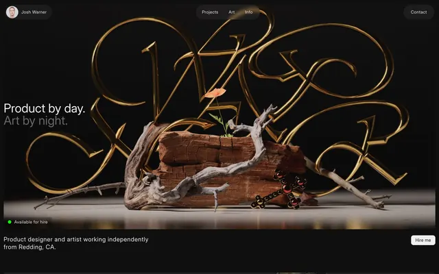
Preview image. Unlock full-res
Midnight gallery, sculpted light
Color palette
Primary background, primary surface color for larger sections
Dominant text color for light backgrounds, borders, and subtle shadow definition against darker surfaces
Primary text color against dark backgrounds, ghost button text and borders
Secondary text and subtle accent lines for headings
Muted body text and less prominent borders
Footer background, slightly darker than the main background for subtle section separation
Darkest shadow base, used for subtle depth
Typography
- Weights
- 400
- Sizes
- 12px
- Line height
- 1.2
- Fallback
- system-ui, 'Helvetica Neue', Arial, sans-serif
Utility text, navigation links, button text, and small interactive elements. Relies on system defaults for efficiency and clean rendering.
- Weights
- 400
- Sizes
- 14px, 16px, 20px, 32px, 40px
- Line height
- 1, 1.2, 1.25, 1.43, 1.5, 1.56
- Letter spacing
- 0.0400em
- Fallback
- 'Inter', sans-serif
Primary text for body content and all headings. Its uniform letter-spacing across sizes maintains a consistent optical density, contributing to the site's compact and readable feel.
Spacing & shape
Elevation
Components
Transparent background, Pure Canvas text and border, with a large 100px border-radius for a distinct pill shape. Padding: 4px vertical, 16px horizontal.
Filled with Pure Canvas, Inky Void text color, with 8px border-radius. Padding: 6px vertical, 14px horizontal. Appears for crucial calls to action.
Transparent background with a subtle Inky Void border. Features an internal 4px left padding to accommodate an icon, and a significant 100px border-radius for a circle or long pill shape. Text is Inter Display, size 12px, weight 400.
Uses a 4px border-radius on images to imply containment. Images are often full-bleed within a section that hints at minimal borders.
Uses system sans-serif font at 12px weight 400. Hover effects may involve subtle background changes or underline, using Pure Canvas color.
Guidelines
- Prioritize high contrast using Pure Canvas (#f0f0f0) for text on Deep Space (#0f0f0f) or Inky Void (#000000) backgrounds.
- Use Inter Display for all major text (headings, body), ensuring 0.04em letter-spacing is applied consistently.
- Apply Deep Space (#0f0f0f) for main backgrounds and Darkened Canvas (#1a1a1a) for secondary backgrounds like footers or distinct sections.
- Utilize large border-radii (100px, 40px) for buttons and interactive elements to create a soft, pill-like appearance.
- Maintain compact spacing, with a default elementGap of 10px between interactive components and text blocks.
- Emphasize content over UI chrome; keep borders minimal and colors purely functional.
- Use the system sans-serif font at 12px for utility text, navigation, and minimal interactive elements.
- Avoid using saturated colors for UI elements; color is reserved for content aesthetics, not interface.
- Do not introduce complex gradients or inner shadows on UI elements; elevation is sparse and subtle.
- Steer clear of aggressive, heavy typography for headlines; rely on Inter Display's light weight and 0.04em tracking.
- Do not use small border-radii (e.g., 2px) on buttons or primary interactive elements; aim for 8px, 40px, or 100px.
- Introduce excessive padding or wide margins that disrupt the compact information density.
- Do not use dark gray text on a dark background; ensure compliance with the 15:1 contrast ratios provided.
- Avoid any drop shadows on text, and keep container shadows subtle and very low opacity.
About this system
ShowHide
Josh Warner's portfolio combines stark dark surfaces with a clean, highly legible typography scale. The design system emphasizes clarity and directness through minimal use of color, relying instead on high contrast, subtle achromatic gradients, and precise spacing. Interactive elements are softly rounded, creating a tactile impression against the otherwise structured aesthetic. Most visual weight is carried by conceptual 3D renders rather than UI adornment.
The page primarily uses a full-bleed dark background with content centered and constrained by an implicit max-width, around 1200px. The hero section is full-bleed with large, conceptual 3D renders and centered, high-contrast headlines. Subsequent sections can alternate between centered content blocks and full-width imagery, often with text-left/image-right or vice-versa patterns for project showcases. Vertical spacing between sections is generous (around 64px), creating distinct visual breaks. Navigation is a sticky top bar with minimal ghost buttons and a prominent brand emblem.
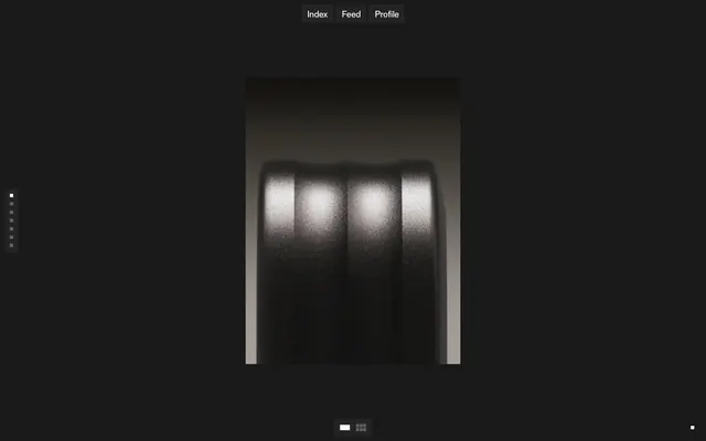
This site features highly stylized 3D renders that serve as key hero elements and section dividers. Images feature sharp details, often with metallic or textured surfaces against dark backgrounds, sometimes with subtle dramatic lighting. The renders are full-bleed for hero sections or artfully integrated into the layout, taking up significant visual space to convey artistic skill. Product mockups are clean and high-fidelity, presented either as isolated objects or within conceptual environments. Iconography is minimal, primarily text-based or simple system icons.
Reminiscent of Stripe, Linear, Figma, Roblox Developer Documentation.
# Josh Warner — Style Reference
> Midnight gallery, sculpted light

**Theme:** dark

**Site:** https://www.joshwarner.design

Josh Warner's portfolio combines stark dark surfaces with a clean, highly legible typography scale. The design system emphasizes clarity and directness through minimal use of color, relying instead on high contrast, subtle achromatic gradients, and precise spacing. Interactive elements are softly rounded, creating a tactile impression against the otherwise structured aesthetic. Most visual weight is carried by conceptual 3D renders rather than UI adornment.

## Tokens — Colors

| Name | Value | Token | Role |
|------|------|------|------|
| Deep Space | `#0f0f0f` | `--color-deep-space` | Primary background, primary surface color for larger sections |
| Inky Void | `#000000` | `--color-inky-void` | Dominant text color for light backgrounds, borders, and subtle shadow definition against darker surfaces |
| Pure Canvas | `#f0f0f0` | `--color-pure-canvas` | Primary text color against dark backgrounds, ghost button text and borders |
| Medium Gray | `#696969` | `--color-medium-gray` | Secondary text and subtle accent lines for headings |
| Light Gray | `#b8b8b8` | `--color-light-gray` | Muted body text and less prominent borders |
| Darkened Canvas | `#1a1a1a` | `--color-darkened-canvas` | Footer background, slightly darker than the main background for subtle section separation |
| Shadow Base | `#080808` | `--color-shadow-base` | Darkest shadow base, used for subtle depth |

## Tokens — Typography

### sans-serif
- **Substitute:** system-ui, 'Helvetica Neue', Arial, sans-serif
- **Weights:** 400
- **Sizes:** 12px
- **Line height:** 1.2
- **Role:** Utility text, navigation links, button text, and small interactive elements. Relies on system defaults for efficiency and clean rendering.

### Inter Display
- **Substitute:** 'Inter', sans-serif
- **Weights:** 400
- **Sizes:** 14px, 16px, 20px, 32px, 40px
- **Line height:** 1, 1.2, 1.25, 1.43, 1.5, 1.56
- **Letter spacing:** 0.0400em
- **Role:** Primary text for body content and all headings. Its uniform letter-spacing across sizes maintains a consistent optical density, contributing to the site's compact and readable feel.

## Tokens — Type Scale

Major Third (1.25) from 16px base.

| Role | Size | Line height | Letter spacing |
|------|------|------|------|
| caption | 12px | 1.2 | — |
| body-sm | 14px | 1.5 | 0.4px |
| body | 16px | 1.2 | 0.4px |
| subheading | 20px | 1.56 | 0.4px |
| heading | 32px | 1.25 | 0.4px |
| display | 40px | 1.43 | 0.4px |

## Tokens — Spacing

- **Section gap:** 64px
- **Card padding:** 14px
- **Element gap:** 10px

## Tokens — Radius

- **Buttons:** 100px
- **Inputs:** 8px
- **Cards:** 4px
- **icons:** 12px
- **tags:** 40px

## Tokens — Elevation

- **Hovered Button:** `rgba(0, 0, 0, 0.16) 0px 0px 10px 0px`
- **Card/Container:** `rgba(0, 0, 0, 0.5) 0px 1px 10px -2px`

## Layout

The page primarily uses a full-bleed dark background with content centered and constrained by an implicit max-width, around 1200px. The hero section is full-bleed with large, conceptual 3D renders and centered, high-contrast headlines. Subsequent sections can alternate between centered content blocks and full-width imagery, often with text-left/image-right or vice-versa patterns for project showcases. Vertical spacing between sections is generous (around 64px), creating distinct visual breaks. Navigation is a sticky top bar with minimal ghost buttons and a prominent brand emblem.

## Imagery

This site features highly stylized 3D renders that serve as key hero elements and section dividers. Images feature sharp details, often with metallic or textured surfaces against dark backgrounds, sometimes with subtle dramatic lighting. The renders are full-bleed for hero sections or artfully integrated into the layout, taking up significant visual space to convey artistic skill. Product mockups are clean and high-fidelity, presented either as isolated objects or within conceptual environments. Iconography is minimal, primarily text-based or simple system icons.

## Components

### Ghost Header Button
*Navigation button, pill-shaped*

Transparent background, Pure Canvas text and border, with a large 100px border-radius for a distinct pill shape. Padding: 4px vertical, 16px horizontal.

### Hire Me Button
*Primary action button, filled and subtly rounded*

Filled with Pure Canvas, Inky Void text color, with 8px border-radius. Padding: 6px vertical, 14px horizontal. Appears for crucial calls to action.

### Avatar Button
*Profile or identity button*

Transparent background with a subtle Inky Void border. Features an internal 4px left padding to accommodate an icon, and a significant 100px border-radius for a circle or long pill shape. Text is Inter Display, size 12px, weight 400.

### Project Card
*Item display in a grid, image-focused*

Uses a 4px border-radius on images to imply containment. Images are often full-bleed within a section that hints at minimal borders.

### Interactive Link
*Inline textual link*

Uses system sans-serif font at 12px weight 400. Hover effects may involve subtle background changes or underline, using Pure Canvas color.

## Guidelines

### Do

- Prioritize high contrast using Pure Canvas (#f0f0f0) for text on Deep Space (#0f0f0f) or Inky Void (#000000) backgrounds.
- Use Inter Display for all major text (headings, body), ensuring 0.04em letter-spacing is applied consistently.
- Apply Deep Space (#0f0f0f) for main backgrounds and Darkened Canvas (#1a1a1a) for secondary backgrounds like footers or distinct sections.
- Utilize large border-radii (100px, 40px) for buttons and interactive elements to create a soft, pill-like appearance.
- Maintain compact spacing, with a default elementGap of 10px between interactive components and text blocks.
- Emphasize content over UI chrome; keep borders minimal and colors purely functional.
- Use the system sans-serif font at 12px for utility text, navigation, and minimal interactive elements.

### Don't

- Avoid using saturated colors for UI elements; color is reserved for content aesthetics, not interface.
- Do not introduce complex gradients or inner shadows on UI elements; elevation is sparse and subtle.
- Steer clear of aggressive, heavy typography for headlines; rely on Inter Display's light weight and 0.04em tracking.
- Do not use small border-radii (e.g., 2px) on buttons or primary interactive elements; aim for 8px, 40px, or 100px.
- Introduce excessive padding or wide margins that disrupt the compact information density.
- Do not use dark gray text on a dark background; ensure compliance with the 15:1 contrast ratios provided.
- Avoid any drop shadows on text, and keep container shadows subtle and very low opacity.

## Agent Prompt Guide

Quick Color Reference:
text: #f0f0f0
background: #0f0f0f
border: #000000
accent: none observed
primary action: #f0f0f0 (filled action)

Example Component Prompts:
1. Create a header navigation button: Pure Canvas text, 12px system sans-serif, 100px radius, 4px vertical / 16px horizontal padding. Border: 1px solid Pure Canvas. Background: transparent.
2. Create a Primary Action Button: #f0f0f0 background, #000000 text, 9999px radius, compact pill padding. Use this filled treatment for the main CTA.
4. Create a content card with an image: Deep Space background, 4px border-radius, `rgba(0, 0, 0, 0.5) 0px 1px 10px -2px` shadow. Internal image has 4px border-radius. Text (Inter Display, 16px, weight 400, #f0f0f0, letter-spacing 0.4px).
More like this





Keep what you find
A free account saves references to boards and can send you a weekly email of picks based on what you save.
To see every result, go Pro.