Preview image. Unlock full-res
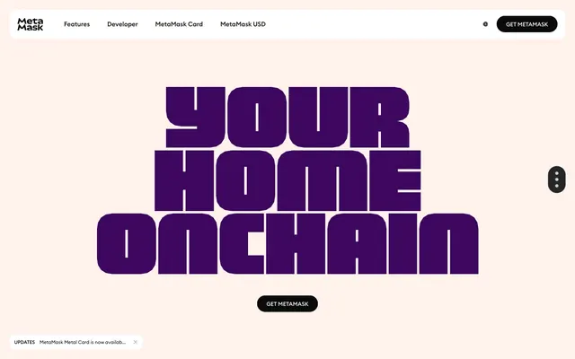
Playful, chunky, soft-edge vibrancy.
Color palette
Soft accent for card backgrounds and decorative elements, hinting at the brand's purple
Primary brand color, used for prominent headings, card backgrounds, and interactive elements like input borders and filled buttons. It's the most saturated color on a light palette
Vibrant background for cards and illustrative elements, suggesting freshness and growth
Evocative card backgrounds and decorative accents, adding warmth
Darker accent for headings, providing strong contrast
Dark accent color for card backgrounds and headings, adding depth to the purple spectrum
Vivid accent for decorative elements and hover states, providing a pop of intense color
Cool-toned card backgrounds for a calming visual contrast
Lighter accent for backgrounds and decorative fills, adding a touch of serene blue
Green wash for highlight backgrounds, decorative bands, and soft emphasis behind content
Vivid accent for fills, used sparingly for strong emphasis
Primary page background and large hero sections, providing a soft, warm base
Default UI background for cards, inputs, and interactive elements. Also standard text color for dark backgrounds
Primary text color for light backgrounds, borders, and dark button backgrounds
Subtle card backgrounds and decorative borders, providing a slightly cooler neutral accent
Card backgrounds, text, and borders, hinting at a darker, muted palette variation
Dark borders and separators for elevated surfaces and inverted UI. Do not promote it to the primary CTA color
Typography
- Weights
- 400, 500, 700
- Sizes
- 8px, 12px, 13px, 14px, 15px, 16px, 24px
- Line height
- 0.8, 1, 1.05, 1.2, 1.24, 1.31, 1.5, 1.65
- Letter spacing
- normal
- Fallback
- Euclid Circular B
Primary UI font for body text, links, buttons, navigation, and general interface elements. Its circularity contributes to the friendly, approachable brand image. Used in various weights to establish hierarchy without relying on extreme size differences.
- Weights
- 400, 500, 600
- Sizes
- 16px, 24px
- Line height
- 1
- Letter spacing
- normal
- Fallback
- Inter
Secondary sans-serif for headings and specific UI elements, providing a clear, modern counterpoint to the more decorative display font.
- Weights
- 400
- Sizes
- 32px, 48px, 75px, 127px, 158px
- Line height
- 1, 1.1, 1.16, 1.25
- Letter spacing
- -0.0060em
- Fallback
- Oswald
Distinctive display font for large, impactful headlines. Its blocky, unconventional letterforms are a core visual identity element, making headlines feel bold and unique. The tight negative tracking emphasizes its chunky nature.
Spacing & shape
Components
Background transparent, text 'Pitch Black' (#0a0a0a), 1px 'Pitch Black' (#0a0a0a) border, 3.95833px border-radius, 9.89583px vertical padding, 19.7917px horizontal padding. Uses MMEuclidCircularB font.
Background transparent, text 'Pitch Black' (#0a0a0a), 1px 'Pitch Black' (#0a0a0a) border, 98.9583px border-radius, no explicit padding, text defines size. Uses MMEuclidCircularB font.
Background transparent, text 'Pitch Black' (#0a0a0a), 1px 'Pitch Black' (#0a0a0a) border, 0px border-radius, 10.8854px all-around padding. Uses MMEuclidCircularB font.
Background 'Electric Violet' (#3d065f), text 'Pitch Black' (#0a0a0a), 98.9583px border-radius, no explicit padding, text defines size. Often found as floating action buttons.
Background 'Ghost White' (#ffffff), 7.91667px border-radius, no shadow, 0px vertical padding, 11.875px horizontal padding.
Background can be 'Dusty Teal' (#013330), 'Cosmic Indigo' (#190066), 'Lavender Bloom' (#eac2ff), 'Sunlit Lime' (#e5ffc3), 'Sunset Orange' (#ffa680), or 'Sky Glaze' (#cce7ff). All use 11.875px border-radius and no shadow.
Background 'Ghost White' (#ffffff), text 'Electric Violet' (#3d065f), 1px 'Electric Violet' (#3d065f) border, 39.5833px border-radius, 32.6562px vertical padding, 43.5417px horizontal padding.
Background 'Pitch Black' (#0a0a0a), text 'Ghost White' (#ffffff), 2.96875px border-radius, 5.44271px vertical padding, 7.61979px horizontal padding. Uses MMEuclidCircularB font.
Background 'Ghost White' (#ffffff), text 'Pitch Black' (#0a0a0a), 2.96875px border-radius, 3.66146px vertical padding, 4.75px horizontal padding. Uses MMEuclidCircularB font.
Lightweight bar with 1px 'Pitch Black' (#0a0a0a) border at the top and bottom, `MMEuclidCircularB` text. Features a dismiss icon with soft transitions.
Guidelines
- Use 'Pale Canvas' (#fff1eb) as the primary page background for a soft, inviting base.
- Employ the 'MMPolyVariable' font for all large headlines (75px, 127px, 158px) with a tight letter-spacing of -0.0060em to emphasize its chunky, unique character.
- Apply 'Electric Violet' (#3d065f) as the dominant brand color for primary actions, critical headings, and any element requiring strong accent on light backgrounds.
- Implement consistent border-radius values: 98.9583px for pill-shaped buttons, 7.91667px for cards, and 3.95833px for ghost buttons to maintain a soft, approachable feel.
- Use 1px 'Slate Gray' (#e9edf6) borders for subtle separation and definition of elements like cards or inputs, contrasting with wider, darker borders for emphasis.
- Maintain a compact density for UI elements, using 6px as the standard 'elementGap' and 12px for 'cardPadding', to keep information accessible without feeling sparse.
- Avoid using harsh, saturated primary colors for large background areas; reserve them for accents and specific interactive elements.
- Do not deviate from the specified tight letter-spacing for 'MMPolyVariable' headlines; its distinctiveness relies on this characteristic.
- Do not use sharp corners; all interactive elements and content containers should adhere to the defined border-radius values.
- Avoid heavy shadows or gradients on neutral elements; focus on flat, clean surfaces with color accents.
- Do not introduce new font families for UI; stick to MMEuclidCircularB, MMSansVariable, and MMPolyVariable to maintain typographic consistency.
- Do not create dense, text-heavy blocks without visual breaks; use the varied card backgrounds and spacing to organize content visually.
About this system
ShowHide
MetaMask uses a playful, vibrant aesthetic that blends bold, chunky typography with a soft, almost pastel base. The design system is characterized by its liberal use of rounded corners and borders, creating a soft and approachable feel. Despite the occasional highly saturated accents and primary purple, the overall presentation remains light due to a dominant pale pink canvas. Gradients on interactive elements contribute to a friendly, dynamic visual system.
The page uses a full-bleed layout for background colors, but content within is often constrained to an implicit max-width, maintaining a centered appearance. The hero section frequently features an oversized, highly stylized headline using the 'MMPolyVariable' font, sometimes overlaid on abstract motion graphics or product visuals. Sections exhibit a consistent vertical rhythm, with ample 'sectionGap' for breathing room, making it feel compact but not cramped. Content arrangement often utilizes two-column or three-column grids for features and information, with alternating text-left/image-right patterns. Navigation is handled by a combination of a fixed top bar and a floating/sticky 'Get MetaMask' button and a 'more options' ellipsis, suggesting a focus on prominent CTAs with secondary navigation accessible.
The visual language is characterized by abstract 3D illustrations that feature rounded, organic shapes and a vibrant, somewhat muted color palette complementary to the brand's purple. These illustrations are often integrated with the typography, creating a dynamic and playful composition, rather than purely decorative. Photography is minimal, almost absent, focusing on product UI or abstract concepts. Icons are primarily filled, with a medium stroke weight where outlines exist, and appear sparingly, serving functional rather than decorative roles. Imagery density is moderate, used to break up large sections of text and add visual interest, often showcasing product capabilities in a conceptual, whimsical way.
Reminiscent of WalletConnect, Rarible, Opensea, Magic Eden.
# Metamask — Style Reference
> Playful, chunky, soft-edge vibrancy.

**Theme:** light

**Site:** https://metamask.io

MetaMask uses a playful, vibrant aesthetic that blends bold, chunky typography with a soft, almost pastel base. The design system is characterized by its liberal use of rounded corners and borders, creating a soft and approachable feel. Despite the occasional highly saturated accents and primary purple, the overall presentation remains light due to a dominant pale pink canvas. Gradients on interactive elements contribute to a friendly, dynamic visual system.

## Tokens — Colors

| Name | Value | Token | Role |
|------|------|------|------|
| Lavender Bloom | `#eac2ff` | `--color-lavender-bloom` | Soft accent for card backgrounds and decorative elements, hinting at the brand's purple |
| Electric Violet | `#3d065f` | `--color-electric-violet` | Primary brand color, used for prominent headings, card backgrounds, and interactive elements like input borders and filled buttons. It's the most saturated color on a light palette |
| Sunlit Lime | `#e5ffc3` | `--color-sunlit-lime` | Vibrant background for cards and illustrative elements, suggesting freshness and growth |
| Sunset Orange | `#ffa680` | `--color-sunset-orange` | Evocative card backgrounds and decorative accents, adding warmth |
| Fire Opal | `#661800` | `--color-fire-opal` | Darker accent for headings, providing strong contrast |
| Cosmic Indigo | `#190066` | `--color-cosmic-indigo` | Dark accent color for card backgrounds and headings, adding depth to the purple spectrum |
| Royal Amethyst | `#d075ff` | `--color-royal-amethyst` | Vivid accent for decorative elements and hover states, providing a pop of intense color |
| Sky Glaze | `#cce7ff` | `--color-sky-glaze` | Cool-toned card backgrounds for a calming visual contrast |
| Oceanic Blue | `#89b0ff` | `--color-oceanic-blue` | Lighter accent for backgrounds and decorative fills, adding a touch of serene blue |
| Vivid Green | `#baf24a` | `--color-vivid-green` | Green wash for highlight backgrounds, decorative bands, and soft emphasis behind content |
| Molten Orange | `#ff5c16` | `--color-molten-orange` | Vivid accent for fills, used sparingly for strong emphasis |
| Pale Canvas | `#fff1eb` | `--color-pale-canvas` | Primary page background and large hero sections, providing a soft, warm base |
| Ghost White | `#ffffff` | `--color-ghost-white` | Default UI background for cards, inputs, and interactive elements. Also standard text color for dark backgrounds |
| Pitch Black | `#0a0a0a` | `--color-pitch-black` | Primary text color for light backgrounds, borders, and dark button backgrounds |
| Slate Gray | `#e9edf6` | `--color-slate-gray` | Subtle card backgrounds and decorative borders, providing a slightly cooler neutral accent |
| Dusty Teal | `#013330` | `--color-dusty-teal` | Card backgrounds, text, and borders, hinting at a darker, muted palette variation |
| Phantom Gray | `#393d46` | `--color-phantom-gray` | Dark borders and separators for elevated surfaces and inverted UI. Do not promote it to the primary CTA color |

## Tokens — Typography

### MMEuclidCircularB
- **Substitute:** Euclid Circular B
- **Weights:** 400, 500, 700
- **Sizes:** 8px, 12px, 13px, 14px, 15px, 16px, 24px
- **Line height:** 0.8, 1, 1.05, 1.2, 1.24, 1.31, 1.5, 1.65
- **Letter spacing:** normal
- **Role:** Primary UI font for body text, links, buttons, navigation, and general interface elements. Its circularity contributes to the friendly, approachable brand image. Used in various weights to establish hierarchy without relying on extreme size differences.

### MMSansVariable
- **Substitute:** Inter
- **Weights:** 400, 500, 600
- **Sizes:** 16px, 24px
- **Line height:** 1
- **Letter spacing:** normal
- **Role:** Secondary sans-serif for headings and specific UI elements, providing a clear, modern counterpoint to the more decorative display font.

### MMPolyVariable
- **Substitute:** Oswald
- **Weights:** 400
- **Sizes:** 32px, 48px, 75px, 127px, 158px
- **Line height:** 1, 1.1, 1.16, 1.25
- **Letter spacing:** -0.0060em
- **Role:** Distinctive display font for large, impactful headlines. Its blocky, unconventional letterforms are a core visual identity element, making headlines feel bold and unique. The tight negative tracking emphasizes its chunky nature.

## Tokens — Type Scale

| Role | Size | Line height | Letter spacing |
|------|------|------|------|
| heading | 24px | 1 | — |
| heading-lg | 32px | 1.16 | -0.48px |
| display | 48px | 1 | -0.48px |
| display-lg | 75px | 1.1 | -0.72px |
| display-xl | 127px | 1.25 | -1.22px |
| display-xxl | 158px | 1 | -1.52px |

## Tokens — Spacing

- **Section gap:** 32px
- **Card padding:** 12px
- **Element gap:** 6px

## Tokens — Radius

- **Default:** 69.2708px
- **Buttons:** 98.9583px
- **Inputs:** 39.5833px
- **Cards:** 7.91667px
- **badges:** 2.96875px

## Layout

The page uses a full-bleed layout for background colors, but content within is often constrained to an implicit max-width, maintaining a centered appearance. The hero section frequently features an oversized, highly stylized headline using the 'MMPolyVariable' font, sometimes overlaid on abstract motion graphics or product visuals. Sections exhibit a consistent vertical rhythm, with ample 'sectionGap' for breathing room, making it feel compact but not cramped. Content arrangement often utilizes two-column or three-column grids for features and information, with alternating text-left/image-right patterns. Navigation is handled by a combination of a fixed top bar and a floating/sticky 'Get MetaMask' button and a 'more options' ellipsis, suggesting a focus on prominent CTAs with secondary navigation accessible.

## Imagery

The visual language is characterized by abstract 3D illustrations that feature rounded, organic shapes and a vibrant, somewhat muted color palette complementary to the brand's purple. These illustrations are often integrated with the typography, creating a dynamic and playful composition, rather than purely decorative. Photography is minimal, almost absent, focusing on product UI or abstract concepts. Icons are primarily filled, with a medium stroke weight where outlines exist, and appear sparingly, serving functional rather than decorative roles. Imagery density is moderate, used to break up large sections of text and add visual interest, often showcasing product capabilities in a conceptual, whimsical way.

## Components

### Ghost Button
*Secondary action or navigation element.*

Background transparent, text 'Pitch Black' (#0a0a0a), 1px 'Pitch Black' (#0a0a0a) border, 3.95833px border-radius, 9.89583px vertical padding, 19.7917px horizontal padding. Uses MMEuclidCircularB font.

### Pill Ghost Button
*Compact navigation or action chip.*

Background transparent, text 'Pitch Black' (#0a0a0a), 1px 'Pitch Black' (#0a0a0a) border, 98.9583px border-radius, no explicit padding, text defines size. Uses MMEuclidCircularB font.

### Square Ghost Button
*Icon-only or minimal action button.*

Background transparent, text 'Pitch Black' (#0a0a0a), 1px 'Pitch Black' (#0a0a0a) border, 0px border-radius, 10.8854px all-around padding. Uses MMEuclidCircularB font.

### Filled Pill Button (Primary)
*Primary call to action.*

Background 'Electric Violet' (#3d065f), text 'Pitch Black' (#0a0a0a), 98.9583px border-radius, no explicit padding, text defines size. Often found as floating action buttons.

### Neutral Information Card
*Standard content grouping.*

Background 'Ghost White' (#ffffff), 7.91667px border-radius, no shadow, 0px vertical padding, 11.875px horizontal padding.

### Themed Card
*Highlighting specific features or content with brand colors.*

Background can be 'Dusty Teal' (#013330), 'Cosmic Indigo' (#190066), 'Lavender Bloom' (#eac2ff), 'Sunlit Lime' (#e5ffc3), 'Sunset Orange' (#ffa680), or 'Sky Glaze' (#cce7ff). All use 11.875px border-radius and no shadow.

### Large Input Field
*Prominent data entry.*

Background 'Ghost White' (#ffffff), text 'Electric Violet' (#3d065f), 1px 'Electric Violet' (#3d065f) border, 39.5833px border-radius, 32.6562px vertical padding, 43.5417px horizontal padding.

### Dark Square Badge
*Highlighting status or category, often for sold items.*

Background 'Pitch Black' (#0a0a0a), text 'Ghost White' (#ffffff), 2.96875px border-radius, 5.44271px vertical padding, 7.61979px horizontal padding. Uses MMEuclidCircularB font.

### Light Square Badge
*Highlighting status or category, often for listed items.*

Background 'Ghost White' (#ffffff), text 'Pitch Black' (#0a0a0a), 2.96875px border-radius, 3.66146px vertical padding, 4.75px horizontal padding. Uses MMEuclidCircularB font.

### Updates Bar
*Persistent notification or announcement banner.*

Lightweight bar with 1px 'Pitch Black' (#0a0a0a) border at the top and bottom, `MMEuclidCircularB` text. Features a dismiss icon with soft transitions.

## Guidelines

### Do

- Use 'Pale Canvas' (#fff1eb) as the primary page background for a soft, inviting base.
- Employ the 'MMPolyVariable' font for all large headlines (75px, 127px, 158px) with a tight letter-spacing of -0.0060em to emphasize its chunky, unique character.
- Apply 'Electric Violet' (#3d065f) as the dominant brand color for primary actions, critical headings, and any element requiring strong accent on light backgrounds.
- Implement consistent border-radius values: 98.9583px for pill-shaped buttons, 7.91667px for cards, and 3.95833px for ghost buttons to maintain a soft, approachable feel.
- Use 1px 'Slate Gray' (#e9edf6) borders for subtle separation and definition of elements like cards or inputs, contrasting with wider, darker borders for emphasis.
- Maintain a compact density for UI elements, using 6px as the standard 'elementGap' and 12px for 'cardPadding', to keep information accessible without feeling sparse.

### Don't

- Avoid using harsh, saturated primary colors for large background areas; reserve them for accents and specific interactive elements.
- Do not deviate from the specified tight letter-spacing for 'MMPolyVariable' headlines; its distinctiveness relies on this characteristic.
- Do not use sharp corners; all interactive elements and content containers should adhere to the defined border-radius values.
- Avoid heavy shadows or gradients on neutral elements; focus on flat, clean surfaces with color accents.
- Do not introduce new font families for UI; stick to MMEuclidCircularB, MMSansVariable, and MMPolyVariable to maintain typographic consistency.
- Do not create dense, text-heavy blocks without visual breaks; use the varied card backgrounds and spacing to organize content visually.

## Agent Prompt Guide

### Quick Color Reference
text: `#0a0a0a`
background: `#fff1eb`
border: `#0a0a0a`
accent: `#d075ff`
primary action: #3d065f (filled action)

### 3-5 Example Component Prompts
1. Create a Primary Action Button: #3d065f background, #ffffff text, 9999px radius, compact pill padding. Use this filled treatment for the main CTA.
2. Design a 'Themed Card' with a 'Sunlit Lime' (#e5ffc3) background and 'MMEuclidCircularB' 14px body text in 'Pitch Black' (#0a0a0a). Ensure a border-radius of 11.875px.
3. Create an 'Updates Bar' at the bottom of the screen with a 'Ghost White' (#ffffff) background, a 1px 'Pitch Black' (#0a0a0a) border, and 'MMEuclidCircularB' 12px text in 'Pitch Black' (#0a0a0a). It should contain the text 'MetaMask Metal Card is now available in the US.'
4. Design a 'Large Input Field' for an email address with a 'Ghost White' (#ffffff) background, a 1px 'Electric Violet' (#3d065f) border, 39.5833px border-radius, and placeholder text in 'Electric Violet' (#3d065f) using MMEuclidCircularB.
More like this






Keep what you find
A free account saves references to boards and can send you a weekly email of picks based on what you save.
To see every result, go Pro.