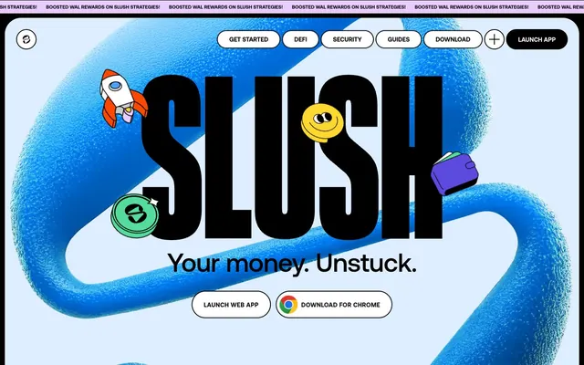
Preview image. Unlock full-res
Playful crypto minimalism with an electric hum.
Color palette
Backgrounds for some cards, links, and accents in illustrations. A significant identity color for interactive elements
Backgrounds for some cards and accents in illustrations. Imparts a digital, fresh feel
Green wash for highlight backgrounds, decorative bands, and soft emphasis behind content
Backgrounds for some cards, links, and accents in illustrations
Backgrounds for some cards and accents in illustrations. A punchy, energetic hue
Backgrounds for some cards and accents in illustrations. Adds a bright, optimistic highlight
Page background — a soft, cool neutral that feels open and digital
Primary text, borders, and some interactive element backgrounds. Creates strong contrast on light surfaces
Card backgrounds, button fills, and primary text on dark backgrounds. A clean, crisp white
Subtle button backgrounds for secondary actions or inactive states
Typography
- Weights
- 800
- Sizes
- 70px, 110px, 160px, 200px, 281px, 640px
- Line height
- 0.75
- Fallback
- Bebas Neue
Large, impactful headlines and hero text. The condensed, heavy-italicized form creates a dynamic, architectural feel that dominates the visual field.
- Weights
- 500, 700
- Sizes
- 12px, 13px, 14px, 15px, 16px, 24px, 30px, 64px
- Line height
- 1, 1.1, 1.2, 1.25, 1.39, 1.56
- Letter spacing
- -0.0100em, 0.0300em, 0.0320em
- Fallback
- Inter
All functional text including body copy, navigation, buttons, and smaller headings. Its neutrality and varying weights provide structure and readability against the bold headlines.
Spacing & shape
Components
Background: Paper (#ffffff), Text: Ink (#000000). Padding 40px all around, with a 40px border-radius, creating a squarish 'pill' form. Uses Aeonik Pro at appropriate size.
Transparent background, Ink (#000000) text and border. Padding 16px vertical, 32px horizontal. Full circular (1600px) border-radius. Uses `Aeonik Pro`.
Background: Pale Ash (#e9e9e9), Text: Ink (#000000). Circular (1600px) border-radius. Uses `Aeonik Pro`.
Background: Paper (#ffffff), Text: Ink (#000000). Icon on left. Circular (1600px) border-radius. 10px padding all around the icon and text to create a compact pill shape. Uses `Aeonik Pro`.
Background: Paper (#ffffff), with no visible shadow. Has a large 40px border-radius. Padding 165.6px vertical, 116.64px horizontal. Uses `Aeonik Pro` for text.
Background can be Vivid Blue (#4da2ff), Vivid Green (#55db9c), Muted Violet (#e9ccff), Flame Orange (#fb4903), Golden Rod (#ffd731), or Royal Purple (#5c4ade). 40px border-radius, no shadow. Padding 48px vertical, 24px horizontal. Uses `Aeonik Pro` text, default Ink (#000000).
Background can be Sky Canvas (#dceeff). Full circular (1600px) border-radius. No padding or shadows specified; likely holds a small icon or single character.
Ink (#000000) text on transparent background. Circular (1600px) border-radius creates a pill-shaped hit area. Uses `Aeonik Pro`.
Guidelines
- Prioritize Lateral font for all prominent headlines and Aeonik Pro for all other text, meticulously applying their specific `letterSpacing` values.
- Use Sky Canvas (#dceeff) as the primary page background to establish the light, digital atmosphere.
- Apply a 40px border-radius for cards and buttons for a consistent rounded but not entirely soft aesthetic.
- Utilize Ink (#000000) when text needs high contrast against light backgrounds, and Paper (#ffffff) for text against dark backgrounds.
- Employ the full set of vibrant accent colors (Vivid Blue, Vivid Green, Muted Violet, Flame Orange, Golden Rod, Royal Purple) only as card backgrounds or in illustrations, not for primary UI elements like buttons or primary text.
- Maintain a comfortable density with element gaps typically at 4px, but be intentional with larger padding values for buttons (40px) or cards (48px to 165px).
- Design interactive elements with a default transparent background and neutral text/border, reserving solid fills for primary actions (Paper filled with Ink text).
- Avoid using the vibrant accent colors directly for primary text or typical button fills; their role is for larger blocks or illustrations.
- Do not deviate from the specified letter-spacing for Aeonik Pro; it is crucial for its overall legibility and aesthetic.
- Do not introduce hard, sharp corners; all significant UI elements should adhere to the established border-radius tokens.
- Refrain from using drop shadows on cards or containers; the design relies on bold fills and borders for visual separation.
- Do not use generic system fonts as substitutes for Aeonik Pro or Lateral; find visually similar options if the custom fonts are unavailable.
- Avoid using the muted violet or violet colors for semantic warning or error states; they function as brand and accent colors.
- Do not use arbitrary spacing values; stick to the defined base unit and observed element/padding values.
About this system
ShowHide
Slush features a playful yet authoritative cryptocurrency aesthetic, combining bold, highly condensed typography for headlines with clean, functional sans-serif for UI. Its core visual identity is built around a light, almost ethereal, blue background accented with vibrant, cartoonish 3D elements and a surprising range of saturated utilitarian colors that appear mostly as fills in illustrations or card backgrounds. Buttons and interactive elements favor high-contrast black on white or transparent styles over solid brand color fills, maintaining a lightweight feel.
The page primarily uses a full-bleed layout on a light blue canvas. The hero section features a full-viewport splash of the organic 3D blue element, with the brand name 'Slush' in dominant, large-scale Lateral typography and a clear sub-headline. Content sections typically alternate between full-width content blocks and left-aligned text with visual elements (illustrations/cards) on the right. There's a strong emphasis on large, centered headlines, creating a monumental feel. Content arrangement often appears as centered stacks, sometimes with asymmetric floating elements. Navigation is a sticky top bar with ghost buttons and a prominent 'Launch App' button. The rhythm is open and spacious, using large vertical gaps between sections.
The site uses a combination of playful, abstract 3D elements and cartoonish illustrations. The 3D elements are organic, fluid shapes in vibrant blue, acting as a backdrop or flowing through the scene. Illustrations for elements like rockets, wallets, and coins are stylized with thick outlines and bold, blocky infills, often appearing as floating icons. Photography is absent. Imagery functions as decorative atmosphere and explanatory content, adding a whimsical and approachable layer to the technical subject. Image density is moderate, with visuals often taking large sections of the canvas, but interspersed with bold typography.
Reminiscent of Rainbow Wallet, Brave Browser, Linear, Zapper.fi.
# Slush — Style Reference
> Playful crypto minimalism with an electric hum.

**Theme:** light

**Site:** https://slush.app

Slush features a playful yet authoritative cryptocurrency aesthetic, combining bold, highly condensed typography for headlines with clean, functional sans-serif for UI. Its core visual identity is built around a light, almost ethereal, blue background accented with vibrant, cartoonish 3D elements and a surprising range of saturated utilitarian colors that appear mostly as fills in illustrations or card backgrounds. Buttons and interactive elements favor high-contrast black on white or transparent styles over solid brand color fills, maintaining a lightweight feel.

## Tokens — Colors

| Name | Value | Token | Role |
|------|------|------|------|
| Royal Purple | `#5c4ade` | `--color-royal-purple` | Backgrounds for some cards, links, and accents in illustrations. A significant identity color for interactive elements |
| Vivid Blue | `#4da2ff` | `--color-vivid-blue` | Backgrounds for some cards and accents in illustrations. Imparts a digital, fresh feel |
| Vivid Green | `#55db9c` | `--color-vivid-green` | Green wash for highlight backgrounds, decorative bands, and soft emphasis behind content |
| Muted Violet | `#e9ccff` | `--color-muted-violet` | Backgrounds for some cards, links, and accents in illustrations |
| Flame Orange | `#fb4903` | `--color-flame-orange` | Backgrounds for some cards and accents in illustrations. A punchy, energetic hue |
| Golden Rod | `#ffd731` | `--color-golden-rod` | Backgrounds for some cards and accents in illustrations. Adds a bright, optimistic highlight |
| Sky Canvas | `#dceeff` | `--color-sky-canvas` | Page background — a soft, cool neutral that feels open and digital |
| Ink | `#000000` | `--color-ink` | Primary text, borders, and some interactive element backgrounds. Creates strong contrast on light surfaces |
| Paper | `#ffffff` | `--color-paper` | Card backgrounds, button fills, and primary text on dark backgrounds. A clean, crisp white |
| Pale Ash | `#e9e9e9` | `--color-pale-ash` | Subtle button backgrounds for secondary actions or inactive states |

## Tokens — Typography

### Lateral
- **Substitute:** Bebas Neue
- **Weights:** 800
- **Sizes:** 70px, 110px, 160px, 200px, 281px, 640px
- **Line height:** 0.75
- **Role:** Large, impactful headlines and hero text. The condensed, heavy-italicized form creates a dynamic, architectural feel that dominates the visual field.

### Aeonik Pro
- **Substitute:** Inter
- **Weights:** 500, 700
- **Sizes:** 12px, 13px, 14px, 15px, 16px, 24px, 30px, 64px
- **Line height:** 1, 1.1, 1.2, 1.25, 1.39, 1.56
- **Letter spacing:** -0.0100em, 0.0300em, 0.0320em
- **Role:** All functional text including body copy, navigation, buttons, and smaller headings. Its neutrality and varying weights provide structure and readability against the bold headlines.

## Tokens — Type Scale

Major Third (1.25) from 14px base.

| Role | Size | Line height | Letter spacing |
|------|------|------|------|
| caption | 12px | 1.25 | — |
| body-sm | 13px | 1.25 | — |
| body | 14px | 1.25 | — |
| body-lg | 15px | 1.25 | — |
| heading-sm | 16px | 1.25 | — |
| heading | 24px | 1.25 | — |
| heading-lg | 30px | 1.25 | — |
| display-sm | 64px | 1.25 | — |

## Tokens — Spacing

- **Section gap:** 48px
- **Card padding:** 48px
- **Element gap:** 4px

## Tokens — Radius

- **Buttons:** 40px
- **Cards:** 40px
- **bodyElements:** 30px
- **circular:** 1600px
- **links:** 20px

## Layout

The page primarily uses a full-bleed layout on a light blue canvas. The hero section features a full-viewport splash of the organic 3D blue element, with the brand name 'Slush' in dominant, large-scale Lateral typography and a clear sub-headline. Content sections typically alternate between full-width content blocks and left-aligned text with visual elements (illustrations/cards) on the right. There's a strong emphasis on large, centered headlines, creating a monumental feel. Content arrangement often appears as centered stacks, sometimes with asymmetric floating elements. Navigation is a sticky top bar with ghost buttons and a prominent 'Launch App' button. The rhythm is open and spacious, using large vertical gaps between sections.

## Imagery

The site uses a combination of playful, abstract 3D elements and cartoonish illustrations. The 3D elements are organic, fluid shapes in vibrant blue, acting as a backdrop or flowing through the scene. Illustrations for elements like rockets, wallets, and coins are stylized with thick outlines and bold, blocky infills, often appearing as floating icons. Photography is absent. Imagery functions as decorative atmosphere and explanatory content, adding a whimsical and approachable layer to the technical subject. Image density is moderate, with visuals often taking large sections of the canvas, but interspersed with bold typography.

## Components

### Primary Filled Button
*Call to action button for key flows.*

Background: Paper (#ffffff), Text: Ink (#000000). Padding 40px all around, with a 40px border-radius, creating a squarish 'pill' form. Uses Aeonik Pro at appropriate size.

### Ghost Button
*Secondary action or navigation items.*

Transparent background, Ink (#000000) text and border. Padding 16px vertical, 32px horizontal. Full circular (1600px) border-radius. Uses `Aeonik Pro`.

### Subtle Grey Button
*Tertiary actions or subtle interactive elements.*

Background: Pale Ash (#e9e9e9), Text: Ink (#000000). Circular (1600px) border-radius. Uses `Aeonik Pro`.

### Download Button with Icon
*Specific download actions for web or mobile.*

Background: Paper (#ffffff), Text: Ink (#000000). Icon on left. Circular (1600px) border-radius. 10px padding all around the icon and text to create a compact pill shape. Uses `Aeonik Pro`.

### Featured Content Card
*Prominent information display.*

Background: Paper (#ffffff), with no visible shadow. Has a large 40px border-radius. Padding 165.6px vertical, 116.64px horizontal. Uses `Aeonik Pro` for text.

### Colored Background Card
*Highlighting specific features or content blocks.*

Background can be Vivid Blue (#4da2ff), Vivid Green (#55db9c), Muted Violet (#e9ccff), Flame Orange (#fb4903), Golden Rod (#ffd731), or Royal Purple (#5c4ade). 40px border-radius, no shadow. Padding 48px vertical, 24px horizontal. Uses `Aeonik Pro` text, default Ink (#000000).

### Tiny Circular Icon Background
*Decorative or small interactive elements.*

Background can be Sky Canvas (#dceeff). Full circular (1600px) border-radius. No padding or shadows specified; likely holds a small icon or single character.

### Top Navigation Link
*Primary navigation items in the header.*

Ink (#000000) text on transparent background. Circular (1600px) border-radius creates a pill-shaped hit area. Uses `Aeonik Pro`.

## Guidelines

### Do

- Prioritize Lateral font for all prominent headlines and Aeonik Pro for all other text, meticulously applying their specific `letterSpacing` values.
- Use Sky Canvas (#dceeff) as the primary page background to establish the light, digital atmosphere.
- Apply a 40px border-radius for cards and buttons for a consistent rounded but not entirely soft aesthetic.
- Utilize Ink (#000000) when text needs high contrast against light backgrounds, and Paper (#ffffff) for text against dark backgrounds.
- Employ the full set of vibrant accent colors (Vivid Blue, Vivid Green, Muted Violet, Flame Orange, Golden Rod, Royal Purple) only as card backgrounds or in illustrations, not for primary UI elements like buttons or primary text.
- Maintain a comfortable density with element gaps typically at 4px, but be intentional with larger padding values for buttons (40px) or cards (48px to 165px).
- Design interactive elements with a default transparent background and neutral text/border, reserving solid fills for primary actions (Paper filled with Ink text).

### Don't

- Avoid using the vibrant accent colors directly for primary text or typical button fills; their role is for larger blocks or illustrations.
- Do not deviate from the specified letter-spacing for Aeonik Pro; it is crucial for its overall legibility and aesthetic.
- Do not introduce hard, sharp corners; all significant UI elements should adhere to the established border-radius tokens.
- Refrain from using drop shadows on cards or containers; the design relies on bold fills and borders for visual separation.
- Do not use generic system fonts as substitutes for Aeonik Pro or Lateral; find visually similar options if the custom fonts are unavailable.
- Avoid using the muted violet or violet colors for semantic warning or error states; they function as brand and accent colors.
- Do not use arbitrary spacing values; stick to the defined base unit and observed element/padding values.

## Agent Prompt Guide

### Quick Color Reference
- text: #000000 (Ink)
- background: #dceeff (Sky Canvas)
- border: #000000 (Ink)
- accent: #5c4ade (Royal Purple)
- primary action: #ffffff (filled action)

### 3-5 Example Component Prompts
1. Create a hero section: Sky Canvas (#dceeff) background. Headline 'Your money. Unstuck.' in Lateral weight 800 at 640px. Centered. Below, ghost buttons: 'Launch web app' and 'Download for Chrome' in Ink (#000000) text and border, transparent background, 1600px radius, 16px vertical, 32px horizontal padding.
2. Create a featured content card: Paper (#ffffff) background, 40px radius, 165.6px vertical and 116.64px horizontal internal padding. Inside, place a secondary heading in Aeonik Pro weight 700 at 30px in Ink (#000000).
3. Create a navigation bar button: Transparent background, 'Download' in Aeonik Pro font, Ink (#000000) color, 1600px border-radius, default padding for ghost buttons.
4. Create a colored content block: Royal Purple (#5c4ade) background, 40px radius, 48px vertical and 24px horizontal padding. Text inside in Aeonik Pro, Paper (#ffffff) color, size 16px.
More like this






Keep what you find
A free account saves references to boards and can send you a weekly email of picks based on what you save.
To see every result, go Pro.