Preview image. Unlock full-res
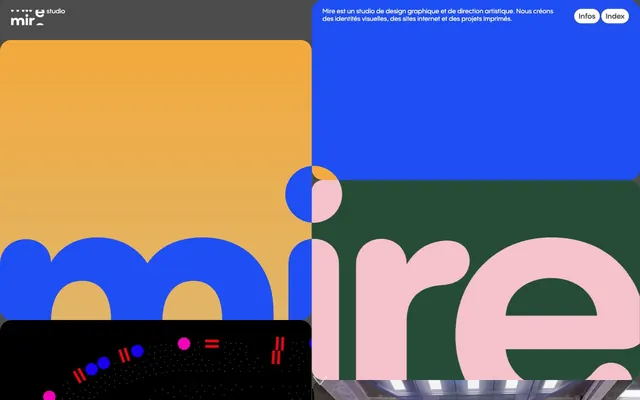
Vibrant geometric collage on a dark canvas.
Color palette
Card backgrounds, decorative blocks
Card backgrounds, vibrant interaction highlights
Card backgrounds, deep accent surfaces
Card backgrounds, vibrant graphic elements
Card backgrounds, bold accent areas
Card backgrounds, dark, rich accent zones
Card backgrounds, high-energy accents
Card backgrounds, strong, contrasting accents
Card backgrounds, warm, inviting graphic elements
Card backgrounds, bright, playful highlights
Card backgrounds, softer, yet distinct accent areas
Card backgrounds, secondary surface color
Card backgrounds, dynamic visual highlights
Decorative background gradient element
Page background, primary text on light surfaces, button border and label
Primary text on dark surfaces, button background, interactive elements
Muted background elements, secondary text
Subtle background accents, dividers
Typography
- Weights
- 400, 600
- Sizes
- 12px, 14px, 16px
- Line height
- 1.15, 1.4
- Letter spacing
- normal
- Fallback
- system-ui, sans-serif
All textual content including headings, body text, links, and button labels. Its rounded humanist sans-serif style provides approachability and legibility in small sizes while adding character to larger headings.
Spacing & shape
Elevation
Components
A pill-shaped button with Pale Mist background and Midnight Ink text. Border is 1px Midnight Ink, radius is 25px. Padding is 8px top/bottom and 10px left/right. Features a subtle shadow: rgba(84, 84, 84, 0.23) 0px 0px 20px 0px.
Cards are large, rounded rectangles (25px radius) that use a diverse palette of vivid brand colors for their backgrounds. They have no visible border, padding, or box-shadow, focusing purely on color and shape to define individual content areas.
Transparent background with Pale Mist text, no padding or border radius. Minimalist, designed to blend into its parent container while providing clear labeling.
Guidelines
- Prioritize a dark canvas using Midnight Ink (#4b4b4b) for backgrounds, with Pale Mist (#ffffff) for primary text.
- Utilize the full spectrum of vivid brand colors for large background blocks and cards, allowing for strong visual contrast and graphic expression.
- Employ PP Pangram Sans Rounded for all text, with a regular weight (400) for body and 600 for emphasis.
- Apply a 25px border-radius consistently to all interactive elements, cards, and prominent imagery for a soft, rounded aesthetic.
- Maintain a compact layout density, with a max-width of 570px to keep focus on detailed content within creative compositions.
- Use a default element gap of 5px and section gap of 25px to create tightly arranged yet distinct visual blocks.
- Design interactive buttons with a Pale Mist (#ffffff) background, Midnight Ink (#4b4b4b) text, 25px corner radius, and the specific `rgba(84, 84, 84, 0.23) 0px 0px 20px 0px` shadow.
- Avoid using light backgrounds. The design system is built for a predominantly dark theme.
- Do not introduce sharp corners or small radii; the roundedness (20px or 25px) is a core aspect of the visual identity.
- Do not use subtle, muted color palettes for primary content blocks; embrace vivid and saturated hues for visual impact.
- Avoid large amounts of white space or expansive, open layouts; the system favors compact, dense visual compositions.
- Do not use generic sans-serif fonts; the unique rounded character of PP Pangram Sans Rounded is essential to the brand.
- Do not neglect the subtle shadow on interactive elements; it provides depth and an intentional softness.
- Avoid applying borders or padding to content cards; their role is to be solid, colorful blocks.
About this system
ShowHide
Mire·studio employs a maximalist collage aesthetic, characterized by an energetic juxtaposition of vibrant, saturated color blocks and large, rounded shapes that often overlap. Typography is compact and precise, providing clear information within dense, visually rich compositions. The system thrives on a dark canvas, utilizing a broad spectrum of chromatic colors for surface distinction and graphic impact rather than a functional accent. Components are organic and soft, with generous radii that contrast against the sharp angles of the overall layout, creating a playful yet organized feel.
The page maintains a tight, compact, max-width layout of 570px, centered on a dark canvas. The hero is a dynamic visual collage, combining bold color blocks, text, and imagery in an asymmetrical, often overlapping arrangement. Content sections maintain consistent vertical spacing (25px) and heavily feature large, rounded, colorful content cards arranged in a fluid, non-grid-like pattern that simulates a digital scrapbook or art installation. Navigation is minimal, limited to two small pill buttons in the top right corner indicating 'Info' and 'Index', maintaining a clean visual field.
This site uses project-specific imagery, photography, and abstract graphics in a maximalist, collage-like fashion. Images are often contained within large, rounded (25px radius) blocks, sometimes overlapping or placed within colorful sections. Photography ranges from product-focused to environmental, often treated with a vibrant, art-directed aesthetic rather than desaturated. Illustrations are dimensional and geometric, using brand colors. Icons are outlined, with a moderate stroke weight, and appear in monochrome as functional elements. Imagery serves to showcase work and create an immersive, atmospheric experience, with a high visual density.
Reminiscent of AIGA Eye on Design, Studio Dumbar, Readymag, Studiostyl.
# mire·studio — Style Reference
> Vibrant geometric collage on a dark canvas.

**Theme:** dark

**Site:** https://mire.studio

Mire·studio employs a maximalist collage aesthetic, characterized by an energetic juxtaposition of vibrant, saturated color blocks and large, rounded shapes that often overlap. Typography is compact and precise, providing clear information within dense, visually rich compositions. The system thrives on a dark canvas, utilizing a broad spectrum of chromatic colors for surface distinction and graphic impact rather than a functional accent. Components are organic and soft, with generous radii that contrast against the sharp angles of the overall layout, creating a playful yet organized feel.

## Tokens — Colors

| Name | Value | Token | Role |
|------|------|------|------|
| Teal Splash | `#00c4ad` | `--color-teal-splash` | Card backgrounds, decorative blocks |
| Violet Impulse | `#6c1ec5` | `--color-violet-impulse` | Card backgrounds, vibrant interaction highlights |
| Forest Deep | `#264c38` | `--color-forest-deep` | Card backgrounds, deep accent surfaces |
| Blue Pop | `#0053d9` | `--color-blue-pop` | Card backgrounds, vibrant graphic elements |
| Pink Blast | `#ba1aba` | `--color-pink-blast` | Card backgrounds, bold accent areas |
| Indigo Depths | `#151655` | `--color-indigo-depths` | Card backgrounds, dark, rich accent zones |
| Neon Green | `#1aff00` | `--color-neon-green` | Card backgrounds, high-energy accents |
| Crimson Edge | `#942929` | `--color-crimson-edge` | Card backgrounds, strong, contrasting accents |
| Sunset Orange | `#ff8000` | `--color-sunset-orange` | Card backgrounds, warm, inviting graphic elements |
| Fuchsia Flare | `#ff66ff` | `--color-fuchsia-flare` | Card backgrounds, bright, playful highlights |
| Rose Dusk | `#855885` | `--color-rose-dusk` | Card backgrounds, softer, yet distinct accent areas |
| Emerald Glade | `#008063` | `--color-emerald-glade` | Card backgrounds, secondary surface color |
| Electric Blue | `#204ef5` | `--color-electric-blue` | Card backgrounds, dynamic visual highlights |
| Golden Gradient | `#f3a93c` | `--color-golden-gradient` | Decorative background gradient element |
| Midnight Ink | `#4b4b4b` | `--color-midnight-ink` | Page background, primary text on light surfaces, button border and label |
| Pale Mist | `#ffffff` | `--color-pale-mist` | Primary text on dark surfaces, button background, interactive elements |
| Storm Gray | `#8a8a8a` | `--color-storm-gray` | Muted background elements, secondary text |
| Sky Haze | `#b2bec4` | `--color-sky-haze` | Subtle background accents, dividers |

## Tokens — Typography

### PP Pangram Sans Rounded
- **Substitute:** system-ui, sans-serif
- **Weights:** 400, 600
- **Sizes:** 12px, 14px, 16px
- **Line height:** 1.15, 1.4
- **Letter spacing:** normal
- **Role:** All textual content including headings, body text, links, and button labels. Its rounded humanist sans-serif style provides approachability and legibility in small sizes while adding character to larger headings.

## Tokens — Type Scale

| Role | Size | Line height | Letter spacing |
|------|------|------|------|
| caption | 12px | 1.4 | — |
| body-sm | 14px | 1.4 | — |
| body | 16px | 1.4 | — |

## Tokens — Spacing

- **Max width:** 570px
- **Section gap:** 25px
- **Card padding:** 0px
- **Element gap:** 5px

## Tokens — Radius

- **General:** 20px
- **Buttons:** 25px
- **Cards:** 25px
- **Images:** 25px

## Tokens — Elevation

- **Pill Button:** `rgba(84, 84, 84, 0.23) 0px 0px 20px 0px`

## Layout

The page maintains a tight, compact, max-width layout of 570px, centered on a dark canvas. The hero is a dynamic visual collage, combining bold color blocks, text, and imagery in an asymmetrical, often overlapping arrangement. Content sections maintain consistent vertical spacing (25px) and heavily feature large, rounded, colorful content cards arranged in a fluid, non-grid-like pattern that simulates a digital scrapbook or art installation. Navigation is minimal, limited to two small pill buttons in the top right corner indicating 'Info' and 'Index', maintaining a clean visual field.

## Imagery

This site uses project-specific imagery, photography, and abstract graphics in a maximalist, collage-like fashion. Images are often contained within large, rounded (25px radius) blocks, sometimes overlapping or placed within colorful sections. Photography ranges from product-focused to environmental, often treated with a vibrant, art-directed aesthetic rather than desaturated. Illustrations are dimensional and geometric, using brand colors. Icons are outlined, with a moderate stroke weight, and appear in monochrome as functional elements. Imagery serves to showcase work and create an immersive, atmospheric experience, with a high visual density.

## Components

### Pill Button
*Interactive element for navigation and actions.*

A pill-shaped button with Pale Mist background and Midnight Ink text. Border is 1px Midnight Ink, radius is 25px. Padding is 8px top/bottom and 10px left/right. Features a subtle shadow: rgba(84, 84, 84, 0.23) 0px 0px 20px 0px.

### Colored Content Card
*Visual container for project previews or content blocks.*

Cards are large, rounded rectangles (25px radius) that use a diverse palette of vivid brand colors for their backgrounds. They have no visible border, padding, or box-shadow, focusing purely on color and shape to define individual content areas.

### Text Badge
*Categorization or informational tags.*

Transparent background with Pale Mist text, no padding or border radius. Minimalist, designed to blend into its parent container while providing clear labeling.

## Guidelines

### Do

- Prioritize a dark canvas using Midnight Ink (#4b4b4b) for backgrounds, with Pale Mist (#ffffff) for primary text.
- Utilize the full spectrum of vivid brand colors for large background blocks and cards, allowing for strong visual contrast and graphic expression.
- Employ PP Pangram Sans Rounded for all text, with a regular weight (400) for body and 600 for emphasis.
- Apply a 25px border-radius consistently to all interactive elements, cards, and prominent imagery for a soft, rounded aesthetic.
- Maintain a compact layout density, with a max-width of 570px to keep focus on detailed content within creative compositions.
- Use a default element gap of 5px and section gap of 25px to create tightly arranged yet distinct visual blocks.
- Design interactive buttons with a Pale Mist (#ffffff) background, Midnight Ink (#4b4b4b) text, 25px corner radius, and the specific `rgba(84, 84, 84, 0.23) 0px 0px 20px 0px` shadow.

### Don't

- Avoid using light backgrounds. The design system is built for a predominantly dark theme.
- Do not introduce sharp corners or small radii; the roundedness (20px or 25px) is a core aspect of the visual identity.
- Do not use subtle, muted color palettes for primary content blocks; embrace vivid and saturated hues for visual impact.
- Avoid large amounts of white space or expansive, open layouts; the system favors compact, dense visual compositions.
- Do not use generic sans-serif fonts; the unique rounded character of PP Pangram Sans Rounded is essential to the brand.
- Do not neglect the subtle shadow on interactive elements; it provides depth and an intentional softness.
- Avoid applying borders or padding to content cards; their role is to be solid, colorful blocks.

## Agent Prompt Guide

### Quick Color Reference
- text: #ffffff
- background: #4b4b4b
- border: #4b4b4b
- accent: #6c1ec5
- primary action: #ffffff (filled action)

### 3-5 Example Component Prompts
- Create a text badge for an informational label: text PP Pangram Sans Rounded weight 400, size 14px, #ffffff, no background, 0px border-radius, 0px padding.
- Generate a content card with a vibrant background: background color #0053d9, 25px border-radius, no border, 0px padding.
- Design a primary navigation button: background #ffffff, text PP Pangram Sans Rounded weight 400, size 14px, #4b4b4b, 25px border-radius, 8px 10px padding, box-shadow rgba(84, 84, 84, 0.23) 0px 0px 20px 0px.
More like this





Keep what you find
A free account saves references to boards and can send you a weekly email of picks based on what you save.
To see every result, go Pro.