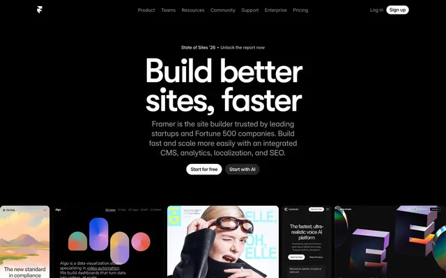
Preview image. Unlock full-res
Inky command center
Color palette
Interactive elements, links, active states, indicators, primary accent. Draws attention and signifies action.
Secondary accent for graphical elements, subtle interactive states where Electric Blue might be too strong for background.
Subtle top-to-bottom gradient for background elements, adding a hint of color variation.
Highlight for specific cards or callouts, purely decorative.
Highlight for specific cards or callouts, purely decorative.
Highlight for specific cards or callouts, purely decorative.
Highlight for specific cards or callouts, purely decorative.
Page background, primary surface, deep canvas. Provides stark contrast for all content.
Secondary surface, subtle elevated panels, card backgrounds. Creates depth against Absolute Zero.
Primary text, heading text, button text, foreground elements. High contrast for readability on dark backgrounds.
Muted text, secondary labels, disabled states. Provides subtler information.
Sub-secondary text, dividing lines. Softer than Ash Gray for less prominent elements.
Tertiary text, less important information, placeholder text.
Tertiary surface layer, slightly darker elevated elements.
Typography
- Weights
- 500
- Sizes
- 110px
- Line height
- 0.85
- Letter spacing
- -0.0500em
- Fallback
- Montserrat
Display headline. Extremely large, tight kerning for maximum impact.
- Weights
- 500
- Sizes
- 32px, 62px, 85px
- Line height
- 0.95, 1, 1.13
- Letter spacing
- -0.0500em at 85px, -0.0310em at 62px, normal at 32px
- Fallback
- Montserrat
Primary headings (H1-H3). Characterized by compact line height and slight negative letter-spacing for a bold, condensed feel. Features stylistic alternates and tabular numbers.
- Weights
- 500
- Sizes
- 12px, 13px, 17px, 18px, 62px
- Line height
- 1, 1.2, 1.3, 1.7, 2.28
- Letter spacing
- -0.0500em at 62px, -0.0460em for 17px/18px, normal elsewhere
- Fallback
- Inter
Secondary headings (H4-H6). Offers a more neutral counterpart to GT Walsheim for less prominent titles.
- Weights
- 400
- Sizes
- 8px, 12px, 13px, 14px, 15px, 18px, 24px
- Line height
- 0.8, 1, 1.07, 1.2, 1.3, 1.4
- Letter spacing
- -0.0200em at 18px and 24px, -0.0180em, -0.0100em, -0.0010em, 0.0300em for specific contexts
- Fallback
- Inter
Body text, subheadings, labels. Highly versatile with broad stylistic controls, ensuring clarity across various information densities. Features a wide range of stylistic sets.
- Weights
- 400, 500, 600, 700
- Sizes
- 10px, 12px, 13px, 14px, 15px, 16px, 20px, 22px
- Line height
- 0.83, 1, 1.1, 1.15, 1.2, 1.3, 1.4, 1.6
- Letter spacing
- -0.0530em to 0.0300em
- Fallback
- Inter
Paragraphs, navigation, general UI text. Provides robust readability with specific handling for tabular numbers and stylistic alternates.
- Weights
- 600
- Sizes
- 9px
- Line height
- 1.11
- Letter spacing
- normal
- Fallback
- Varela Round
Fine print, metadata. Distinctive small-caps style via stylistic sets.
Spacing & shape
Components
backgroundColor=rgba(255, 255, 255, 0.15), color=rgb(0, 0, 238) (browser default link color, interpret as Electric Blue #0099ff), borderRadius=100px, paddingTop=10px, paddingRight=14px, paddingBottom=10px, paddingLeft=14px. Text uses Inter font family. Appears as a white ghost button on dark background.
backgroundColor=rgba(0, 0, 0, 0), color=rgb(0, 0, 0) (browser default, interpret as Vapor White #ffffff against dark), borderRadius=0px, paddingTop=0px, paddingRight=0px, paddingBottom=0px, paddingLeft=0px. Used for subtle actions or navigation within sections.
backgroundColor=rgb(255, 255, 255), color=rgb(0, 0, 238) (browser default, interpret as Electric Blue #0099ff), borderRadius=100px, paddingTop=10px, paddingRight=14px, paddingBottom=10px, paddingLeft=14px. Used for critical actions on lighter backgrounds or when extra prominence is needed.
backgroundColor=rgba(255, 255, 255, 0.1), color=rgb(0, 0, 0) (browser default, interpret as Vapor White #ffffff), borderRadius=40px, paddingTop=0px, paddingRight=0px, paddingBottom=0px, paddingLeft=0px. Used for subtle actions like closing modals or navigation controls.
color=Vapor White (#ffffff), font-size=14px, font-weight=Inter Regular (400), no explicit background, padding: 0. Configured for horizontal menu display.
background-color: Charcoal Canvas (#080808) or a variety of vivid accent colors (Tangerine, Goldenrod, Emerald, Amethyst) for visual distinction. Border radius: 8px. Text content uses various Inter weights. Often contains images or abstract patterns.
min-height: 200px (inferred). backgroundColor=rgba(255, 255, 255, 0.15) or Charcoal Canvas (#080808). borderRadius=8px. Padding is implied 10-15px. Contains a small title and short body text.
Implicit background matching surrounding surface (e.g. Charcoal Canvas #080808). Text color: Vapor White (#ffffff). Placeholder text color: Ash Gray (#999999). Focus ring: rgb(9, 9, 9) 0px 0px 0px 2px (Dark Shadow).
Guidelines
- Use Absolute Zero (#000000) as the primary background for all page sections to enforce a consistent dark theme.
- Apply Vapor White (#ffffff) for all main headings and body text on dark backgrounds to ensure maximum contrast and readability.
- Reserve Electric Blue (#0099ff) exclusively for interactive elements like links, buttons, and active states to guide user attention.
- Utilize 100px border radius for all primary calls-to-action to create distinct pill-shaped buttons.
- Employ the GT Walsheim fonts (GT Walsheim Framer Medium, GT Walsheim Medium) for all major headlines to convey the brand's unique character.
- Maintain a compact line height for all display and heading typography (e.g., 0.85 for 110px, 0.95 for 85px) to achieve a dense, type-driven aesthetic.
- Layer surfaces using Absolute Zero (#000000) and Charcoal Canvas (#080808) to create depth without relying on prominent shadows.
- Avoid using light backgrounds for entire page sections; the theme is predominantly dark.
- Do not use generic system fonts for prominent headings; GT Walsheim is critical for brand identity.
- Do not introduce additional accent colors beyond Electric Blue (#0099ff) and the designated card highlights (Tangerine, Goldenrod, Emerald, Amethyst).
- Avoid box shadows for general elevation; subtle background color shifts (e.g., #000000 to #080808) provide the primary sense of layering.
- Do not use letter-spacing: normal for headlines; specific negative letter-spacing values (-0.0500em, -0.0310em) are integral to the typographic style.
- Do not vary border radius for buttons; stick to 100px for pill shapes and 8px for cards/inputs.
- Do not introduce complex gradients or textures on primary surfaces; the background should remain clean and near-monochromatic.
About this system
ShowHide
Framer's design pulsates like a high-contrast digital canvas, where every element is deliberately placed against a deep, inky black. The interplay of brilliant white typography and electric blue accents (#0099ff) against the #000000 background creates an immediate sense of clarity and impact, reminiscent of a command-line interface or a designer's dark-mode workspace. Generously rounded elements, especially 100px pill buttons, introduce soft dynamism into an otherwise sharp, modern aesthetic, making complex tools feel approachable. Subtle layers of near-black surfaces (#080808) provide depth without relying on heavy shadows, maintaining a lightweight, performant feel.
The layout primarily uses a full-bleed dark canvas for the background. Content is centered and constrained within an implied max-width (no explicit pageMaxWidth, but content blocks are visually centered and not full-width). The hero section features a centered, oversized headline on a full-bleed dark background, with prominent pill-shaped call-to-action buttons. Subsequent sections alternate between large, impactful text blocks and grids of featured content. There's a prominent 3-column card grid for 'Made with Framer' examples, showcasing various visual styles within a consistent structural framework. Vertical spacing between sections is generous but not excessively sprawling, contributing to a compact visual density.
The visual language is a blend of tight product screenshots, abstract geometric shapes with vibrant accent colors, and stylized photography. Product screenshots are typically contained within cards, often featuring a subtle background or drop shadow. Illustrations are geometric and abstract, using brand accent colors (Tangerine, Goldenrod, Emerald, Amethyst) to add visual interest and break up the dark interface. Photography is used sparingly for social proof, featuring desaturated or monochrome portraits within circular masks. Icons are monochrome, outlined, and minimal, primarily in Vapor White against dark backgrounds. Imagery primarily serves to showcase products, demonstrate features, or provide decorative color accents, balanced with a high density of textual content.
Reminiscent of Vercel, Linear, Supabase, Notion, Webflow.
# Framer — Style Reference
> Inky command center

**Theme:** dark

**Site:** https://framer.com

Framer's design pulsates like a high-contrast digital canvas, where every element is deliberately placed against a deep, inky black. The interplay of brilliant white typography and electric blue accents (#0099ff) against the #000000 background creates an immediate sense of clarity and impact, reminiscent of a command-line interface or a designer's dark-mode workspace. Generously rounded elements, especially 100px pill buttons, introduce soft dynamism into an otherwise sharp, modern aesthetic, making complex tools feel approachable. Subtle layers of near-black surfaces (#080808) provide depth without relying on heavy shadows, maintaining a lightweight, performant feel.

## Tokens — Colors

| Name | Value | Token | Role |
|------|------|------|------|
| Electric Blue | `#0099ff` | `--color-electric-blue` | Interactive elements, links, active states, indicators, primary accent. Draws attention and signifies action. |
| Sky Indigo | `#0055ff` | `--color-sky-indigo` | Secondary accent for graphical elements, subtle interactive states where Electric Blue might be too strong for background. |
| Cyan Fade | `#05ff9f` | `--color-cyan-fade` | Subtle top-to-bottom gradient for background elements, adding a hint of color variation. |
| Tangerine | `#fd5d5c` | `--color-tangerine` | Highlight for specific cards or callouts, purely decorative. |
| Goldenrod | `#fac80a` | `--color-goldenrod` | Highlight for specific cards or callouts, purely decorative. |
| Emerald | `#33c659` | `--color-emerald` | Highlight for specific cards or callouts, purely decorative. |
| Amethyst | `#9869fd` | `--color-amethyst` | Highlight for specific cards or callouts, purely decorative. |
| Absolute Zero | `#000000` | `--color-absolute-zero` | Page background, primary surface, deep canvas. Provides stark contrast for all content. |
| Charcoal Canvas | `#080808` | `--color-charcoal-canvas` | Secondary surface, subtle elevated panels, card backgrounds. Creates depth against Absolute Zero. |
| Vapor White | `#ffffff` | `--color-vapor-white` | Primary text, heading text, button text, foreground elements. High contrast for readability on dark backgrounds. |
| Ash Gray | `#999999` | `--color-ash-gray` | Muted text, secondary labels, disabled states. Provides subtler information. |
| Silver Mist | `#cccccc` | `--color-silver-mist` | Sub-secondary text, dividing lines. Softer than Ash Gray for less prominent elements. |
| Slate Dust | `#666666` | `--color-slate-dust` | Tertiary text, less important information, placeholder text. |
| Deep Space | `#171717` | `--color-deep-space` | Tertiary surface layer, slightly darker elevated elements. |

## Tokens — Typography

### GT Walsheim Framer Medium
- **Substitute:** Montserrat
- **Weights:** 500
- **Sizes:** 110px
- **Line height:** 0.85
- **Letter spacing:** -0.0500em
- **Role:** Display headline. Extremely large, tight kerning for maximum impact.

### GT Walsheim Medium
- **Substitute:** Montserrat
- **Weights:** 500
- **Sizes:** 32px, 62px, 85px
- **Line height:** 0.95, 1, 1.13
- **Letter spacing:** -0.0500em at 85px, -0.0310em at 62px, normal at 32px
- **Role:** Primary headings (H1-H3). Characterized by compact line height and slight negative letter-spacing for a bold, condensed feel. Features stylistic alternates and tabular numbers.

### Mona Sans
- **Substitute:** Inter
- **Weights:** 500
- **Sizes:** 12px, 13px, 17px, 18px, 62px
- **Line height:** 1, 1.2, 1.3, 1.7, 2.28
- **Letter spacing:** -0.0500em at 62px, -0.0460em for 17px/18px, normal elsewhere
- **Role:** Secondary headings (H4-H6). Offers a more neutral counterpart to GT Walsheim for less prominent titles.

### Inter Variable
- **Substitute:** Inter
- **Weights:** 400
- **Sizes:** 8px, 12px, 13px, 14px, 15px, 18px, 24px
- **Line height:** 0.8, 1, 1.07, 1.2, 1.3, 1.4
- **Letter spacing:** -0.0200em at 18px and 24px, -0.0180em, -0.0100em, -0.0010em, 0.0300em for specific contexts
- **Role:** Body text, subheadings, labels. Highly versatile with broad stylistic controls, ensuring clarity across various information densities. Features a wide range of stylistic sets.

### Inter
- **Substitute:** Inter
- **Weights:** 400, 500, 600, 700
- **Sizes:** 10px, 12px, 13px, 14px, 15px, 16px, 20px, 22px
- **Line height:** 0.83, 1, 1.1, 1.15, 1.2, 1.3, 1.4, 1.6
- **Letter spacing:** -0.0530em to 0.0300em
- **Role:** Paragraphs, navigation, general UI text. Provides robust readability with specific handling for tabular numbers and stylistic alternates.

### Open Runde
- **Substitute:** Varela Round
- **Weights:** 600
- **Sizes:** 9px
- **Line height:** 1.11
- **Letter spacing:** normal
- **Role:** Fine print, metadata. Distinctive small-caps style via stylistic sets.

## Tokens — Type Scale

Augmented Fourth (1.414) from 14px base.

| Role | Size | Line height | Letter spacing |
|------|------|------|------|
| body | 14px | 1.3 | — |
| body-lg | 18px | 1.4 | -0.02em |
| subheading | 24px | 1.07 | -0.02em |
| heading-sm | 32px | 1 | — |
| heading | 62px | 1 | -0.031em |
| heading-lg | 85px | 0.95 | -0.05em |
| display | 110px | 0.85 | -0.05em |

## Tokens — Spacing

- **Section gap:** 64px
- **Card padding:** 10px
- **Element gap:** 4px

## Tokens — Radius

- **Buttons:** 100px
- **Inputs:** 8px
- **Cards:** 8px
- **Images:** 8px
- **modals:** 12px

## Layout

The layout primarily uses a full-bleed dark canvas for the background. Content is centered and constrained within an implied max-width (no explicit pageMaxWidth, but content blocks are visually centered and not full-width). The hero section features a centered, oversized headline on a full-bleed dark background, with prominent pill-shaped call-to-action buttons. Subsequent sections alternate between large, impactful text blocks and grids of featured content. There's a prominent 3-column card grid for 'Made with Framer' examples, showcasing various visual styles within a consistent structural framework. Vertical spacing between sections is generous but not excessively sprawling, contributing to a compact visual density.

## Imagery

The visual language is a blend of tight product screenshots, abstract geometric shapes with vibrant accent colors, and stylized photography. Product screenshots are typically contained within cards, often featuring a subtle background or drop shadow. Illustrations are geometric and abstract, using brand accent colors (Tangerine, Goldenrod, Emerald, Amethyst) to add visual interest and break up the dark interface. Photography is used sparingly for social proof, featuring desaturated or monochrome portraits within circular masks. Icons are monochrome, outlined, and minimal, primarily in Vapor White against dark backgrounds. Imagery primarily serves to showcase products, demonstrate features, or provide decorative color accents, balanced with a high density of textual content.

## Components

### CTA Button Group

### Testimonial Card

### Trusted By — Logo Bar

### Primary Hero Button
*Call to action*

backgroundColor=rgba(255, 255, 255, 0.15), color=rgb(0, 0, 238) (browser default link color, interpret as Electric Blue #0099ff), borderRadius=100px, paddingTop=10px, paddingRight=14px, paddingBottom=10px, paddingLeft=14px. Text uses Inter font family. Appears as a white ghost button on dark background.

### Secondary Ghost Button
*Secondary call to action*

backgroundColor=rgba(0, 0, 0, 0), color=rgb(0, 0, 0) (browser default, interpret as Vapor White #ffffff against dark), borderRadius=0px, paddingTop=0px, paddingRight=0px, paddingBottom=0px, paddingLeft=0px. Used for subtle actions or navigation within sections.

### Solid Primary Button
*High-emphasis call to action*

backgroundColor=rgb(255, 255, 255), color=rgb(0, 0, 238) (browser default, interpret as Electric Blue #0099ff), borderRadius=100px, paddingTop=10px, paddingRight=14px, paddingBottom=10px, paddingLeft=14px. Used for critical actions on lighter backgrounds or when extra prominence is needed.

### Icon-only Button
*Action without text label*

backgroundColor=rgba(255, 255, 255, 0.1), color=rgb(0, 0, 0) (browser default, interpret as Vapor White #ffffff), borderRadius=40px, paddingTop=0px, paddingRight=0px, paddingBottom=0px, paddingLeft=0px. Used for subtle actions like closing modals or navigation controls.

### Navigation Link
*Top navigation item*

color=Vapor White (#ffffff), font-size=14px, font-weight=Inter Regular (400), no explicit background, padding: 0. Configured for horizontal menu display.

### Case Study Card
*Showcase customer work*

background-color: Charcoal Canvas (#080808) or a variety of vivid accent colors (Tangerine, Goldenrod, Emerald, Amethyst) for visual distinction. Border radius: 8px. Text content uses various Inter weights. Often contains images or abstract patterns.

### Small Feature Card
*Highlight key features*

min-height: 200px (inferred). backgroundColor=rgba(255, 255, 255, 0.15) or Charcoal Canvas (#080808). borderRadius=8px. Padding is implied 10-15px. Contains a small title and short body text.

### Text Input / Field
*User data entry*

Implicit background matching surrounding surface (e.g. Charcoal Canvas #080808). Text color: Vapor White (#ffffff). Placeholder text color: Ash Gray (#999999). Focus ring: rgb(9, 9, 9) 0px 0px 0px 2px (Dark Shadow).

## Guidelines

### Do

- Use Absolute Zero (#000000) as the primary background for all page sections to enforce a consistent dark theme.
- Apply Vapor White (#ffffff) for all main headings and body text on dark backgrounds to ensure maximum contrast and readability.
- Reserve Electric Blue (#0099ff) exclusively for interactive elements like links, buttons, and active states to guide user attention.
- Utilize 100px border radius for all primary calls-to-action to create distinct pill-shaped buttons.
- Employ the GT Walsheim fonts (GT Walsheim Framer Medium, GT Walsheim Medium) for all major headlines to convey the brand's unique character.
- Maintain a compact line height for all display and heading typography (e.g., 0.85 for 110px, 0.95 for 85px) to achieve a dense, type-driven aesthetic.
- Layer surfaces using Absolute Zero (#000000) and Charcoal Canvas (#080808) to create depth without relying on prominent shadows.

### Don't

- Avoid using light backgrounds for entire page sections; the theme is predominantly dark.
- Do not use generic system fonts for prominent headings; GT Walsheim is critical for brand identity.
- Do not introduce additional accent colors beyond Electric Blue (#0099ff) and the designated card highlights (Tangerine, Goldenrod, Emerald, Amethyst).
- Avoid box shadows for general elevation; subtle background color shifts (e.g., #000000 to #080808) provide the primary sense of layering.
- Do not use letter-spacing: normal for headlines; specific negative letter-spacing values (-0.0500em, -0.0310em) are integral to the typographic style.
- Do not vary border radius for buttons; stick to 100px for pill shapes and 8px for cards/inputs.
- Do not introduce complex gradients or textures on primary surfaces; the background should remain clean and near-monochromatic.

## Agent Prompt Guide

4. **Create a Testimonial Section:** Set background to Absolute Zero (#000000). Use a `heading-sm` sized GT Walsheim Medium (32px, #ffffff, lineHeight 1) for the main quote. Underneath, add two lines of `body` text (Inter, 14px, #a6a6a6) for the author's name and title. The testimonial card itself could use Charcoal Canvas (#080808) with 8px radius.
More like this





Keep what you find
A free account saves references to boards and can send you a weekly email of picks based on what you save.
To see every result, go Pro.