Preview image. Unlock full-res
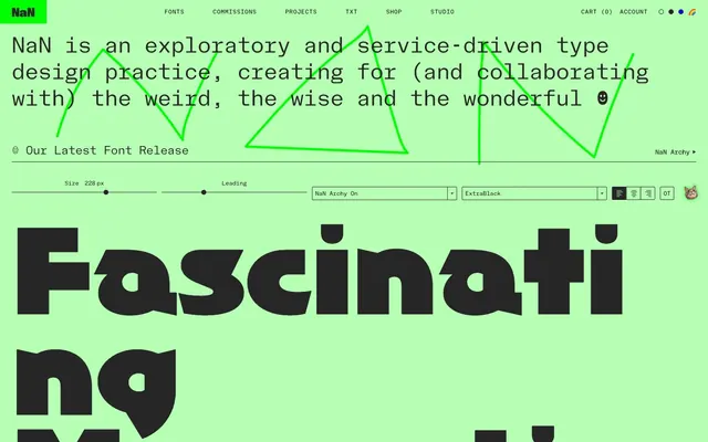
Digital Acid-Green Canvas: A hyper-digital screen, like a glowing terminal displaying custom fonts on a luminous green background.
Color palette
Page background, primary surface, accent for interactive elements, borders, and text in dark mode
Decorative highlights, UI accents, occasionally as a vibrant surface background. Appears sparingly for high-impact visual cues
Rare accent for buttons or interactive states, providing a sharp, electric contrast
Supporting palette color for small decorative accents when the core palette needs contrast. Do not promote it to the primary CTA color
Primary text color, border color, and background for secondary surface elements, providing deep contrast against the vivid backgrounds
Input text, critical borders, and fills for certain icons, reserved for maximum contrast
Input field backgrounds and occasional elevated surfaces
Muted text, subtle borders, and placeholder content
Subtle background for UI elements like buttons in a desaturated state
Input element borders, indicating inactive or default states
Typography
- Weights
- 300, 400, 500, 700, 800, 900
- Sizes
- 12px, 13px, 14px, 16px, 20px, 24px, 26px, 32px, 45px
- Line height
- 1, 1.2, 1.5, 2, 2.25, 3
- Letter spacing
- 0.075
- Fallback
- Space Mono
Navigation, body text, general UI elements, and code snippets. Its monospaced nature contributes to the site's digital aesthetic.
- Weights
- 300, 400, 700
- Sizes
- 12px, 16px, 45px, 86px
- Line height
- 1.2, 1.5
- Letter spacing
- 0
- Fallback
- Poppins
Muted headings, secondary content titles, and some larger display text. Provides a softer, proportional alternative to 'NaN Holo Mono'.
- Weights
- 400
- Sizes
- 216px
- Line height
- 1
- Letter spacing
- 0
- Fallback
- Playfair Display Italic
Highly decorative, massive display headlines for font showcases. Its thin italic form creates dramatic contrast.
- Weights
- 400
- Sizes
- 216px
- Line height
- 0.85
- Letter spacing
- 0
- Fallback
- Anton
Bold, impactful display headlines for font showcases, designed for high visual impact at extremely large sizes.
- Weights
- 400
- Sizes
- 228px
- Line height
- 0.9
- Letter spacing
- 0
- Fallback
- Bebas Neue
Largest display headlines for font showcases, characterized by its extra-black weight and unique 'ON' style.
- Weights
- 400
- Sizes
- 336px
- Line height
- 0.8
- Letter spacing
- 0
- Fallback
- Oswald
The most extreme display font for full-width typographic impact, featuring ultra-wide letterforms.
- Weights
- 400
- Sizes
- 86px
- Line height
- 1
NaNRageZippNarrowThin — detected in extracted data but not described by AI
- Weights
- 400
- Sizes
- 86px
- Line height
- 1
NaNRageSoftXCondensedRegular — detected in extracted data but not described by AI
- Weights
- 400
- Sizes
- 86px
- Line height
- 1
NaNRageBeauStandardSemibold — detected in extracted data but not described by AI
- Weights
- 400
- Sizes
- 86px
- Line height
- 1
NaNRageSansNarrowMedium — detected in extracted data but not described by AI
- Weights
- 400
- Sizes
- 86px
- Line height
- 1
NaNSerfATextLightItalic — detected in extracted data but not described by AI
- Weights
- 400
- Sizes
- 86px
- Line height
- 1
NaNSerfSansLightItalic — detected in extracted data but not described by AI
Spacing & shape
Components
Text in NaN Holo Mono, 14px, weight 400, Midnight Graphite (#262626). Underlined by a 1px solid Screen Mint (#b7ffb4) border on hover, with 1px padding below.
Screen Mint (#b7ffb4) background with Midnight Graphite (#262626) text, 2px border radius on the right side only (0px 2px 2px 0px). Padding: 1.5px top, 7.5px right, 1px bottom, 7.5px left. Font: NaN Holo Mono, 14px, weight 400.
Midnight Graphite (#262626) background with Screen Mint (#b7ffb4) text, 2px border radius on the left side only (2px 0px 0px 2px). Padding: 1.5px top, 7.5px right, 1px bottom, 7.5px left. Font: NaN Holo Mono, 14px, weight 400.
Transparent background with Midnight Graphite (#262626) text and a 1px Midnight Graphite (#262626) border, 2px border radius. Padding: 1.2px top, 6px right, 0px bottom, 6px left. Font: NaN Holo Mono, 14px, weight 400.
Background uses Hologram Gradient: linear-gradient(270deg, rgb(255, 163, 182), rgb(221, 169, 255) 33%, rgb(162, 209, 255) 66%, rgb(255, 163, 182)). Black text. Rounded corners with a radius of 29.4px. Font: NaN Holo Nano, 14px, weight 400.
Midnight Graphite (#262626) background with Screen Mint (#b7ffb4) text, 2px border radius. Content padding is typically 29px. Contains large display typography elements like NaN Rage Zipp Narrow Thin at 86px.
Paper White (#ffffff) background, Absolute Black (#000000) text, and a 1px Input Gray (#767676) border. No border-radius. Padding: 29.4px top, 17px right, 29.4px bottom, 34px left. Font: NaN Holo Mono, 14px, weight 400.
Elements appear as small, square buttons. The 'On' state uses Midnight Graphite (#262626) background with Screen Mint (#b7ffb4) text, 2px radius. The 'Off' state uses Screen Mint (#b7ffb4) background with Midnight Graphite (#262626) text.
Guidelines
- Prioritize Screen Mint (#b7ffb4) as the dominant background color for most page sections, creating a luminous base.
- Use Midnight Graphite (#262626) for primary text and important borders to ensure high contrast against Screen Mint (#b7ffb4).
- Employ NaN Holo Mono at 14px weight 400 with 0.075em letter spacing for all body text and UI labels.
- Apply a Hologram Gradient to key 'Discover More' or 'Subscribe' actions, using rounded edges (29.4px) for a distinct interactive feel.
- Structure information using prominent, large-scale custom display typefaces like NaN ArchyONExtraBlack_PREVIEW for visual impact in showcasing fonts.
- Maintain minimal border radii (2px) on most interactive elements and cards, reserving larger radii (18px, 29.4px) for specific design accents.
- Use a default element gap of 5px for inline elements and tight groupings, building up to 40px for section separation.
- Avoid using vibrant colors for large blocks of text; reserve them for accents, backgrounds, or specific UI elements.
- Do not introduce new typefaces; the system relies heavily on its custom NaN font family for brand identity.
- Refrain from using drop shadows or heavy elevation; the design system favors a flat, digital aesthetic with strong color contrasts.
- Do not use generic circular or heavily rounded buttons; specific, often asymmetrical, radii (e.g., 0px 2px 2px 0px) are characteristic of this design.
- Avoid breaking the high-contrast pairing of Screen Mint (#b7ffb4) and Midnight Graphite (#262626) for primary interactive elements.
- Do not use excessive visual flourishes or gradients beyond the defined Hologram Gradient; the system communicates through typography and bold color.
- Do not deviate from the compact density; generous negative space should be achieved through section gaps rather than element-level padding.
About this system
ShowHide
NaN employs an experimental and vibrant aesthetic, channeling a 'digital paper' feel through a primary mint green canvas. Typography is the central visual element, utilizing custom typefaces with expressive weights and massive display sizes. Interaction is marked by sharp contrasts between dark charcoal and the vivid mint, with subtle holographic gradients adding a touch of digital luminescence.
Reminiscent of AIGA Eye on Design, Future Fonts, Pangram Pangram Foundry, Grilli Type, Dinamo.
# NaN — Style Reference
> Digital Acid-Green Canvas: A hyper-digital screen, like a glowing terminal displaying custom fonts on a luminous green background.

**Theme:** dark

**Site:** https://www.nan.xyz

NaN employs an experimental and vibrant aesthetic, channeling a 'digital paper' feel through a primary mint green canvas. Typography is the central visual element, utilizing custom typefaces with expressive weights and massive display sizes. Interaction is marked by sharp contrasts between dark charcoal and the vivid mint, with subtle holographic gradients adding a touch of digital luminescence.

## Tokens — Colors

| Name | Value | Token | Role |
|------|------|------|------|
| Screen Mint | `#b7ffb4` | `--color-screen-mint` | Page background, primary surface, accent for interactive elements, borders, and text in dark mode |
| Code Green | `#00ff00` | `--color-code-green` | Decorative highlights, UI accents, occasionally as a vibrant surface background. Appears sparingly for high-impact visual cues |
| Chromatic Blue | `#0000ff` | `--color-chromatic-blue` | Rare accent for buttons or interactive states, providing a sharp, electric contrast |
| Hologram Gradient | `#ffb005` | `--color-hologram-gradient` | Supporting palette color for small decorative accents when the core palette needs contrast. Do not promote it to the primary CTA color |
| Midnight Graphite | `#262626` | `--color-midnight-graphite` | Primary text color, border color, and background for secondary surface elements, providing deep contrast against the vivid backgrounds |
| Absolute Black | `#000000` | `--color-absolute-black` | Input text, critical borders, and fills for certain icons, reserved for maximum contrast |
| Paper White | `#ffffff` | `--color-paper-white` | Input field backgrounds and occasional elevated surfaces |
| Mercury Gray | `#999999` | `--color-mercury-gray` | Muted text, subtle borders, and placeholder content |
| Light Steel | `#efefef` | `--color-light-steel` | Subtle background for UI elements like buttons in a desaturated state |
| Input Gray | `#767676` | `--color-input-gray` | Input element borders, indicating inactive or default states |

## Tokens — Typography

### NaN Holo Mono
- **Substitute:** Space Mono
- **Weights:** 300, 400, 500, 700, 800, 900
- **Sizes:** 12px, 13px, 14px, 16px, 20px, 24px, 26px, 32px, 45px
- **Line height:** 1, 1.2, 1.5, 2, 2.25, 3
- **Letter spacing:** 0.075
- **Role:** Navigation, body text, general UI elements, and code snippets. Its monospaced nature contributes to the site's digital aesthetic.

### NaN Holo
- **Substitute:** Poppins
- **Weights:** 300, 400, 700
- **Sizes:** 12px, 16px, 45px, 86px
- **Line height:** 1.2, 1.5
- **Letter spacing:** 0
- **Role:** Muted headings, secondary content titles, and some larger display text. Provides a softer, proportional alternative to 'NaN Holo Mono'.

### NaNSuperXSerifTextThinItalicPREVIEW
- **Substitute:** Playfair Display Italic
- **Weights:** 400
- **Sizes:** 216px
- **Line height:** 1
- **Letter spacing:** 0
- **Role:** Highly decorative, massive display headlines for font showcases. Its thin italic form creates dramatic contrast.

### NaNSuperXSansDisplayBlackPREVIEW
- **Substitute:** Anton
- **Weights:** 400
- **Sizes:** 216px
- **Line height:** 0.85
- **Letter spacing:** 0
- **Role:** Bold, impactful display headlines for font showcases, designed for high visual impact at extremely large sizes.

### NaNArchyONExtraBlack_PREVIEW
- **Substitute:** Bebas Neue
- **Weights:** 400
- **Sizes:** 228px
- **Line height:** 0.9
- **Letter spacing:** 0
- **Role:** Largest display headlines for font showcases, characterized by its extra-black weight and unique 'ON' style.

### NaNHoloGigawideUltra1
- **Substitute:** Oswald
- **Weights:** 400
- **Sizes:** 336px
- **Line height:** 0.8
- **Letter spacing:** 0
- **Role:** The most extreme display font for full-width typographic impact, featuring ultra-wide letterforms.

### NaNRageZippNarrowThin
- **Weights:** 400
- **Sizes:** 86px
- **Line height:** 1
- **Role:** NaNRageZippNarrowThin — detected in extracted data but not described by AI

### NaNRageSoftXCondensedRegular
- **Weights:** 400
- **Sizes:** 86px
- **Line height:** 1
- **Role:** NaNRageSoftXCondensedRegular — detected in extracted data but not described by AI

### NaNRageBeauStandardSemibold
- **Weights:** 400
- **Sizes:** 86px
- **Line height:** 1
- **Role:** NaNRageBeauStandardSemibold — detected in extracted data but not described by AI

### NaNRageSansNarrowMedium
- **Weights:** 400
- **Sizes:** 86px
- **Line height:** 1
- **Role:** NaNRageSansNarrowMedium — detected in extracted data but not described by AI

### NaNSerfATextLightItalic
- **Weights:** 400
- **Sizes:** 86px
- **Line height:** 1
- **Role:** NaNSerfATextLightItalic — detected in extracted data but not described by AI

### NaNSerfSansLightItalic
- **Weights:** 400
- **Sizes:** 86px
- **Line height:** 1
- **Role:** NaNSerfSansLightItalic — detected in extracted data but not described by AI

## Tokens — Type Scale

| Role | Size | Line height | Letter spacing |
|------|------|------|------|
| caption | 12px | 1.5 | 0.075em |
| body | 14px | 1.5 | 0.075em |
| heading | 24px | 1.2 | — |
| display-sm | 45px | 1.2 | — |
| display | 86px | 1 | — |
| display-lg | 216px | 1 | — |

## Tokens — Spacing

- **Section gap:** 40px
- **Card padding:** 29px
- **Element gap:** 5px

## Tokens — Radius

- **Default:** 2px
- **Images:** 8px
- **links:** 18px
- **massiveButton:** 29.4px

## Components

### Primary Navigation Link
*Navigational element with underline on hover*

Text in NaN Holo Mono, 14px, weight 400, Midnight Graphite (#262626). Underlined by a 1px solid Screen Mint (#b7ffb4) border on hover, with 1px padding below.

### Primary Button (Filled)
*Call to action button for primary interactions*

Screen Mint (#b7ffb4) background with Midnight Graphite (#262626) text, 2px border radius on the right side only (0px 2px 2px 0px). Padding: 1.5px top, 7.5px right, 1px bottom, 7.5px left. Font: NaN Holo Mono, 14px, weight 400.

### Primary Button (Filled, Left Rounded)
*Used for sequenced or grouped actions, rounded on the left*

Midnight Graphite (#262626) background with Screen Mint (#b7ffb4) text, 2px border radius on the left side only (2px 0px 0px 2px). Padding: 1.5px top, 7.5px right, 1px bottom, 7.5px left. Font: NaN Holo Mono, 14px, weight 400.

### Ghost Button
*Secondary action or subtle navigation*

Transparent background with Midnight Graphite (#262626) text and a 1px Midnight Graphite (#262626) border, 2px border radius. Padding: 1.2px top, 6px right, 0px bottom, 6px left. Font: NaN Holo Mono, 14px, weight 400.

### Hologram Action Button
*High-impact call to action, often for 'Discover More'*

Background uses Hologram Gradient: linear-gradient(270deg, rgb(255, 163, 182), rgb(221, 169, 255) 33%, rgb(162, 209, 255) 66%, rgb(255, 163, 182)). Black text. Rounded corners with a radius of 29.4px. Font: NaN Holo Nano, 14px, weight 400.

### Font Showcase Card
*Displays individual font variants or examples*

Midnight Graphite (#262626) background with Screen Mint (#b7ffb4) text, 2px border radius. Content padding is typically 29px. Contains large display typography elements like NaN Rage Zipp Narrow Thin at 86px.

### Text Input (Default)
*Standard form input field*

Paper White (#ffffff) background, Absolute Black (#000000) text, and a 1px Input Gray (#767676) border. No border-radius. Padding: 29.4px top, 17px right, 29.4px bottom, 34px left. Font: NaN Holo Mono, 14px, weight 400.

### Toggle Switch
*Provides an on/off selection for options*

Elements appear as small, square buttons. The 'On' state uses Midnight Graphite (#262626) background with Screen Mint (#b7ffb4) text, 2px radius. The 'Off' state uses Screen Mint (#b7ffb4) background with Midnight Graphite (#262626) text.

## Guidelines

### Do

- Prioritize Screen Mint (#b7ffb4) as the dominant background color for most page sections, creating a luminous base.
- Use Midnight Graphite (#262626) for primary text and important borders to ensure high contrast against Screen Mint (#b7ffb4).
- Employ NaN Holo Mono at 14px weight 400 with 0.075em letter spacing for all body text and UI labels.
- Apply a Hologram Gradient to key 'Discover More' or 'Subscribe' actions, using rounded edges (29.4px) for a distinct interactive feel.
- Structure information using prominent, large-scale custom display typefaces like NaN ArchyONExtraBlack_PREVIEW for visual impact in showcasing fonts.
- Maintain minimal border radii (2px) on most interactive elements and cards, reserving larger radii (18px, 29.4px) for specific design accents.
- Use a default element gap of 5px for inline elements and tight groupings, building up to 40px for section separation.

### Don't

- Avoid using vibrant colors for large blocks of text; reserve them for accents, backgrounds, or specific UI elements.
- Do not introduce new typefaces; the system relies heavily on its custom NaN font family for brand identity.
- Refrain from using drop shadows or heavy elevation; the design system favors a flat, digital aesthetic with strong color contrasts.
- Do not use generic circular or heavily rounded buttons; specific, often asymmetrical, radii (e.g., 0px 2px 2px 0px) are characteristic of this design.
- Avoid breaking the high-contrast pairing of Screen Mint (#b7ffb4) and Midnight Graphite (#262626) for primary interactive elements.
- Do not use excessive visual flourishes or gradients beyond the defined Hologram Gradient; the system communicates through typography and bold color.
- Do not deviate from the compact density; generous negative space should be achieved through section gaps rather than element-level padding.

## Agent Prompt Guide

Quick Color Reference:
text: #262626
background: #b7ffb4
border: #262626
accent: #00ff00
primary action: #b7ffb4 (filled action)

Example Component Prompts:
1. Create a navigation link: 'Fonts' button in NaN Holo Mono, 14px, weight 400, #262626 text, transparent background, 1px #262626 border, 2px radius, 1.2px top / 6px right / 0px bottom / 6px left padding.
2. Create a 'Discover More' button: 'DISCOVER MORE' text in NaN Holo Mono, 14px, weight 400, #000000 text, background linear-gradient(270deg, #ffa3b6, #dda9ff 33%, #a2d1ff 66%, #ffa3b6), 29.4px border radius, 14px top / 7.5px right / 1px bottom / 7.5px left padding.
3. Create a font showcase card: 'NaN Rage Zipp' text in NaN Holo, 86px, weight 400, #b7ffb4 text, #262626 background, 2px border radius, 29px padding.
4. Create an input field: Background #ffffff, border 1px solid #767676, text #000000 in NaN Holo Mono, 14px, weight 400. Padding: 29.4px top, 17px right, 29.4px bottom, 34px left.
More like this





Keep what you find
A free account saves references to boards and can send you a weekly email of picks based on what you save.
To see every result, go Pro.