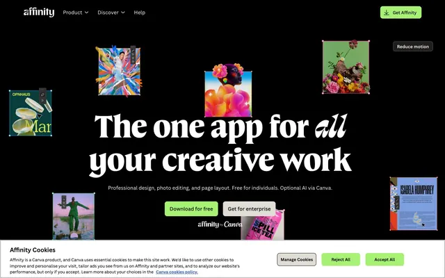
Preview image. Unlock full-res
Theatrical design stage, floating artworks
Color palette
Green action color for filled buttons, selected navigation states, and focused conversion moments; Hero background element, large-scale visual impact, creating a dynamic backdrop
Decorative card backgrounds, accent elements
Link states, decorative image borders, interactive highlights
Links, decorative elements, subtle interactive accents
Specific links, brand-related emphasis
Icon embellishments, subtle decorative accents
Page background, hero sections, primary dark surfaces, most text
Card backgrounds, text on light surfaces, subtle contrast against Canvas Black
Elevated card backgrounds on dark canvas, providing a slightly lighter dark surface
Muted text, secondary information, borders, and dividers
Helper text, subtle labels, placeholder elements
Secondary button backgrounds, cookie banners, less prominent UI elements on dark backgrounds
Text on dark backgrounds, icon fills, card backgrounds on light sections, active states
Hairline borders and subtle dividers for light UI elements
Typography
- Weights
- 400, 700
- Sizes
- 48px, 56px, 80px, 112px
- Line height
- 0.96, 0.98, 1, 1.1
- Fallback
- Playfair Display or Lora
Primary display and hero headlines. Variable serif brings a classic, authoritative feel, but at large sizes, it leans towards modern elegance. Normal letter spacing ensures legibility for these substantial titles.
- Weights
- 400, 401, 500, 600, 700
- Sizes
- 10px, 13px, 14px, 16px, 19px, 24px, 32px, 38px
- Line height
- 1.2, 1.25, 1.3, 1.38, 1.4, 1.5, 1.57
- Letter spacing
- 0.01em
- Fallback
- Inter or Lato
Functional text: body copy, navigation, buttons, and form labels. Its uniform positive letter-spacing adds a touch of accessible airiness throughout the UI.
- Weights
- 400
- Sizes
- 10px
- Line height
- 1.2
- Fallback
- Georgia
Tertiary content, small print, and occasional stylistic accents. Lower prominence, used sparingly.
- Weights
- 400
- Sizes
- 13px
- Line height
- 1.2, 1.8
- Fallback
- Helvetica Neue
Fallback and specific utility text for browser-controlled elements like cookie banners or system messages.
Spacing & shape
Elevation
Components
Filled button with Affinity Green background, Paper White text, and 8px radius. Padding: 8px vertical, 16px horizontal. Example: 'Download for free'.
Outlined button with Paper White border, Paper White text, and 9999px (pill) radius. Padding: 12px vertical, 24px horizontal. Background is transparent. Example: 'Get for enterprise'.
Filled button with Muted White background, Foreground Black text, and 8px radius. Padding: 8px vertical, 16px horizontal.
Paper White background, 8px border radius, no shadow. Used for showcasing content against the dark canvas.
Foreground Black background, 8px border radius, no shadow. Used for a darker content surface on the page.
Dark Card Surface background, 16px border radius, no shadow. Used for more prominent content blocks, adding a slight visual lift.
Paper White text against Canvas Black, 4px border radius for active states (not always visible but present for interaction). Padding: 4px vertical, 4px horizontal.
Guidelines
- Always use Canvas Black (#000000) as the primary page background.
- Utilize Affirmative Green (#a7f175) exclusively for primary calls to action and active interactive states, ensuring high contrast.
- Employ Affinity Serif Variable for all prominent headlines, varying sizes but maintaining its inherent normal letter spacing.
- Apply Canva Sans for all body text, navigation, and button labels, setting letterSpacing: 0.01em for consistent readability.
- Default to an 8px border radius for most elements like buttons and cards, creating a consistent soft corner styling.
- Use a 9999px border radius for pill-shaped secondary action buttons to distinguish them from primary actions.
- Maintain a clear visual hierarchy by differentiating card backgrounds: Paper White for light cards, Foreground Black for dark cards, and Dark Card Surface for elevated dark cards.
- Do not use generic system serifs for headlines; Affinity Serif Variable is critical for brand identity.
- Avoid using multiple chromatic colors for primary calls to action; Affinity Green has a singular role.
- Do not use subtle elevation shadows on cards; the design prioritizes flat surfaces with clear background color differentiation.
- Refrain from altering the positive letter-spacing of Canva Sans; it's a core aspect of its visual rhythm.
- Do not use square corners for interactive elements; 8px or 9999px radii are preferred.
- Avoid using light text on light backgrounds or dark text on dark backgrounds without sufficient contrast, as the system relies on high contrast pairings.
- Do not use more than two levels of dark background (#000000, #0f1015, #211d1d) unless explicitly defined for a unique component.
About this system
ShowHide
Affinity presents a dark, theatrical stage for creativity, utilizing deep black canvases to highlight vibrant, floating artistic elements. Typography is a confident mix of a bespoke serif for headlines, bringing a classic yet bold presence, paired with a modern sans-serif for functional text. Bright, almost neon green serves as the primary accent, signaling interactive states and calls to action with an energetic pop against the dark backdrop, while subtle elevation and distinct radii define interactive components, ensuring a tactile, precise feel.
The page operates on a full-bleed structure for background colors, primarily using Canvas Black (#000000) as the base, creating an immersive, dark theme from edge to edge. Content within sections is often centered, adhering to a perceived maximum width implicitly, though not strictly constrained by a single `pageMaxWidth`. The hero section features a full-width dark background with a large, centered headline using the distinctive Affinity Serif Variable type, flanked by vibrant, seemingly scattered image cards. Sections below this often alternate between dark and subtly lighter dark backgrounds, maintaining consistent vertical spacing. Content is generally arranged in centered stacks or implied multi-column layouts for features, moving towards a more structured grid system for showcasing products or detailed information. Navigation is a fixed top bar on a dark background, with prominent 'Get Affinity' action.
Imagery on Affinity is a curated display of artistic works and product screenshots. The visuals are typically contained within rectangular frames, often with a subtle shadow suggesting depth, and positioned to 'float' against the dark background canvas. Photography is vibrant and artistic, showcasing diverse subjects with strong color palettes. Product screenshots are crisp, highlighting the UI within the app itself. Icons are primarily outlined or filled, with a moderate stroke weight, and in some cases, feature subtle color accents. Imagery serves a decorative and inspirational role, showcasing the creative possibilities of the software, rather than purely functional explanations. The density is moderate, balancing text and visuals, ensuring images occupy meaningful, showcased space rather than being mere accompaniments.
Reminiscent of Figma, Spline, Webflow, Canva.
# Affinity — Style Reference
> Theatrical design stage, floating artworks

**Theme:** dark

**Site:** https://www.affinity.studio

Affinity presents a dark, theatrical stage for creativity, utilizing deep black canvases to highlight vibrant, floating artistic elements. Typography is a confident mix of a bespoke serif for headlines, bringing a classic yet bold presence, paired with a modern sans-serif for functional text. Bright, almost neon green serves as the primary accent, signaling interactive states and calls to action with an energetic pop against the dark backdrop, while subtle elevation and distinct radii define interactive components, ensuring a tactile, precise feel.

## Tokens — Colors

| Name | Value | Token | Role |
|------|------|------|------|
| Affinity Green | `#a7f175` | `--color-affinity-green` | Green action color for filled buttons, selected navigation states, and focused conversion moments; Hero background element, large-scale visual impact, creating a dynamic backdrop |
| Ocean Teal | `#83d9e1` | `--color-ocean-teal` | Decorative card backgrounds, accent elements |
| Electric Violet | `#9e9eff` | `--color-electric-violet` | Link states, decorative image borders, interactive highlights |
| Deep Plum | `#a370fc` | `--color-deep-plum` | Links, decorative elements, subtle interactive accents |
| Canva Blue | `#3860be` | `--color-canva-blue` | Specific links, brand-related emphasis |
| Sunrise Yellow | `#fdbd68` | `--color-sunrise-yellow` | Icon embellishments, subtle decorative accents |
| Canvas Black | `#000000` | `--color-canvas-black` | Page background, hero sections, primary dark surfaces, most text |
| Foreground Black | `#0f1015` | `--color-foreground-black` | Card backgrounds, text on light surfaces, subtle contrast against Canvas Black |
| Dark Card Surface | `#211d1d` | `--color-dark-card-surface` | Elevated card backgrounds on dark canvas, providing a slightly lighter dark surface |
| Midtone Gray | `#505050` | `--color-midtone-gray` | Muted text, secondary information, borders, and dividers |
| Light Gray Text | `#707477` | `--color-light-gray-text` | Helper text, subtle labels, placeholder elements |
| Muted White | `#e0dcd6` | `--color-muted-white` | Secondary button backgrounds, cookie banners, less prominent UI elements on dark backgrounds |
| Paper White | `#ffffff` | `--color-paper-white` | Text on dark backgrounds, icon fills, card backgrounds on light sections, active states |
| Border Silver | `#c4c4c4` | `--color-border-silver` | Hairline borders and subtle dividers for light UI elements |

## Tokens — Typography

### Affinity Serif Variable
- **Substitute:** Playfair Display or Lora
- **Weights:** 400, 700
- **Sizes:** 48px, 56px, 80px, 112px
- **Line height:** 0.96, 0.98, 1, 1.1
- **Role:** Primary display and hero headlines. Variable serif brings a classic, authoritative feel, but at large sizes, it leans towards modern elegance. Normal letter spacing ensures legibility for these substantial titles.

### Canva Sans
- **Substitute:** Inter or Lato
- **Weights:** 400, 401, 500, 600, 700
- **Sizes:** 10px, 13px, 14px, 16px, 19px, 24px, 32px, 38px
- **Line height:** 1.2, 1.25, 1.3, 1.38, 1.4, 1.5, 1.57
- **Letter spacing:** 0.01em
- **Role:** Functional text: body copy, navigation, buttons, and form labels. Its uniform positive letter-spacing adds a touch of accessible airiness throughout the UI.

### Times
- **Substitute:** Georgia
- **Weights:** 400
- **Sizes:** 10px
- **Line height:** 1.2
- **Role:** Tertiary content, small print, and occasional stylistic accents. Lower prominence, used sparingly.

### Arial
- **Substitute:** Helvetica Neue
- **Weights:** 400
- **Sizes:** 13px
- **Line height:** 1.2, 1.8
- **Role:** Fallback and specific utility text for browser-controlled elements like cookie banners or system messages.

## Tokens — Type Scale

| Role | Size | Line height | Letter spacing |
|------|------|------|------|
| caption | 10px | 1.2 | — |
| heading-sm | 19px | 1.4 | 0.01em |
| heading | 24px | 1.5 | 0.01em |
| heading-lg | 38px | 1.57 | 0.01em |
| display | 112px | 0.96 | — |

## Tokens — Spacing

- **Section gap:** 48px
- **Card padding:** 16px
- **Element gap:** 4px

## Tokens — Radius

- **Default:** 8px
- **Buttons:** 8px
- **Cards:** 8px
- **links:** 4px
- **pills:** 9999px

## Tokens — Elevation

- **Image Card Shadow:** `rgba(0, 0, 0, 0.32) -20px 34px 64px 0px`
- **General Elevated UI Shadow:** `rgba(64, 79, 109, 0.06) 0px 0px 0px 0.5px, rgba(24, 44, 89, 0.137) 0px 2px 4px 0px, rgba(24, 44, 89, 0.07) 0px 6px 12px 0px`
- **Subtle Inner/Outer Shadow:** `rgba(255, 255, 255, 0.07) 0px 0.5px 0px 0px inset, rgba(255, 255, 255, 0.07) 0px 0px 0px 0.5px inset, rgba(0, 0, 0, 0.3) 0px 2px 4px 0px, rgba(0, 0, 0, 0.2) 0px 4px 8px 0px`
- **Button Focus/Hover Shadow:** `rgba(14, 19, 24, 0.07) 0px 0px 0px 1px, rgba(47, 64, 80, 0.25) 0px 2px 18px 0px`

## Layout

The page operates on a full-bleed structure for background colors, primarily using Canvas Black (#000000) as the base, creating an immersive, dark theme from edge to edge. Content within sections is often centered, adhering to a perceived maximum width implicitly, though not strictly constrained by a single `pageMaxWidth`. The hero section features a full-width dark background with a large, centered headline using the distinctive Affinity Serif Variable type, flanked by vibrant, seemingly scattered image cards. Sections below this often alternate between dark and subtly lighter dark backgrounds, maintaining consistent vertical spacing. Content is generally arranged in centered stacks or implied multi-column layouts for features, moving towards a more structured grid system for showcasing products or detailed information. Navigation is a fixed top bar on a dark background, with prominent 'Get Affinity' action.

## Imagery

Imagery on Affinity is a curated display of artistic works and product screenshots. The visuals are typically contained within rectangular frames, often with a subtle shadow suggesting depth, and positioned to 'float' against the dark background canvas. Photography is vibrant and artistic, showcasing diverse subjects with strong color palettes. Product screenshots are crisp, highlighting the UI within the app itself. Icons are primarily outlined or filled, with a moderate stroke weight, and in some cases, feature subtle color accents. Imagery serves a decorative and inspirational role, showcasing the creative possibilities of the software, rather than purely functional explanations. The density is moderate, balancing text and visuals, ensuring images occupy meaningful, showcased space rather than being mere accompaniments.

## Components

### Primary Action Button
*Key interaction element*

Filled button with Affinity Green background, Paper White text, and 8px radius. Padding: 8px vertical, 16px horizontal. Example: 'Download for free'.

### Ghost Button (Pill)
*Secondary action control*

Outlined button with Paper White border, Paper White text, and 9999px (pill) radius. Padding: 12px vertical, 24px horizontal. Background is transparent. Example: 'Get for enterprise'.

### Cookie Action Button
*Tertiary consent action*

Filled button with Muted White background, Foreground Black text, and 8px radius. Padding: 8px vertical, 16px horizontal.

### Light-Theme Card
*Content container on dark backgrounds*

Paper White background, 8px border radius, no shadow. Used for showcasing content against the dark canvas.

### Dark-Theme Card
*Content container on dark backgrounds*

Foreground Black background, 8px border radius, no shadow. Used for a darker content surface on the page.

### Elevated Dark-Theme Card
*Prominent content container*

Dark Card Surface background, 16px border radius, no shadow. Used for more prominent content blocks, adding a slight visual lift.

### Navigation Link
*Primary navigation item*

Paper White text against Canvas Black, 4px border radius for active states (not always visible but present for interaction). Padding: 4px vertical, 4px horizontal.

## Guidelines

### Do

- Always use Canvas Black (#000000) as the primary page background.
- Utilize Affirmative Green (#a7f175) exclusively for primary calls to action and active interactive states, ensuring high contrast.
- Employ Affinity Serif Variable for all prominent headlines, varying sizes but maintaining its inherent normal letter spacing.
- Apply Canva Sans for all body text, navigation, and button labels, setting letterSpacing: 0.01em for consistent readability.
- Default to an 8px border radius for most elements like buttons and cards, creating a consistent soft corner styling.
- Use a 9999px border radius for pill-shaped secondary action buttons to distinguish them from primary actions.
- Maintain a clear visual hierarchy by differentiating card backgrounds: Paper White for light cards, Foreground Black for dark cards, and Dark Card Surface for elevated dark cards.

### Don't

- Do not use generic system serifs for headlines; Affinity Serif Variable is critical for brand identity.
- Avoid using multiple chromatic colors for primary calls to action; Affinity Green has a singular role.
- Do not use subtle elevation shadows on cards; the design prioritizes flat surfaces with clear background color differentiation.
- Refrain from altering the positive letter-spacing of Canva Sans; it's a core aspect of its visual rhythm.
- Do not use square corners for interactive elements; 8px or 9999px radii are preferred.
- Avoid using light text on light backgrounds or dark text on dark backgrounds without sufficient contrast, as the system relies on high contrast pairings.
- Do not use more than two levels of dark background (#000000, #0f1015, #211d1d) unless explicitly defined for a unique component.

## Agent Prompt Guide

Quick Color Reference:
- text: #ffffff
- background: #000000
- border: #c4c4c4
- accent: #9e9eff
- primary action: #a7f175 (filled action)

Example Component Prompts:
- Create a Primary Action Button: #a7f175 background, #000000 text, 9999px radius, compact pill padding. Use this filled treatment for the main CTA.
- Design a content card: Dark-Theme Card background (#0f1015), 8px border radius. Headline 'Powerful editing tools' at 24px Canva Sans weight 600, Paper White text. Body paragraph at 16px Canva Sans weight 400, Light Gray Text (#707477), letterSpacing 0.01em.
- Create a secondary navigation element: Ghost Button (Pill) with Paper White border, Paper White text, 9999px radius, 'Get for enterprise'. Padding should be 12px vertical, 24px horizontal.
- Implement a footer link: Text 'Privacy Policy' using Canva Sans weight 400, Midtone Gray (#505050), letterSpacing 0.01em. On hover, apply Electric Violet (#9e9eff) color.
More like this





Keep what you find
A free account saves references to boards and can send you a weekly email of picks based on what you save.
To see every result, go Pro.