Preview image. Unlock full-res
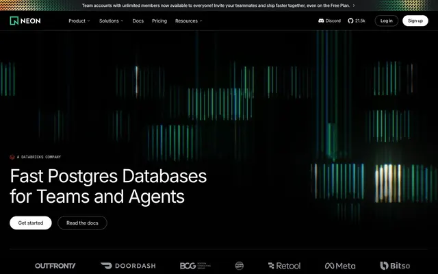
Server Room After Dark. A deep black environment where data and interactions are the only sources of light.
Color palette
Key brand accent, active state indicators, data visualizations — injects a vibrant, code-like energy.
Subtle background tones in visualizations, less prominent brand elements.
Special effect for highlighting code or UI elements, mimicking a terminal scanline.
Used sparingly for icons or highlights requiring urgent attention.
Primary text, primary CTA button backgrounds, icons.
Secondary text, descriptive copy, inactive navigation links.
Hover states on dark elements, subtle highlights.
Borders, dividers, subtle UI structure.
Secondary surfaces floating on the background.
Card backgrounds, code block surfaces.
The darkest surface color before pure black, for subtle elevation.
The absolute page background.
Typography
- Weights
- 400, 500
- Sizes
- 10px, 12px, 13px, 14px, 15px, 16px, 18px, 20px, 24px, 28px, 32px, 40px, 44px, 48px, 60px, 80px
- Line height
- 1, 1.13, 1.25, 1.38, 1.5
- Letter spacing
- Tight negative tracking on all display and heading sizes (-3.2px at 80px, -1.2px at 48px), becoming normal at body copy sizes.
- Fallback
- Inter
Headlines and primary marketing copy. Its clean, neutral geometry provides high readability, contrasting with the more stylized monospaced font.
- Weights
- 400, 500, 600
- Sizes
- 12px, 14px, 16px, 18px, 20px
- Line height
- 1, 1.13, 1.38, 1.5, 1.65
- Letter spacing
- Slight negative tracking enhances density in UI contexts (-0.7px at 14px, -0.43px at 16px).
- Fallback
- Fira Code, Source Code Pro
Code snippets, UI labels, and data displays. Its monospaced form adds a technical, typewriter-like precision, reinforcing the developer-centric identity.
Spacing & shape
Components
A pill-shaped button with a Whiteout (#ffffff) background and Graphite Deep (#151617) text. Uses Inter font. Padding is H: 28px, V: 12px. Radius is 9999px.
A pill-shaped button with a transparent background, Whiteout (#ffffff) text, and a 1px solid border in Graphite Light (#303236). Uses Inter font. Padding is H: 18px, V: 12px. Radius is 9999px.
Whiteout (#ffffff) text using Inter. Preceded by a small dot or icon colored with Neon Glow (#34d59a).
Text in Ash (#797d86) using Inter font. On hover or active state, text becomes Whiteout (#ffffff).
Small, all-caps text using GeistMono in Ash (#797d86) or a similar gray. Often preceded by a Neon Glow (#34d59a) icon or symbol.
Full-width bar with a Blackout (#000000) background. Text uses Inter font in a legible color like Whiteout (#ffffff) or Neon Glow (#34d59a).
A row of logos rendered in a monochrome Ash (#797d86) or Pewter (#94979e) color on a Blackout (#000000) background.
Guidelines
- Use pure Blackout (#000000) for all main section backgrounds.
- Reserve Neon Glow (#34d59a) for interactive highlights, data visualizations, and small decorative accents only.
- Employ the Whiteout (#ffffff) pill button for all primary calls-to-action.
- Use GeistMono for all code snippets, terminal simulations, and compact UI labels.
- Apply tight negative letter-spacing (-1.2px or more) to all headlines 48px and larger.
- Achieve depth by layering near-black surfaces (e.g., #151617 on #000000), not with box-shadows.
- Maintain a strict dichotomy of shapes: 9999px radius for buttons, 4px for all other containers.
- Don't use gradients or background colors on main page sections.
- Don't use traditional box-shadows for elevation.
- Don't use Neon Glow (#34d59a) for body copy or headlines.
- Don't use saturated colors other than the primary brand green and the occasional red alert accent.
- Don't mix Inter and GeistMono within the same sentence or headline.
- Don't use rounded corners larger than 4px on cards, code blocks, or input fields.
- Don't create buttons that aren't pill-shaped.
About this system
ShowHide
The design feels like a high-end server room after dark — a pure black void where information glows. A strict monochrome palette of pure black (#000000) and white (#ffffff) creates maximum contrast, ensuring text and UI are starkly legible. All visual energy comes from a single, electric green (#34d59a) that mimics terminal output and data visualizations, used exclusively for accents and decorative, code-like background graphics. The system achieves depth not with shadows but with subtle, layered near-black surfaces. A unique tension exists between the pill-shaped buttons and the sharp, 4px corners of all other UI containers.
The page structure is full-bleed black, creating an immersive, infinite canvas. A centered headline over an abstract data-viz graphic defines the hero. Below the hero, content is organized within a centered max-width container (approx. 1200px), creating focus. Sections flow seamlessly into one another without visual dividers, relying on generous vertical spacing (96-128px) to create rhythm. Content is arranged in simple, symmetrical layouts: centered stacks for headlines, two-column grids for feature lists, and multi-column grids for logos. A sticky header provides persistent navigation.
Visuals are exclusively abstract, generative graphics resembling data streams, server activity, or glitch art. Composed of thin vertical lines in Neon Glow (#34d59a) and other muted tones, they serve as atmospheric backdrops rather than informational content. Product visuals are limited to stylized screenshots of terminal windows and code blocks, treated as UI components. Photography and traditional illustrations are absent. This text-and-abstract-graphic approach creates a purely digital, code-native environment.
Reminiscent of Vercel, Linear, GitHub, Replit.
# Neon — Style Reference
> Server Room After Dark. A deep black environment where data and interactions are the only sources of light.

**Theme:** dark

**Site:** https://neon.tech

The design feels like a high-end server room after dark — a pure black void where information glows. A strict monochrome palette of pure black (#000000) and white (#ffffff) creates maximum contrast, ensuring text and UI are starkly legible. All visual energy comes from a single, electric green (#34d59a) that mimics terminal output and data visualizations, used exclusively for accents and decorative, code-like background graphics. The system achieves depth not with shadows but with subtle, layered near-black surfaces. A unique tension exists between the pill-shaped buttons and the sharp, 4px corners of all other UI containers.

## Tokens — Colors

| Name | Value | Token | Role |
|------|------|------|------|
| Neon Glow | `#34d59a` | `--color-neon-glow` | Key brand accent, active state indicators, data visualizations — injects a vibrant, code-like energy. |
| Neon Muted | `#285d49` | `--color-neon-muted` | Subtle background tones in visualizations, less prominent brand elements. |
| Scanline Fade | `#39a57d` | `--color-scanline-fade` | Special effect for highlighting code or UI elements, mimicking a terminal scanline. |
| System Warning | `#ff3621` | `--color-system-warning` | Used sparingly for icons or highlights requiring urgent attention. |
| Whiteout | `#ffffff` | `--color-whiteout` | Primary text, primary CTA button backgrounds, icons. |
| Ash | `#797d86` | `--color-ash` | Secondary text, descriptive copy, inactive navigation links. |
| Cloud | `#c9cbcf` | `--color-cloud` | Hover states on dark elements, subtle highlights. |
| Graphite Light | `#303236` | `--color-graphite-light` | Borders, dividers, subtle UI structure. |
| Graphite | `#242628` | `--color-graphite` | Secondary surfaces floating on the background. |
| Graphite Deep | `#151617` | `--color-graphite-deep` | Card backgrounds, code block surfaces. |
| Depth | `#0a0a0b` | `--color-depth` | The darkest surface color before pure black, for subtle elevation. |
| Blackout | `#000000` | `--color-blackout` | The absolute page background. |

## Tokens — Typography

### Inter
- **Substitute:** Inter
- **Weights:** 400, 500
- **Sizes:** 10px, 12px, 13px, 14px, 15px, 16px, 18px, 20px, 24px, 28px, 32px, 40px, 44px, 48px, 60px, 80px
- **Line height:** 1, 1.13, 1.25, 1.38, 1.5
- **Letter spacing:** Tight negative tracking on all display and heading sizes (-3.2px at 80px, -1.2px at 48px), becoming normal at body copy sizes.
- **Role:** Headlines and primary marketing copy. Its clean, neutral geometry provides high readability, contrasting with the more stylized monospaced font.

### GeistMono
- **Substitute:** Fira Code, Source Code Pro
- **Weights:** 400, 500, 600
- **Sizes:** 12px, 14px, 16px, 18px, 20px
- **Line height:** 1, 1.13, 1.38, 1.5, 1.65
- **Letter spacing:** Slight negative tracking enhances density in UI contexts (-0.7px at 14px, -0.43px at 16px).
- **Role:** Code snippets, UI labels, and data displays. Its monospaced form adds a technical, typewriter-like precision, reinforcing the developer-centric identity.

## Tokens — Type Scale

Perfect Fourth (1.333) from 16px base.

| Role | Size | Line height | Letter spacing |
|------|------|------|------|
| caption | 12px | 1.5 | -0.7px |
| body-sm | 14px | 1.5 | -0.7px |
| body | 16px | 1.5 | -0.43px |
| subheading | 18px | 1.38 | -0.36px |
| heading-sm | 24px | 1.25 | -0.24px |
| heading | 32px | 1.25 | -0.64px |
| heading-lg | 48px | 1.13 | -1.2px |
| display | 80px | 1 | -3.2px |

## Tokens — Spacing

- **Max width:** 1200px
- **Section gap:** 96-128px
- **Card padding:** 24px
- **Element gap:** 8-16px

## Tokens — Radius

- **Buttons:** 9999px
- **Inputs:** 4px
- **Cards:** 4px
- **containers:** 4px

## Layout

The page structure is full-bleed black, creating an immersive, infinite canvas. A centered headline over an abstract data-viz graphic defines the hero. Below the hero, content is organized within a centered max-width container (approx. 1200px), creating focus. Sections flow seamlessly into one another without visual dividers, relying on generous vertical spacing (96-128px) to create rhythm. Content is arranged in simple, symmetrical layouts: centered stacks for headlines, two-column grids for feature lists, and multi-column grids for logos. A sticky header provides persistent navigation.

## Imagery

Visuals are exclusively abstract, generative graphics resembling data streams, server activity, or glitch art. Composed of thin vertical lines in Neon Glow (#34d59a) and other muted tones, they serve as atmospheric backdrops rather than informational content. Product visuals are limited to stylized screenshots of terminal windows and code blocks, treated as UI components. Photography and traditional illustrations are absent. This text-and-abstract-graphic approach creates a purely digital, code-native environment.

## Components

### CTA Button Group

### Terminal Code Block

### Feature Navigation List

### Primary Pill Button
*The main call-to-action, e.g., 'Get started', 'Sign up'.*

A pill-shaped button with a Whiteout (#ffffff) background and Graphite Deep (#151617) text. Uses Inter font. Padding is H: 28px, V: 12px. Radius is 9999px.

### Ghost Pill Button
*Secondary actions, e.g., 'Read the docs', 'Log in'.*

A pill-shaped button with a transparent background, Whiteout (#ffffff) text, and a 1px solid border in Graphite Light (#303236). Uses Inter font. Padding is H: 18px, V: 12px. Radius is 9999px.

### Feature List Item
*Bulleted items in feature sections.*

Whiteout (#ffffff) text using Inter. Preceded by a small dot or icon colored with Neon Glow (#34d59a).

### Navigation Link
*Links in the main site header.*

Text in Ash (#797d86) using Inter font. On hover or active state, text becomes Whiteout (#ffffff).

### Tag Badge
*Small informational tags, like 'A DATABRICKS COMPANY'.*

Small, all-caps text using GeistMono in Ash (#797d86) or a similar gray. Often preceded by a Neon Glow (#34d59a) icon or symbol.

### Announcement Bar
*A persistent top bar for site-wide announcements.*

Full-width bar with a Blackout (#000000) background. Text uses Inter font in a legible color like Whiteout (#ffffff) or Neon Glow (#34d59a).

### Logo Bar
*A section displaying logos of partner or client companies.*

A row of logos rendered in a monochrome Ash (#797d86) or Pewter (#94979e) color on a Blackout (#000000) background.

## Guidelines

### Do

- Use pure Blackout (#000000) for all main section backgrounds.
- Reserve Neon Glow (#34d59a) for interactive highlights, data visualizations, and small decorative accents only.
- Employ the Whiteout (#ffffff) pill button for all primary calls-to-action.
- Use GeistMono for all code snippets, terminal simulations, and compact UI labels.
- Apply tight negative letter-spacing (-1.2px or more) to all headlines 48px and larger.
- Achieve depth by layering near-black surfaces (e.g., #151617 on #000000), not with box-shadows.
- Maintain a strict dichotomy of shapes: 9999px radius for buttons, 4px for all other containers.

### Don't

- Don't use gradients or background colors on main page sections.
- Don't use traditional box-shadows for elevation.
- Don't use Neon Glow (#34d59a) for body copy or headlines.
- Don't use saturated colors other than the primary brand green and the occasional red alert accent.
- Don't mix Inter and GeistMono within the same sentence or headline.
- Don't use rounded corners larger than 4px on cards, code blocks, or input fields.
- Don't create buttons that aren't pill-shaped.

## Agent Prompt Guide

### Quick Color Reference
- **Page Background:** Blackout (`#000000`)
- **Primary Text:** Whiteout (`#ffffff`)
- **Secondary Text:** Ash (`#797d86`)
- **Accent / Highlight:** Neon Glow (`#34d59a`)
- **CTA Button:** Whiteout (`#ffffff`) background, Graphite Deep (`#151617`) text
- **Border / Divider:** Graphite Light (`#303236`)

### Example Component Prompts
1.  **Hero Section:** "Create a full-screen hero section with a `Blackout` #000000 background. Add a large display headline: text 'Fast Postgres Databases', font `Inter` 80px weight 500, color `Whiteout` #ffffff, line-height 1.0, and letter-spacing -3.2px. Below it, add a primary CTA button: 'Get started' in a `Whiteout` #ffffff pill with `Graphite Deep` #151617 text, 9999px radius, and 12px 28px padding."
2.  **Code Block:** "Design a terminal code block component. Use a `Graphite Deep` #151617 background with 4px rounded corners and 24px padding. The text inside should use the `GeistMono` font at 14px. Default text color is `Whiteout` #ffffff. Highlight specific keywords or outputs with `Neon Glow` #34d59a."
3.  **Feature Section:** "Create a two-column section on a `Blackout` #000000 background. In the left column, create a list of features with `Whiteout` #ffffff text and a `Neon Glow` #34d59a dot prefix. In the right column, add a heading 'Integrate with a single command' using `Inter` 48px, `Whiteout` #ffffff color, and -1.2px letter-spacing."
More like this









Keep what you find
A free account saves references to boards and can send you a weekly email of picks based on what you save.
To see every result, go Pro.