Preview image. Unlock full-res
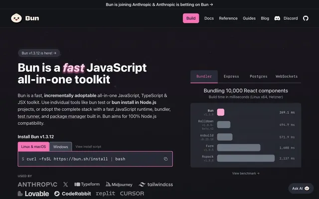
Synthwave dark lab – precision code illuminated by neon accents.
Color palette
Primary brand accent, interactive elements (buttons, links), highlight text for 'fast', 'toolkit'.
Secondary brand accent, highlight boxes, specific callouts.
Subtle highlight text, often paired with Cyber Pink for larger headings.
Decorative gradients creating a subtle pulse effect around key content, drawing attention without being overly aggressive.
Background gradient for certain elevated sections, providing a soft transition from the Cyber Pink hue.
Call-to-action button backgrounds, strong interactive elements.
Highlight text for specific data points or status indicators.
Interactive text like tooltips or active filters.
Illustration accent, indicating energy or speed.
Illustration accent, adding depth and visual interest.
Page background, primary dark surface.
Card backgrounds, section backgrounds, deeper surface level.
Component backgrounds, code blocks, secondary dark surfaces.
Subtle borders, dividers, subtle active states.
Accent borders, button outlines, subtle hover states.
Secondary body text, disabled states.
Primary body text, labels, icons.
High-contrast text, primary headers, active elements.
Success states, positive indicators, checkmarks.
Warning messages, caution indicators.
Error messages, destructive actions.
Typography
- Weights
- 300, 400, 500, 600, 700, 800
- Sizes
- 12px, 13px, 14px, 16px, 18px, 20px, 21px, 24px, 48px, 53px, 60px
- Line height
- 1, 1.2, 1.33, 1.4, 1.43, 1.5, 1.54, 1.56, 1.63, 1.78, 1.85
- Letter spacing
- normal
- Fallback
- Inter
Primary text font for all UI elements, body copy, headings, and navigation. Uses various weights and sizes to establish hierarchy, with weight 800 often used for bold declarations within headlines.
- Weights
- 400, 500, 600, 700
- Sizes
- 12px, 13px, 14px, 16px, 18px, 19px
- Line height
- 1.11, 1.33, 1.43, 1.5, 1.51, 1.54, 1.6, 1.63
- Letter spacing
- normal
- Fallback
- Fira Code
Monospace font specifically for code snippets, command line inputs, and technical details, reinforcing the developer-centric nature of the product.
Spacing & shape
Elevation
Components
Background: Magenta Glow (#ec4899), Text: Polar White (#ffffff), Radius: 8px, Padding: 16px 36px (implies min-width).
Background: transparent (rgba(0,0,0,0)), Text: Silver Text (#d1d5db), Border: Charcoal Canvas (#282a36), Radius: 7px 7px 0px 0px, Padding: 16px.
Background: transparent (rgba(0,0,0,0)), Text: Polar White (#ffffff), Border: rgba(255, 255, 255, 0.16), Radius: 6px, Padding: 4px.
Background: transparent (rgba(0,0,0,0)), Text: Polar White (#ffffff), Border: Graphite Accent (#3b3f4b), Radius: 5px, Padding: 32px.
Background: Charcoal Canvas (#282a36), Text: Polar White (#ffffff), Border: Slate Border (#3a3a3f), Radius: 8px, Padding: 16px.
Background: Obsidian Base (#14151a), individual bars use Cyber Pink (#f472b6) with a subtle shadow: rgba(0,0,0,0.25) 0px 25px 50px -12px, Text: Silver Text (#e5e7eb) for labels, Polar White (#ffffff) for values. Radius: 4px.
Background: Charcoal Canvas (#282a36), Text: various syntax-highlighted colors (e.g., Faded Rose #fbcfe8 for keywords, Electric Cyan #22d3ee for types, Polar White #ffffff for general code), Font: JetBrains Mono. Radius: 8px, Padding: 16px.
Background: Cyber Pink (#f472b6) variants or Neon Violet (#a855f7) variants, Text: Polar White (#ffffff), Radius: 9999px (pill shape), Padding: 4px 8px.
Guidelines
- Use Midnight Core (#0d0e11) as the base page background.
- Apply Charcoal Canvas (#282a36) for card surfaces and code blocks.
- Highlight primary calls-to-action with Magenta Glow (#ec4899) background and Polar White (#ffffff) text.
- Maintain high contrast text with Polar White (#ffffff) for headings and Silver Text (#e5e7eb) for body copy against dark backgrounds.
- Utilize 9999px radius for small interactive elements like tags and badges, creating a soft pill shape.
- Reserve JetBrains Mono for all code-related content, including command-line interfaces and code snippets.
- Use Cyber Pink (#f472b6) and Neon Violet (#a855f7) sparingly for key accents, interactive states, and important highlights.
- Avoid using light backgrounds; the theme is exclusively dark, leveraging specific dark neutrals.
- Do not introduce strong shadows on most elements, as depth is primarily created through varying dark surface colors and subtle inner borders.
- Do not deviate from the system-ui for general text content; save JetBrains Mono for code only.
- Avoid overuse of chromatic colors; they are accents, not primary content colors.
- Do not use generic button styles; always apply the specified padding, border, and radius for each button variant.
- Avoid any radius value other than 4px, 8px, 12px, 30px, or 9999px, as these define the system's shape language.
About this system
ShowHide
This design system conjures a high-tech laboratory vibe, a 'synthesized chaos' where sophisticated functionality meets playful, almost neon, branding. The dominant dark charcoal background creates a stark stage for bursts of vivid pinks and violets. Careful use of these vibrant chromatic accents for interactive elements and key messaging prevents visual fatigue, while subtle textural gradients and inner borders add depth to an otherwise flat dark aesthetic. The fusion of precise monospace code snippets with the broader system font reflects the dual nature of developer tools: serious, technical work presented with an engaging, almost futuristic flair.
The layout is primarily a max-width 1280px centered content model, providing ample breathing room against the full-bleed dark background. The hero section features a centered headline over a dark background, flanked by call-to-action buttons. Subsequent sections typically alternate between centered text blocks and asymmetric compositions, often with text on one side and a visual (like a code block or graph) on the other. Vertical rhythm is established by section gaps, emphasizing content blocks. There are instances of 2-column and 3-column card grids for features, breaking the vertical flow. Navigation is a sticky top bar, minimal and focused, integrating a primary 'Build' CTA with links and Discord access. The overall density is balanced, prioritizing clarity and direct information presentation.
The visual language for imagery is primarily functional and illustrative, designed to complement the dark UI. Graphics are a mix of abstract shapes, data visualizations, and code snippets. Product imagery is absent; instead, performance graphs, command-line outputs, and code blocks serve as the primary visual content. Icons are monocolor, typically in Polar White or an accent color, following an outlined or filled style without complex gradients, used functionally (e.g., checkmarks, arrows). Sparse, vibrant, geometric 'bug' illustrations or abstract shapes (like stars or splashes of color) add a playful, almost animated energy, often acting as badges or highlights. Density is moderate, with visuals strategically placed to break up text-heavy sections or to illustrate technical concepts directly.
Reminiscent of Vercel, GitHub, linear.app, Tailwind UI (dark themes), Stripe (developer docs).
# Bun — Style Reference
> Synthwave dark lab – precision code illuminated by neon accents.

**Theme:** dark

**Site:** https://bun.sh

This design system conjures a high-tech laboratory vibe, a 'synthesized chaos' where sophisticated functionality meets playful, almost neon, branding. The dominant dark charcoal background creates a stark stage for bursts of vivid pinks and violets. Careful use of these vibrant chromatic accents for interactive elements and key messaging prevents visual fatigue, while subtle textural gradients and inner borders add depth to an otherwise flat dark aesthetic. The fusion of precise monospace code snippets with the broader system font reflects the dual nature of developer tools: serious, technical work presented with an engaging, almost futuristic flair.

## Tokens — Colors

| Name | Value | Token | Role |
|------|------|------|------|
| Cyber Pink | `#f472b6` | `--color-cyber-pink` | Primary brand accent, interactive elements (buttons, links), highlight text for 'fast', 'toolkit'. |
| Neon Violet | `#a855f7` | `--color-neon-violet` | Secondary brand accent, highlight boxes, specific callouts. |
| Faded Rose | `#fbcfe8` | `--color-faded-rose` | Subtle highlight text, often paired with Cyber Pink for larger headings. |
| Gradient Pink Pulse | `#ec4899` | `--color-gradient-pink-pulse` | Decorative gradients creating a subtle pulse effect around key content, drawing attention without being overly aggressive. |
| Gradient Pink Fade | `#f472b6` | `--color-gradient-pink-fade` | Background gradient for certain elevated sections, providing a soft transition from the Cyber Pink hue. |
| Magenta Glow | `#ec4899` | `--color-magenta-glow` | Call-to-action button backgrounds, strong interactive elements. |
| Electric Cyan | `#22d3ee` | `--color-electric-cyan` | Highlight text for specific data points or status indicators. |
| Virtual Violet | `#c084fc` | `--color-virtual-violet` | Interactive text like tooltips or active filters. |
| Gradient Sunset | `#e67e22` | `--color-gradient-sunset` | Illustration accent, indicating energy or speed. |
| Gradient Cosmos | `#b301b3` | `--color-gradient-cosmos` | Illustration accent, adding depth and visual interest. |
| Midnight Core | `#0d0e11` | `--color-midnight-core` | Page background, primary dark surface. |
| Obsidian Base | `#14151a` | `--color-obsidian-base` | Card backgrounds, section backgrounds, deeper surface level. |
| Charcoal Canvas | `#282a36` | `--color-charcoal-canvas` | Component backgrounds, code blocks, secondary dark surfaces. |
| Slate Border | `#3a3a3f` | `--color-slate-border` | Subtle borders, dividers, subtle active states. |
| Graphite Accent | `#3b3f4b` | `--color-graphite-accent` | Accent borders, button outlines, subtle hover states. |
| Ash Text | `#6b7280` | `--color-ash-text` | Secondary body text, disabled states. |
| Silver Text | `#e5e7eb` | `--color-silver-text` | Primary body text, labels, icons. |
| Polar White | `#ffffff` | `--color-polar-white` | High-contrast text, primary headers, active elements. |
| System Green | `#34d399` | `--color-system-green` | Success states, positive indicators, checkmarks. |
| Warning Yellow | `#fcd34d` | `--color-warning-yellow` | Warning messages, caution indicators. |
| Danger Red | `#f87171` | `--color-danger-red` | Error messages, destructive actions. |

## Tokens — Typography

### system-ui
- **Substitute:** Inter
- **Weights:** 300, 400, 500, 600, 700, 800
- **Sizes:** 12px, 13px, 14px, 16px, 18px, 20px, 21px, 24px, 48px, 53px, 60px
- **Line height:** 1, 1.2, 1.33, 1.4, 1.43, 1.5, 1.54, 1.56, 1.63, 1.78, 1.85
- **Letter spacing:** normal
- **Role:** Primary text font for all UI elements, body copy, headings, and navigation. Uses various weights and sizes to establish hierarchy, with weight 800 often used for bold declarations within headlines.

### JetBrains Mono
- **Substitute:** Fira Code
- **Weights:** 400, 500, 600, 700
- **Sizes:** 12px, 13px, 14px, 16px, 18px, 19px
- **Line height:** 1.11, 1.33, 1.43, 1.5, 1.51, 1.54, 1.6, 1.63
- **Letter spacing:** normal
- **Role:** Monospace font specifically for code snippets, command line inputs, and technical details, reinforcing the developer-centric nature of the product.

## Tokens — Type Scale

Perfect Fifth (1.5) from 14px base.

| Role | Size | Line height | Letter spacing |
|------|------|------|------|
| caption | 12px | 1.5 | — |
| body | 14px | 1.43 | — |
| heading | 20px | 1.4 | — |
| heading-lg | 24px | 1.33 | — |
| display | 60px | 1 | — |

## Tokens — Spacing

- **Max width:** 1280px
- **Section gap:** 128px
- **Element gap:** 8px

## Tokens — Radius

- **Default:** 8px
- **Buttons:** 8px
- **badge:** 9999px
- **input:** 7px

## Tokens — Elevation

- **Card/Container Shadow:** `rgba(0, 0, 0, 0.25) 0px 25px 50px -12px`
- **Highlight Badge Shadow:** `rgba(131, 24, 67, 0.1) 0px 10px 15px -3px, rgba(131, 24, 67, 0.1) 0px 4px 6px -4px`

## Layout

The layout is primarily a max-width 1280px centered content model, providing ample breathing room against the full-bleed dark background. The hero section features a centered headline over a dark background, flanked by call-to-action buttons. Subsequent sections typically alternate between centered text blocks and asymmetric compositions, often with text on one side and a visual (like a code block or graph) on the other. Vertical rhythm is established by section gaps, emphasizing content blocks. There are instances of 2-column and 3-column card grids for features, breaking the vertical flow. Navigation is a sticky top bar, minimal and focused, integrating a primary 'Build' CTA with links and Discord access. The overall density is balanced, prioritizing clarity and direct information presentation.

## Imagery

The visual language for imagery is primarily functional and illustrative, designed to complement the dark UI. Graphics are a mix of abstract shapes, data visualizations, and code snippets. Product imagery is absent; instead, performance graphs, command-line outputs, and code blocks serve as the primary visual content. Icons are monocolor, typically in Polar White or an accent color, following an outlined or filled style without complex gradients, used functionally (e.g., checkmarks, arrows). Sparse, vibrant, geometric 'bug' illustrations or abstract shapes (like stars or splashes of color) add a playful, almost animated energy, often acting as badges or highlights. Density is moderate, with visuals strategically placed to break up text-heavy sections or to illustrate technical concepts directly.

## Components

### Install Command Line Input with OS Tabs

### Feature Cards — Four Tools One Toolkit

### API Pill Selector + Code Block

### Primary CTA Button
*Main call-to-action.*

Background: Magenta Glow (#ec4899), Text: Polar White (#ffffff), Radius: 8px, Padding: 16px 36px (implies min-width).

### Ghost Navigation Button
*Secondary navigation or filter items.*

Background: transparent (rgba(0,0,0,0)), Text: Silver Text (#d1d5db), Border: Charcoal Canvas (#282a36), Radius: 7px 7px 0px 0px, Padding: 16px.

### Text Accent Button
*Tertiary actions or category toggles.*

Background: transparent (rgba(0,0,0,0)), Text: Polar White (#ffffff), Border: rgba(255, 255, 255, 0.16), Radius: 6px, Padding: 4px.

### Large Feature Card
*Prominent feature display.*

Background: transparent (rgba(0,0,0,0)), Text: Polar White (#ffffff), Border: Graphite Accent (#3b3f4b), Radius: 5px, Padding: 32px.

### Command Line Input
*Code snippets for user interaction.*

Background: Charcoal Canvas (#282a36), Text: Polar White (#ffffff), Border: Slate Border (#3a3a3f), Radius: 8px, Padding: 16px.

### Performance Bar Graph
*Visual representation of data.*

Background: Obsidian Base (#14151a), individual bars use Cyber Pink (#f472b6) with a subtle shadow: rgba(0,0,0,0.25) 0px 25px 50px -12px, Text: Silver Text (#e5e7eb) for labels, Polar White (#ffffff) for values. Radius: 4px.

### Code Block
*Displaying source code.*

Background: Charcoal Canvas (#282a36), Text: various syntax-highlighted colors (e.g., Faded Rose #fbcfe8 for keywords, Electric Cyan #22d3ee for types, Polar White #ffffff for general code), Font: JetBrains Mono. Radius: 8px, Padding: 16px.

### Highlight Badge (Replaces)
*Emphasizing replacements or comparisons.*

Background: Cyber Pink (#f472b6) variants or Neon Violet (#a855f7) variants, Text: Polar White (#ffffff), Radius: 9999px (pill shape), Padding: 4px 8px.

## Guidelines

### Do

- Use Midnight Core (#0d0e11) as the base page background.
- Apply Charcoal Canvas (#282a36) for card surfaces and code blocks.
- Highlight primary calls-to-action with Magenta Glow (#ec4899) background and Polar White (#ffffff) text.
- Maintain high contrast text with Polar White (#ffffff) for headings and Silver Text (#e5e7eb) for body copy against dark backgrounds.
- Utilize 9999px radius for small interactive elements like tags and badges, creating a soft pill shape.
- Reserve JetBrains Mono for all code-related content, including command-line interfaces and code snippets.
- Use Cyber Pink (#f472b6) and Neon Violet (#a855f7) sparingly for key accents, interactive states, and important highlights.

### Don't

- Avoid using light backgrounds; the theme is exclusively dark, leveraging specific dark neutrals.
- Do not introduce strong shadows on most elements, as depth is primarily created through varying dark surface colors and subtle inner borders.
- Do not deviate from the system-ui for general text content; save JetBrains Mono for code only.
- Avoid overuse of chromatic colors; they are accents, not primary content colors.
- Do not use generic button styles; always apply the specified padding, border, and radius for each button variant.
- Avoid any radius value other than 4px, 8px, 12px, 30px, or 9999px, as these define the system's shape language.

## Agent Prompt Guide

1. **Quick Color Reference:**
   - Text (primary): #ffffff
   - Text (secondary): #e5e7eb
   - Background (page): #0d0e11
   - Background (card): #14151a
   - CTA: #ec4899
   - Border (subtle): #3a3a3f
   - Accent: #f472b6

2. **Example Component Prompts:**
   - Create a hero section: background Midnight Core (#0d0e11). Headline 'Bun is a fast JavaScript all-in-one toolkit' using system-ui, weight 800 for 'fast' and 'all-in-one toolkit' color Cyber Pink (#f472b6), size 60px, line-height 1.0. Body text Silver Text (#e5e7eb) at 16px, line-height 1.5. Include a Primary CTA Button labeled 'Try it'.
   - Generate a 'Bundling Performance' card: background Obsidian Base (#14151a), padding 16px. Title 'Bundling 10,000 React components' text Polar White (#ffffff), size 20px, weight 700. Inside, add a Performance Bar Graph with bars colored Cyber Pink (#f472b6) and labels Silver Text (#e5e7eb), code values Polar White (#ffffff).
   - Design a command line input: background Charcoal Canvas (#282a36), border Slate Border (#3a3a3f), radius 8px, padding 16px. Placeholder text 'bun ./index.ts' using JetBrains Mono, Silver Text (#e5e7eb), 16px. Place a Cyber Pink (#f472b6) highlight badge with 'REPLACES NPM' text to its right, using 9999px radius and 4px 8px padding.
More like this




Keep what you find
A free account saves references to boards and can send you a weekly email of picks based on what you save.
To see every result, go Pro.