Preview image. Unlock full-res
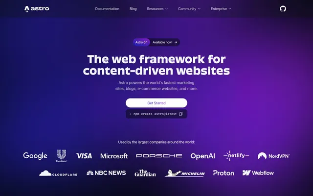
Deep-space console light show. Gradient-infused dark surfaces illuminated by precise, vibrant accents and high-contrast text.
Color palette
Primary brand gradient, used on hero sections and key calls to action, drawing immediate visual attention through its active, vibrant feel.
Secondary brand gradient, complementing the primary gradient with a warm, energetic streak for accent areas.
Tertiary brand gradient, used for softer, more subdued accent backgrounds or decorative elements, adding depth.
Vivid accent for highlighting key information, code snippets, or interactive elements, appearing like a focused light source.
Vivid blue accent for links, interactive elements, and focused states, providing a clear visual cue that complements the gradient palette.
Highlight color for specific keywords or badge text, creating a warm contrast.
Another vibrant accent for code, links, and specific highlight text.
Primary background for the application, providing a dark canvas for all content.
Slightly darker shade used for subtle button backgrounds and card shadows, indicating interactivity or a lower prominence.
Secondary text and subdued headings, providing a comfortable contrast on dark backgrounds.
Subtle borders and separators, subtly segmenting content without drawing too much attention.
Primary text color for body copy and headings, ensuring maximum legibility on dark surfaces.
Strongest contrast for critical text elements, active states, and icons.
Typography
- Weights
- 300, 400, 500, 600, 700
- Sizes
- 14px, 16px, 20px
- Line height
- 1, 1.4, 1.5, 1.65, 1.81
- Letter spacing
- normal
- Fallback
- Inter
Default UI text, for body copy, buttons, navigation, and small headings. Its neutrality provides a stable foundation for the more expressive headings.
- Weights
- 300, 400, 700
- Sizes
- 20px, 30px, 36px, 48px
- Line height
- 1.1, 1.11, 1.2, 1.4
- Letter spacing
- normal
- Fallback
- Poppins
Display and marketing headings. The custom features are crucial for its distinct character, creating a modern, slightly technical yet approachable feel.
- Weights
- 300, 400
- Sizes
- 14px
- Line height
- 1.65
- Letter spacing
- normal
- Fallback
- Fira Code
Code snippets and technical references, providing clear distinction and readability for developers. Its consistent width aligns with a tools-focused brand.
- Weights
- 300, 400
- Sizes
- 12px, 16px
- Line height
- 1, 1.33, 1.5
- Letter spacing
- 0.4px
- Fallback
- Space Mono
Small functional text, potentially for labels, tags, or iconography support. The letter spacing gives it a precise, technical feel, differentiating it from body text.
- Weights
- 200, 400
- Sizes
- 16px, 18px
- Line height
- 1.5
- Letter spacing
- normal
- Fallback
- Inter
Alternative body text for specific passages or components, providing additional typographic texture and a slightly different x-height from the system default.
Spacing & shape
Components
Rounded pill shape with Aurora text on Deep Space background, minimal padding. Used for high-emphasis actions like 'Get Started'. `backgroundColor: rgb(255, 255, 255)` (appears white but rendered with transparent overlay), `color: rgb(242, 246, 250)`, `borderRadius: 9999px`, `padding: 8px 16px`.
Ghost button with rounded pill shape, Cosmic Dust background with slight transparency, Aurora text. Used for less prominent actions, like framework selection buttons. `backgroundColor: rgba(44, 44, 44, 0.3)`, `color: rgb(242, 246, 250)`, `borderRadius: 9999px`, `padding: 8px 24px`.
Invisible button with only Aurora text, no background or border. For purely text-based actions or navigation within sections. `backgroundColor: rgba(0, 0, 0, 0)`, `color: rgb(242, 246, 250)`.
Text link using Stardust color, no background or border, used for navigation items until interaction. `color: rgb(191, 193, 201)`.
Small pill-shaped badge indicating a version number and 'Available now!'. Uses a Cosmic Dust background and Aurora text. `backgroundColor: rgba(44, 44, 44, 0.3)`, `color: rgb(242, 246, 250)`, `borderRadius: 9999px`, `padding: 8px 24px`.
Guidelines
- Use Deep Space (#060913) as the default page background to establish the dark theme.
- Apply Interstellar Gradient Alpha (linear-gradient(83.21deg, rgb(50, 69, 255), rgb(184, 69, 237))) to hero sections and primary CTAs for high visual impact.
- Render all primary body and heading text in Aurora (#f2f6fa) or White Dwarf (#ffffff) for optimal contrast on dark backgrounds.
- Utilize 9999px border-radius for all interactive buttons and badges, creating a soft, approachable pill shape.
- Employ `Obviously` font (weights 300, 400, 700) for all display headings to leverage its distinctive custom features.
- Maintain an `elementGap` of 8px for vertical and horizontal spacing between adjacent small elements like buttons or icons.
- Use `MDIO` font specifically for technical labels and small functional text, taking advantage of its 0.4px letter spacing.
- Avoid using bright, high-saturation colors for large background areas; reserve them strictly for accents and gradients.
- Do not deviate from the 9999px radius for buttons or the 16px radius for cards; these radii are key to the brand's aesthetic.
- Never use generic system monospace fonts when rendering code; always use `ui-monospace` (or `Fira Code`) for consistency.
- Do not introduce drop shadows for card elevation; rely on `Cosmic Dust` (#1f232e) background color difference to indicate layers.
- Do not use overly complex or multi-color iconography; stick to minimal, outline, or single-fill styles using accent colors like Cosmic Sparkle Vivid or White Dwarf.
- Avoid excessive text justification or wide line lengths; keep body text at `16px` with a `1.5` line height (24px) for readability.
- Do not use letter spacing on `Obviously` font for headings; its inherent `fontFeatureSettings` define its character.
About this system
ShowHide
Astro's design system evokes a digital cosmos, combining deep, expansive dark backgrounds with vibrant, carefully placed gradients and neon-like accents. The visual identity balances technical precision with a sense of wonder, achieved through high-contrast typography against dark surfaces and circular forms paired with sharp geometric edges. Gradient overlays create an illusion of depth and energy, while a consistent approach to spacing ensures legibility and a comfortable user experience even within information-dense segments.
The page maintains a `1280px` max-width, with content centered. The hero section is full-bleed, showcasing the `Interstellar Gradient Alpha` background with a centered headline and CTA section. Subsequent sections alternate between the `Deep Space` (#060913) and `Cosmic Dust` (#1f232e) background colors, creating a subtle visual rhythm without hard dividers. Content within these sections often follows a two-column layout, typically text-left with an illustrative element or screenshot right, or a grid of `Feature Cards`. Vertical spacing between sections is generous (`sectionGap: 64px`), contributing to the comfortable reading density. Navigation is managed by a sticky top bar with links and a subtle GitHub icon.
The site predominantly uses abstract, gradient-infused graphics (Interstellar Gradient Alpha/Beta) as background elements, creating a sense of depth and energy. Product screenshots are typically contained within cards (Cosmic Dust background, 16px radius), appearing as embedded UI elements. Icons are simplified and often outlined or single-filled, consistently appearing in White Dwarf (#ffffff) or Stardust (#858b98), sometimes with a vibrant Cosmic Sparkle color (#4bf3c8, #54b9ff) as an accent. The imagery's role is primarily decorative and atmospheric, establishing a tech-forward, cosmic brand identity, with product shots serving an explanatory function without lifestyle photography.
Reminiscent of Vercel, Linear, Supabase, GitHub, Netlify.
# Astro — Style Reference
> Deep-space console light show. Gradient-infused dark surfaces illuminated by precise, vibrant accents and high-contrast text.

**Theme:** dark

**Site:** https://astro.build

Astro's design system evokes a digital cosmos, combining deep, expansive dark backgrounds with vibrant, carefully placed gradients and neon-like accents. The visual identity balances technical precision with a sense of wonder, achieved through high-contrast typography against dark surfaces and circular forms paired with sharp geometric edges. Gradient overlays create an illusion of depth and energy, while a consistent approach to spacing ensures legibility and a comfortable user experience even within information-dense segments.

## Tokens — Colors

| Name | Value | Token | Role |
|------|------|------|------|
| Interstellar Gradient Alpha | `#b845ed` | `--color-interstellar-gradient-alpha` | Primary brand gradient, used on hero sections and key calls to action, drawing immediate visual attention through its active, vibrant feel. |
| Interstellar Gradient Beta | `#f041ff` | `--color-interstellar-gradient-beta` | Secondary brand gradient, complementing the primary gradient with a warm, energetic streak for accent areas. |
| Interstellar Gradient Gamma | `#2f4cb3` | `--color-interstellar-gradient-gamma` | Tertiary brand gradient, used for softer, more subdued accent backgrounds or decorative elements, adding depth. |
| Cosmic Sparkle Vivid | `#4bf3c8` | `--color-cosmic-sparkle-vivid` | Vivid accent for highlighting key information, code snippets, or interactive elements, appearing like a focused light source. |
| Cosmic Sparkle Blue | `#54b9ff` | `--color-cosmic-sparkle-blue` | Vivid blue accent for links, interactive elements, and focused states, providing a clear visual cue that complements the gradient palette. |
| Asteroid Dust | `#ffd493` | `--color-asteroid-dust` | Highlight color for specific keywords or badge text, creating a warm contrast. |
| Galaxy Violet | `#acafff` | `--color-galaxy-violet` | Another vibrant accent for code, links, and specific highlight text. |
| Deep Space | `#060913` | `--color-deep-space` | Primary background for the application, providing a dark canvas for all content. |
| Void Shadow | `#0c0f19` | `--color-void-shadow` | Slightly darker shade used for subtle button backgrounds and card shadows, indicating interactivity or a lower prominence. |
| Stardust | `#858b98` | `--color-stardust` | Secondary text and subdued headings, providing a comfortable contrast on dark backgrounds. |
| Lunar Gray | `#545864` | `--color-lunar-gray` | Subtle borders and separators, subtly segmenting content without drawing too much attention. |
| Aurora | `#f2f6fa` | `--color-aurora` | Primary text color for body copy and headings, ensuring maximum legibility on dark surfaces. |
| White Dwarf | `#ffffff` | `--color-white-dwarf` | Strongest contrast for critical text elements, active states, and icons. |

## Tokens — Typography

### ui-sans-serif
- **Substitute:** Inter
- **Weights:** 300, 400, 500, 600, 700
- **Sizes:** 14px, 16px, 20px
- **Line height:** 1, 1.4, 1.5, 1.65, 1.81
- **Letter spacing:** normal
- **Role:** Default UI text, for body copy, buttons, navigation, and small headings. Its neutrality provides a stable foundation for the more expressive headings.

### Obviously
- **Substitute:** Poppins
- **Weights:** 300, 400, 700
- **Sizes:** 20px, 30px, 36px, 48px
- **Line height:** 1.1, 1.11, 1.2, 1.4
- **Letter spacing:** normal
- **Role:** Display and marketing headings. The custom features are crucial for its distinct character, creating a modern, slightly technical yet approachable feel.

### ui-monospace
- **Substitute:** Fira Code
- **Weights:** 300, 400
- **Sizes:** 14px
- **Line height:** 1.65
- **Letter spacing:** normal
- **Role:** Code snippets and technical references, providing clear distinction and readability for developers. Its consistent width aligns with a tools-focused brand.

### MDIO
- **Substitute:** Space Mono
- **Weights:** 300, 400
- **Sizes:** 12px, 16px
- **Line height:** 1, 1.33, 1.5
- **Letter spacing:** 0.4px
- **Role:** Small functional text, potentially for labels, tags, or iconography support. The letter spacing gives it a precise, technical feel, differentiating it from body text.

### Inter
- **Substitute:** Inter
- **Weights:** 200, 400
- **Sizes:** 16px, 18px
- **Line height:** 1.5
- **Letter spacing:** normal
- **Role:** Alternative body text for specific passages or components, providing additional typographic texture and a slightly different x-height from the system default.

## Tokens — Type Scale

Major Third (1.25) from 16px base.

| Role | Size | Line height | Letter spacing |
|------|------|------|------|
| caption | 12px | 16px | 0.48px |
| body-sm | 14px | 21px | — |
| body | 16px | 24px | — |
| subheading | 20px | 22px | — |
| heading | 30px | 33px | — |
| heading-lg | 36px | 40px | — |
| display | 48px | 53px | — |

## Tokens — Spacing

- **Max width:** 1280px
- **Section gap:** 64px
- **Card padding:** 24px
- **Element gap:** 8px

## Tokens — Radius

- **Buttons:** 9999px
- **Cards:** 16px
- **badges:** 8px

## Layout

The page maintains a `1280px` max-width, with content centered. The hero section is full-bleed, showcasing the `Interstellar Gradient Alpha` background with a centered headline and CTA section. Subsequent sections alternate between the `Deep Space` (#060913) and `Cosmic Dust` (#1f232e) background colors, creating a subtle visual rhythm without hard dividers. Content within these sections often follows a two-column layout, typically text-left with an illustrative element or screenshot right, or a grid of `Feature Cards`. Vertical spacing between sections is generous (`sectionGap: 64px`), contributing to the comfortable reading density. Navigation is managed by a sticky top bar with links and a subtle GitHub icon.

## Imagery

The site predominantly uses abstract, gradient-infused graphics (Interstellar Gradient Alpha/Beta) as background elements, creating a sense of depth and energy. Product screenshots are typically contained within cards (Cosmic Dust background, 16px radius), appearing as embedded UI elements. Icons are simplified and often outlined or single-filled, consistently appearing in White Dwarf (#ffffff) or Stardust (#858b98), sometimes with a vibrant Cosmic Sparkle color (#4bf3c8, #54b9ff) as an accent. The imagery's role is primarily decorative and atmospheric, establishing a tech-forward, cosmic brand identity, with product shots serving an explanatory function without lifestyle photography.

## Components

### Hero CTA Buttons + Version Badge

### Feature Cards — What is Astro?

### Themes Tab Selector + Cards

### Primary Filled Button
*Call to action*

Rounded pill shape with Aurora text on Deep Space background, minimal padding. Used for high-emphasis actions like 'Get Started'. `backgroundColor: rgb(255, 255, 255)` (appears white but rendered with transparent overlay), `color: rgb(242, 246, 250)`, `borderRadius: 9999px`, `padding: 8px 16px`.

### Subtle Pill Button
*Secondary action*

Ghost button with rounded pill shape, Cosmic Dust background with slight transparency, Aurora text. Used for less prominent actions, like framework selection buttons. `backgroundColor: rgba(44, 44, 44, 0.3)`, `color: rgb(242, 246, 250)`, `borderRadius: 9999px`, `padding: 8px 24px`.

### Text Link Button
*Tertiary action*

Invisible button with only Aurora text, no background or border. For purely text-based actions or navigation within sections. `backgroundColor: rgba(0, 0, 0, 0)`, `color: rgb(242, 246, 250)`.

### Default Navigation Link
*Navigation element*

Text link using Stardust color, no background or border, used for navigation items until interaction. `color: rgb(191, 193, 201)`.

### Astro Current Version Badge
*Informational badge*

Small pill-shaped badge indicating a version number and 'Available now!'. Uses a Cosmic Dust background and Aurora text. `backgroundColor: rgba(44, 44, 44, 0.3)`, `color: rgb(242, 246, 250)`, `borderRadius: 9999px`, `padding: 8px 24px`.

## Guidelines

### Do

- Use Deep Space (#060913) as the default page background to establish the dark theme.
- Apply Interstellar Gradient Alpha (linear-gradient(83.21deg, rgb(50, 69, 255), rgb(184, 69, 237))) to hero sections and primary CTAs for high visual impact.
- Render all primary body and heading text in Aurora (#f2f6fa) or White Dwarf (#ffffff) for optimal contrast on dark backgrounds.
- Utilize 9999px border-radius for all interactive buttons and badges, creating a soft, approachable pill shape.
- Employ `Obviously` font (weights 300, 400, 700) for all display headings to leverage its distinctive custom features.
- Maintain an `elementGap` of 8px for vertical and horizontal spacing between adjacent small elements like buttons or icons.
- Use `MDIO` font specifically for technical labels and small functional text, taking advantage of its 0.4px letter spacing.

### Don't

- Avoid using bright, high-saturation colors for large background areas; reserve them strictly for accents and gradients.
- Do not deviate from the 9999px radius for buttons or the 16px radius for cards; these radii are key to the brand's aesthetic.
- Never use generic system monospace fonts when rendering code; always use `ui-monospace` (or `Fira Code`) for consistency.
- Do not introduce drop shadows for card elevation; rely on `Cosmic Dust` (#1f232e) background color difference to indicate layers.
- Do not use overly complex or multi-color iconography; stick to minimal, outline, or single-fill styles using accent colors like Cosmic Sparkle Vivid or White Dwarf.
- Avoid excessive text justification or wide line lengths; keep body text at `16px` with a `1.5` line height (24px) for readability.
- Do not use letter spacing on `Obviously` font for headings; its inherent `fontFeatureSettings` define its character.

## Agent Prompt Guide

### Quick Color Reference
- Text (Primary): #f2f6fa
- Background (Primary): #060913
- CTA Button Background: #ffffff
- Border (Subtle): #e5e7eb
- Accent (Vivid): #4bf3c8

### 3-5 Example Component Prompts
1. **Create a Hero Section:** Full-width background using `linear-gradient(83.21deg, rgb(50, 69, 255), rgb(184, 69, 237))`. Centered headline 'The web framework for content-driven websites' using `Obviously` font size 48px, weight 700, color `Aurora` (#f2f6fa), line-height 1.1. Below that, a secondary text 'Astro powers the world's fastest...' using `ui-sans-serif` font size 18px, weight 400, color `Stardust` (#858b98), line-height 1.5. A primary button 'Get Started' with `White Dwarf` (#ffffff) background, `Aurora` (#f2f6fa) text, 9999px border-radius, and `8px 16px` padding.
2. **Generate a Feature Card:** Background color `Cosmic Dust` (#1f232e), border-radius 16px, no shadow. Inside, a heading 'Server-First' using `Obviously` font size 20px, weight 400, color `Aurora` (#f2f6fa), line-height 1.2. Below, body text 'Astro improves website performance...' using `ui-sans-serif` font size 16px, weight 400, color `Stardust` (#858b98), line-height 1.5. Apply `elementGap` of `8px` between elements within the card.
3. **Design a Subtle Pill Button:** Background `rgba(44, 44, 44, 0.3)`, text color `Aurora` (#f2f6fa), border-radius 9999px, `8px 24px` padding. Text content 'React' using `ui-sans-serif` font size 16px, weight 400.
4. **Display a Code Snippet Block:** Background `Deep Space` (#060913) with a subtle `Cosmic Dust` (#1f232e) border (`1px solid #1f232e`), 16px border-radius, `24px` padding. Code text within using `ui-monospace` font size 14px, weight 400, color `Cosmic Sparkle Vivid` (#4bf3c8), line-height 1.65. Ensure the text `npm create astro@latest` is rendered like this.
More like this




Keep what you find
A free account saves references to boards and can send you a weekly email of picks based on what you save.
To see every result, go Pro.