Preview image. Unlock full-res
Sculpted digital canvas.
Color palette
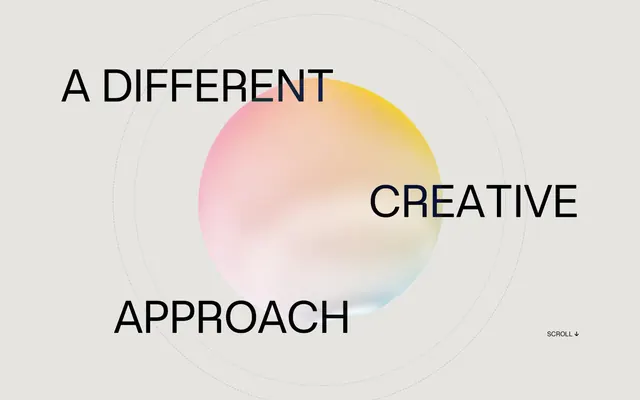
Hero background element, large decorative shapes, occasional icon accent — a central visual motif that introduces dynamic color
Supporting palette color for small decorative accents when the core palette needs contrast. Do not promote it to the primary CTA color
Primary text, darkest UI element borders, prominent headings
Page background, main surface color, light UI element borders, muted text
Elevated surfaces, secondary backgrounds, icon fills
Subtle dividers, ghost button borders, decorative strokes
Typography
- Weights
- 400, 700
- Sizes
- 11px, 15px, 18px, 34px, 46px, 70px, 76px, 103px
- Line height
- 0.8, 1, 1.4
- Letter spacing
- 0.0060em, 0.0130em, 0.0170em, 0.0500em
- Fallback
- Inter
The primary typeface for all text. The custom nature and broad range of weights and sizes allow for both headline impact and readable body copy. The high letter-spacing on larger sizes creates an airy, uncrowded feel.
Spacing & shape
Components
Large text, often using the 103px or 76px size from Ataero Retina OB Edition, weight 400 or 700, with letter-spacing for impact (e.g., 0.0500em). Color: Midnight Ink (#1d1d1d).
Text link using Ataero Retina OB Edition, 15px or 18px, weight 400. Color: Midnight Ink (#1d1d1d). Features an animated underline or border-transition on hover. Border-color for surrounding elements: Frost Gray (#bfbebe).
Card with Canvas White (#e5e4e0) or Pure White (#ffffff) background, rounded corners at 9.52381px. Internal padding of around 19px, with elements spaced by 8px or 15px. Features subtle 1px dashed borders in Frost Gray (#bfbebe) for a lightweight structure.
A container with a Pure White (#ffffff) background, roughly 9.52381px corner radius. Often bordered with a 1px dashed line (Frost Gray #bfbebe) and containing a desaturated/monochromatic brand logo. Padding around 19px.
Set in Ataero Retina OB Edition, 15px, weight 400. Color: Midnight Ink (#1d1d1d) or a slightly lighter shade if context for secondary information. Line-height 1.4.
Guidelines
- Use Canvas White (#e5e4e0) as the primary page background.
- Apply Midnight Ink (#1d1d1d) for all main text and prominent UI elements.
- Employ Ataero Retina OB Edition as the sole typeface, utilizing its various sizes and weights to create hierarchy.
- Maintain generous letter-spacing, especially for headlines (e.g., 0.0500em at 103px) to enhance the airy aesthetic.
- Structure layouts with a comfortable density, allowing ample negative space and 76px section gaps.
- Incorporate the Gradient Aura (linear-gradient(255deg, #facb0, #f06ba8 30%, #78bae6 65%, #ffffff)) only for large, singular decorative elements, not for functional UI.
- Use a default border radius of 9.52381px for interactive elements and containers like cards.
- Avoid using multiple typefaces; Ataero Retina OB Edition is the only sanctioned font.
- Do not introduce new saturated primary colors; limit color accents to the Gradient Aura and Brand Orange (#ff642f) sparingly.
- Do not use heavy shadows or strong elevation; prefer subtle borders (1px dashed in Frost Gray #bfbebe) or a complete absence of shadows.
- Do not overcrowd sections; prioritize readability and a sense of open space over information density.
- Avoid solid, filled buttons; prefer ghost-style links or subtle outlined interactive elements.
- Do not use dark backgrounds for entire sections; maintain a light-themed interface with Canvas White (#e5e4e0) or Pure White (#ffffff) as dominant surfaces.
- Do not use standard underline styles for links; implement custom hover states like border-transitions for ghost links.
About this system
ShowHide
OFF+BRAND. embodies a refined, digital-first aesthetic with a limited monochromatic palette and expressive typography. The visual system features delicate dotted line work, liberal use of negative space, and large, dynamic headlines set against a near-white canvas. Color is introduced sparingly through vibrant gradients in hero elements and subtle brand accents, making these instances feel impactful. Components are generally lightweight, often transparent or outlined, to maintain an airy and unburdened feel.
The page employs a full-bleed, max-width contained layout with centered content blocks that have generous horizontal margins, creating an expansive feel. The hero section is full-bleed, featuring a centered headline overlaid on a large, abstract gradient sphere. Sections maintain a consistent vertical rhythm with 76px spacing, creating distinct divisions without hard lines. Content is primarily arranged in centered stacks or two-column text-left/image-right configurations. Logo grids and feature blocks often appear in 3-column layouts. Navigation is represented by subtle text links, maintaining a minimal and uncluttered top bar appearance, with a scroll indicator for initial guidance.
This design system relies heavily on abstract graphics and subtle iconography. Main imagery features large, soft-focus gradients or ethereal, spherical abstract graphics that serve as atmospheric backdrops. Product and client visuals are presented as clean, often desaturated or monochromatic logos within structured grids, or as tight, focused wireframe product illustrations that highlight detail without overwhelming color. Icons are minimal, outlined, and monochromatic (Midnight Ink #1d1d1d on Canvas White #e5e4e0), using a fine stroke weight, and primarily serve as functional indicators or decorative elements in dotted lines.
Reminiscent of Framer, Active Theory, Sagmeister & Walsh, B&W.
# OFF+BRAND. — Style Reference
> Sculpted digital canvas.

**Theme:** light

**Site:** https://www.itsoffbrand.com

OFF+BRAND. embodies a refined, digital-first aesthetic with a limited monochromatic palette and expressive typography. The visual system features delicate dotted line work, liberal use of negative space, and large, dynamic headlines set against a near-white canvas. Color is introduced sparingly through vibrant gradients in hero elements and subtle brand accents, making these instances feel impactful. Components are generally lightweight, often transparent or outlined, to maintain an airy and unburdened feel.

## Tokens — Colors

| Name | Value | Token | Role |
|------|------|------|------|
| Gradient Aura | `#facb00` | `--color-gradient-aura` | Hero background element, large decorative shapes, occasional icon accent — a central visual motif that introduces dynamic color |
| Brand Orange | `#ff642f` | `--color-brand-orange` | Supporting palette color for small decorative accents when the core palette needs contrast. Do not promote it to the primary CTA color |
| Midnight Ink | `#1d1d1d` | `--color-midnight-ink` | Primary text, darkest UI element borders, prominent headings |
| Canvas White | `#e5e4e0` | `--color-canvas-white` | Page background, main surface color, light UI element borders, muted text |
| Pure White | `#ffffff` | `--color-pure-white` | Elevated surfaces, secondary backgrounds, icon fills |
| Frost Gray | `#bfbebe` | `--color-frost-gray` | Subtle dividers, ghost button borders, decorative strokes |

## Tokens — Typography

### Ataero Retina OB Edition
- **Substitute:** Inter
- **Weights:** 400, 700
- **Sizes:** 11px, 15px, 18px, 34px, 46px, 70px, 76px, 103px
- **Line height:** 0.8, 1, 1.4
- **Letter spacing:** 0.0060em, 0.0130em, 0.0170em, 0.0500em
- **Role:** The primary typeface for all text. The custom nature and broad range of weights and sizes allow for both headline impact and readable body copy. The high letter-spacing on larger sizes creates an airy, uncrowded feel.

## Tokens — Type Scale

| Role | Size | Line height | Letter spacing |
|------|------|------|------|
| caption | 11px | 1.4 | 0.078em |
| body-sm | 15px | 1.4 | 0.078em |
| body | 18px | 1.4 | 0.078em |
| subheading | 34px | 1 | 0.078em |
| heading-sm | 46px | 0.8 | 0.69px |
| heading | 70px | 0.8 | 0.88px |
| heading-lg | 76px | 0.8 | 0.99px |
| display | 103px | 0.8 | 1.2px |

## Tokens — Spacing

- **Section gap:** 76px
- **Card padding:** 19px
- **Element gap:** 19px

## Tokens — Radius

- **Default:** 9.52381px
- **headings:** 6.47619px
- **largeElements:** 30.4762px

## Layout

The page employs a full-bleed, max-width contained layout with centered content blocks that have generous horizontal margins, creating an expansive feel. The hero section is full-bleed, featuring a centered headline overlaid on a large, abstract gradient sphere. Sections maintain a consistent vertical rhythm with 76px spacing, creating distinct divisions without hard lines. Content is primarily arranged in centered stacks or two-column text-left/image-right configurations. Logo grids and feature blocks often appear in 3-column layouts. Navigation is represented by subtle text links, maintaining a minimal and uncluttered top bar appearance, with a scroll indicator for initial guidance.

## Imagery

This design system relies heavily on abstract graphics and subtle iconography. Main imagery features large, soft-focus gradients or ethereal, spherical abstract graphics that serve as atmospheric backdrops. Product and client visuals are presented as clean, often desaturated or monochromatic logos within structured grids, or as tight, focused wireframe product illustrations that highlight detail without overwhelming color. Icons are minimal, outlined, and monochromatic (Midnight Ink #1d1d1d on Canvas White #e5e4e0), using a fine stroke weight, and primarily serve as functional indicators or decorative elements in dotted lines.

## Components

### Hero Headline
*Dominant page titles and impactful statements.*

Large text, often using the 103px or 76px size from Ataero Retina OB Edition, weight 400 or 700, with letter-spacing for impact (e.g., 0.0500em). Color: Midnight Ink (#1d1d1d).

### Ghost Action Link
*Secondary actions and navigations.*

Text link using Ataero Retina OB Edition, 15px or 18px, weight 400. Color: Midnight Ink (#1d1d1d). Features an animated underline or border-transition on hover. Border-color for surrounding elements: Frost Gray (#bfbebe).

### Feature Card
*Displaying work examples or service offerings.*

Card with Canvas White (#e5e4e0) or Pure White (#ffffff) background, rounded corners at 9.52381px. Internal padding of around 19px, with elements spaced by 8px or 15px. Features subtle 1px dashed borders in Frost Gray (#bfbebe) for a lightweight structure.

### Brand Logo Grid Item
*Displaying client logos or trusted partners.*

A container with a Pure White (#ffffff) background, roughly 9.52381px corner radius. Often bordered with a 1px dashed line (Frost Gray #bfbebe) and containing a desaturated/monochromatic brand logo. Padding around 19px.

### Muted Body Text
*Descriptive paragraphs and detailed information.*

Set in Ataero Retina OB Edition, 15px, weight 400. Color: Midnight Ink (#1d1d1d) or a slightly lighter shade if context for secondary information. Line-height 1.4.

## Guidelines

### Do

- Use Canvas White (#e5e4e0) as the primary page background.
- Apply Midnight Ink (#1d1d1d) for all main text and prominent UI elements.
- Employ Ataero Retina OB Edition as the sole typeface, utilizing its various sizes and weights to create hierarchy.
- Maintain generous letter-spacing, especially for headlines (e.g., 0.0500em at 103px) to enhance the airy aesthetic.
- Structure layouts with a comfortable density, allowing ample negative space and 76px section gaps.
- Incorporate the Gradient Aura (linear-gradient(255deg, #facb0, #f06ba8 30%, #78bae6 65%, #ffffff)) only for large, singular decorative elements, not for functional UI.
- Use a default border radius of 9.52381px for interactive elements and containers like cards.

### Don't

- Avoid using multiple typefaces; Ataero Retina OB Edition is the only sanctioned font.
- Do not introduce new saturated primary colors; limit color accents to the Gradient Aura and Brand Orange (#ff642f) sparingly.
- Do not use heavy shadows or strong elevation; prefer subtle borders (1px dashed in Frost Gray #bfbebe) or a complete absence of shadows.
- Do not overcrowd sections; prioritize readability and a sense of open space over information density.
- Avoid solid, filled buttons; prefer ghost-style links or subtle outlined interactive elements.
- Do not use dark backgrounds for entire sections; maintain a light-themed interface with Canvas White (#e5e4e0) or Pure White (#ffffff) as dominant surfaces.
- Do not use standard underline styles for links; implement custom hover states like border-transitions for ghost links.

## Agent Prompt Guide

Quick Color Reference:
text: #1d1d1d
background: #e5e4e0
border: #bfbebe
accent: #facb00 (Gradients are prominent. For solid accents use #ff642f)
primary action: no distinct CTA color

Example Component Prompts:
1. Create a Hero Headline for 'A DIFFERENT CREATIVE APPROACH': using Ataero Retina OB Edition, size 103px, weight 700, color #1d1d1d, letter-spacing 1.2px, line-height 0.8. Place it centrally on a Canvas White (#e5e4e0) background over an abstract Gradient Aura sphere.
2. Design a Ghost Action Link for 'ABOUT US': Ataero Retina OB Edition, size 18px, weight 400, color #1d1d1d, with an arrow icon. Ensure it has a subtle animated underline effect on hover, not a fill. Ensure surrounding non-textual borders are Frost Gray (#bfbebe).
3. Generate a Feature Card displaying a client logo: a Pure White (#ffffff) background with 9.52381px border radius, 1px dashed border in Frost Gray (#bfbebe). Internal padding of 19px, with elements inside spaced using 8px gaps. The text below the logo should be Muted Body Text: Ataero Retina OB Edition, size 15px, weight 400, color #1d1d1d, line-height 1.4.
More like this







Keep what you find
A free account saves references to boards and can send you a weekly email of picks based on what you save.
To see every result, go Pro.