Preview image. Unlock full-res
Vibrant type on contrasting canvas.
Color palette
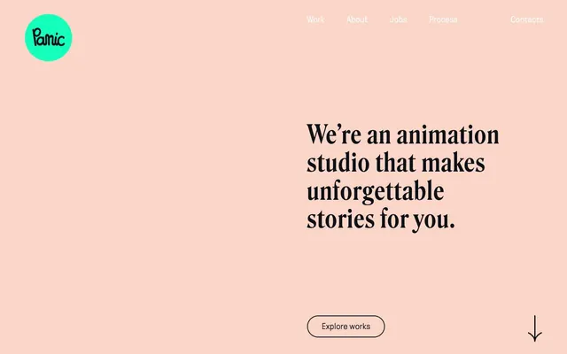
Background for the brand's circular logo, providing a vivid, unexpected burst of color against neutrals
Accent for large, impactful headlines in dark sections and decorative flourishes like stars and arrows, creating an electrifying contrast
Dominant background for light sections, providing a warm and inviting base
Primary text color, dark backgrounds for contrasting sections, and ghost button borders. High contrast to emphasize content
Used for occasional text in dark sections and subtle border elements
Alternative color for primary text and various border elements, reinforcing high contrast
Typography
- Weights
- 500
- Sizes
- 45px, 65px, 75px
- Line height
- 1, 1.1, 1.15
- Letter spacing
- 0.04em
- Fallback
- Playfair Display
Headlines and emphasis text. Its ornate, high-contrast display characteristics make it feel premium and bold, demanding attention.
- Weights
- 300
- Sizes
- 22px
- Line height
- 1.45
- Letter spacing
- 0.005em
- Fallback
- Inter
Body text, navigation, and button labels. Its lightness and slightly condensed form keep text feeling modern and airy, preventing it from competing with the expressive headlines.
Spacing & shape
Components
Transparent background with a 2px solid border in Midnight Ink (#0e1017) and Midnight Ink (#0e1017) text. Highly rounded corners (60px radius). Padding of 10px vertical and 35px horizontal. Uses GT Pressura font at 22px, weight 300.
A circular element with a solid Emerald Pop (#16ffbd) fill. Contains the brand name in a dark font.
Text link in Midnight Ink (#0e1017) against light backgrounds or Pure White (#ffffff) against dark backgrounds. Uses GT Pressura font. Hover states likely involve an underline or color shift.
Guidelines
- Use Panic Peach (#f8e2db) as the dominant background for light-themed sections, providing warmth.
- Pair Roslindale 500 headlines with GT Pressura 300 body text for consistent typographic contrast.
- Implement 60px border-radius for all interactive elements like buttons to maintain a soft, friendly aesthetic.
- Utilize Sunbeam Yellow (#fff050) exclusively for dramatic headlines or decorative graphical elements on dark backgrounds.
- Maintain generous 90px vertical section gaps and 50px horizontal column gaps to create a spacious, breathable layout.
- Employ Midnight Ink (#0e1017) for all primary text and un-filled button borders for strong contrast and legibility.
- Use Emerald Pop (#16ffbd) only for the brand logo or other specific brand marks, not for general UI elements.
- Do not use Roslindale for body text; reserve it entirely for headlines and display text.
- Avoid using Sunbeam Yellow (#fff050) as a button background color or for large blocks of text.
- Do not introduce square or low-radius corners on interactive elements; enforce 60px radius.
- Do not use multiple font families beyond Roslindale and GT Pressura without explicit approval.
- Avoid tight element spacing; prioritize the generous 12px element gap and larger section paddings.
- Do not use Emerald Pop (#16ffbd) for any interactive states or general background elements.
- Do not use gradients; the system relies on solid color blocks for structure and impact.
About this system
ShowHide
Panic Studio's design system combines bold, expressive typography with a vibrant, contrasting color palette. The visual identity alternates between a warm, soft peach background with dark text and a moody, dark background punctuated by energetic yellow headlines. Components are minimal, relying on generous spacing and high contrast to define their presence. The overall impression is playful yet authoritative, reflecting a creative agency that values strong visual storytelling.
Pages are structured with a full-bleed background that alternates between Panic Peach and Midnight Ink. Content is centered and largely contained within a flexible max-width, creating a clear content rhythm. The hero section often features large, centered headlines over a solid background. Sections are separated by generous vertical spacing (90px). Content flows in mostly single-column stacks with occasional multi-column feature or work showcases, but always high contrast and centered. Navigation is a minimal top-right bar with simple text links.
This system primarily uses iconography and limited imagery. The branding relies on abstract, geometric shapes (like the circular logo background) and simple, expressive icons (e.g., down arrows, small starbursts). When present, product imagery is likely to be high-quality, contained, and without busy backgrounds, allowing the expressive typography to dominate. Icons should be monochrome outlined or filled with the brand's key accent colors (Sunbeam Yellow). Imagery is decorative and used to punctuate text rather than being content-heavy.
Reminiscent of Stripe, Figma, Huge Inc., Active Theory.
# Panic — Style Reference
> Vibrant type on contrasting canvas.

**Theme:** mixed

**Site:** https://panicstudio.tv

Panic Studio's design system combines bold, expressive typography with a vibrant, contrasting color palette. The visual identity alternates between a warm, soft peach background with dark text and a moody, dark background punctuated by energetic yellow headlines. Components are minimal, relying on generous spacing and high contrast to define their presence. The overall impression is playful yet authoritative, reflecting a creative agency that values strong visual storytelling.

## Tokens — Colors

| Name | Value | Token | Role |
|------|------|------|------|
| Emerald Pop | `#16ffbd` | `--color-emerald-pop` | Background for the brand's circular logo, providing a vivid, unexpected burst of color against neutrals |
| Sunbeam Yellow | `#fff050` | `--color-sunbeam-yellow` | Accent for large, impactful headlines in dark sections and decorative flourishes like stars and arrows, creating an electrifying contrast |
| Panic Peach | `#f8e2db` | `--color-panic-peach` | Dominant background for light sections, providing a warm and inviting base |
| Midnight Ink | `#0e1017` | `--color-midnight-ink` | Primary text color, dark backgrounds for contrasting sections, and ghost button borders. High contrast to emphasize content |
| Pure White | `#ffffff` | `--color-pure-white` | Used for occasional text in dark sections and subtle border elements |
| Absolute Black | `#000000` | `--color-absolute-black` | Alternative color for primary text and various border elements, reinforcing high contrast |

## Tokens — Typography

### Roslindale
- **Substitute:** Playfair Display
- **Weights:** 500
- **Sizes:** 45px, 65px, 75px
- **Line height:** 1, 1.1, 1.15
- **Letter spacing:** 0.04em
- **Role:** Headlines and emphasis text. Its ornate, high-contrast display characteristics make it feel premium and bold, demanding attention.

### GT Pressura
- **Substitute:** Inter
- **Weights:** 300
- **Sizes:** 22px
- **Line height:** 1.45
- **Letter spacing:** 0.005em
- **Role:** Body text, navigation, and button labels. Its lightness and slightly condensed form keep text feeling modern and airy, preventing it from competing with the expressive headlines.

## Tokens — Type Scale

Perfect Fifth (1.5) from 22px base.

| Role | Size | Line height | Letter spacing |
|------|------|------|------|
| body | 22px | 1.45 | 0.11px |
| heading | 45px | 1.15 | 1.8px |
| heading-lg | 65px | 1.1 | 2.6px |
| display | 75px | 1 | 3px |

## Tokens — Spacing

- **Section gap:** 90px
- **Card padding:** 30px
- **Element gap:** 12px

## Tokens — Radius

- **Buttons:** 60px

## Layout

Pages are structured with a full-bleed background that alternates between Panic Peach and Midnight Ink. Content is centered and largely contained within a flexible max-width, creating a clear content rhythm. The hero section often features large, centered headlines over a solid background. Sections are separated by generous vertical spacing (90px). Content flows in mostly single-column stacks with occasional multi-column feature or work showcases, but always high contrast and centered. Navigation is a minimal top-right bar with simple text links.

## Imagery

This system primarily uses iconography and limited imagery. The branding relies on abstract, geometric shapes (like the circular logo background) and simple, expressive icons (e.g., down arrows, small starbursts). When present, product imagery is likely to be high-quality, contained, and without busy backgrounds, allowing the expressive typography to dominate. Icons should be monochrome outlined or filled with the brand's key accent colors (Sunbeam Yellow). Imagery is decorative and used to punctuate text rather than being content-heavy.

## Components

### Ghost Button - Light
*Call to action button for light backgrounds.*

Transparent background with a 2px solid border in Midnight Ink (#0e1017) and Midnight Ink (#0e1017) text. Highly rounded corners (60px radius). Padding of 10px vertical and 35px horizontal. Uses GT Pressura font at 22px, weight 300.

### Logo Circle
*Brand identity mark.*

A circular element with a solid Emerald Pop (#16ffbd) fill. Contains the brand name in a dark font.

### Primary Navigation Link
*Top-level navigation item.*

Text link in Midnight Ink (#0e1017) against light backgrounds or Pure White (#ffffff) against dark backgrounds. Uses GT Pressura font. Hover states likely involve an underline or color shift.

## Guidelines

### Do

- Use Panic Peach (#f8e2db) as the dominant background for light-themed sections, providing warmth.
- Pair Roslindale 500 headlines with GT Pressura 300 body text for consistent typographic contrast.
- Implement 60px border-radius for all interactive elements like buttons to maintain a soft, friendly aesthetic.
- Utilize Sunbeam Yellow (#fff050) exclusively for dramatic headlines or decorative graphical elements on dark backgrounds.
- Maintain generous 90px vertical section gaps and 50px horizontal column gaps to create a spacious, breathable layout.
- Employ Midnight Ink (#0e1017) for all primary text and un-filled button borders for strong contrast and legibility.
- Use Emerald Pop (#16ffbd) only for the brand logo or other specific brand marks, not for general UI elements.

### Don't

- Do not use Roslindale for body text; reserve it entirely for headlines and display text.
- Avoid using Sunbeam Yellow (#fff050) as a button background color or for large blocks of text.
- Do not introduce square or low-radius corners on interactive elements; enforce 60px radius.
- Do not use multiple font families beyond Roslindale and GT Pressura without explicit approval.
- Avoid tight element spacing; prioritize the generous 12px element gap and larger section paddings.
- Do not use Emerald Pop (#16ffbd) for any interactive states or general background elements.
- Do not use gradients; the system relies on solid color blocks for structure and impact.

## Agent Prompt Guide

Quick Color Reference:
text: #0e1017
background: #f8e2db
border: #0e1017
accent: #fff050
primary action: no distinct CTA color

Example Component Prompts:
1. Create a header section on Panic Peach (#f8e2db) background. Include the brand logo (Emerald Pop circle #16ffbd) on the left and a navigation bar on the right with 'Work', 'About', 'Jobs', 'Process', 'Contacts' as links in Midnight Ink (#0e1017), using GT Pressura 22px weight 300, 0.005em letter-spacing.
2. Design a hero section with a Midnight Ink (#0e1017) background. The main headline 'FEATURED WORK' should use Roslindale 75px weight 500, 0.04em letter-spacing in Sunbeam Yellow (#fff050).
3. Create a descriptive text block on a Panic Peach (#f8e2db) background. Use GT Pressura 22px weight 300, 0.005em letter-spacing for text in Midnight Ink (#0e1017). Below the text, add a Ghost Button 'Explore works': transparent background, 2px solid Midnight Ink (#0e1017) border, 60px radius, 10px vertical and 35px horizontal padding, with text in Midnight Ink (#0e1017) using GT Pressura 22px weight 300.
More like this







Keep what you find
A free account saves references to boards and can send you a weekly email of picks based on what you save.
To see every result, go Pro.