Preview image. Unlock full-res
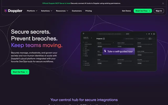
Midnight command center. Deep purples on near-black surfaces, highlighted by electric green and violet, feel like precise, secure control.
Color palette
Decorative backgrounds for hero sections, prominent visual elements. Creates a sense of depth and energy.
Backgrounds for abstract graphics and brand illustrations, providing a cosmic, high-tech mood.
Primary call-to-action buttons, interactive links, active states. This vibrant green is the main interactive accent.
Highlighting key headings, brand elements. A vivid violet used sparingly for emphasis, contrasting with the green.
Primary surface background, text on light elements (buttons). The dominant deep purple-gray setting the dark theme.
Secondary surface background, subtly deeper than Midnight Ink to create visual layering without heavy shadows.
Primary body text, headers on dark backgrounds, key interactive text. High contrast for readability against dark surfaces.
Secondary text, placeholder text, inactive elements. Provides a softer contrast than Text Off-White.
Subtle borders, dividers, card outlines. A near-achromatic light gray that provides structure on dark backgrounds.
Typography
- Weights
- 400, 450, 500, 700
- Sizes
- 12px, 14px, 15px, 16px, 18px, 24px, 32px, 48px, 64px, 96px
- Line height
- 1, 1.05, 1.15, 1.2, 1.4, 1.5
- Letter spacing
- -0.48, -0.16, 0.14, 0.48
- Fallback
- Inter
The sole typeface for all content. Its versatility across weights and sizes, combined with micro letter-spacing adjustments, maintains a sleek, optimized feel across headlines and body text.
Spacing & shape
Components
backgroundColor=rgba(0, 0, 0, 0), color=rgb(208, 201, 196), no border, 0px border-radius, 0px padding. Uses Ash Gray for text color.
backgroundColor=rgb(0, 245, 117), color=rgb(28, 22, 36), 12px border-radius, 10px 16px padding. Text is Midnight Ink, background is Accent Green.
backgroundColor=rgba(242, 241, 237, 0.04), color=rgb(241, 240, 236), 20px border-radius, 8px 10px padding. Uses primary body text color and a subtle transparent background, creating a 'frosted glass' effect.
backgroundColor=rgba(242, 241, 237, 0.04), 20px border-radius, no box-shadow, 28px padding. Displays content on a slightly elevated, transparent dark surface.
Guidelines
- Use Accent Green (#00f575) exclusively for primary calls-to-action to maximize its impact.
- Apply 'Doppler Repro' font with appropriate letterSpacing from the type scale for all text elements.
- Maintain a 20px border-radius for all cards and informational badges.
- Structure UI elements with Text Off-White (#f1f0ec) on Midnight Ink (#1c1624) or Deep Plum (#2d2734) for optimal contrast in dark mode.
- Utilize Outline Pale (#e5e7eb) for subtle borders and dividers to provide structure without adding visual weight.
- Employ consistent 8px element gaps for most internal component spacing.
- Do not use saturated colors other than Accent Green or Accent Violet for interactive elements or brand highlights.
- Avoid box-shadows; use background color layering (Midnight Ink, Deep Plum) and subtle borders for elevation and separation.
- Do not use highly rounded corners (e.g., 9999px) on any elements other than specific, explicit tags.
- Do not introduce additional font families; 'Doppler Repro' covers all typographic needs.
- Avoid using bright, non-text colors (like red, yellow, pure white) for large text blocks, as it undermines the dark theme's sophistication.
About this system
ShowHide
Doppler's visual style is a 'midnight command center' behind frosted glass, creating an atmosphere of secure, high-tech operations. Deep purples and blacks form the primary palette, suggesting seriousness and advanced technology. Vivid electric green and violet accents cut through the darkness, like indicator lights on a complex dashboard, highlighting crucial actions and information. A subtle border treatment using a near-achromatic light gray provides structure and division without breaking the dark theme, reinforcing the 'frosted glass' feel.
The layout features a full-bleed dark background (Midnight Ink) with content sections generally confined to a centered, implicit max-width. The hero section employs a split layout: a commanding headline and descriptive text on the left, an illustrative product screenshot on the right, all on a gradient background. Subsequent sections reveal a consistent vertical rhythm of padding (64px sectionGap), alternating between text-centric blocks and grid layouts (e.g., a 4-column card grid for integrations). Content arrangement often uses a text-left, image-right or grid-based pattern. The page is information-dense yet maintains clear visual separation through consistent spacing and subtle surface variations. Navigation is a sticky top bar with ghost buttons and a prominent Accent Green CTA.
Imagery primarily consists of product screenshots and abstract, brand-colored graphics/illustrations. Product screenshots are contained within device mockups or dark-themed UI frames, showcasing the product's interface. Illustrations employ vivid violet, green, and deep purple color palettes, featuring organic, flowing shapes as well as geometric abstractions, often with subtle gradients (Nebula Pink Radial) or glowing effects that integrate seamlessly into the dark theme. Icons are consistently monochrome (Outline Pale on dark backgrounds) and outlined with a medium stroke weight. The visual language centers on explaining complex technical concepts through clear UI examples and atmospheric, abstract visuals rather than photography, contributing to a high-density, informational feel.
Reminiscent of Vercel, Supabase, Linear, GitHub (dark mode).
# Doppler — Style Reference
> Midnight command center. Deep purples on near-black surfaces, highlighted by electric green and violet, feel like precise, secure control.

**Theme:** dark

**Site:** https://doppler.com

Doppler's visual style is a 'midnight command center' behind frosted glass, creating an atmosphere of secure, high-tech operations. Deep purples and blacks form the primary palette, suggesting seriousness and advanced technology. Vivid electric green and violet accents cut through the darkness, like indicator lights on a complex dashboard, highlighting crucial actions and information. A subtle border treatment using a near-achromatic light gray provides structure and division without breaking the dark theme, reinforcing the 'frosted glass' feel.

## Tokens — Colors

| Name | Value | Token | Role |
|------|------|------|------|
| Deep Violet Gradient | `#6b13f5` | `--color-deep-violet-gradient` | Decorative backgrounds for hero sections, prominent visual elements. Creates a sense of depth and energy. |
| Nebula Pink Radial | `#231736` | `--color-nebula-pink-radial` | Backgrounds for abstract graphics and brand illustrations, providing a cosmic, high-tech mood. |
| Accent Green | `#00f575` | `--color-accent-green` | Primary call-to-action buttons, interactive links, active states. This vibrant green is the main interactive accent. |
| Accent Violet | `#b997ff` | `--color-accent-violet` | Highlighting key headings, brand elements. A vivid violet used sparingly for emphasis, contrasting with the green. |
| Midnight Ink | `#1c1624` | `--color-midnight-ink` | Primary surface background, text on light elements (buttons). The dominant deep purple-gray setting the dark theme. |
| Deep Plum | `#2d2734` | `--color-deep-plum` | Secondary surface background, subtly deeper than Midnight Ink to create visual layering without heavy shadows. |
| Text Off-White | `#f1f0ec` | `--color-text-off-white` | Primary body text, headers on dark backgrounds, key interactive text. High contrast for readability against dark surfaces. |
| Ash Gray | `#d0c9c4` | `--color-ash-gray` | Secondary text, placeholder text, inactive elements. Provides a softer contrast than Text Off-White. |
| Outline Pale | `#e5e7eb` | `--color-outline-pale` | Subtle borders, dividers, card outlines. A near-achromatic light gray that provides structure on dark backgrounds. |

## Tokens — Typography

### Doppler Repro
- **Substitute:** Inter
- **Weights:** 400, 450, 500, 700
- **Sizes:** 12px, 14px, 15px, 16px, 18px, 24px, 32px, 48px, 64px, 96px
- **Line height:** 1, 1.05, 1.15, 1.2, 1.4, 1.5
- **Letter spacing:** -0.48, -0.16, 0.14, 0.48
- **Role:** The sole typeface for all content. Its versatility across weights and sizes, combined with micro letter-spacing adjustments, maintains a sleek, optimized feel across headlines and body text.

## Tokens — Type Scale

Major Third (1.25) from 16px base.

| Role | Size | Line height | Letter spacing |
|------|------|------|------|
| caption | 12px | 1.5 | — |
| body-sm | 14px | 1.5 | — |
| body | 16px | 1.5 | — |
| subheading | 18px | 1.4 | — |
| heading-sm | 24px | 1.2 | — |
| heading | 32px | 1.15 | — |
| heading-lg | 48px | 1.05 | -0.48px |
| display | 64px | 1 | -0.48px |

## Tokens — Spacing

- **Section gap:** 64px
- **Card padding:** 28px
- **Element gap:** 8px

## Tokens — Radius

- **Buttons:** 12px
- **Cards:** 20px
- **menuItems:** 20px
- **tags:** 20px

## Layout

The layout features a full-bleed dark background (Midnight Ink) with content sections generally confined to a centered, implicit max-width. The hero section employs a split layout: a commanding headline and descriptive text on the left, an illustrative product screenshot on the right, all on a gradient background. Subsequent sections reveal a consistent vertical rhythm of padding (64px sectionGap), alternating between text-centric blocks and grid layouts (e.g., a 4-column card grid for integrations). Content arrangement often uses a text-left, image-right or grid-based pattern. The page is information-dense yet maintains clear visual separation through consistent spacing and subtle surface variations. Navigation is a sticky top bar with ghost buttons and a prominent Accent Green CTA.

## Imagery

Imagery primarily consists of product screenshots and abstract, brand-colored graphics/illustrations. Product screenshots are contained within device mockups or dark-themed UI frames, showcasing the product's interface. Illustrations employ vivid violet, green, and deep purple color palettes, featuring organic, flowing shapes as well as geometric abstractions, often with subtle gradients (Nebula Pink Radial) or glowing effects that integrate seamlessly into the dark theme. Icons are consistently monochrome (Outline Pale on dark backgrounds) and outlined with a medium stroke weight. The visual language centers on explaining complex technical concepts through clear UI examples and atmospheric, abstract visuals rather than photography, contributing to a high-density, informational feel.

## Components

### Primary CTA Button Group

### Integration Feature Card

### Announcement Banner

### Ghost Navigation Button
*Primary navigation and subtle secondary actions.*

backgroundColor=rgba(0, 0, 0, 0), color=rgb(208, 201, 196), no border, 0px border-radius, 0px padding. Uses Ash Gray for text color.

### Primary CTA Button
*Main calls to action.*

backgroundColor=rgb(0, 245, 117), color=rgb(28, 22, 36), 12px border-radius, 10px 16px padding. Text is Midnight Ink, background is Accent Green.

### Badge Button
*Informational tags or small interactive elements, often in navigation.*

backgroundColor=rgba(242, 241, 237, 0.04), color=rgb(241, 240, 236), 20px border-radius, 8px 10px padding. Uses primary body text color and a subtle transparent background, creating a 'frosted glass' effect.

### Feature Card
*Showcasing integration partners or key features.*

backgroundColor=rgba(242, 241, 237, 0.04), 20px border-radius, no box-shadow, 28px padding. Displays content on a slightly elevated, transparent dark surface.

## Guidelines

### Do

- Use Accent Green (#00f575) exclusively for primary calls-to-action to maximize its impact.
- Apply 'Doppler Repro' font with appropriate letterSpacing from the type scale for all text elements.
- Maintain a 20px border-radius for all cards and informational badges.
- Structure UI elements with Text Off-White (#f1f0ec) on Midnight Ink (#1c1624) or Deep Plum (#2d2734) for optimal contrast in dark mode.
- Utilize Outline Pale (#e5e7eb) for subtle borders and dividers to provide structure without adding visual weight.
- Employ consistent 8px element gaps for most internal component spacing.

### Don't

- Do not use saturated colors other than Accent Green or Accent Violet for interactive elements or brand highlights.
- Avoid box-shadows; use background color layering (Midnight Ink, Deep Plum) and subtle borders for elevation and separation.
- Do not use highly rounded corners (e.g., 9999px) on any elements other than specific, explicit tags.
- Do not introduce additional font families; 'Doppler Repro' covers all typographic needs.
- Avoid using bright, non-text colors (like red, yellow, pure white) for large text blocks, as it undermines the dark theme's sophistication.

## Agent Prompt Guide

### Quick Color Reference
- Text: #f1f0ec
- Background: #1c1624
- CTA: #00f575
- Border: #e5e7eb
- Accent: #b997ff

### Example Component Prompts
1. Create a `Primary CTA Button`: background #00f575, text #1c1624, border-radius 12px, padding 10px 16px. Label with 'Start for Free →'.
2. Design a `Feature Card`: background rgba(242, 241, 237, 0.04), border-radius 20px, padding 28px. Inside, use a heading at 24px 'Doppler Repro' weight 500, #f1f0ec, lineHeight 1.2. Below, body text at 16px 'Doppler Repro' weight 400, #f1f0ec, lineHeight 1.5.
3. Implement a page section titled 'Secure secrets. Prevent breaches. Keep teams moving.': Use a display heading at 'Doppler Repro' 64px weight 700, #f1f0ec, letter-spacing -0.48px. Beneath it, body text 18px #f1f0ec, lineHeight 1.4.
4. Generate a `Badge Button`: background rgba(242, 241, 237, 0.04), text #f1f0ec, border-radius 20px, padding 8px 10px. Label with 'Official Doppler MCP Server'.
More like this





Keep what you find
A free account saves references to boards and can send you a weekly email of picks based on what you save.
To see every result, go Pro.