Preview image. Unlock full-res
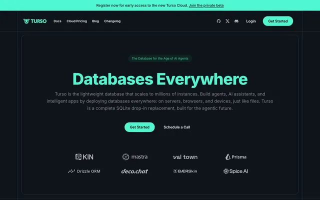
Electric Teal Command Center. A dark, digital workspace where a single vibrant hue highlights critical actions amid a field of deep shadows.
Color palette
Primary accent for interactive elements, headlines, and key call-to-action buttons — it provides critical visual energy and draws attention. Also used for some subtle icons and text highlighting like callouts.
Accent color for specific interactive elements or highlighted status indicators.
Border color for highly specific interactive states or badges.
Primary background color, base surface.
Text color on Hacker Teal buttons, providing maximum contrast.
Primary text color for body, headings, and most interactive elements on dark backgrounds. Also used as iconography color.
Subtle border color for most components like cards and buttons, creating a crisp edge against the dark background.
Background for secondary buttons and subtle panel fills.
Secondary text color for less prominent body copy, hints, and descriptions.
Tertiary text color for fine print and less important information.
Typography
- Weights
- 400
- Sizes
- 12px, 14px, 16px, 18px
- Line height
- 1.5, 1.56, 1.6, 1.63, 1.75, 1.78, 2
- Fallback
- system-ui
Body copy, captions, and secondary information. Its consistent legibility across various sizes ensures technical content remains digestible.
- Weights
- 500
- Sizes
- 12px, 14px, 16px, 18px
- Line height
- 1.5, 1.56, 1.6, 1.63
- Fallback
- system-ui
Navigation links, button text, and emphasized body text. Provides a subtle visual lift from regular body copy without being bold.
- Weights
- 600
- Sizes
- 16px, 20px, 24px, 30px, 36px, 48px
- Line height
- 1, 1.11, 1.2, 1.33, 1.43, 1.5
- Letter spacing
- -0.0250em
- Fallback
- system-ui
Subheadings and prominent section titles. The slightly negative letter spacing for larger sizes tightens text for a modern, impactful display without being heavy.
- Weights
- 700
- Sizes
- 72px
- Line height
- 1
- Letter spacing
- -0.0250em
- Fallback
- system-ui
Primary display headings. This substantial weight, combined with tight letter spacing, gives main titles a commanding yet precise presence.
- Weights
- 800
- Sizes
- 48px, 72px
- Line height
- 1, 1.11
- Letter spacing
- -0.0250em
- Fallback
- system-ui
Very large display text, used sparingly for maximum impact in hero sections or emphasized statements. The extra weight enhances the authoritative, technical feel.
Spacing & shape
Components
Background: Hacker Teal (#4ff7d1), Text: Void Black (#000000), Border: none, Radius: 9999px, Padding: 12px vertical, 24px horizontal. Uses 'Inter' weight 500.
Background: Charcoal Surface (#162129), Text: Cloud Gray (#ffffff), Border: 1px solid Slate Border (#283945), Radius: 12px, Padding: 16px vertical, 16px horizontal. Uses 'Inter' weight 500.
Background: Electric Violet (#d946ef), Text: Cloud Gray (#ffffff), Border: none, Radius: 9999px, Padding: 10px vertical, 14px horizontal. Uses 'Inter' weight 500.
Background: rgba(255, 255, 255, 0.1), Text: Cloud Gray (#ffffff), Border: none, Radius: 9999px, Padding: 10px vertical, 14px horizontal. Uses 'Inter' weight 500.
Background: Deep Space (#0d1318), Border: 1px solid Slate Border (#283945), Radius: 12px, Padding: 40px, or 24px vertical and 40px horizontal. Contains headlines (Inter 600) and body text (Inter 400).
Text: Cloud Gray (#ffffff), Weight: Inter 500, Size: 16px, Hover/Active state changes text color to Hacker Teal (#4ff7d1) for interaction feedback.
Background: rgba(255, 255, 255, 0.1) or Electric Violet (#d946ef), Text: Cloud Gray (#ffffff), Radius: 9999px, Padding: typically 6px vertical, 14px horizontal. Uses 'Inter' weight 500.
Background: Deep Space (#0d1318), Border: 1px solid Neon Pink (#a21caf), Radius: 12px. Padding: 40px. Often contains specific badges or buttons.
Guidelines
- Prioritize Hacker Teal (#4ff7d1) for primary calls to action, headlines, and key interactive elements to draw the eye.
- Maintain a deep, dark aesthetic using Deep Space (#0d1318) for backgrounds and Charcoal Surface (#162129) for secondary panels.
- Use Cloud Gray (#ffffff) for primary text on dark backgrounds, ensuring high contrast and legibility.
- Apply 12px radius to most structural components like cards and panels for a consistent, subtle modern edge.
- Implement 9999px radius for all primary and secondary buttons, along with small badges, to create distinct interaction points.
- Employ the Inter font family, varying weights (400-800) to establish clear typographic hierarchy without introducing new typefaces.
- Use Slate Border (#283945) for all component borders to subtly define elements against the dark background without harshness.
- Avoid introducing additional saturated colors that would dilute the impact of Hacker Teal (#4ff7d1) and Electric Violet (#d946ef).
- Don't use overly rounded corners (e.g. 24px) on large content cards; reserve that for specific, small elements like nav items.
- Do not use shadows for elevation; rely on border colors, background tints, and spacing to define hierarchy and depth.
- Refrain from using light backgrounds; the entire system is built for a dark interface, and light elements would disrupt the aesthetic.
- Do not use generic system fonts; 'Inter' is critical to the site's modern, technical tone.
- Avoid dense information blocks; use generous spacing (40px padding, 8px-16px element gaps) for comfortable readability on deep backgrounds.
- Do not use small font sizes (below 14px for body content), as it compromises readability on the dark theme.
About this system
ShowHide
Turso's design evokes a sophisticated 'hacker aesthetic' — dark, precise, and highly functional code tooling. The interplay of a deep, almost black background with a singular, vibrant teal accent color (#4ff7d1) creates an electric tension. Sharp rectangular panels with subtle, near-black borders provide structure, contrasting with the occasional pill-shaped button that introduces a touch of approachable modernity. Text hierarchy is established through font weight and size variations, not color, with the vivid teal reserved for key calls to action and distinguishing elements.
The layout adheres to a max-width, center-aligned model for primary content, though the hero section spans full-bleed with its dark background. The initial hero features a large, centered headline and subtext, with action buttons below. Sections maintain generous vertical spacing (around 40px), creating a breathable rhythm. Content often appears in a simple stacked fashion or within 2-column grids, frequently with a text block on one side and a supporting visual element or code snippet on the other. Card grids (2 per row in larger sections) are used for feature showcases, maintaining consistent interior padding and border treatments. The navigation is a sticky top bar, providing persistent access to links and CTAs. The overall Impression is one of structured organization, allowing the dark background and accent colors to guide the eye.
The site favors technical illustrations and product-focused iconography over photography or complex 3D renders. Illustrations, when present, are often abstract geometric shapes or line art in Hacker Teal or subtle grayscale, serving a decorative or conceptual role without being visually heavy. Icons are predominantly clean, outlined, and monochromatic (Cloud Gray or Hacker Teal), used functionally to accompany text or denote actions. There's an emphasis on product code snippets and logos of partnered technologies, serving as social proof and contextual information rather than decorative elements. Visuals are contained and typically full-width within the content columns, maintaining the structured, code-like aesthetic. The density is moderate to high, with visuals used strategically to break up text and convey functionality.
Reminiscent of Vercel, Supabase, Tailwind CSS.
# Turso — Style Reference
> Electric Teal Command Center. A dark, digital workspace where a single vibrant hue highlights critical actions amid a field of deep shadows.

**Theme:** dark

**Site:** https://turso.tech

Turso's design evokes a sophisticated 'hacker aesthetic' — dark, precise, and highly functional code tooling. The interplay of a deep, almost black background with a singular, vibrant teal accent color (#4ff7d1) creates an electric tension. Sharp rectangular panels with subtle, near-black borders provide structure, contrasting with the occasional pill-shaped button that introduces a touch of approachable modernity. Text hierarchy is established through font weight and size variations, not color, with the vivid teal reserved for key calls to action and distinguishing elements.

## Tokens — Colors

| Name | Value | Token | Role |
|------|------|------|------|
| Hacker Teal | `#4ff7d1` | `--color-hacker-teal` | Primary accent for interactive elements, headlines, and key call-to-action buttons — it provides critical visual energy and draws attention. Also used for some subtle icons and text highlighting like callouts. |
| Electric Violet | `#d946ef` | `--color-electric-violet` | Accent color for specific interactive elements or highlighted status indicators. |
| Neon Pink | `#a21caf` | `--color-neon-pink` | Border color for highly specific interactive states or badges. |
| Deep Space | `#0d1318` | `--color-deep-space` | Primary background color, base surface. |
| Void Black | `#000000` | `--color-void-black` | Text color on Hacker Teal buttons, providing maximum contrast. |
| Cloud Gray | `#ffffff` | `--color-cloud-gray` | Primary text color for body, headings, and most interactive elements on dark backgrounds. Also used as iconography color. |
| Slate Border | `#283945` | `--color-slate-border` | Subtle border color for most components like cards and buttons, creating a crisp edge against the dark background. |
| Charcoal Surface | `#162129` | `--color-charcoal-surface` | Background for secondary buttons and subtle panel fills. |
| Whisper Gray | `#86898c` | `--color-whisper-gray` | Secondary text color for less prominent body copy, hints, and descriptions. |
| Subtle Gray | `#b6b8ba` | `--color-subtle-gray` | Tertiary text color for fine print and less important information. |

## Tokens — Typography

### Inter
- **Substitute:** system-ui
- **Weights:** 400
- **Sizes:** 12px, 14px, 16px, 18px
- **Line height:** 1.5, 1.56, 1.6, 1.63, 1.75, 1.78, 2
- **Role:** Body copy, captions, and secondary information. Its consistent legibility across various sizes ensures technical content remains digestible.

### Inter
- **Substitute:** system-ui
- **Weights:** 500
- **Sizes:** 12px, 14px, 16px, 18px
- **Line height:** 1.5, 1.56, 1.6, 1.63
- **Role:** Navigation links, button text, and emphasized body text. Provides a subtle visual lift from regular body copy without being bold.

### Inter
- **Substitute:** system-ui
- **Weights:** 600
- **Sizes:** 16px, 20px, 24px, 30px, 36px, 48px
- **Line height:** 1, 1.11, 1.2, 1.33, 1.43, 1.5
- **Letter spacing:** -0.0250em
- **Role:** Subheadings and prominent section titles. The slightly negative letter spacing for larger sizes tightens text for a modern, impactful display without being heavy.

### Inter
- **Substitute:** system-ui
- **Weights:** 700
- **Sizes:** 72px
- **Line height:** 1
- **Letter spacing:** -0.0250em
- **Role:** Primary display headings. This substantial weight, combined with tight letter spacing, gives main titles a commanding yet precise presence.

### Inter
- **Substitute:** system-ui
- **Weights:** 800
- **Sizes:** 48px, 72px
- **Line height:** 1, 1.11
- **Letter spacing:** -0.0250em
- **Role:** Very large display text, used sparingly for maximum impact in hero sections or emphasized statements. The extra weight enhances the authoritative, technical feel.

## Tokens — Type Scale

Perfect Fourth (1.333) from 16px base.

| Role | Size | Line height | Letter spacing |
|------|------|------|------|
| caption | 12px | 1.75 | — |
| body-sm | 14px | 1.78 | — |
| body | 16px | 1.63 | — |
| subheading | 20px | 1.5 | -0.48px |
| heading | 30px | 1.33 | -0.75px |
| heading-lg | 36px | 1.2 | -0.9px |
| display | 72px | 1 | -1.8px |

## Tokens — Spacing

- **Section gap:** 40px

## Tokens — Radius

- **General:** 12px
- **Buttons:** 9999px
- **Cards:** 12px
- **navItems:** 9999px

## Layout

The layout adheres to a max-width, center-aligned model for primary content, though the hero section spans full-bleed with its dark background. The initial hero features a large, centered headline and subtext, with action buttons below. Sections maintain generous vertical spacing (around 40px), creating a breathable rhythm. Content often appears in a simple stacked fashion or within 2-column grids, frequently with a text block on one side and a supporting visual element or code snippet on the other. Card grids (2 per row in larger sections) are used for feature showcases, maintaining consistent interior padding and border treatments. The navigation is a sticky top bar, providing persistent access to links and CTAs. The overall Impression is one of structured organization, allowing the dark background and accent colors to guide the eye.

## Imagery

The site favors technical illustrations and product-focused iconography over photography or complex 3D renders. Illustrations, when present, are often abstract geometric shapes or line art in Hacker Teal or subtle grayscale, serving a decorative or conceptual role without being visually heavy. Icons are predominantly clean, outlined, and monochromatic (Cloud Gray or Hacker Teal), used functionally to accompany text or denote actions. There's an emphasis on product code snippets and logos of partnered technologies, serving as social proof and contextual information rather than decorative elements. Visuals are contained and typically full-width within the content columns, maintaining the structured, code-like aesthetic. The density is moderate to high, with visuals used strategically to break up text and convey functionality.

## Components

### Button Group — Primary, Secondary & Badge

### Product Cards — Turso & Turso Cloud

### Announcement Banner + Hero Badge

### Primary Call-to-Action Button
*Main interactive button*

Background: Hacker Teal (#4ff7d1), Text: Void Black (#000000), Border: none, Radius: 9999px, Padding: 12px vertical, 24px horizontal. Uses 'Inter' weight 500.

### Secondary Ghost Button
*Alternative or less prominent action*

Background: Charcoal Surface (#162129), Text: Cloud Gray (#ffffff), Border: 1px solid Slate Border (#283945), Radius: 12px, Padding: 16px vertical, 16px horizontal. Uses 'Inter' weight 500.

### Badge Button (Violet)
*Small, emphasized action or status label*

Background: Electric Violet (#d946ef), Text: Cloud Gray (#ffffff), Border: none, Radius: 9999px, Padding: 10px vertical, 14px horizontal. Uses 'Inter' weight 500.

### Badge Button (Transparent)
*Small, less emphasized action or status label*

Background: rgba(255, 255, 255, 0.1), Text: Cloud Gray (#ffffff), Border: none, Radius: 9999px, Padding: 10px vertical, 14px horizontal. Uses 'Inter' weight 500.

### Dark Card Panel
*Content container for features or information blocks*

Background: Deep Space (#0d1318), Border: 1px solid Slate Border (#283945), Radius: 12px, Padding: 40px, or 24px vertical and 40px horizontal. Contains headlines (Inter 600) and body text (Inter 400).

### Top Navigation Link
*Primary navigation item in header*

Text: Cloud Gray (#ffffff), Weight: Inter 500, Size: 16px, Hover/Active state changes text color to Hacker Teal (#4ff7d1) for interaction feedback.

### Section Highlight Badge
*Small, descriptive badge for section status or category*

Background: rgba(255, 255, 255, 0.1) or Electric Violet (#d946ef), Text: Cloud Gray (#ffffff), Radius: 9999px, Padding: typically 6px vertical, 14px horizontal. Uses 'Inter' weight 500.

### Secondary Accent Card
*Distinguishes a specific offer or product within a grid*

Background: Deep Space (#0d1318), Border: 1px solid Neon Pink (#a21caf), Radius: 12px. Padding: 40px. Often contains specific badges or buttons.

## Guidelines

### Do

- Prioritize Hacker Teal (#4ff7d1) for primary calls to action, headlines, and key interactive elements to draw the eye.
- Maintain a deep, dark aesthetic using Deep Space (#0d1318) for backgrounds and Charcoal Surface (#162129) for secondary panels.
- Use Cloud Gray (#ffffff) for primary text on dark backgrounds, ensuring high contrast and legibility.
- Apply 12px radius to most structural components like cards and panels for a consistent, subtle modern edge.
- Implement 9999px radius for all primary and secondary buttons, along with small badges, to create distinct interaction points.
- Employ the Inter font family, varying weights (400-800) to establish clear typographic hierarchy without introducing new typefaces.
- Use Slate Border (#283945) for all component borders to subtly define elements against the dark background without harshness.

### Don't

- Avoid introducing additional saturated colors that would dilute the impact of Hacker Teal (#4ff7d1) and Electric Violet (#d946ef).
- Don't use overly rounded corners (e.g. 24px) on large content cards; reserve that for specific, small elements like nav items.
- Do not use shadows for elevation; rely on border colors, background tints, and spacing to define hierarchy and depth.
- Refrain from using light backgrounds; the entire system is built for a dark interface, and light elements would disrupt the aesthetic.
- Do not use generic system fonts; 'Inter' is critical to the site's modern, technical tone.
- Avoid dense information blocks; use generous spacing (40px padding, 8px-16px element gaps) for comfortable readability on deep backgrounds.
- Do not use small font sizes (below 14px for body content), as it compromises readability on the dark theme.

## Agent Prompt Guide

### Quick Color Reference
- Text (Cloud Gray): #ffffff
- Background (Deep Space): #0d1318
- CTA (Hacker Teal): #4ff7d1
- Border (Slate Border): #283945
- Accent (Electric Violet): #d946ef

### Example Component Prompts
1. **Create a hero section:** 1200px max-width, centered. Background Deep Space (#0d1318). Centered headline 'Databases Everywhere' (Inter 800, 72px, 1.0 lineHeight, -0.025em letter-spacing, Hacker Teal #4ff7d1). Subtext (Inter 400, 18px, 1.6 lineHeight, Cloud Gray #ffffff) below, padding 40px. Two buttons below, centered: Primary Call-to-Action 'Get Started' (Hacker Teal #4ff7d1, Void Black #000000 text, 9999px radius, 12px/24px padding) and Secondary Ghost Button 'Schedule a Call' (Charcoal Surface #162129, Cloud Gray #ffffff text, Slate Border #283945 border, 12px radius, 16px/16px padding), with 16px horizontal spacing between them.
2. **Generate a Dark Card Panel:** Background Deep Space (#0d1318), 1px solid Slate Border (#283945) border, 12px radius, 40px inner padding. Inside, place a 'BETA' Section Highlight Badge (Electric Violet #d946ef, Cloud Gray #ffffff text, 9999px radius, 6px/14px padding). Below the badge, a heading 'Turso' (Inter 600, 30px, 1.33 lineHeight, -0.025em letter-spacing, Cloud Gray #ffffff). Below the heading, body text (Inter 400, 16px, 1.6 lineHeight, Whisper Gray #86898c). Include two small Badge Buttons at the bottom for actions: 'curl -sSL tur.so/install | sh' (Charcoal Surface #162129, Cloud Gray #ffffff text, 9999px radius, 10px/14px padding) and 'GitHub 18K Stars' (Charcoal Surface #162129, Cloud Gray #ffffff text, 9999px radius, 10px/14px padding).
3. **Design a top navigation bar:** Full-width. Background Deep Space (#0d1318). Left aligned 'Turso' logo (Inter 600, 20px, Hacker Teal #4ff7d1). Right-aligned navigation links 'Docs', 'Cloud Pricing', 'Blog', 'Changelog' (Inter 500, 16px, Cloud Gray #ffffff, 24px horizontal spacing). Rightmost section contains a login link and a Primary Call-to-Action button 'Get Started' (Hacker Teal #4ff7d1, Void Black #000000 text, 9999px radius, 12px/24px padding).
More like this





Keep what you find
A free account saves references to boards and can send you a weekly email of picks based on what you save.
To see every result, go Pro.