Preview image. Unlock full-res
Subtle Depth, Focused Accent
Color palette
Supporting palette color for small decorative accents when the core palette needs contrast. Do not promote it to the primary CTA color
Page backgrounds, card surfaces, UI frames. Provides a bright, spacious backdrop
Primary text, prominent icons, dark backgrounds for contrasting sections. Foundation for high-contrast interface elements
Secondary text, muted icons, subtle borders, and background elements in dark mode. Provides hierarchy with less visual weight than Ink Black
Subtle shadow base for elevation effects
Typography
- Weights
- 400, 600
- Sizes
- 12px, 15px, 24px, 30px, 45px
- Line height
- 1.1, 1.2, 1.5
- Letter spacing
- -0.0200em
- Fallback
- system-ui
Primary UI text, body copy, link text. Its utilitarian clarity ensures readability across all functional elements.
- Weights
- 450
- Sizes
- 24px, 30px, 45px, 53px
- Line height
- 1.1
- Letter spacing
- -0.0200em
Prominent headings and display text. The variable font offers dynamic sizing and a distinctive, semi-bold presence without being heavy.
- Weights
- 400
- Sizes
- 24px, 30px, 45px, 53px
- Line height
- 1.1, 1.5
- Letter spacing
- -0.0300em
Attention-grabbing headlines and badge text. Features a tighter tracking for a more compact and impactful feel than other fonts.
- Weights
- 400
- Sizes
- 15px, 24px
- Line height
- 1.2, 1.5
- Letter spacing
- -0.0200em
Secondary headings and stylized body sections, often within badges. Provides a slightly lighter alternative to Haffer Variable for text hierarchy.
Spacing & shape
Elevation
Components
Filled button with a vibrant gradient background and an 8px border-radius, using Ink Black text. Acts as the main prompt for user action. Example: 'Download Poly'.
Ghost button with an Ink Black border (1px solid), Ink Black text, and a transparent background. Features an 8px border-radius. Provides a secondary action without commanding primary focus. Example: 'Watch Video'.
Simple text link using Ink Black or Steel Gray text for header navigation items. Lightly shadowed on hover with #cccccc for a subtle lift. Example: 'Login', 'Join waitlist'.
Text badge with Canvas White text on a transparent background, sans padding or border-radius, often using the Bogue font for distinctiveness. Used for highlighting key phrases. Example: 'Preserve human knowledge with Poly.'
Guidelines
- Use 'Canvas White' #f4f4f4 as the primary background for most sections to maintain a bright, open feel.
- Apply 'Ink Black' #000000 for all primary text and critical UI elements to ensure high contrast and readability.
- Reserve the 'Poly Gradient' (linear-gradient(134.77deg, rgb(244, 130, 77) 25.1%, rgb(244, 41, 25) 74.9%)) exclusively for primary calls to action and brand accents.
- Employ an 8px border-radius for all interactive elements like buttons and any card-like containers to establish a consistent soft edge.
- Maintain a clear visual hierarchy by using 'Inter' for body and functional text, and 'Haffer Variable' or 'Bogue' for headings as appropriate.
- Utilize 12px for 'elementGap' to define comfortable spacing between interactive elements and components.
- Introduce subtle elevation using rgba(0, 0, 0, 0.2) 2px 2px 5px 0px for interactive elements on hover, giving them a slight lift off the surface.
- Do not use saturated colors other than the 'Poly Gradient' for interactive elements or brand accents.
- Avoid arbitrary border-radius values; stick to the standard 8px for a cohesive look.
- Do not use the 'Poly Gradient' or any significant chromatic colors for body text or secondary UI elements.
- Do not exceed a page max-width of 1280px for core content, allowing for a contained reading experience.
- Refrain from using strong, opaque shadows; leverage the subtle inset/offset shadow style for visual depth.
- Do not use more than two distinct font families on any single screen to avoid visual clutter.
- Avoid dense information blocks; instead, use 'sectionGap' of 48px to create comfortable visual breaks between major content areas.
About this system
ShowHide
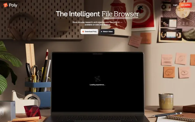
Poly's visual system evokes a smart, understated productivity environment. It employs a near-monochromatic palette for structural elements, allowing a single vibrant orange-red gradient to serve as a focused accent for branding and calls to action. Typography balances a clean sans-serif for body text with distinctive custom display fonts for impact, featuring subtle letter-spacing for refined text blocks. Components are clean and minimal with soft rounded corners and a focus on clarity through considered use of shadows for depth.
The page primarily uses a contained layout within a 1280px max-width, centrally aligned. The hero section is full-bleed with the atmospheric photography, featuring centered main headlines and calls to action. Below the hero, content generally follows a clean, spacious vertical rhythm with a section gap of 48px. Specific content arrangements are not fully discernible from the provided data but suggest a focus on clear, stacked information blocks, likely with a single column. Navigation is a minimal top bar, featuring discrete 'Login' and 'Join waitlist' links.
The visual language for imagery is primarily functional and contextual, with product screenshots (like a laptop screen showing UI) or atmospheric photography setting a scene. The prominent hero image uses muted, desaturated, high-key photography of a desk setup, serving as a background for UI elements. There are no illustrations or highly stylized graphics, emphasizing a realistic and grounded aesthetic. Icons (e.g., play button triangle, download arrow) are minimal, filled, and monochromatic, integrated seamlessly into buttons. Imagery serves to establish a professional, productive atmosphere and demonstrate product interaction, rather than purely decorative or abstract concepts.
Reminiscent of Raycast, Warp terminal, Supabase.
# Poly — Style Reference
> Subtle Depth, Focused Accent

**Theme:** light

**Site:** https://poly.app

Poly's visual system evokes a smart, understated productivity environment. It employs a near-monochromatic palette for structural elements, allowing a single vibrant orange-red gradient to serve as a focused accent for branding and calls to action. Typography balances a clean sans-serif for body text with distinctive custom display fonts for impact, featuring subtle letter-spacing for refined text blocks. Components are clean and minimal with soft rounded corners and a focus on clarity through considered use of shadows for depth.

## Tokens — Colors

| Name | Value | Token | Role |
|------|------|------|------|
| Poly Gradient | `#f4824d` | `--color-poly-gradient` | Supporting palette color for small decorative accents when the core palette needs contrast. Do not promote it to the primary CTA color |
| Canvas White | `#f4f4f4` | `--color-canvas-white` | Page backgrounds, card surfaces, UI frames. Provides a bright, spacious backdrop |
| Ink Black | `#000000` | `--color-ink-black` | Primary text, prominent icons, dark backgrounds for contrasting sections. Foundation for high-contrast interface elements |
| Steel Gray | `#292930` | `--color-steel-gray` | Secondary text, muted icons, subtle borders, and background elements in dark mode. Provides hierarchy with less visual weight than Ink Black |
| Shadow Tint | `#cccccc` | `--color-shadow-tint` | Subtle shadow base for elevation effects |

## Tokens — Typography

### Inter
- **Substitute:** system-ui
- **Weights:** 400, 600
- **Sizes:** 12px, 15px, 24px, 30px, 45px
- **Line height:** 1.1, 1.2, 1.5
- **Letter spacing:** -0.0200em
- **Role:** Primary UI text, body copy, link text. Its utilitarian clarity ensures readability across all functional elements.

### Haffer Variable
- **Weights:** 450
- **Sizes:** 24px, 30px, 45px, 53px
- **Line height:** 1.1
- **Letter spacing:** -0.0200em
- **Role:** Prominent headings and display text. The variable font offers dynamic sizing and a distinctive, semi-bold presence without being heavy.

### Bogue
- **Weights:** 400
- **Sizes:** 24px, 30px, 45px, 53px
- **Line height:** 1.1, 1.5
- **Letter spacing:** -0.0300em
- **Role:** Attention-grabbing headlines and badge text. Features a tighter tracking for a more compact and impactful feel than other fonts.

### Haffer
- **Weights:** 400
- **Sizes:** 15px, 24px
- **Line height:** 1.2, 1.5
- **Letter spacing:** -0.0200em
- **Role:** Secondary headings and stylized body sections, often within badges. Provides a slightly lighter alternative to Haffer Variable for text hierarchy.

## Tokens — Type Scale

Perfect Fourth (1.333) from 15px base.

| Role | Size | Line height | Letter spacing |
|------|------|------|------|
| caption | 12px | 1.5 | -0.24px |
| body | 15px | 1.5 | -0.3px |
| subheading | 24px | 1.2 | -0.48px |
| heading | 30px | 1.1 | -0.6px |
| heading-lg | 45px | 1.1 | -0.9px |
| display | 53px | 1.1 | -1.06px |

## Tokens — Spacing

- **Max width:** 1280px
- **Section gap:** 48px
- **Card padding:** 24px
- **Element gap:** 12px

## Tokens — Radius

- **Default:** 8px

## Tokens — Elevation

- **Interactive Link/Button:** `rgba(0, 0, 0, 0.2) 2px 2px 5px 0px, rgba(0, 0, 0, 0.15) -2px -2px 4px 0px inset, rgba(255, 255, 255, 0.15) 2px 2px 4px 0px inset`

## Layout

The page primarily uses a contained layout within a 1280px max-width, centrally aligned. The hero section is full-bleed with the atmospheric photography, featuring centered main headlines and calls to action. Below the hero, content generally follows a clean, spacious vertical rhythm with a section gap of 48px. Specific content arrangements are not fully discernible from the provided data but suggest a focus on clear, stacked information blocks, likely with a single column. Navigation is a minimal top bar, featuring discrete 'Login' and 'Join waitlist' links.

## Imagery

The visual language for imagery is primarily functional and contextual, with product screenshots (like a laptop screen showing UI) or atmospheric photography setting a scene. The prominent hero image uses muted, desaturated, high-key photography of a desk setup, serving as a background for UI elements. There are no illustrations or highly stylized graphics, emphasizing a realistic and grounded aesthetic. Icons (e.g., play button triangle, download arrow) are minimal, filled, and monochromatic, integrated seamlessly into buttons. Imagery serves to establish a professional, productive atmosphere and demonstrate product interaction, rather than purely decorative or abstract concepts.

## Components

### Primary Call-to-Action Button
*Interactive element*

Filled button with a vibrant gradient background and an 8px border-radius, using Ink Black text. Acts as the main prompt for user action. Example: 'Download Poly'.

### Secondary Ghost Button
*Interactive element*

Ghost button with an Ink Black border (1px solid), Ink Black text, and a transparent background. Features an 8px border-radius. Provides a secondary action without commanding primary focus. Example: 'Watch Video'.

### Navigation Link
*Interactive element*

Simple text link using Ink Black or Steel Gray text for header navigation items. Lightly shadowed on hover with #cccccc for a subtle lift. Example: 'Login', 'Join waitlist'.

### Info Badge
*Informative label*

Text badge with Canvas White text on a transparent background, sans padding or border-radius, often using the Bogue font for distinctiveness. Used for highlighting key phrases. Example: 'Preserve human knowledge with Poly.'

## Guidelines

### Do

- Use 'Canvas White' #f4f4f4 as the primary background for most sections to maintain a bright, open feel.
- Apply 'Ink Black' #000000 for all primary text and critical UI elements to ensure high contrast and readability.
- Reserve the 'Poly Gradient' (linear-gradient(134.77deg, rgb(244, 130, 77) 25.1%, rgb(244, 41, 25) 74.9%)) exclusively for primary calls to action and brand accents.
- Employ an 8px border-radius for all interactive elements like buttons and any card-like containers to establish a consistent soft edge.
- Maintain a clear visual hierarchy by using 'Inter' for body and functional text, and 'Haffer Variable' or 'Bogue' for headings as appropriate.
- Utilize 12px for 'elementGap' to define comfortable spacing between interactive elements and components.
- Introduce subtle elevation using rgba(0, 0, 0, 0.2) 2px 2px 5px 0px for interactive elements on hover, giving them a slight lift off the surface.

### Don't

- Do not use saturated colors other than the 'Poly Gradient' for interactive elements or brand accents.
- Avoid arbitrary border-radius values; stick to the standard 8px for a cohesive look.
- Do not use the 'Poly Gradient' or any significant chromatic colors for body text or secondary UI elements.
- Do not exceed a page max-width of 1280px for core content, allowing for a contained reading experience.
- Refrain from using strong, opaque shadows; leverage the subtle inset/offset shadow style for visual depth.
- Do not use more than two distinct font families on any single screen to avoid visual clutter.
- Avoid dense information blocks; instead, use 'sectionGap' of 48px to create comfortable visual breaks between major content areas.

## Agent Prompt Guide

Quick Color Reference:
text: #000000
background: #f4f4f4
border: #292930
accent: #f4824d
primary action: no distinct CTA color

Example Component Prompts:
No distinct primary action color was observed; use the extracted neutral button treatments instead of inventing a filled CTA color.
2. Create a secondary ghost button: background transparent, border 1px solid #000000, text #000000 (Inter 400), border-radius 8px, padding 12px 24px. Label 'Watch Video'.
3. Create a header navigation link: text #000000 (Inter 400), on hover add box-shadow rgba(0, 0, 0, 0.2) 2px 2px 5px 0px, rgba(0, 0, 0, 0.15) -2px -2px 4px 0px inset, rgba(255, 255, 255, 0.15) 2px 2px 4px 0px inset. Label 'Login'.
4. Create a hero heading: 'The Intelligent File Browser' using Haffer Variable 450, 53px, #f4f4f4, letter-spacing -1.06px, line-height 1.1.
More like this







Keep what you find
A free account saves references to boards and can send you a weekly email of picks based on what you save.
To see every result, go Pro.