Preview image. Unlock full-res
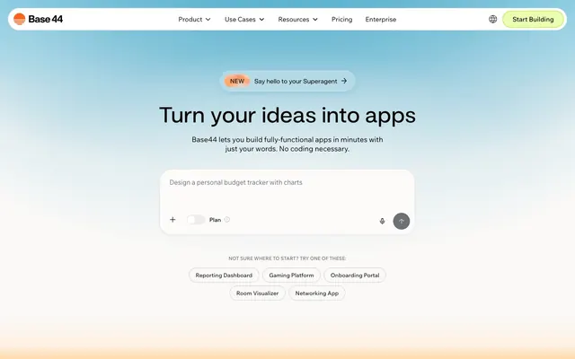
Softly Lit Gradient Canvas
Color palette
Primary action button borders, 'Start Building' button accent
Selected item background, subtle brand highlights
Decorative illustration accents, brand iconography
Hero section background
Hero section background
Outlined action button borders for prompts
Page backgrounds, subtle card surfaces
Observed in link borderColor, other backgroundColor, button borderColor. Extracted usage does not support a distinct primary control color.
Primary text, prominent headings, strong borders
Secondary text, input placeholder text, subtle borders
Dividers, subtle accent borders on cards
Muted body text, supportive captions, subtle input backgrounds
Backgrounds for decorative elements and subtle section dividers
Default button borders, light input borders
Typography
- Weights
- 400
- Sizes
- 10px, 13px, 14px
- Line height
- 1.2
- Fallback
- Arial
Small functional text like captions, utility links, and fine print. The system font choice maintains legibility at small sizes.
- Weights
- 400
- Sizes
- 22px, 24px, 34px, 51px, 55px, 56px, 63px
- Line height
- 0.9, 1, 1.07, 1.1, 1.4
- Fallback
- system-ui
Display and Major Headings — its generous letter spacing and fluid line heights give large text a soft, open presence.
- Weights
- 400
- Sizes
- 16px, 20px, 28px, 30px, 42px
- Line height
- 1, 1.2, 1.3
- Fallback
- system-ui
Section headings and content titles — slightly more structured than display text, maintaining readability without feeling dense.
- Weights
- 400, 500, 600, 700
- Sizes
- 12px, 14px, 16px, 18px
- Line height
- 1.2, 1.3, 1.4, 1.5, 1.6
- Letter spacing
- 0.1em
- Fallback
- system-ui
Body text and user input fields — consistent letter spacing across weights ensures clarity in both continuous prose and short UI labels.
- Weights
- 400
- Sizes
- 16px
- Line height
- 1.2
- Fallback
- system-ui
Navigation and button labels — a steady weight for interactive elements that need to be clear and inviting.
- Weights
- 400
- Sizes
- 10px
- Line height
- 1.2
- Fallback
- system-ui
Microcopy and specialized decorative text, offering a distinctive voice for minor elements.
- Weights
- 400
- Sizes
- 22px, 24px, 34px, 51px, 55px, 56px, 63px
- Line height
- 0.9, 1, 1.07, 1.1, 1.4
wfont_343a2a_5b4cd32fc19d46e1b8c1b142abb27d39 — detected in extracted data but not described by AI
Spacing & shape
Components
Text link using Madefor-Text at 16px, weight 400, Ink Black #000000, without explicit padding or border.
Background is Light Lime #ebffb1, border is 1px solid Lime Spritz #ade900, text is Madefor-Text at 16px weight 400 Ink Black #000000. Features a 999px border-radius for a pill shape.
Transparent background, text is Ink Black #000000, 1px border in Ash Border #cfcfcf, with 999px border-radius. Padding of 0px vertical and 16px horizontal.
White background offset from Canvas Pearl, with a 7.42183px border-radius. No box shadow evident. Padding is 0px.
Background is Snowdrift White #ffffff, text is Graphite Text #232529. Placeholder text would use Graphite Text. Has a transparent border. Padding of 15px top, 3px bottom, 10px right, 24px left.
Transparent background, text is Ink Black #000000, with a 1px border in a lightened Graphite Text rgb(15, 15, 15, 0.2). Features a 999px border-radius. Padding is 0px vertical and 16px horizontal.
Uses a solid Coral Orange '#d8723c', with Snowdrift White text, 999px border-radius, and tight internal padding.
A pill-shaped background with a distinct fill color when active (e.g. Light Lime #ebffb1), with a circular 'handle' (Snowdrift White #ffffff) that slides along its track.
A transparent background button with Ink Black #000000 text, 0px border-radius and minimal padding (8px top, 12px horizontal).
Background is Snowdrift White #ffffff, border-radius is 7.42183px, with a subtle box-shadow: rgba(34, 40, 42, 0.04) 0px 3px 10px 0px.
Guidelines
- Use Canvas Pearl #faf9f7 for primary page backgrounds to maintain an airy feel.
- Apply Snowdrift White #ffffff for card surfaces and interactive elements to create soft contrast and elevation against the canvas.
- Reserve Ink Black #000000 for primary text and headings, ensuring high readability.
- Implement Ghost Button styling with a 1px Ash Border #cfcfcf and 999px border-radius for secondary actions.
- Utilize Lime Spritz #ade900 for CTA button borders and key interactive indicators, contrasting with the soft neutrals.
- Maintain a comfortable information density using an average elementGap of 10px and sectionGap of 45px.
- Employ the 999px border-radius for all primary buttons and tags to deliver a consistent, rounded interactive experience.
- Avoid using saturated background colors for large sections; gradients should remain pastel and subtle.
- Do not use dark text colors on anything but light backgrounds to preserve contrast and system aesthetic.
- Do not introduce sharp corners on interactive elements; prefer soft rounding (999px or 9.89577px) for buttons and inputs.
- Do not apply prominent box shadows for elevation; rely on subtle background color shifts or the single rgba(34, 40, 42, 0.04) 0px 3px 10px 0px for modals.
- Avoid introducing additional vivid colors outside of Lime Spritz #ade900 and Sunset Orange #d8723c to maintain focused accents.
- Do not break the established type scale; ensure all text adheres to defined sizes, weights, and line heights for consistent rhythm.
- Avoid using complex or busy background imagery; prefer soft gradients or solid colors that allow UI elements to stand out.
About this system
ShowHide
The Base44 design system feels like a softly lit, expansive workspace, where ideas emerge clearly against a gentle, optimistic backdrop. Pastel gradients and a predominant off-white canvas create an airy, unburdened atmosphere. Subtle dark gray text and muted interactive elements ensure focus remains on content creation, while distinct, vibrant accents like lime green and vivid orange are used sparingly for key actions, adding a precise, almost signal-like pop of functionality. Rounded corners on interactive components juxtapose with the generally crisp, unadorned typography, softening the technical edge of an AI platform.
The page model is a full-bleed background, with content constrained to a central max-width (unspecified in data but implied by content alignment). The hero section features a full-viewport gradient background with a centered headline and a primary input pattern, creating an immediate focal point. Section rhythm alternates between full-bleed gradient backgrounds and solid Canvas Pearl #faf9f7 sections, clearly delineating content blocks. Content arrangement often uses centered stacks for headlines and subtext, followed by symmetrical grid layouts for suggestions or feature cards. The main navigation is a sticky top bar with text links and a distinct green pill button for the main CTA. The overall density is spacious, ensuring ample breathing room around elements.
The site largely avoids traditional photography, instead relying on UI-as-imagery presentation and abstract graphics. Product screenshots are contained within device outlines or soft-edged cards, maintaining a pristine, focused view. Icons are primarily subtle outlines (stroke-based) in Ink Black or Graphite Text, occasionally filled with a brand accent color. Decorative graphics utilize soft, multi-color gradients for atmospheric branding, never overlapping content but often serving as full-bleed background elements. Imagery is explanatory or decorative, never serving as social proof or lifestyle elements. The density is image-light, text-dominant, with visual weight primarily in UI demonstrations.
Reminiscent of Stripe, Linear, Figma, Webflow.
# Base44 — Style Reference
> Softly Lit Gradient Canvas

**Theme:** light

**Site:** https://base44.com

The Base44 design system feels like a softly lit, expansive workspace, where ideas emerge clearly against a gentle, optimistic backdrop. Pastel gradients and a predominant off-white canvas create an airy, unburdened atmosphere. Subtle dark gray text and muted interactive elements ensure focus remains on content creation, while distinct, vibrant accents like lime green and vivid orange are used sparingly for key actions, adding a precise, almost signal-like pop of functionality. Rounded corners on interactive components juxtapose with the generally crisp, unadorned typography, softening the technical edge of an AI platform.

## Tokens — Colors

| Name | Value | Token | Role |
|------|------|------|------|
| Lime Spritz | `#ade900` | `--color-lime-spritz` | Primary action button borders, 'Start Building' button accent |
| Light Lime | `#ebffb1` | `--color-light-lime` | Selected item background, subtle brand highlights |
| Blazing Orange | `#ff631f` | `--color-blazing-orange` | Decorative illustration accents, brand iconography |
| Sky Dream Gradient | `#F2F1ED` | `--color-sky-dream-gradient` | Hero section background |
| Warm Horizon Gradient | `#FBFBFB` | `--color-warm-horizon-gradient` | Hero section background |
| Sunset Orange | `#d8723c` | `--color-sunset-orange` | Outlined action button borders for prompts |
| Canvas Pearl | `#faf9f7` | `--color-canvas-pearl` | Page backgrounds, subtle card surfaces |
| Snowdrift White | `#ffffff` | `--color-snowdrift-white` | Observed in link borderColor, other backgroundColor, button borderColor. Extracted usage does not support a distinct primary control color. |
| Ink Black | `#000000` | `--color-ink-black` | Primary text, prominent headings, strong borders |
| Graphite Text | `#232529` | `--color-graphite-text` | Secondary text, input placeholder text, subtle borders |
| Slate Gray | `#324158` | `--color-slate-gray` | Dividers, subtle accent borders on cards |
| Stone Whisper | `#696f7b` | `--color-stone-whisper` | Muted body text, supportive captions, subtle input backgrounds |
| #e6e6e6 | `#e6e6e6` | `--color-e6e6e6` | Backgrounds for decorative elements and subtle section dividers |
| Ash Border | `#cfcfcf` | `--color-ash-border` | Default button borders, light input borders |

## Tokens — Typography

### Arial
- **Substitute:** Arial
- **Weights:** 400
- **Sizes:** 10px, 13px, 14px
- **Line height:** 1.2
- **Role:** Small functional text like captions, utility links, and fine print. The system font choice maintains legibility at small sizes.

### wfont_343a2a_5b4cd32fc19d46e1b8c1b142abb27d39
- **Substitute:** system-ui
- **Weights:** 400
- **Sizes:** 22px, 24px, 34px, 51px, 55px, 56px, 63px
- **Line height:** 0.9, 1, 1.07, 1.1, 1.4
- **Role:** Display and Major Headings — its generous letter spacing and fluid line heights give large text a soft, open presence.

### wfont_343a2a_4e484da66ffc4465a05a1c9ea5caf495
- **Substitute:** system-ui
- **Weights:** 400
- **Sizes:** 16px, 20px, 28px, 30px, 42px
- **Line height:** 1, 1.2, 1.3
- **Role:** Section headings and content titles — slightly more structured than display text, maintaining readability without feeling dense.

### wix-madefor-text-v2
- **Substitute:** system-ui
- **Weights:** 400, 500, 600, 700
- **Sizes:** 12px, 14px, 16px, 18px
- **Line height:** 1.2, 1.3, 1.4, 1.5, 1.6
- **Letter spacing:** 0.1em
- **Role:** Body text and user input fields — consistent letter spacing across weights ensures clarity in both continuous prose and short UI labels.

### Madefor-Text
- **Substitute:** system-ui
- **Weights:** 400
- **Sizes:** 16px
- **Line height:** 1.2
- **Role:** Navigation and button labels — a steady weight for interactive elements that need to be clear and inviting.

### Madefor-Display
- **Substitute:** system-ui
- **Weights:** 400
- **Sizes:** 10px
- **Line height:** 1.2
- **Role:** Microcopy and specialized decorative text, offering a distinctive voice for minor elements.

### wfont_343a2a_5b4cd32fc19d46e1b8c1b142abb27d39
- **Weights:** 400
- **Sizes:** 22px, 24px, 34px, 51px, 55px, 56px, 63px
- **Line height:** 0.9, 1, 1.07, 1.1, 1.4
- **Role:** wfont_343a2a_5b4cd32fc19d46e1b8c1b142abb27d39 — detected in extracted data but not described by AI

## Tokens — Type Scale

Augmented Fourth (1.414) from 14px base.

| Role | Size | Line height | Letter spacing |
|------|------|------|------|
| caption | 10px | 1.2 | — |
| body | 14px | 1.2 | 0.1px |
| heading-sm | 20px | 1.2 | — |
| heading | 28px | 1.3 | — |
| heading-lg | 42px | 1.3 | — |
| display | 56px | 1.07 | — |

## Tokens — Spacing

- **Section gap:** 45px
- **Card padding:** 40px
- **Element gap:** 10px

## Tokens — Radius

- **Default:** 9.89577px
- **Buttons:** 999px
- **Cards:** 7.42183px
- **compact-buttons:** 300px
- **decorative-large:** 741.445px
- **prominent-elements:** 13.8541px
- **small:** 3px

## Layout

The page model is a full-bleed background, with content constrained to a central max-width (unspecified in data but implied by content alignment). The hero section features a full-viewport gradient background with a centered headline and a primary input pattern, creating an immediate focal point. Section rhythm alternates between full-bleed gradient backgrounds and solid Canvas Pearl #faf9f7 sections, clearly delineating content blocks. Content arrangement often uses centered stacks for headlines and subtext, followed by symmetrical grid layouts for suggestions or feature cards. The main navigation is a sticky top bar with text links and a distinct green pill button for the main CTA. The overall density is spacious, ensuring ample breathing room around elements.

## Imagery

The site largely avoids traditional photography, instead relying on UI-as-imagery presentation and abstract graphics. Product screenshots are contained within device outlines or soft-edged cards, maintaining a pristine, focused view. Icons are primarily subtle outlines (stroke-based) in Ink Black or Graphite Text, occasionally filled with a brand accent color. Decorative graphics utilize soft, multi-color gradients for atmospheric branding, never overlapping content but often serving as full-bleed background elements. Imagery is explanatory or decorative, never serving as social proof or lifestyle elements. The density is image-light, text-dominant, with visual weight primarily in UI demonstrations.

## Components

### Hero Input with Suggestion Pills

### Feature Section Card

### Button Group + CTA Variants

### Primary Navigation Link
*Interactive element*

Text link using Madefor-Text at 16px, weight 400, Ink Black #000000, without explicit padding or border.

### Header CTA Button
*Primary Call to Action*

Background is Light Lime #ebffb1, border is 1px solid Lime Spritz #ade900, text is Madefor-Text at 16px weight 400 Ink Black #000000. Features a 999px border-radius for a pill shape.

### Ghost Button
*Secondary action*

Transparent background, text is Ink Black #000000, 1px border in Ash Border #cfcfcf, with 999px border-radius. Padding of 0px vertical and 16px horizontal.

### Feature Card
*Content container*

White background offset from Canvas Pearl, with a 7.42183px border-radius. No box shadow evident. Padding is 0px.

### Input Field
*Data entry*

Background is Snowdrift White #ffffff, text is Graphite Text #232529. Placeholder text would use Graphite Text. Has a transparent border. Padding of 15px top, 3px bottom, 10px right, 24px left.

### Suggestion Pill Button
*Interactive filter/suggestion*

Transparent background, text is Ink Black #000000, with a 1px border in a lightened Graphite Text rgb(15, 15, 15, 0.2). Features a 999px border-radius. Padding is 0px vertical and 16px horizontal.

### New Feature Tag
*Informational label*

Uses a solid Coral Orange '#d8723c', with Snowdrift White text, 999px border-radius, and tight internal padding.

### Toggle Switch
*Binary control*

A pill-shaped background with a distinct fill color when active (e.g. Light Lime #ebffb1), with a circular 'handle' (Snowdrift White #ffffff) that slides along its track.

### Text Input Button
*Secondary Call to Action*

A transparent background button with Ink Black #000000 text, 0px border-radius and minimal padding (8px top, 12px horizontal).

### Modal Card
*Overlay content*

Background is Snowdrift White #ffffff, border-radius is 7.42183px, with a subtle box-shadow: rgba(34, 40, 42, 0.04) 0px 3px 10px 0px.

## Guidelines

### Do

- Use Canvas Pearl #faf9f7 for primary page backgrounds to maintain an airy feel.
- Apply Snowdrift White #ffffff for card surfaces and interactive elements to create soft contrast and elevation against the canvas.
- Reserve Ink Black #000000 for primary text and headings, ensuring high readability.
- Implement Ghost Button styling with a 1px Ash Border #cfcfcf and 999px border-radius for secondary actions.
- Utilize Lime Spritz #ade900 for CTA button borders and key interactive indicators, contrasting with the soft neutrals.
- Maintain a comfortable information density using an average elementGap of 10px and sectionGap of 45px.
- Employ the 999px border-radius for all primary buttons and tags to deliver a consistent, rounded interactive experience.

### Don't

- Avoid using saturated background colors for large sections; gradients should remain pastel and subtle.
- Do not use dark text colors on anything but light backgrounds to preserve contrast and system aesthetic.
- Do not introduce sharp corners on interactive elements; prefer soft rounding (999px or 9.89577px) for buttons and inputs.
- Do not apply prominent box shadows for elevation; rely on subtle background color shifts or the single rgba(34, 40, 42, 0.04) 0px 3px 10px 0px for modals.
- Avoid introducing additional vivid colors outside of Lime Spritz #ade900 and Sunset Orange #d8723c to maintain focused accents.
- Do not break the established type scale; ensure all text adheres to defined sizes, weights, and line heights for consistent rhythm.
- Avoid using complex or busy background imagery; prefer soft gradients or solid colors that allow UI elements to stand out.

## Agent Prompt Guide

Quick Color Reference:
- text: #000000
- background: #faf9f7
- border: #cfcfcf
- accent: #ade900
- primary action: #ebffb1 (filled action)

Example Component Prompts:
1. Create a Primary Action Button: #ebffb1 background, #000000 text, 9999px radius, compact pill padding. Use this filled treatment for the main CTA.
2. Develop a Header CTA Button: background Light Lime #ebffb1, border 1px solid Lime Spritz #ade900, text 'Start Building' using Madefor-Text at 16px weight 400, Ink Black #000000. Apply a 999px border-radius. Padding 0px vertical, 16px horizontal.
3. Design an Input Field: background Snowdrift White #ffffff, text Graphite Text #232529. Border is transparent. Padding 15px top, 3px bottom, 10px right, 24px left.
4. Construct a Feature Card: background Snowdrift White #ffffff, border-radius 7.42183px. No box shadow. Padding 0px.
More like this




Keep what you find
A free account saves references to boards and can send you a weekly email of picks based on what you save.
To see every result, go Pro.