Preview image. Unlock full-res
gallery on black velvet
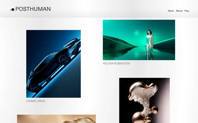
Posthuman presents a stark, high-contrast digital canvas, emphasizing bold typography and rich imagery. The visual system leverages pure black backgrounds and a limited grayscale palette to make product and art photography stand out. Subtle motion and interaction provide a sense of refined professionalism without detracting from the visual content. Prioritize image content: Most of the page should be dedicated to high-quality, full-bleed imagery, allowing generous space around product visuals. Use pure black for backgrounds: All primary page backgrounds and image surrounds should be Absolute Zero (#000000) to create maximum contrast and focus on visuals. Employ Diatype Variable for headlines and navigation: Use Diatype Variable at 40px for prominent headlines and 18px for navigation links, maintaining consistent weight 400. Employ Arizona Sans Variable for image captions: Use Arizona Sans Variable at 20px, weight 215, for all descriptive text related to imagery. Maintain strict spacing: Use 20px for vertical gaps between visual elements and 49px for internal padding within implicit card structures. Keep all corners sharp: Employ a 0px border-radius for all visual elements, including images and any implied card borders. Avoid decorative borders or shadows: Components should rely on content boundaries rather than explicit borders or drop shadows to define their space. Do not introduce additional background colors unless specifically for a highlighted section: All backgrounds should be variations of black or the neutral Fog Canvas (#c9c9c9). Refrain from using heavily stylized buttons: Interactive elements should be subtle text links or ghost-like outlines, not filled chromatic buttons. Do not add additional icons or graphical elements without strict justification: The focus is on photography/renderings, not illustrative UI elements. Do not deviate from the specified font families, weights, and sizes: The typographic hierarchy is minimalist and precise. Avoid complex gradients or overlaid textures: Maintain a flat, dark canvas to highlight imagery.