Preview image. Unlock full-res
Deep space console: focused intensity.
Color palette
Call-to-action text, primary interactive element highlights, success states.
Call-to-action button backgrounds when paired with Terminal Green text, active indicators.
Decorative hero background accent, draws focus to key sections.
Subtle background glow for featured content blocks.
Hyperlinks, secondary interactive text.
Border accents for specialized cards or highlight elements.
Primary page background, default text color on light elements.
Card backgrounds, section dividers, slightly elevated surfaces.
Button backgrounds, form inputs, secondary content containers.
Border colors, subtle dividers, inactive states.
Secondary text, subtle icon fill, placeholder text.
Primary text on dark backgrounds, active states for text and icons.
Alerts or error states, used sparingly for emphasis.
Typography
- Weights
- 400, 500, 600, 700
- Sizes
- 14px, 16px, 18px, 20px, 36px, 48px, 60px
- Line height
- 1, 1.11, 1.38, 1.4, 1.5
- Letter spacing
- -0.0250em
- Fallback
- Segoe UI, sans-serif
Headlines and prominent display text. The tight letter-spacing gives a modern, compressed feel, making large text feel sharp and precise.
- Weights
- 400, 500, 600, 700
- Sizes
- 10px, 12px, 14px, 15px, 16px, 18px, 20px
- Line height
- 1, 1.33, 1.4, 1.43, 1.5, 1.56, 1.63
- Letter spacing
- 0.0250em
- Fallback
- Roboto, Arial, sans-serif
Body copy, navigation, buttons, and most UI elements. The slightly expanded letter-spacing provides excellent readability on dark backgrounds.
- Weights
- 400
- Sizes
- 14px, 18px
- Line height
- 1.43, 1.56
- Fallback
- SFMono-Regular, monospace
Code snippets, technical details, and specific data displays. Its monospace nature ensures alignment for structured information.
Spacing & shape
Elevation
Components
Filled button for primary actions. Background `Canopy Green` (#366740), text `Terminal Green` (#71d083), border `Canopy Green` (#366740). Rounded corners at 10px.
Ghost button with `Carbon Black` (#04040b) background, `Snow Drift` (#eeeef0) text, and `Storm Gray` (#3c393f) border. Rounded corners at 6px. Padding: 16px vertical, 16px horizontal.
Transparent background button (`rgba(0, 0, 0, 0)`), `Cloud Burst` (#b5b2bc) text, no visible border (`oklch(0.922 0 0)`). Radius 4px. Padding: 8px vertical, 12px horizontal.
Minimal button for navigation. Background `Ash Gray` (#323035), text `Snow Drift` (#eeeef0), no explicit border. Sharp corners (0px radius). Padding: 20px all sides. Used in header/footer.
Card with `Night Sky` (#121113) background, a subtle inset shadow (`rgba(255, 255, 255, 0.06) 0px 1px 0px 0px inset`), and `Ash Gray` (#323035) border. 6px border radius. Internal padding likely 16px.
Small, informative badge with `Canopy Green` (#366740) background, `Terminal Green` (#71d083) text, and `Storm Gray` (#3c393f) border. Rounded corners at 10px. Padding 12px vertical, 16px horizontal for text `Red Hat Text Variable` 16px.
Uses `Red Hat Display Variable` at 60px size, weights 600 or 700, with `Snow Drift` (#eeeef0) color and tight letter-spacing -0.0250em.
Uses `Red Hat Display Variable` at 36px size, weights 400 or 500, with `Snow Drift` (#eeeef0) color and tight letter-spacing -0.0250em.
Guidelines
- Use `Carbon Black` (#04040b) for primary page backgrounds to maintain a consistent dark theme.
- Apply `Canopy Green` (#366740) for all primary call-to-action button backgrounds, paired with `Terminal Green` (#71d083) text.
- Implement 6px border radius as the default for most interface elements, with 10px used for key interactive elements like primary buttons.
- Ensure `Red Hat Text Variable` with 0.0250em letter-spacing is used for all body text and secondary UI elements for optimal legibility.
- Maintain a clear visual hierarchy using `Red Hat Display Variable` for headlines, particularly with its tight -0.0250em letter-spacing to distinguish it from body copy.
- Utilize `Ash Gray` (#323035) for button backgrounds and secondary content blocks to create subtle elevation on dark surfaces.
- Avoid using bright, high-saturation colors for large background areas; colors like `Terminal Green` (#71d083) are strictly for accents and interactive elements.
- Do not deviate from the specified letter-spacing values across `Red Hat Display Variable` and `Red Hat Text Variable` as they are integral to the system's character.
- Avoid excessive use of shadows; the system relies on layer colors (`Night Sky`, `Ash Gray`) and subtle inset shadows for depth.
- Do not introduce new typefaces; `Red Hat Display`, `Red Hat Text`, and `Red Hat Mono` are the only approved families.
- Refrain from using color in body text that does not meet the specified `Snow Drift` (#eeeef0) or `Cloud Burst` (#b5b2bc) for readability against dark backgrounds.
- Do not use generic square or fully rounded (pill) shapes; adhere to the 6px and 10px radii for a consistent, structured appearance.
About this system
ShowHide
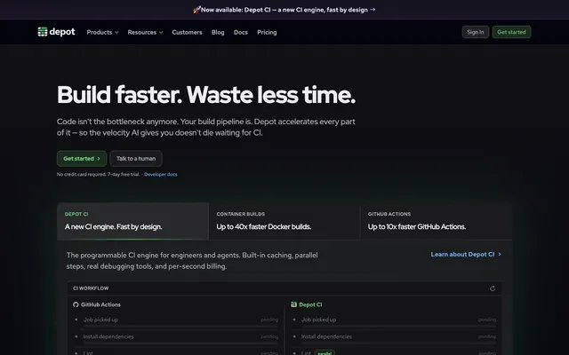
Depot’s aesthetic is a high-contrast dark mode, evoking a command center's precision. Deep, near-black backgrounds frame content, punctuated by vivid green accents that immediately draw the eye to critical interactive elements. A subtle progression of dark grays creates layered surfaces, adding depth and structure without reliance on heavy shadows. The overall impression is one of efficiency and focused power without distraction, like a purpose-built tool designed for speed.
The layout is predominantly full-bleed dark, with content constrained within a centered max-width, though the exact `pageMaxWidth` is not explicitly defined it appears to allow generous negative space. The hero section features a centered headline over a dark background, with clear calls to action below. Sections are visually distinct, often with solid color backgrounds for separation, like the alternating `Night Sky` (#121113) and `Carbon Black` (#04040b) sections. Content is frequently arranged in two-column layouts, with text and descriptions on one side and a visual (code example, product screenshot, or illustration) on the other. A structured card grid appears for feature showcases. The navigation is a sticky top bar, providing persistent access to key links.
This design primarily uses product screenshots and brand-colored illustrations. Product screenshots are typically contained within card-like structures, showing UI elements and code, often with a subtle `Terminal Green` (#71d083) highlight to draw attention to key features. Illustrations are flat, geometric, and follow the brand's green and dark gray palette, used decoratively to break up sections or emphasize concepts, rather than depicting real-world scenarios. Small, mono-color icons, usually `Snow Drift` (#eeeef0) or `Terminal Green` (#71d083), are extensively used to denote features, actions, and navigation elements. The overall density of imagery is balanced, supporting the text-heavy technical content without overwhelming it, acting as visual cues rather than dominant storytelling elements.
Reminiscent of Vercel, GitHub, Linear.
# Depot — Style Reference
> Deep space console: focused intensity.

**Theme:** dark

**Site:** https://depot.dev

Depot’s aesthetic is a high-contrast dark mode, evoking a command center's precision. Deep, near-black backgrounds frame content, punctuated by vivid green accents that immediately draw the eye to critical interactive elements. A subtle progression of dark grays creates layered surfaces, adding depth and structure without reliance on heavy shadows. The overall impression is one of efficiency and focused power without distraction, like a purpose-built tool designed for speed.

## Tokens — Colors

| Name | Value | Token | Role |
|------|------|------|------|
| Terminal Green | `#71d083` | `--color-terminal-green` | Call-to-action text, primary interactive element highlights, success states. |
| Canopy Green | `#366740` | `--color-canopy-green` | Call-to-action button backgrounds when paired with Terminal Green text, active indicators. |
| Green Burst Gradient | `#46a758` | `--color-green-burst-gradient` | Decorative hero background accent, draws focus to key sections. |
| Radial Glow Gradient | `#64c878` | `--color-radial-glow-gradient` | Subtle background glow for featured content blocks. |
| Link Blue | `#70b8ff` | `--color-link-blue` | Hyperlinks, secondary interactive text. |
| Twilight Purple | `#473876` | `--color-twilight-purple` | Border accents for specialized cards or highlight elements. |
| Carbon Black | `#04040b` | `--color-carbon-black` | Primary page background, default text color on light elements. |
| Night Sky | `#121113` | `--color-night-sky` | Card backgrounds, section dividers, slightly elevated surfaces. |
| Ash Gray | `#323035` | `--color-ash-gray` | Button backgrounds, form inputs, secondary content containers. |
| Storm Gray | `#3c393f` | `--color-storm-gray` | Border colors, subtle dividers, inactive states. |
| Cloud Burst | `#b5b2bc` | `--color-cloud-burst` | Secondary text, subtle icon fill, placeholder text. |
| Snow Drift | `#eeeef0` | `--color-snow-drift` | Primary text on dark backgrounds, active states for text and icons. |
| Crimson Spark | `#ff9592` | `--color-crimson-spark` | Alerts or error states, used sparingly for emphasis. |

## Tokens — Typography

### Red Hat Display Variable
- **Substitute:** Segoe UI, sans-serif
- **Weights:** 400, 500, 600, 700
- **Sizes:** 14px, 16px, 18px, 20px, 36px, 48px, 60px
- **Line height:** 1, 1.11, 1.38, 1.4, 1.5
- **Letter spacing:** -0.0250em
- **Role:** Headlines and prominent display text. The tight letter-spacing gives a modern, compressed feel, making large text feel sharp and precise.

### Red Hat Text Variable
- **Substitute:** Roboto, Arial, sans-serif
- **Weights:** 400, 500, 600, 700
- **Sizes:** 10px, 12px, 14px, 15px, 16px, 18px, 20px
- **Line height:** 1, 1.33, 1.4, 1.43, 1.5, 1.56, 1.63
- **Letter spacing:** 0.0250em
- **Role:** Body copy, navigation, buttons, and most UI elements. The slightly expanded letter-spacing provides excellent readability on dark backgrounds.

### Red Hat Mono Variable
- **Substitute:** SFMono-Regular, monospace
- **Weights:** 400
- **Sizes:** 14px, 18px
- **Line height:** 1.43, 1.56
- **Role:** Code snippets, technical details, and specific data displays. Its monospace nature ensures alignment for structured information.

## Tokens — Type Scale

| Role | Size | Line height | Letter spacing |
|------|------|------|------|
| caption | 10px | 1.5 | 0.25px |
| body | 14px | 1.43 | 0.35px |
| heading | 20px | 1.33 | -0.5px |
| heading-lg | 36px | 1.11 | -0.9px |
| display | 60px | 1 | -1.5px |

## Tokens — Spacing

- **Section gap:** 64px
- **Card padding:** 16px
- **Element gap:** 8px

## Tokens — Radius

- **Default:** 6px
- **Buttons:** 6px
- **Cards:** 6px
- **interactiveElements:** 10px
- **smallElements:** 2px

## Tokens — Elevation

- **Feature Card:** `rgba(255, 255, 255, 0.06) 0px 1px 0px 0px inset`

## Layout

The layout is predominantly full-bleed dark, with content constrained within a centered max-width, though the exact `pageMaxWidth` is not explicitly defined it appears to allow generous negative space. The hero section features a centered headline over a dark background, with clear calls to action below. Sections are visually distinct, often with solid color backgrounds for separation, like the alternating `Night Sky` (#121113) and `Carbon Black` (#04040b) sections. Content is frequently arranged in two-column layouts, with text and descriptions on one side and a visual (code example, product screenshot, or illustration) on the other. A structured card grid appears for feature showcases. The navigation is a sticky top bar, providing persistent access to key links.

## Imagery

This design primarily uses product screenshots and brand-colored illustrations. Product screenshots are typically contained within card-like structures, showing UI elements and code, often with a subtle `Terminal Green` (#71d083) highlight to draw attention to key features. Illustrations are flat, geometric, and follow the brand's green and dark gray palette, used decoratively to break up sections or emphasize concepts, rather than depicting real-world scenarios. Small, mono-color icons, usually `Snow Drift` (#eeeef0) or `Terminal Green` (#71d083), are extensively used to denote features, actions, and navigation elements. The overall density of imagery is balanced, supporting the text-heavy technical content without overwhelming it, acting as visual cues rather than dominant storytelling elements.

## Components

### CTA Button Group

### Product Tab Selector Cards

### Announcement Banner + Highlight Badge

### Primary Action Button
*Call to action*

Filled button for primary actions. Background `Canopy Green` (#366740), text `Terminal Green` (#71d083), border `Canopy Green` (#366740). Rounded corners at 10px.

### Secondary Action Button
*Secondary call to action*

Ghost button with `Carbon Black` (#04040b) background, `Snow Drift` (#eeeef0) text, and `Storm Gray` (#3c393f) border. Rounded corners at 6px. Padding: 16px vertical, 16px horizontal.

### Tertiary Ghost Button
*Mildly emphasized action*

Transparent background button (`rgba(0, 0, 0, 0)`), `Cloud Burst` (#b5b2bc) text, no visible border (`oklch(0.922 0 0)`). Radius 4px. Padding: 8px vertical, 12px horizontal.

### Navigation Link Button
*Navigation and internal links*

Minimal button for navigation. Background `Ash Gray` (#323035), text `Snow Drift` (#eeeef0), no explicit border. Sharp corners (0px radius). Padding: 20px all sides. Used in header/footer.

### Feature Card
*Content grouping*

Card with `Night Sky` (#121113) background, a subtle inset shadow (`rgba(255, 255, 255, 0.06) 0px 1px 0px 0px inset`), and `Ash Gray` (#323035) border. 6px border radius. Internal padding likely 16px.

### Highlight Badge
*Small, informative label*

Small, informative badge with `Canopy Green` (#366740) background, `Terminal Green` (#71d083) text, and `Storm Gray` (#3c393f) border. Rounded corners at 10px. Padding 12px vertical, 16px horizontal for text `Red Hat Text Variable` 16px.

### Hero Headline
*Primary page title*

Uses `Red Hat Display Variable` at 60px size, weights 600 or 700, with `Snow Drift` (#eeeef0) color and tight letter-spacing -0.0250em.

### Secondary Headline
*Section titles*

Uses `Red Hat Display Variable` at 36px size, weights 400 or 500, with `Snow Drift` (#eeeef0) color and tight letter-spacing -0.0250em.

## Guidelines

### Do

- Use `Carbon Black` (#04040b) for primary page backgrounds to maintain a consistent dark theme.
- Apply `Canopy Green` (#366740) for all primary call-to-action button backgrounds, paired with `Terminal Green` (#71d083) text.
- Implement 6px border radius as the default for most interface elements, with 10px used for key interactive elements like primary buttons.
- Ensure `Red Hat Text Variable` with 0.0250em letter-spacing is used for all body text and secondary UI elements for optimal legibility.
- Maintain a clear visual hierarchy using `Red Hat Display Variable` for headlines, particularly with its tight -0.0250em letter-spacing to distinguish it from body copy.
- Utilize `Ash Gray` (#323035) for button backgrounds and secondary content blocks to create subtle elevation on dark surfaces.

### Don't

- Avoid using bright, high-saturation colors for large background areas; colors like `Terminal Green` (#71d083) are strictly for accents and interactive elements.
- Do not deviate from the specified letter-spacing values across `Red Hat Display Variable` and `Red Hat Text Variable` as they are integral to the system's character.
- Avoid excessive use of shadows; the system relies on layer colors (`Night Sky`, `Ash Gray`) and subtle inset shadows for depth.
- Do not introduce new typefaces; `Red Hat Display`, `Red Hat Text`, and `Red Hat Mono` are the only approved families.
- Refrain from using color in body text that does not meet the specified `Snow Drift` (#eeeef0) or `Cloud Burst` (#b5b2bc) for readability against dark backgrounds.
- Do not use generic square or fully rounded (pill) shapes; adhere to the 6px and 10px radii for a consistent, structured appearance.

## Agent Prompt Guide

### Quick Color Reference
- Text: `#eeeef0` (Snow Drift)
- Background: `#04040b` (Carbon Black)
- CTA Background: `#366740` (Canopy Green)
- CTA Text: `#71d083` (Terminal Green)
- Border: `#3c393f` (Storm Gray)
- Secondary Text: `#b5b2bc` (Cloud Burst)

### 3-5 Example Component Prompts
1. **Create a Hero Section**: Background `Carbon Black` (#04040b). Headline: 'Build faster. Waste less time.' using `Red Hat Display Variable` at 60px, weight 700, color `Snow Drift` (#eeeef0), letter-spacing -1.5px. Below, a `Primary Action Button` with text 'Get started'.
2. **Generate a Feature Card**: Background `Night Sky` (#121113), with a `Storm Gray` (#3c393f) border and 6px border-radius. Include a subtle inset shadow: `rgba(255, 255, 255, 0.06) 0px 1px 0px 0px inset`. Content text should use `Snow Drift` (#eeeef0) with `Red Hat Text Variable` 16px, letter-spacing 0.4px.
3. **Design a Navigation Bar**: Background same as page, `Carbon Black` (#04040b). Navigation links use `Cloud Burst` (#b5b2bc) text (e.g., 'Products', 'Resources'), `Red Hat Text Variable` 16px. Include two right-aligned buttons: a `Navigation Link Button` for 'Sign In' and a `Primary Action Button` for 'Get started'.
4. **Display a Code Block**: Background `Night Sky` (#121113), text `Cloud Burst` (#b5b2bc), using `Red Hat Mono Variable` 14px. Ensure code line spacing is 1.43, with no letter-spacing. Use 6px border-radius for the block.
More like this






Keep what you find
A free account saves references to boards and can send you a weekly email of picks based on what you save.
To see every result, go Pro.