Preview image. Unlock full-res
Dark Terminal, Electric Green
Color palette
Green action color for filled buttons, selected navigation states, and focused conversion moments
Page backgrounds, card surfaces, table headers for a deep dark aesthetic
Hairline borders, subtle dividers, inactive input outlines — providing separation on dark surfaces
Secondary borders for buttons and UI elements, slightly darker than Graphite
Muted secondary text, placeholder text — receding into the dark background
Subtle text variant, slightly softer than pure white for minor details
Primary text, critical UI elements, active states, and elements that need to pop against dark backgrounds
Text for specific UI elements, icon fills — providing maximum contrast
Dark borders and separators for elevated surfaces and inverted UI. Do not promote it to the primary CTA color
Typography
- Weights
- 400, 500
- Sizes
- 14px, 18px, 24px, 28px
- Line height
- 1.17, 1.29, 1.33, 1.43
- Letter spacing
- normal
- Fallback
- Outfit, Poppins
Headings and primary text that needs to stand out. Its slightly geometric structure provides a modern, confident tone.
- Weights
- 400, 500
- Sizes
- 10px, 12px, 14px, 18px, 24px
- Line height
- 1, 1.17, 1.33, 1.4, 1.43
- Letter spacing
- normal
- Fallback
- IBM Plex Mono, Fira Code
Monospace for data display, code snippets, and structured information where precise alignment and a technical feel are desired.
Spacing & shape
Elevation
Components
Transparent background, White text, Graphite border at 9999px radius (pill shape). Padding is minimal, e.g., 12px horizontal.
Transparent background, White text, no border, 0px radius. Used for inline actions or navigation within sections. Padding 12px horizontal, 16px vertical.
Transparent background, White text, Graphite border at 4px radius, providing a slightly rounded rectangular shape. Minimal padding.
Slightly opaque background (rgba(255, 255, 255, 0.06)), White text, Graphite border at 9999px radius. Used to indicate active selection in filters.
Cadmium Green background, Black text, 9999px radius. High contrast to immediately draw attention. Example padding 12px horizontal, 4px vertical (derived from 'Login' button).
Rich Black background, 12px border radius, no box-shadow. Contains images and text, with 0px padding as content often bleeds to edges.
Transparent background, White text, Graphite border at 6px radius. Placeholder text in Silver Text. Padding 12px vertical.
Rich Black background, no border radius. Alternating background slight variations (not explicitly detected but typical in tables) and Graphite dividers between rows. Font uses Geist Mono for data.
Guidelines
- Prioritize Rich Black (#0a0a0a) for all primary backgrounds and card surfaces to maintain the deep, dark aesthetic.
- Use Cadmium Green (#faff00) exclusively for primary calls-to-action, active states, and critical indicators, making it pop against the dark UI.
- Apply Geist Mono for all data-driven elements, tables, and numeric displays to convey a technical, precise feel.
- Utilize 9999px border radius for all interactive buttons and tags to create a consistent 'pill' shape.
- Maintain subtle visual hierarchy with Graphite (#27272a) for hairline borders and inactive outlines.
- Use 8px as the default element gap for consistent spacing between interactive components and text blocks.
- Ensure headings always use the Tomorrow font family to provide visual distinction from technical data.
- Avoid using bright or overly saturated colors other than Cadmium Green (#faff00) to preserve the stark dark theme.
- Do not introduce strong drop shadows; rely on subtle borders and slight background opacity changes for depth.
- Refrain from using mixed fonts for single pieces of information; stick to Geist Mono for data and Tomorrow for headings/primary text.
- Do not deviate from the established border radii (6px, 12px, 9999px); avoid arbitrary rounding.
- Never use White (#ffffff) as a background for entire sections; reserve it for text and critical UI contrast.
- Avoid large, expansive padding within cards; content should feel relatively compact and framed by borders.
- Do not use generic gray tones for borders where Graphite (#27272a) or Ash Gray (#3b3b3b) are specified.
About this system
ShowHide
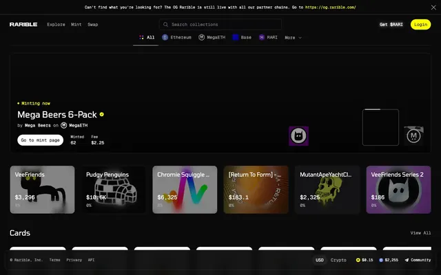
Rarible presents a command center aesthetic: a dark canvas with sharp geometric cards and a singular vivid green accent. Typography is compact and precise, using a monospace family for detail and a clean sans-serif for headlines. Bordered elements and subtle elevation provide structure without visual clutter, creating a focused environment for digital asset trading. The dominant visual language emphasizes technicality and functional clarity over rich ornamentation.
The page uses a full-bleed structure for the main content area, with elements extending to the edges of the viewport horizontally. The hero section is dark and centered. Content is organized into distinct, vertically stacked sections, separated by consistent 32px section gaps. Within these sections, a columnar grid system is evident, particularly for feature cards, often 3-4 columns wide. Text and UI elements tend to be left-aligned or centered within their containers, avoiding complex asymmetric compositions. The layout prioritizes an information-dense, yet organized, presentation, complemented by a sticky top navigation bar and a persistent footer.
The site's imagery is primarily composed of diverse NFT art, often presented within structured cards. These visuals range from cartoonish characters to abstract designs, with no consistent color treatment or photographic style. They are always contained within boundaries, either sharp 6px rectangles or slightly rounded 12px cards, and serve as direct content rather than decorative atmosphere. Icons are filled, mono-color, and often use the Cadmium Green accent or White, maintaining a minimalist appearance. There's an absence of lifestyle photography or complex illustrations, emphasizing that the NFTs themselves are the primary visual content.
Reminiscent of OpenSea, Coinbase Wallet, Etherscan, Uniswap.
# Rarible — Style Reference
> Dark Terminal, Electric Green

**Theme:** dark

**Site:** https://rarible.com

Rarible presents a command center aesthetic: a dark canvas with sharp geometric cards and a singular vivid green accent. Typography is compact and precise, using a monospace family for detail and a clean sans-serif for headlines. Bordered elements and subtle elevation provide structure without visual clutter, creating a focused environment for digital asset trading. The dominant visual language emphasizes technicality and functional clarity over rich ornamentation.

## Tokens — Colors

| Name | Value | Token | Role |
|------|------|------|------|
| Cadmium Green | `#faff00` | `--color-cadmium-green` | Green action color for filled buttons, selected navigation states, and focused conversion moments |
| Rich Black | `#0a0a0a` | `--color-rich-black` | Page backgrounds, card surfaces, table headers for a deep dark aesthetic |
| Graphite | `#27272a` | `--color-graphite` | Hairline borders, subtle dividers, inactive input outlines — providing separation on dark surfaces |
| Ash Gray | `#3b3b3b` | `--color-ash-gray` | Secondary borders for buttons and UI elements, slightly darker than Graphite |
| Silver Text | `#9d9d9d` | `--color-silver-text` | Muted secondary text, placeholder text — receding into the dark background |
| Off White | `#cecece` | `--color-off-white` | Subtle text variant, slightly softer than pure white for minor details |
| White | `#ffffff` | `--color-white` | Primary text, critical UI elements, active states, and elements that need to pop against dark backgrounds |
| True Black | `#000000` | `--color-true-black` | Text for specific UI elements, icon fills — providing maximum contrast |
| Dark Granite | `#18181b` | `--color-dark-granite` | Dark borders and separators for elevated surfaces and inverted UI. Do not promote it to the primary CTA color |

## Tokens — Typography

### Tomorrow
- **Substitute:** Outfit, Poppins
- **Weights:** 400, 500
- **Sizes:** 14px, 18px, 24px, 28px
- **Line height:** 1.17, 1.29, 1.33, 1.43
- **Letter spacing:** normal
- **Role:** Headings and primary text that needs to stand out. Its slightly geometric structure provides a modern, confident tone.

### Geist Mono
- **Substitute:** IBM Plex Mono, Fira Code
- **Weights:** 400, 500
- **Sizes:** 10px, 12px, 14px, 18px, 24px
- **Line height:** 1, 1.17, 1.33, 1.4, 1.43
- **Letter spacing:** normal
- **Role:** Monospace for data display, code snippets, and structured information where precise alignment and a technical feel are desired.

## Tokens — Type Scale

| Role | Size | Line height | Letter spacing |
|------|------|------|------|
| caption | 10px | 1.43 | — |
| body | 14px | 1.43 | — |
| subheading | 18px | 1.29 | — |
| heading | 24px | 1.17 | — |
| display | 28px | 1.33 | — |

## Tokens — Spacing

- **Section gap:** 32px
- **Card padding:** 16px
- **Element gap:** 8px

## Tokens — Radius

- **Default:** 6px
- **Buttons:** 9999px
- **Cards:** 12px

## Tokens — Elevation

- **Input:** `rgba(0, 0, 0, 0.05) 0px 1px 2px 0px`
- **Button:** `rgba(0, 0, 0, 0.05) 0px 1px 2px 0px`

## Layout

The page uses a full-bleed structure for the main content area, with elements extending to the edges of the viewport horizontally. The hero section is dark and centered. Content is organized into distinct, vertically stacked sections, separated by consistent 32px section gaps. Within these sections, a columnar grid system is evident, particularly for feature cards, often 3-4 columns wide. Text and UI elements tend to be left-aligned or centered within their containers, avoiding complex asymmetric compositions. The layout prioritizes an information-dense, yet organized, presentation, complemented by a sticky top navigation bar and a persistent footer.

## Imagery

The site's imagery is primarily composed of diverse NFT art, often presented within structured cards. These visuals range from cartoonish characters to abstract designs, with no consistent color treatment or photographic style. They are always contained within boundaries, either sharp 6px rectangles or slightly rounded 12px cards, and serve as direct content rather than decorative atmosphere. Icons are filled, mono-color, and often use the Cadmium Green accent or White, maintaining a minimalist appearance. There's an absence of lifestyle photography or complex illustrations, emphasizing that the NFTs themselves are the primary visual content.

## Components

### Pill Ghost Button
*Secondary action or filter button*

Transparent background, White text, Graphite border at 9999px radius (pill shape). Padding is minimal, e.g., 12px horizontal.

### Outline Text Button
*Tertiary action or navigation link*

Transparent background, White text, no border, 0px radius. Used for inline actions or navigation within sections. Padding 12px horizontal, 16px vertical.

### Outline Rectangular Button
*Filter or category selection*

Transparent background, White text, Graphite border at 4px radius, providing a slightly rounded rectangular shape. Minimal padding.

### Filled Filter Button
*Active filter or selection*

Slightly opaque background (rgba(255, 255, 255, 0.06)), White text, Graphite border at 9999px radius. Used to indicate active selection in filters.

### Primary Action Button
*Prominent action button (Login, Get $RARI)*

Cadmium Green background, Black text, 9999px radius. High contrast to immediately draw attention. Example padding 12px horizontal, 4px vertical (derived from 'Login' button).

### NFT Collection Card
*Display individual NFT collections or items*

Rich Black background, 12px border radius, no box-shadow. Contains images and text, with 0px padding as content often bleeds to edges.

### Search Input
*Main search functionality*

Transparent background, White text, Graphite border at 6px radius. Placeholder text in Silver Text. Padding 12px vertical.

### Table Row
*Display data in tabular format*

Rich Black background, no border radius. Alternating background slight variations (not explicitly detected but typical in tables) and Graphite dividers between rows. Font uses Geist Mono for data.

## Guidelines

### Do

- Prioritize Rich Black (#0a0a0a) for all primary backgrounds and card surfaces to maintain the deep, dark aesthetic.
- Use Cadmium Green (#faff00) exclusively for primary calls-to-action, active states, and critical indicators, making it pop against the dark UI.
- Apply Geist Mono for all data-driven elements, tables, and numeric displays to convey a technical, precise feel.
- Utilize 9999px border radius for all interactive buttons and tags to create a consistent 'pill' shape.
- Maintain subtle visual hierarchy with Graphite (#27272a) for hairline borders and inactive outlines.
- Use 8px as the default element gap for consistent spacing between interactive components and text blocks.
- Ensure headings always use the Tomorrow font family to provide visual distinction from technical data.

### Don't

- Avoid using bright or overly saturated colors other than Cadmium Green (#faff00) to preserve the stark dark theme.
- Do not introduce strong drop shadows; rely on subtle borders and slight background opacity changes for depth.
- Refrain from using mixed fonts for single pieces of information; stick to Geist Mono for data and Tomorrow for headings/primary text.
- Do not deviate from the established border radii (6px, 12px, 9999px); avoid arbitrary rounding.
- Never use White (#ffffff) as a background for entire sections; reserve it for text and critical UI contrast.
- Avoid large, expansive padding within cards; content should feel relatively compact and framed by borders.
- Do not use generic gray tones for borders where Graphite (#27272a) or Ash Gray (#3b3b3b) are specified.

## Agent Prompt Guide

Quick Color Reference:
- text: #ffffff
- background: #0a0a0a
- border: #27272a
- accent: #faff00
- primary action: #faff00 (filled action)

Example Component Prompts:
- Create a 'Login' button: Cadmium Green (#faff00) background, True Black (#000000) text, Tomorrow font weight 400, 9999px radius, 12px horizontal padding.
- Design an 'NFT Collection Card': Rich Black (#0a0a0a) background, 12px radius, no box-shadow, with a 1px Graphite (#27272a) border. Header text in Tomorrow font weight 500, White (#ffffff) color. Data points in Geist Mono weight 400, Silver Text (#9d9d9d).
- Construct a 'Search Input': Transparent background, 1px Graphite (#27272a) border at 6px radius. Placeholder text 'Search collections' in Silver Text (#9d9d9d), active text in White (#ffffff). Padding 12px vertical.
- Build a 'Filter Pill': Transparent background, 1px Graphite (#27272a) border, 9999px radius. Text in White (#ffffff) using Tomorrow font weight 400. Padding 4px vertical, 12px horizontal.
More like this




Keep what you find
A free account saves references to boards and can send you a weekly email of picks based on what you save.
To see every result, go Pro.